SlideMagic Blog

Frequent updates about all things presentations since 2008. Subscribe to never miss a post.

RSS
all posts

Category Layout

·Layout

Subway maps for cars

People accept that subway maps do not reflect the topographical reality of a city. They show how to travel from A to B, which lines you should take, and where you should switch stations.

The generation of my children has grown up with navigation apps and when they are behind the wheel of a car, they actually have very limited awareness of where things are, the only thing they know well is how much time it roughly takes to get to different places.

This map of Tel Aviv and its surroundings might be a useful too for them (credit: Yaron Shemesh)

This is actually how your brain likes to store information in general, not just maps

·Layout

Football charts in SlideMagic

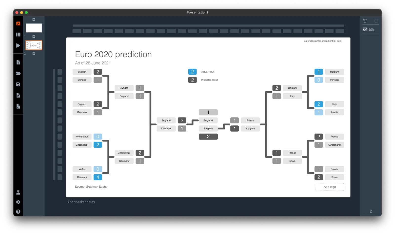
If you need to plot the progress of your team in the FIFA World Cup, SlideMagic is there to help you. There are a number of football charts in the library, including a tree where you can add teams in the knock out race to the final (see below).

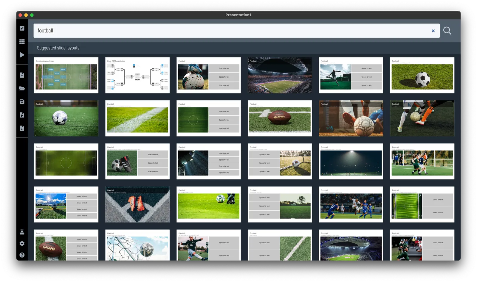
Simply search for football in the SlideMagic app and the charts will show up (see below).

SlideMagic Pro users can convert these slides to PowerPoint or PDF. Free student plan available

·Images

Leading the eye

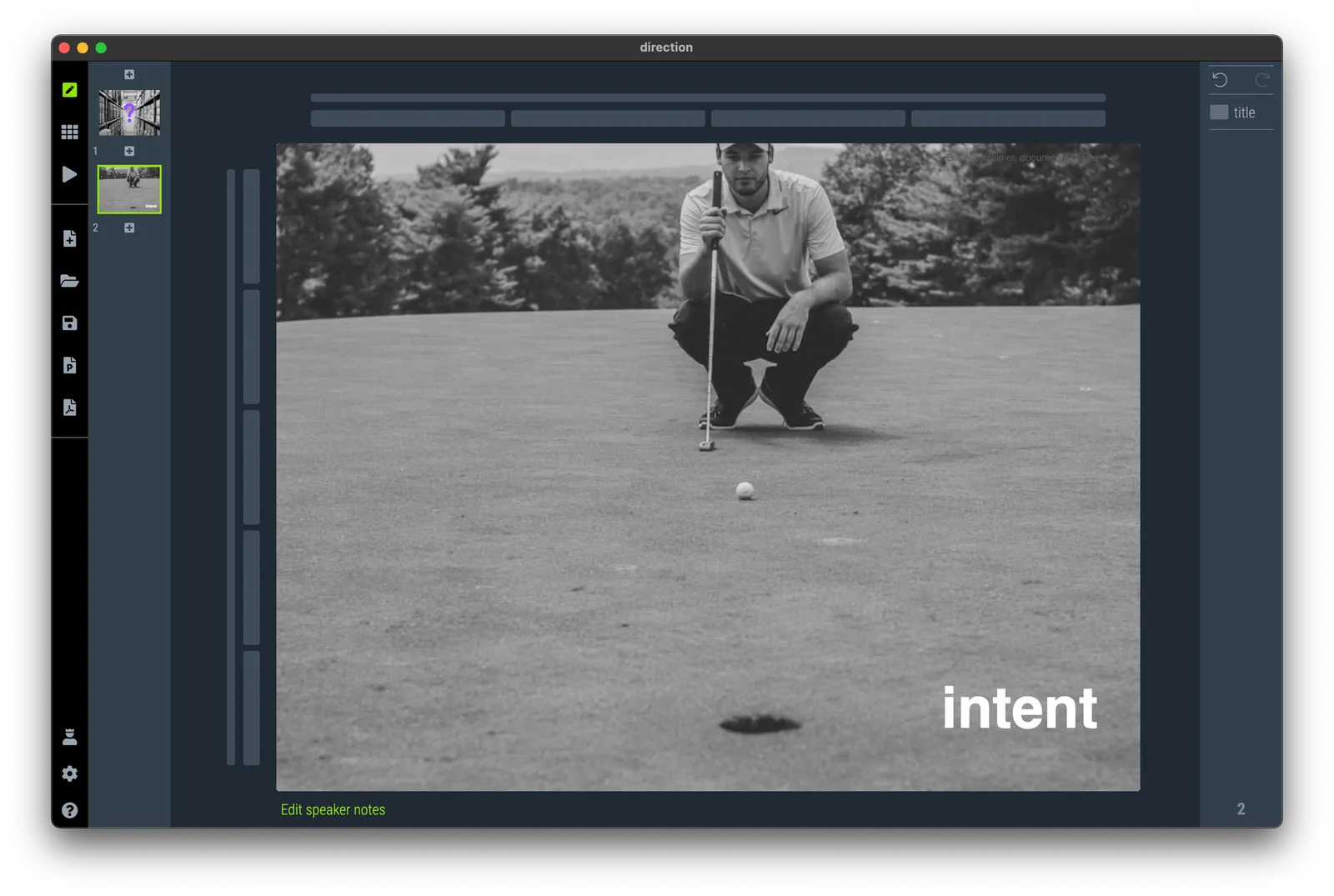
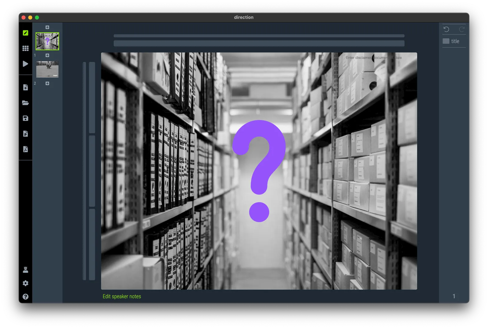
When looking for images, pay attention to how they can lead the eye of the audience. Below are 2 examples of images that draw the eye to a certain spot. (RSS email readers might have to open the link to the blog post to see the images).

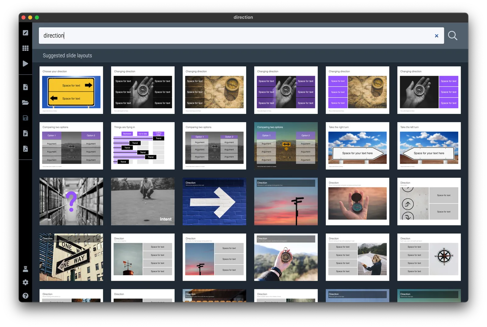
I have added the images to the SlideMagic slide library so you can use them in your own presentations. (Search for example for “direction” and they will show up, see the example image below).

Pro users can convert these slides to PowerPoint or PDF

·Layout

Fixed slide titles

PowerPoint slide templates originate from the 1980s. “Slides” would mainly be data charts: graphs and tables to show information. At the top of these pages would be a descriptive title (Economic output in the EU), and the subtitle would give the unit of measurement ($ billion).

Slide templates evolved. Business school professors and management consultants invented frameworks, more conceptual slide layouts, and people started using presentation software to layout their entire story on the big screen, often in bullet points. Descriptive titles became messages.

In most cases the title stayed. Every slide always has a title at the top. But this layout does not always work. People started adding a big arrow, with another big message next to it to make sure that the audience gets the point (it is spelled out 2x on the slide).

Titles take up valuable screen real estate, especially on widescreen 16x9 layouts. They make the chart body space even longer, more stretched. A loooong sentence in small font across a 16x9 slide can be hard to read.

I have become more flexible when it comes to titles. Data charts still have them. But other slide layouts might have none, instead, just an image, or a big text box somewhere else on the page. Or a message that is actually a few paragraphs long, on the side of the slide.

In SlideMagic, you can instantly change the layout of slides, and switch the fixed title on or off. It is time to let go of the obligatory title. See the the examples below. (If you are reading this as an email blog update, you might have to click through to the original post to see).


Continue reading →
·SlideMagic

Graphical language

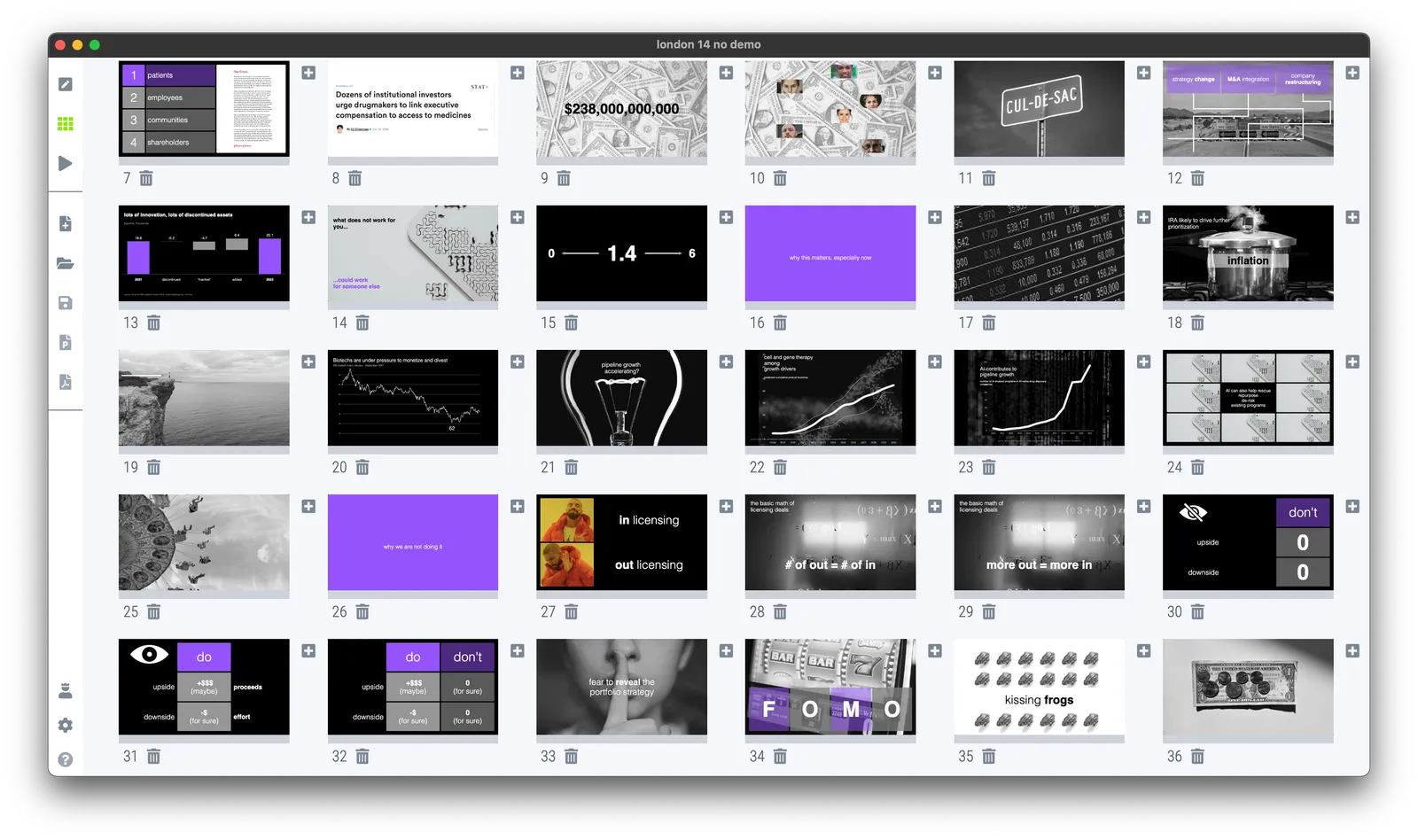
Make sure you maintain a consistent graphical language throughout your slides. Here is a thumbnail view of a section of a deck I used in recent meetings.

Here are the guidelines I used:

  • Dark background, white text, purple accent
  • Page-filling, black and white images
  • No capitals
  • Selectively bolding a word in a sentence
  • No slide titles in a fixed position

Every slide blends right in without, complicated graphics, and SlideMagic makes it really easy to apply this style.

·Layout

First meme in a deck

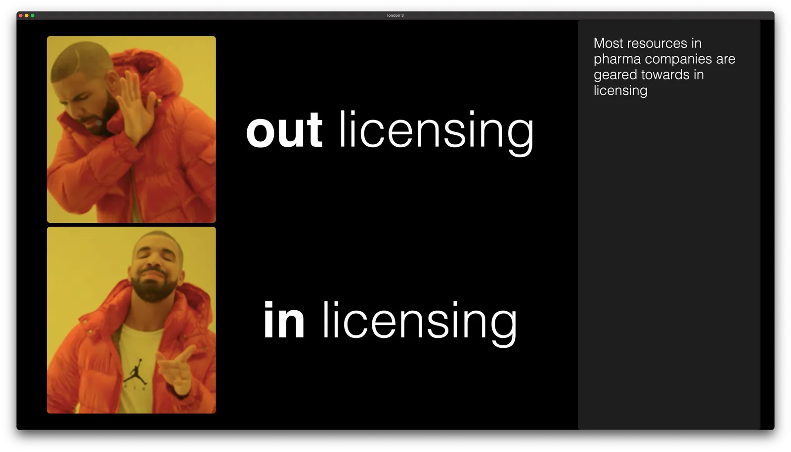
It took a bit of time, but I finally included a meme in an actual presentation…

I will add this chart to the SlideMagic slide library, search for “meme” in the app and it will show up for your to use. It is tempting to try to adjust the image, for example by removing the background, but the color scheme is actually an integral part of the visual concept. For people who are not familiar with this, some background on Drakeposting.

·Layout

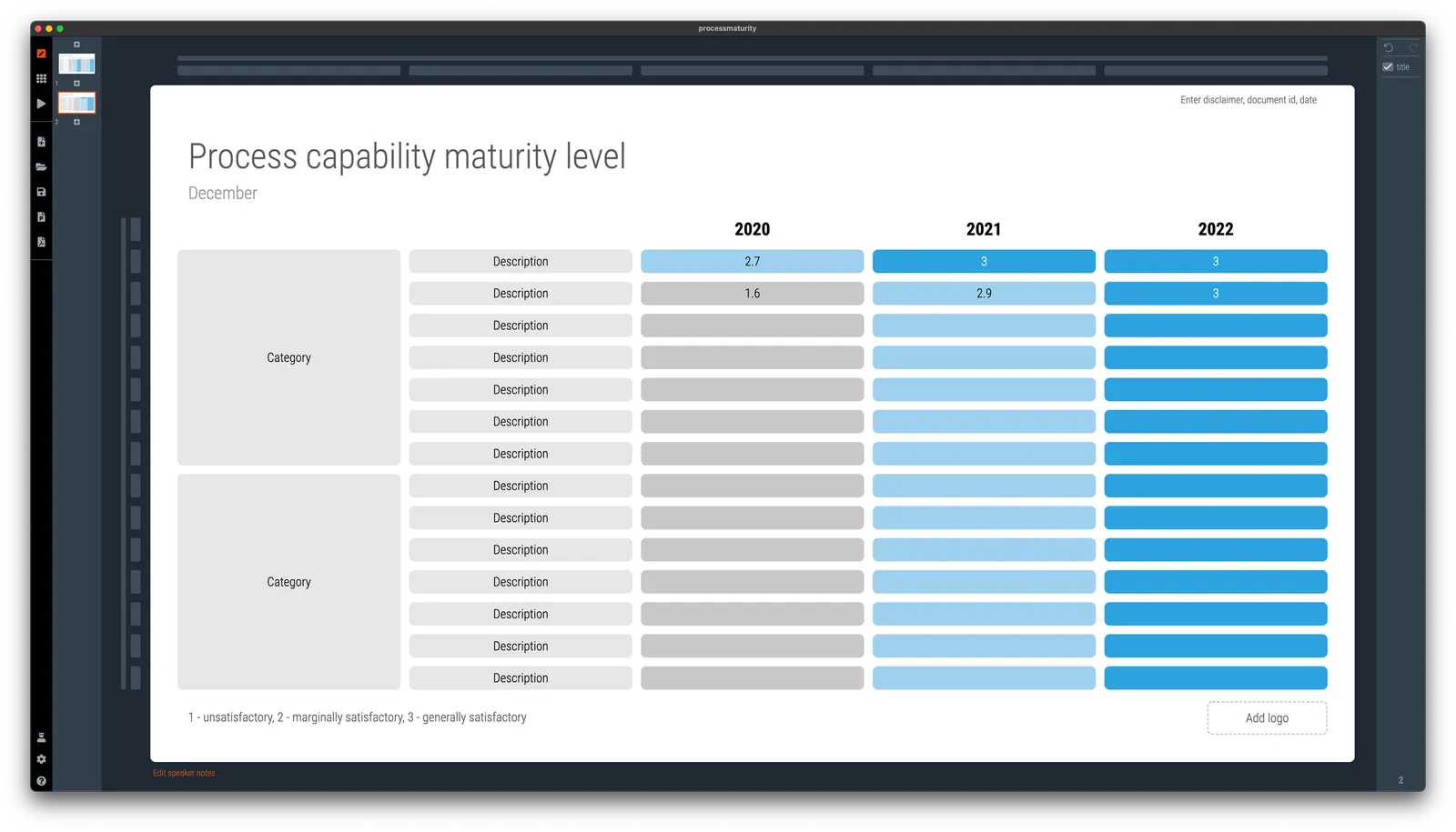
Template request: process maturity

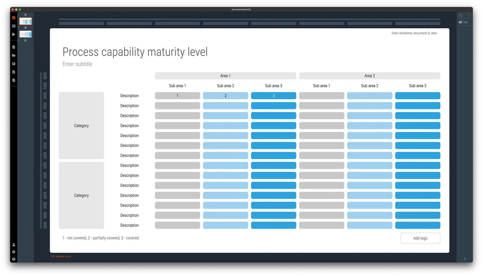
A SlideMagic user requested additional templates in the area of organization design and benchmarking. I added these two upon request. (Don’t tell anyone the secret that these slide design request are usually put up within 24 hours after asking for them.)

Simply searching for ‘process’ in the app will reveal them, or search online via this link. Pro users can convert them to PowerPoint (students, did you see the free SlideMagic Pro plan for you?).

·Layout

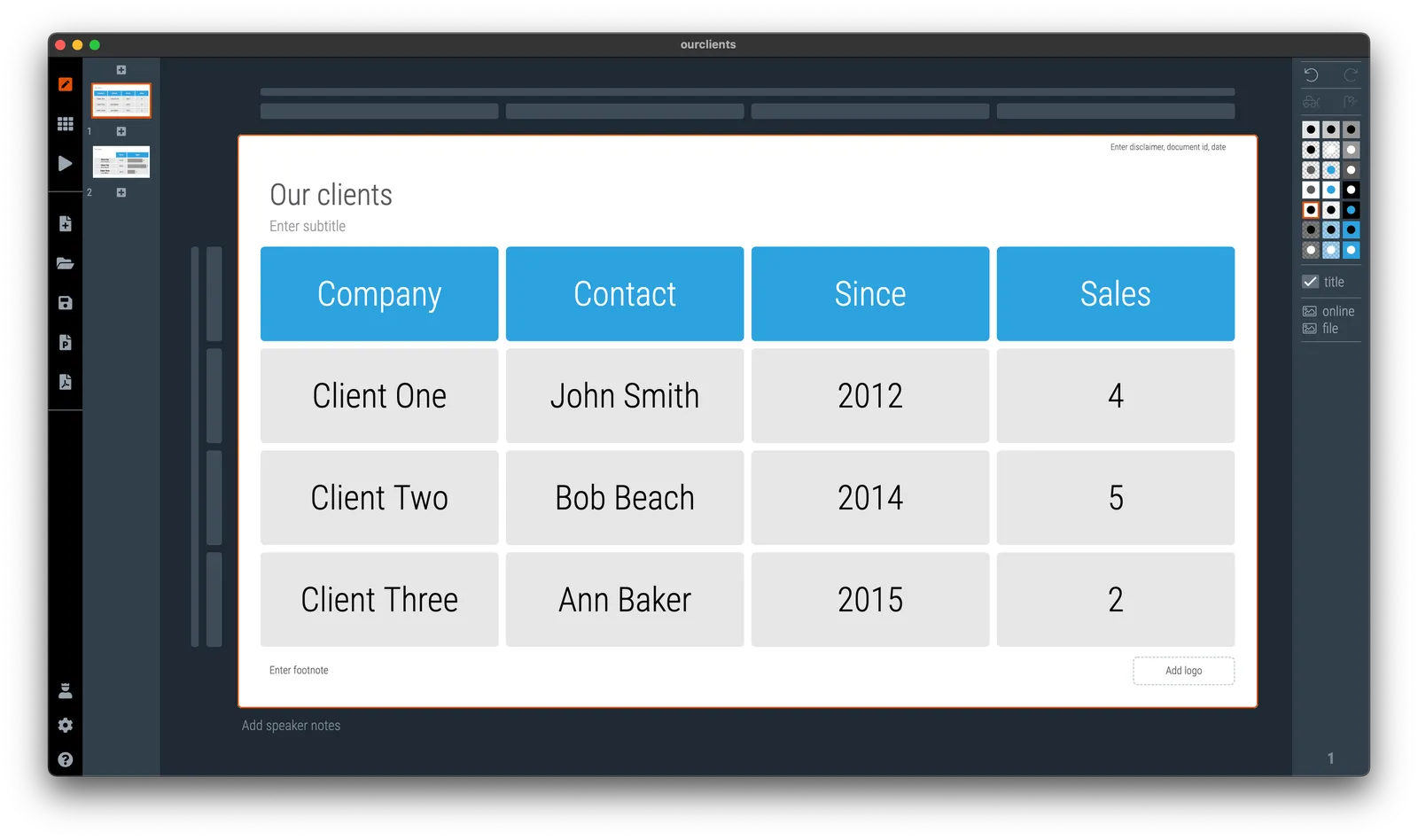
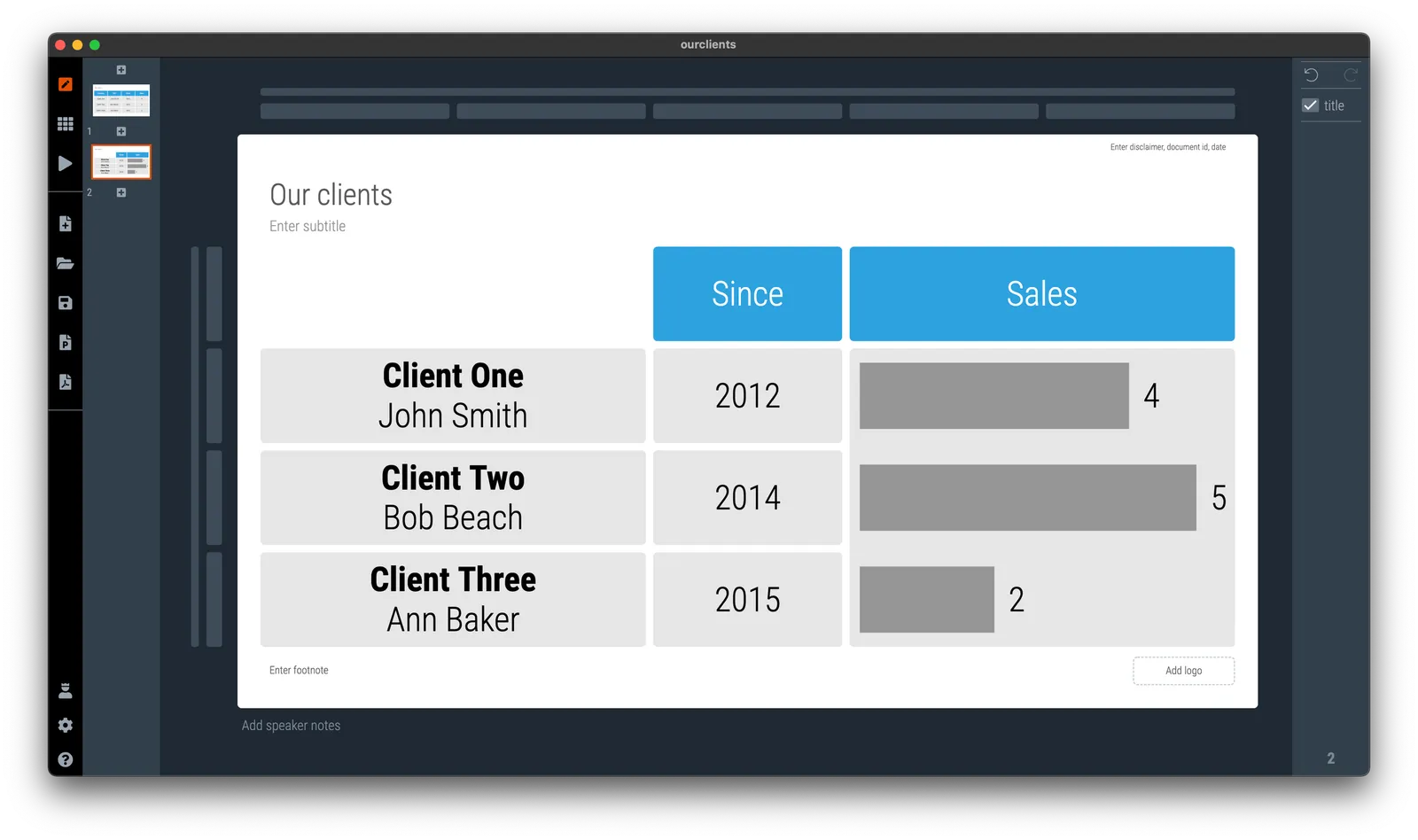
Grouping data in tables

In spreadsheets or databases, things should be clearly labeled. Every column has a heading that describes what’s in it. When it comes to slide design, you can allow yourself a bit more freedom. Look at the 2 slides below

In the second slide, I omitted detailed descriptions of data that is probably clear to the audience, and grouped things together in one box. Easier on the eye.

·Layout

Presenting for the phone camera

Over the past 2 weeks I have visited 2 large conferences in the fields of software and healthcare (apologies for the lower posting frequency here). During the latter, I witnessed something I have not really seen before: the presentation for the phone camera.

Companies get 13 minute presentation slots which are filled with sequences of slides loaded with scientific data. The presenter flicks through them at super high speed, I could barely read their headlines.

The audience does not seem to mind. Each slide is captured with a smartphone camera and saved for viewing later, back in the office. The more data on a drug’s efficacy and safety the better. Large pharma companies seeking to buy molecules, competitors wanting to check in on the market, countries seeking inspiration for their own research, and investors wondering where to invest their money are totally happy with the approach.

·Advertising

Proportions

It is extremely hard to make a digital composition of multiple images look credible as a realistic scene. See in the ads below, the sizes of the objects are not right in relation to each other, and the angle of lens is inconsistent.

Alternative approaches:

  • An illustration
  • Make the actual shot in the field
  • Use proper 3D animation software