SlideMagic Blog

Frequent updates about all things presentations since 2008. Subscribe to never miss a post.

RSS
all posts

Category Layout

·Layout

Eyeball the thumbnails

The thumbnail strip to the left of most presentation software is not only useful for switching to other slides, it also is a good feedback mechanism for slide layouts. It is like sitting in the back row of a big auditorium, or viewing the slide in a small preview window on a Zoom call.

·Layout

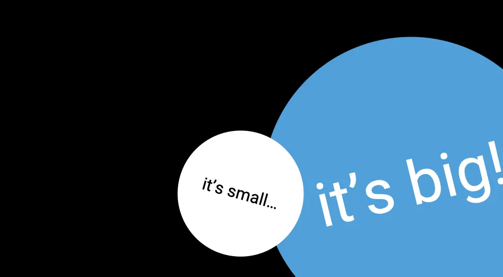
Out of the frame

If you are daring, you can consider letting shape go off the page, or tilting text in them to make your slide look more alive. And/or tilt things a little. Text could even run a bit out of the page frame. The good thing about circles is that tilting text does not impact your overall slide layout.

(Yes I know, no circles (yet) in SlideMagic.)

·Typography

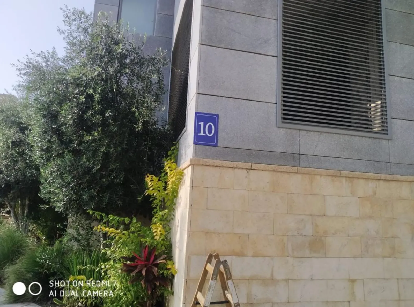
Typography is everywhere

The building manager finally installed a house number on our building, to reduce the amount of desperate calls I get from couriers. Still, I wished he had asked me for a suggested position where to put it. “Bleeding off the page” is not the right concept here…

·Layout

Your pitch deck on the home page

Happy 2022! I am returning to blogging after the holidays. Over the past week I have been busy designing the web page of our new medical startup (still in stealth, so I cannot show it to you yet…).

The more I thought about this page, the more I came to the conclusion that the web presence of this company at this stage should be a pitch deck to potential partners, rather than the usual feature list and headshots of the management team.

Most “presentations” on web pages are either a static gallery of images/screenshots, or an embedded video., but this layout does not look very good across a wide range of unpredictable screen sizes. For a chart to look good on different screen sizes, and more importantly different aspect ratios (phones are portrait, computers are landscape), you need to break the fundamental layout of the page.

Most slides have the classical title-on-top, content-in-a-rectangle-below layout. For my site, I changed that to 2 squares, one of which takes the role of the slide title with a big written message, and 1 with a supporting graphic. The layout changes depending on the device you are watching the site.


This layout change is common on web sites, but it is used a bit randomly. Pictures and text blocks move around disconnected depending on the screen size. For a “presentation” you need tighter control.

Another major problem for a web designer is rapidly changing content. It is common to make small and big changes to pitch decks all the time, while websites are relatively static. To solve this, my experience with SlideMagic came in very handy. I wrote a simple chart engine that reads “slides” with their titles and shapes in a simple format, and then renders them on the screen in the desired aspect ratio.


Continue reading →
·Typography

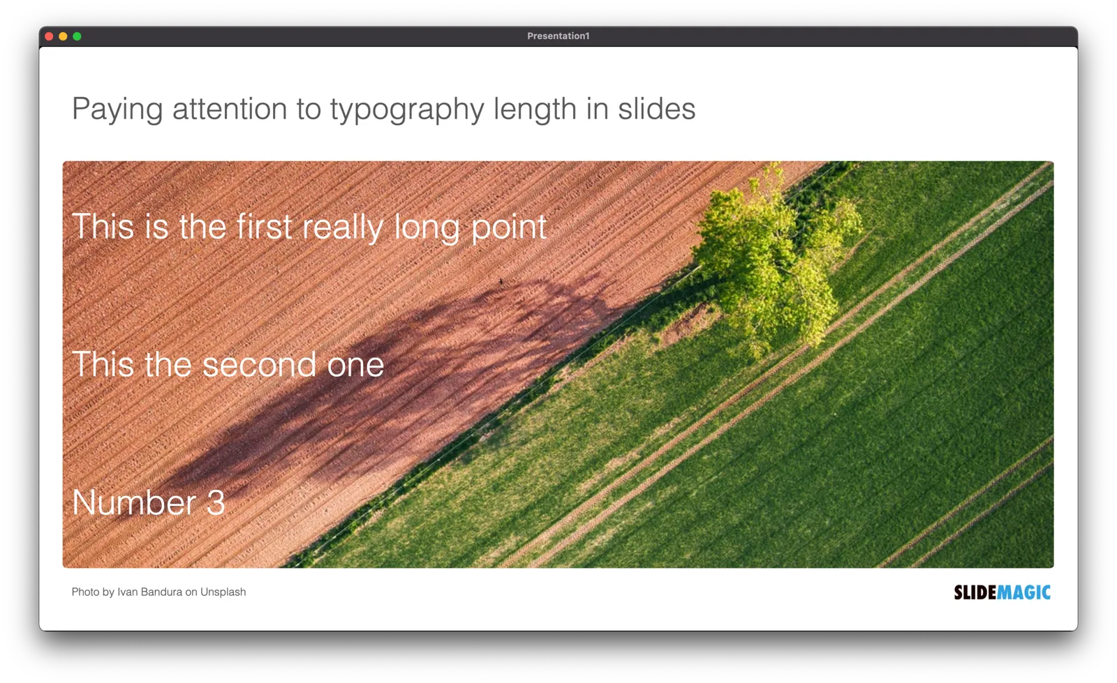
Sorting text by length

In slide design, every detail counts. Pay attention to the length of text blocks when putting them on a page. Sorting them by length can give an interesting visual effect. Or the other extreme, picks words on purpose so that the length of each text box is more or less the same.

PS. How did I get the picture? Search for “diagonal" in the SlideMagic app and you get lots of suggestions

·Layout

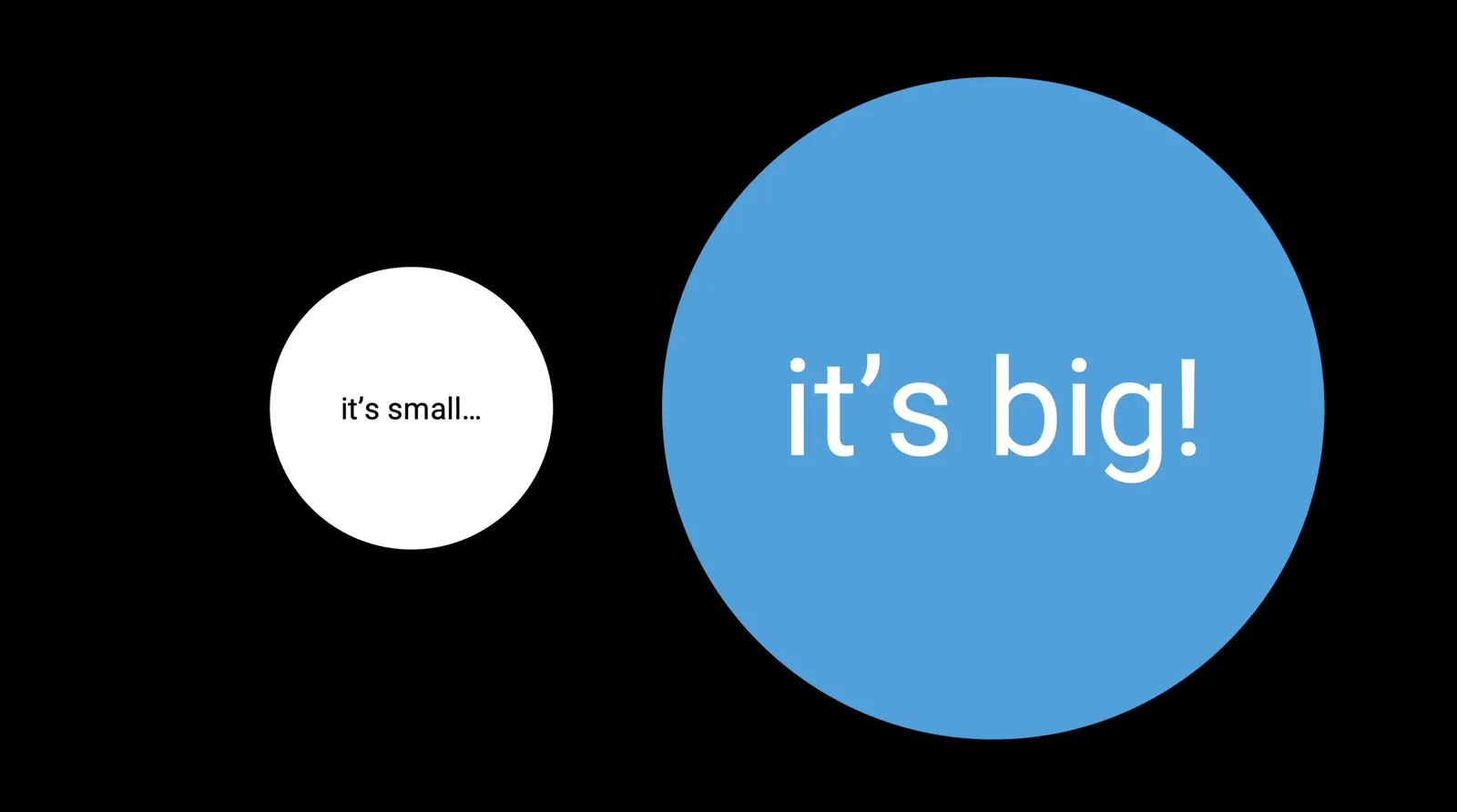
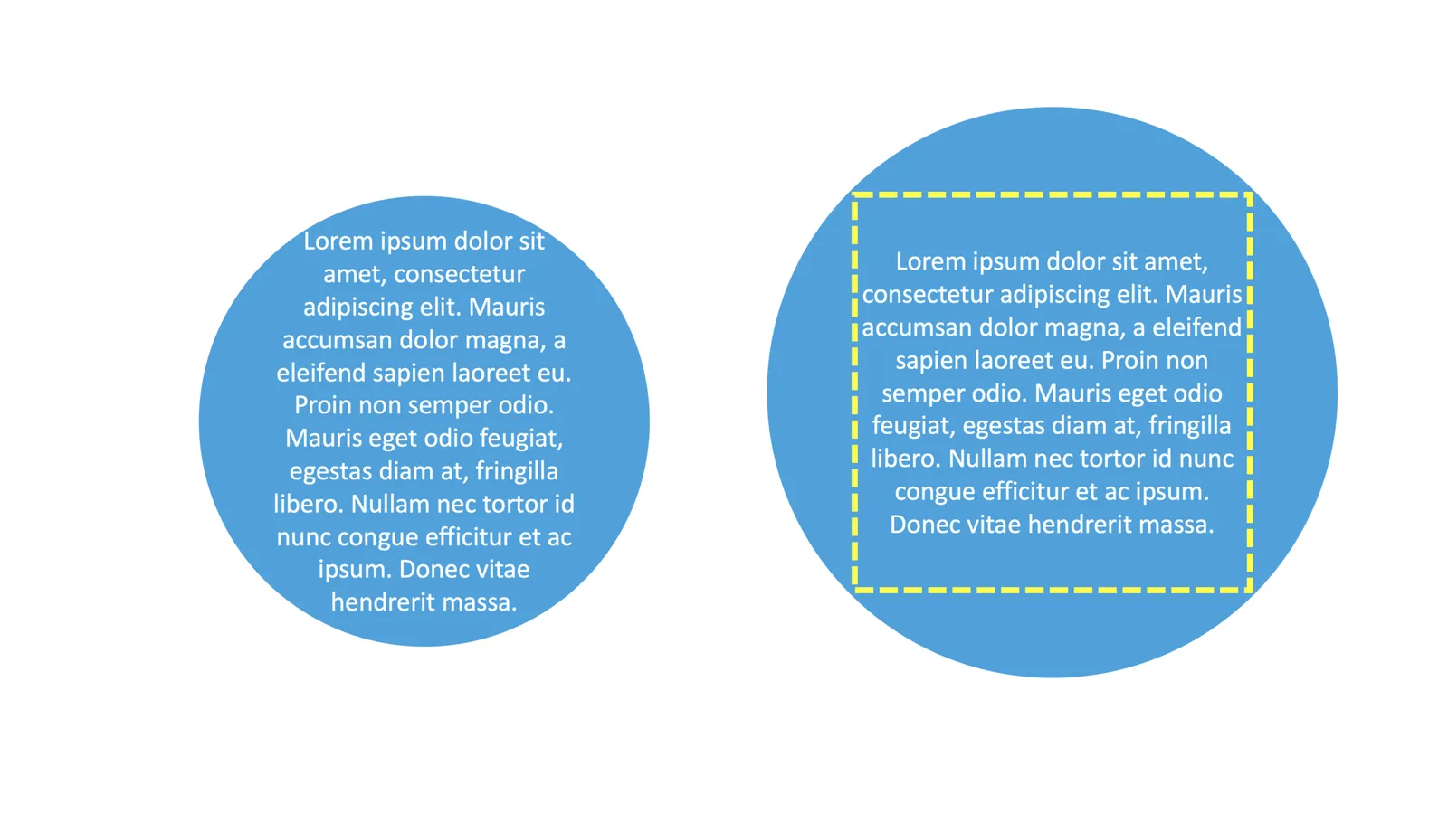
Fitting text in circles

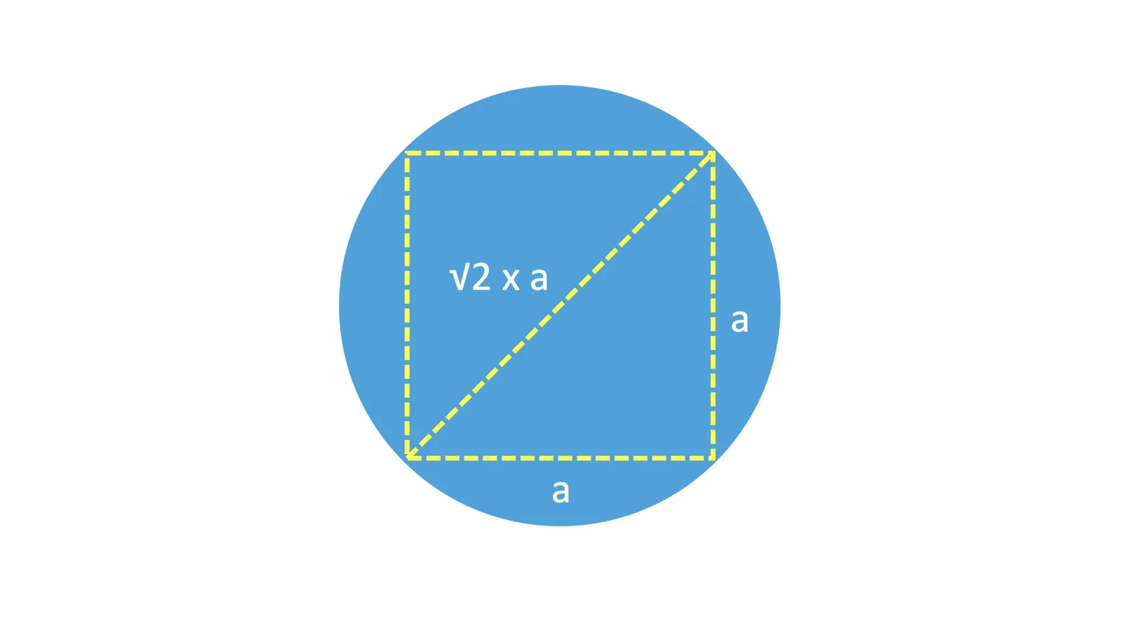
It is very tricky to fit paragraph text into a circle. Line breaks are never smooth, especially when you have long words. My approach is to use a larger circle, but fit the text inside an imaginary square that just fits inside the circle.

For math geeks, the ratio between the side of the square and the diameter of the circle is the square root of 2. I had to use this proportion recently to fix a web site layout.

Obviously very short headings fit perfectly well inside a circle.

(Yes, yes, circles will come to SlideMagic)

·Design

Organized randomness

This is a tricky thing to do: create a layout of seemingly random elements that look good together. I need to deal with this now for the new venture I am setting up

It is a process of constant iteration. Put one type of elements, put another. Add text and titles. They shift the weight of the page, so everything has to move around again, different screen aspect ratio, another shuffle. Repeat, repeat.

Subconsciously, your brain is scanning for anomalies in the unwritten rules of a layout. You don’t know what they are, but you see it when you break them. For example, including one angle in the path above that is “sharp” (i.e., smaller than 90 degrees, would stand out.

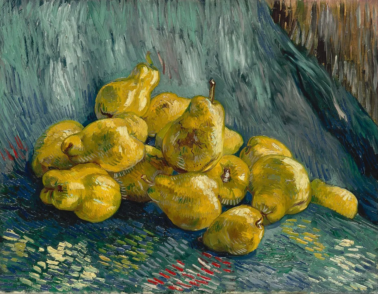
Architects have to deal with this a lot, or painters laying out the “random” elements of a still life painting.

In the end, we are all artists.

·Templates

Another slide makeover

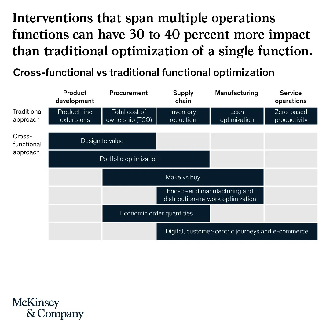
McKinsey’s social media activity provides an excellent stream of slides to work on. The one below could have come straight out of SlideMagic.

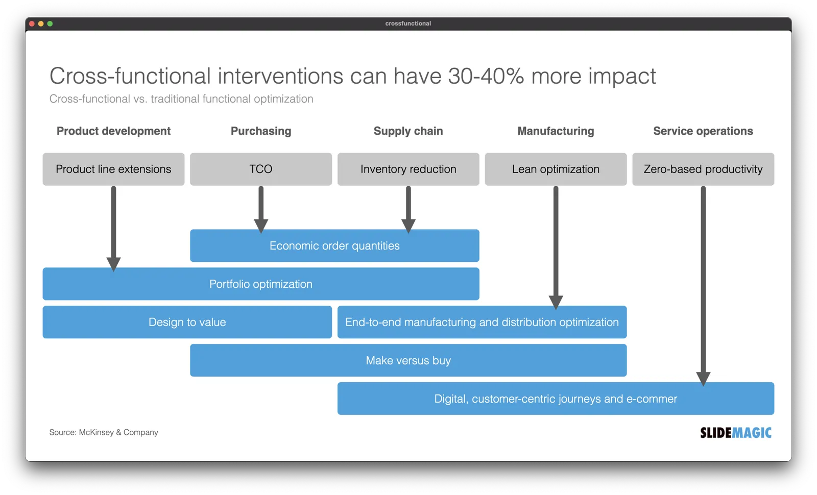
I created a proper SlideMagic version with a few improvements:

  • Emphasized the “from to” theme of the chart with arrows, and two contrasting colors, and a bigger distance between the two options
  • Lighten the colors a bit, especially the dark top row of the original puts a lot fo weight in the chart
  • Actually reduced the font size a bit to give the text more breathing space in the boxes
  • Re-shuffling the bars to get a more pleasing overall composition
  • I eliminated the left column, the audience can guess the description, to add more balance to the composition and gain some extra space

SlideMagic users can use this chart, simply search for a relevant keyword (operations, consulting), and it will pop up for you to adjust to your own project.

·Layout

Dynamic layouts

For my next venture, I am actually getting into a lot of “slide” design work: displaying financial data in a web browser with totally unpredictable screen sizes and screen aspect ratios. This problem has been solved for traditional web sites with text and pictures. (That is pictures where you do not really care how they are cropped).

For financial information, this is not the case. Spreadsheet-like tables that look good both on a 27” widescreen monitor and a smartphone screen, for example. All this layout work is not the core of what this venture will be about, but I am learning a ton that can feed back into SlideMagic. And vice versa, the SlideMagic chart engine, could take data from this new system and create presentations pretty much on the fly.

To be continued.

·Layout

Not a very good Apple slide....

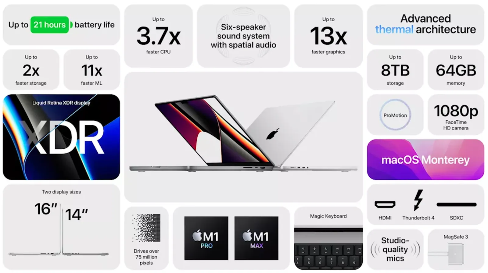
This Apple slide from a recent product launch event looks very non-Apple…

  • Busy, lots of information
  • Font sizes all over the place
  • Big 13x, 11x, 2x, but hard to read what is improved
  • Rounded edges are too rounded
  • The grid is broken
  • Imbalance: some boxes have heavy dark images, bleeding off the edge, others have no images…
  • Look at the font styling used for “thermal”

The people and design budget at Apple can do better than this…