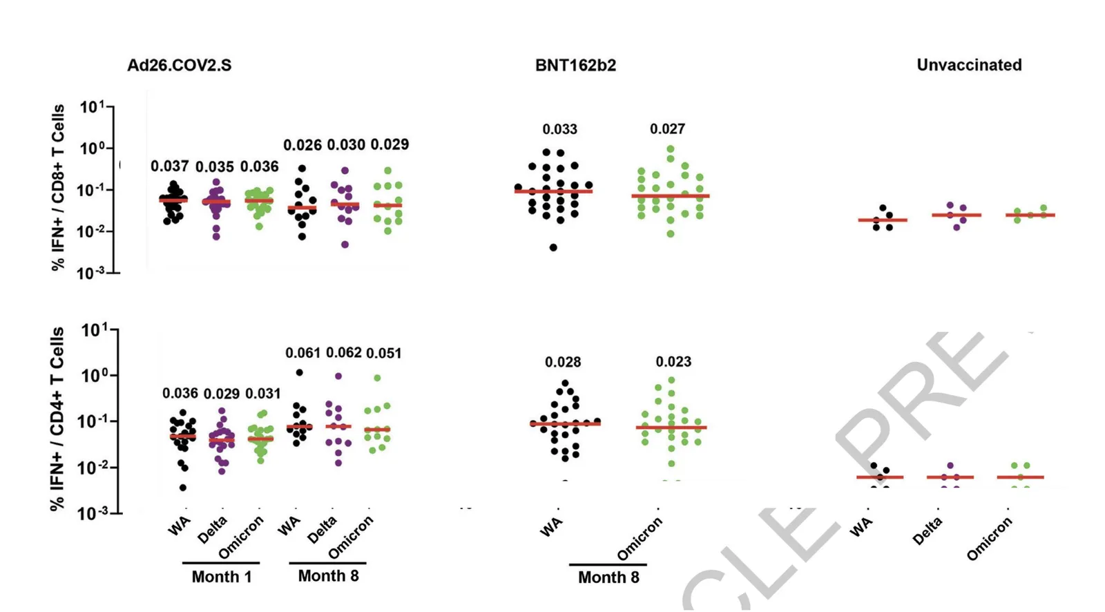
In scientific documents, there are chart making conventions that make sense, clearly labelled axes, titles, etc. etc. Use these charts in your article that you submit for publication in a prestigious paper. For an on-screen slide show however, you could deviate from this standard. Your objective is to communicate the findings as best as possible, referring to the paper for the details.
See the example below (source), lots of duplication in axis labels.
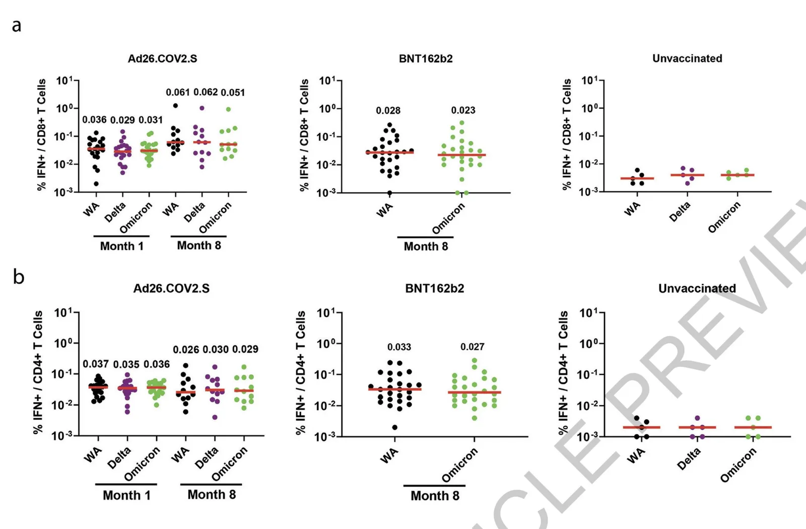
You can make the page a lot calmer be omitting some of these labels. I quickly cut and paste the elements in the image below. (This is not a makeover, just a super rough reshuffle to show you what I meant).