SlideMagic Blog

Frequent updates about all things presentations since 2008. Subscribe to never miss a post.

RSS
all posts

Category Design

·Design

Please help complete this Squidoo page for presenters

Squidoo is a tool developed by marketing guru Seth Godin that makes it easy to create overview web pages, a so called lens. I created one for presenters and need your help to complete it.

My aim is to create a useful collection of tools and resources for presenters. It would be impossible for me to maintain on my own. Instead, I am using the “Plex” technology that allows visitors to add links and vote them up or down.

Feel free to add, or vote up-down, blogs, books, gadgets, online tools, or suggest other categories that you want to see on the lens. The voting is less important here than the actual listing.

Revenues that the site generates (if you click through an Amazon link for example) are donated to charity.

Please visit the lens here on www.squidoo.com/stickyslides.

·Design

Don't let stock photo sites do the brain storming for you

Everyone now knows how to get their hands on beautiful images. The next challenge to make your presentation stand out is to pick the right ones. I prefer to do the chart concept brainstorming myself, rather than relying on a stock image search engine to do it for me. We completed the project. Typing in “success” for “finish” will give you a stream of highly predictable and often cheesy images. “Man in suit raising his arms in victorious joy”, “hiqh quality render of a character crossing the finish line”. You/the human brain can do better than that. Think of the concept you want to make, all the way to the end. Then, search a highly specific (stock) image that goes with it. Armstrong waiving his hand on the moon, a bunch of empty, used coffee cups on a desk.

And remember, the right visual concept does not always involve an image.

·Advertising

Chart concept: you can't see what's under the surface

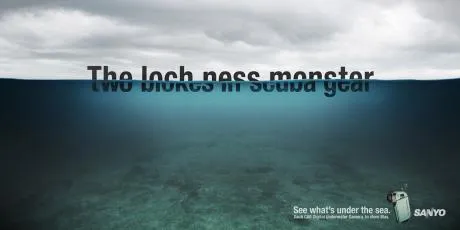
I often have to use a visual concept of the “tip of the ice berg”, “things are different as they appear”. The picture of an actual ice berg is the obvious choice to use. The Titanic archetype is deeply engrained in our collective memory.

These Sanyo ads show how you can use typography to do the same thing. The first image replaces the image of an ice berg with the actual words, but it gets really interesting when removing the link to the ice berg all together and start using giant text cut in half. Big enough that you can actually read both sentences (sort of) easily.

Not very friendly to audience members with dyslexia though.

Via Ads of the World.

·Delivery

Switch off your parallel visual thinking - only rehearse out loud

You flick through the slides of your presentation on the way to the venue in the taxi. The slides look great, the story is perfectly clear.

Not anymore when you are on stage.

A live rehearsal is the only way to go. And not only to practice stance and eye contact (with the mirror in front of you).

You need to switch your brain from parallel to sequential processing. An image says more than a thousand words. If you look at your own slide it all fits together perfectly. That image, the diagram, those 2 words, the pressure of the 2 opposing arrows. For you (the slide designer), it triggers a complex set of thoughts in your brain.

The audience does not have any of this. You need to translate that complex mental picture into a sequence of thoughts and sentences that allow your audience to get that same insight.

The only way to do that is to “switch off” your parallel visual thinking and start listening to your own sequential stream of words.

·Art

Weekend reading: Rene Margritte paintings and Photoshop images

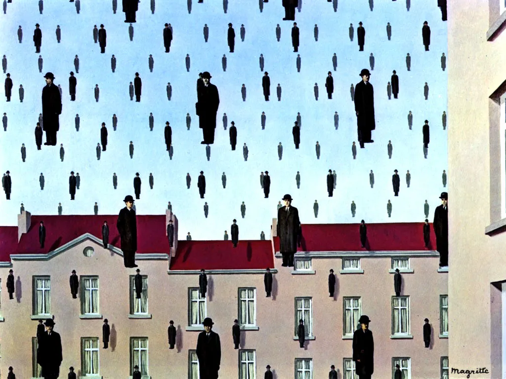
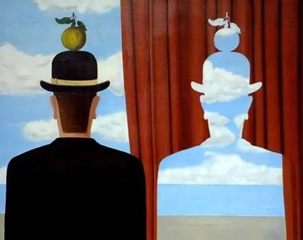
I am browsing through an old (1979) book, Magritte: Ideas and Images, about the life of the Belgian painter Rene Margrite this weekend. What if he could have used Photoshop? Repetition of graphical elements, cut outs, projections. He was ahead of his time.

·Design

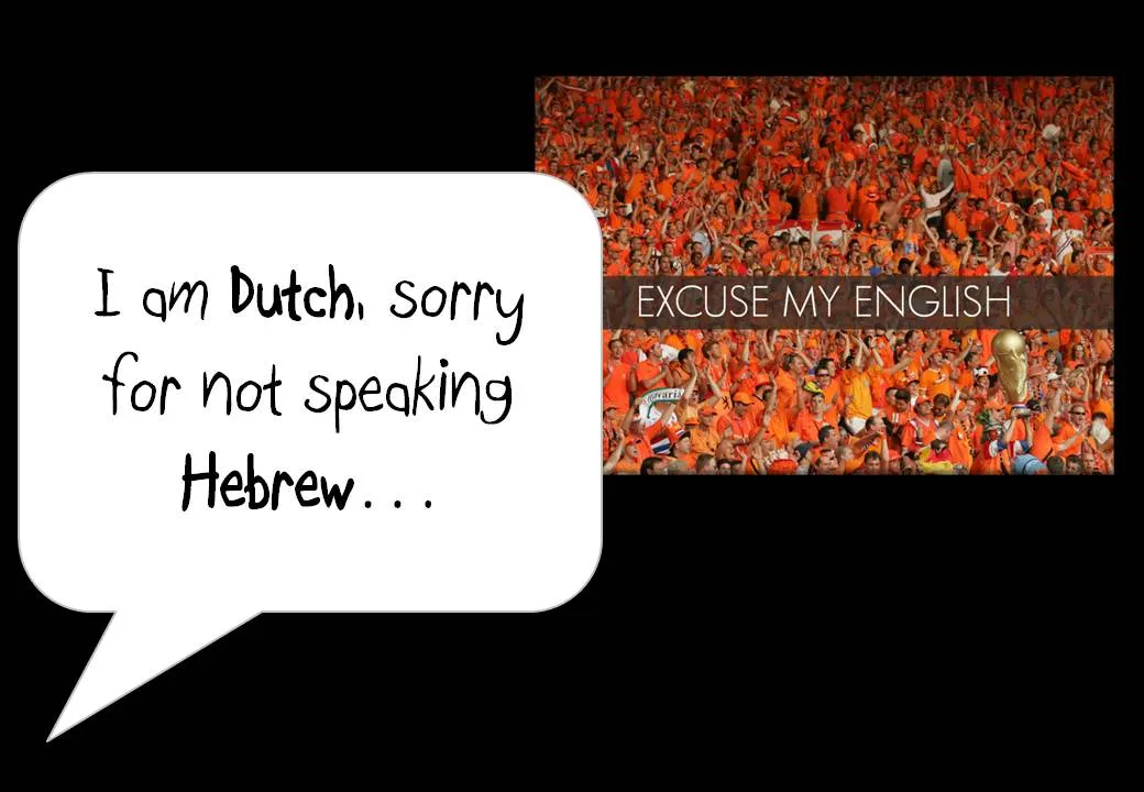
"Excuse my English" - slides that cannot stand on their own

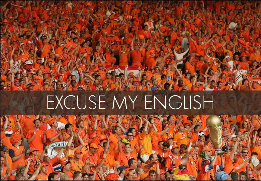
I put the slides I used for a presentation on SlideShare despite that they actually do not stand on their own very well.

One piece of feedback I got is that I should not apologize for speaking poor English on the first slide. Rather as a presenter, you should radiate confidence. Makes perfect sense. This is actually not what the slide with the Dutch soccer supporters was meant to say… I was apologizing for not speaking Hebrew.

In this context, the mismatch was harmless and even funny. In other situations it might not be.

I enjoyed receiving so much positive feedback on the SlideShare slides. Thank you very much. The benefits of sharing the slides far outweigh the drawbacks in this case.

·Design

Slides from my guest lecture at the Technion

Last night, I gave a guest lecture to the Eclub of the Technion Institute in Haifa, Israel. We discussed presentation design in general, lessons for entrepreneurs wanting to pitch to venture capitalists for funding, and some PowerPoint makeover tricks.

The slides are a perfect example of visuals that cannot stand on their own (without the presenter being present). Having said that, here they are:

·Design

Keep your images real

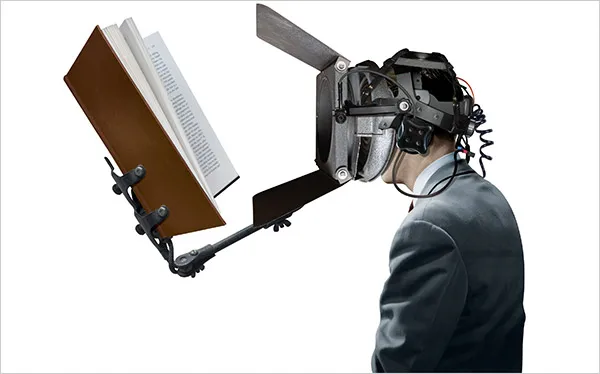
Today, Photoshop can do a lot, but it is still hard to make that perfect photo composition. Today, the New York Times used this image in an article about research to improve concentration.

Nice Photoshop work, but:

  • The composition is good, but not perfect. Either do something that is 100% real, or completely not real (i.e., a photo cartoon)
  • The image catches attention (“what is that scary device attached to this person’s head?”), but does not immediately create the link to concentration. A real image would have been better (5 builders NOT looking away from their work as a woman passes by for example).

Keep your images real.

·Design

[Israel-only] I will be speaking tomorrow May 6 at the Technion in Haifa

If you are around Haifa tomorrow evening you are welcome to join my talk to the Technion Entrepreneurs Club. The discussion will be about improving presentations in general, with a specific focus on VC pitches for startups. Tell the gate that you are here for the “entrepreneurs event”

Technion Industrial Engineering Building Room 216 Wednesday May 6 18:30 Directions can be found in the “about” section of this site.

·Design

2009: the year of stock image fatigue

Today I am writing a speech for a group of university students, so I had the luxury of being able to"go all the way" with creativity, not having to worry about whether visual concepts would be appropriate for the audience.

Eighty slides later, I got tired of many of the images I used and cut back on a lot of them.

  • Page after page of yet another stunningly beautiful image takes the attention away from the presenter and gives the audience the impression of reading a giant coffee table picture book
  • There is only so many funny or shocking images an audience can absorb. One “pie in the face” can be funny, one aggressive guy might be OK, but not ten slides like these. People don’t like to look at close-ups of spiders.
  • Metaphors get forced: “I knew he would use that squashed orange to show that we are being squeezed by the competition.”
  • Cost: 80 pages with a few trial images per page start to add up.

What you can do to overcome stock image fatigue:

  • (I passed level 0 already: cutting out the cheesy image)
  • Have the courage to go even more minimalistic: use a few words on a beautiful background color (experiment with light and elegant fonts, short words with are extremely large fonts)
  • Re-color stock images so they look more similar
  • Use images that are similar in style, for example just “retro” black & white shots throughout your presentation
  • Use real images from sources such as Flickr (check the license)