

Blog post

Keep your images real

May 6, 2009 · by Jan Schultink
← all posts

Today, Photoshop can do a lot, but it is still hard to make that perfect photo composition. Today, the New York Times used this image in an article about research to improve concentration.
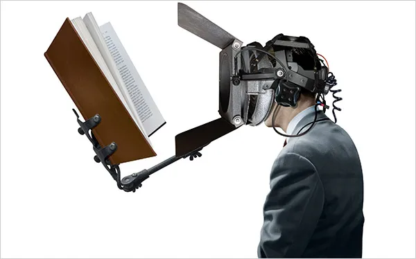
Nice Photoshop work, but:

Keep your images real.

DesignImagesPowerPointPresentation designPresentation

About this blog

Notes on all things presentations — design, storytelling, and AI workflows.

Subscribe now to never miss a post.

RSS

About SlideMagic

A platform for business presentations.

A free student plan is available.

4 comments

Jan Schultink2009-05-14 14:36:00
Smiling, in Dutch say you cannot argue about taste :-)
Anonymous2009-05-14 13:52:00
I disagree too!
When I looked to the picture, I immediately thought about concentration. It is just what people wanted to see. This knowledge about people, you just have to know or to learn, so you should not just going to say something like this. Its a bad article!

And my english also!
Wollard Hutch
Jonathan B2009-05-07 17:53:00
I disagree. I think there is a lot of merit in using an artistic abstraction to convey an idea. The article is about using science and technology as a way to increase concentration. The image is an exageration of that idea. It wasn't meant to look perfectly real, and shouldn't. That's what keeps it a humorous exageration vs. a manipulated photograph. Note the size of the book, and the mismatched perspectives. The device is clearly not real, but the image is eye catching, makes you re-interpret the headline, and most importantly guides you into the article to discover for yourself how science is ACTUALLY going about improving concentration.
Jan Schultink2009-05-07 19:25:00
Jonathan, I think you described precisely what the editors were trying to achieve with the image. Personally, I just don't find the image very pleasing. I am a print subscriber to the NYT and did spot the article there. I am curious whether it appeared here as well, or just in the online version.