Make-over artist tip: don't underline words
Underlining words just doesn’t look good. Especially not in headlines. Use a bold font instead, or italics inside body text to emphasize.


Frequent updates about all things presentations since 2008. Subscribe to never miss a post.
Underlining words just doesn’t look good. Especially not in headlines. Use a bold font instead, or italics inside body text to emphasize.
Weekend reading. I was reading some stories of George and Martha this weekend to my children, and was reminded of a great blog post by Nancy Duarte about leveraging your audience’s anticipation in your presentation. Let them do a bit of the work as well, rather than just sitting down while being spoon-fed with content.
The “slide” with the grinning George is a more powerful one than Martha walking away to get a towel while the information conveyed is the same.


The images are scans from this book. Recommended for any parent.
Speaker notes are a great tool to prepare a presentation. You can write out your thoughts in sentences, independent from the visual structure of your slide (sequential instead of parallel). In PowerPoint presenter view, you can display them on your own computer, while the audience only sees the clean slide.
Speaker notes are usually somewhat hidden. You can see them if you have the editing window open at the bottom of the slide edit screen, or when you print the notes pages. It is easy to forget that you’ve entered them.
Nonetheless, they are an integral part of the PPT file. You send the PPT, you send the notes. So be careful in case you use notes to add side comments like “note to self: do not bring up the poor 2008 performance! :-)”. A sure guarantee that it will be brought up during the presentation. UPDATE: Akash Bhatia provides a wonderful solution in the comments. I have re-written my post below:
One solution could be to send a PDF version of your docoument. But there is a smart feature in PowerPoint 2007. Hit the Office button, select “prepare” and then click “inspect document”. It lets you purge all kind of personal information from your presentation, including presenter notes. Make sure to save your file under a different name before saving.

Taking two more slides from my presentation about investor presentations.
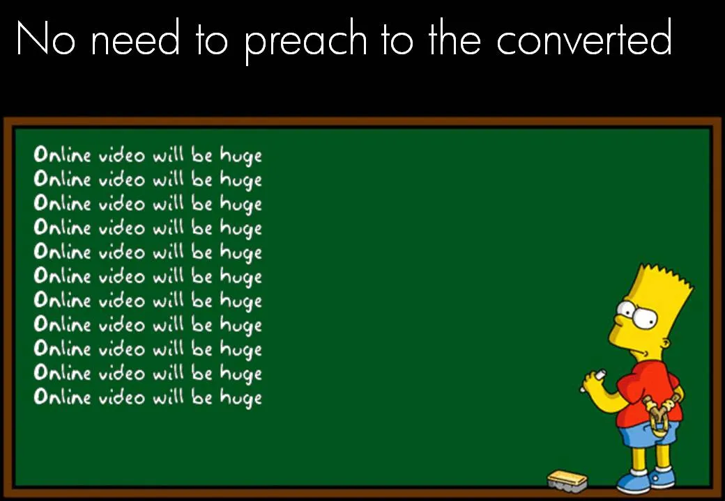
There is no point in going on, and on, and on about something that is already common knowledge. Everyone assumes that online video will be a huge market. (Of course, we could be collectively wrong). Don’t spend your valuable presentation time on this.
On the contrary, focus on your obvious weaknesses. Highlighting weaknesses does not mean shooting yourself in the foot by bringing up details that harm your investment case. Instead, think what questions any intelligent human being would have when listening to your story. There is no avoiding. If you don’t address them, the questions will remain.
“So, you are trying to build a page rank-based search engine?” “Yes, exactly, you picked that up fast. Let me show you our cool technology and some pretty impressive first search results” Wrong answer.
Most of the slides in my presentation about VC pitch lessons do not stand on their own. In a series of blog posts I will take some of them and add the full long-hand description of what they express.

Tell what you are about in the very first slide of the presentation. VCs like to put in you a box. If you don’t do it for them, they will spend the time guessing while you deliver your carefully crafted buildup of the story. People who are busy guessing, do not register other content.
Telling what you are about is not the same as running the entire presentation on the first slide, and repeat the same story on the other 20 slides in the deck. “We are an online book store”. “Aah, now I know”. No more explanation needed.
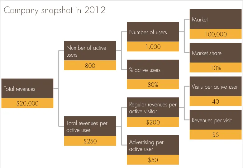
One of the last pages in every venture capitalist funding presentation is the “hockey stick” of revenues and profits shooting through the roof. VCs expect a bit of optimism from a startup, but at the same time want to do a reality check on these numbers.
I often use a company snapshot, a tree of the key factors that add up/multiply to the projected revenue figure. Make sure the factors are real things you can touch: people, visits, etc. CORRECTION: Also make sure the tree adds up and calculates through, something that cannot be said about the example below.
Sometimes you cannot avoid building up a busy data slide to take your audience through it step by step. In case of data-driven charts, it is tricky to create 3 independent graphs that are nicely aligned. I tend to create one big chart and use a white box to cover part of the information. Gradually I unveil more information by taking the white boxes off, instead of creating animations with new elements popping up.
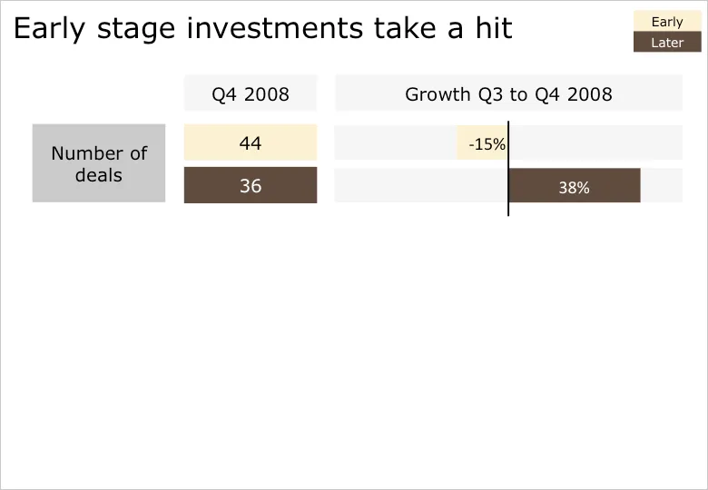
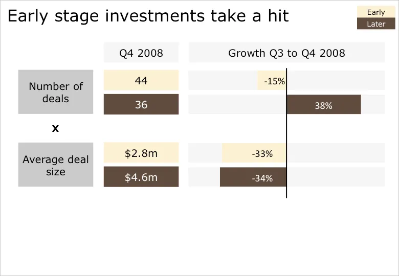
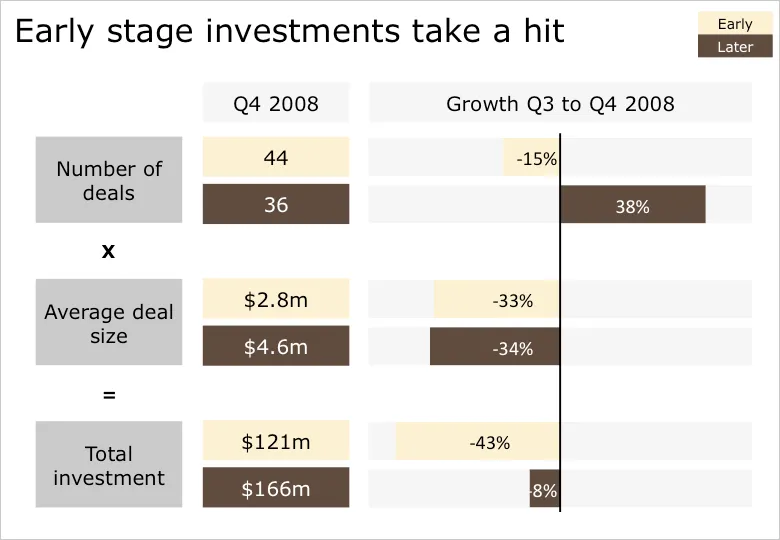
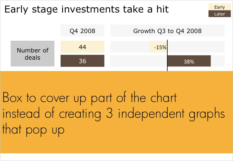
B.t.w. for those interested: the data above is the quarterly overview of VC investments in Israel, compiled in PwC’s Money Tree report for Q4 2008.
Information Aesthetics is talking about visualization nostalgia. Hey, we used to have a ruler like this at McKinsey. I will continue to look for one, or a picture. They were blue, had boxes for bar/column charts and pie diagrams, and a few triangles and arrows.
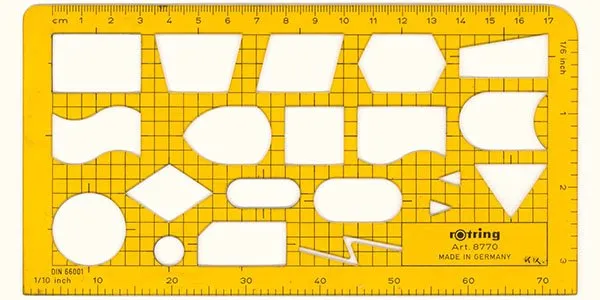
The bad thing is that all your charts sort of looked the same. The good news was that, because you were trained to use this ruler, you always tried to find a graphical way to present your information, hardly ever resorting to bullet points.
This ad from Ads of the World sparked some ideas.

One, the image bubble with the contrasting thought is an interesting concept that can be used in PowerPoint charts.
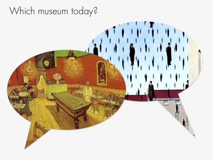
Two, I am not using the ability to fill shapes with pictures enough. It’s easy. In format shape, go to fill, and choose texture or picture, and off you go. The effect is best used with irregular shapes (clouds, stars, etc.) rather than plain rectangles.
It took me a while before I understood why this image is a huge Photoshop disaster. I will stay vague in order not to give it away. More evidence in favor of the “Zen-style” presentation.

From an earlier post on Photoshop Disasters.