SlideMagic Blog

Frequent updates about all things presentations since 2008. Subscribe to never miss a post.

RSS
all posts

Category Design

·Design

Leonard Cohen building up audience participation

Songwriter / poet Leonard Cohen gave a concert in Tel Aviv a few days ago. In “Tower of Song” he kept the audience craving for The Answer (to all mysteries of life) for almost 2 minutes. The audience got really excited, the backing vocals had to work hard… Listen to the entire song, or skip through to 6:00. No, no spoiler here. The video below is not the Tel Aviv concert, but a different performance in the same tour.

The presentation lesson. Many communication philosophies such as Barbera Minto’s Pyramid Principle (used by McKinsey) advocate to present your conclusion first, then provide backup and logic. Very efficient, at every single point in time, the audience knows the key message of the presentation. Sometimes humor, suspense, drama and good story telling might actually do a better job in getting a message across though. Highly structured presentations are not always the most memorable ones.
·Advertising

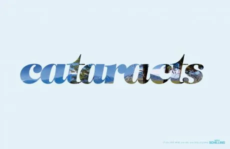
Filling charaters with an image (redux)

This ad (via Ads of the World) reminded me of an earlier post showing that you can also achieve this effect in PowerPoint (2007). It only works with huge, huge characters. The ones I used in my original post are actually not big enough.

·Cartoons

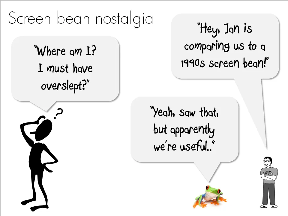
Screen bean nostalgia...

A number of good things have happened in presentation design over the past few years. Yesterday, I came across one of these screen beans that used to feature prominently in many corporate presentations in the 1990s. I am very glad people are not using them anymore. (But I must admit that deep in my heart there is a bit of screen bean nostalgia…).

There is a modern reincarnation of the screen bean character though. A small cartoon with a text balloon placed on the border of a slide. He/she often makes a side comment that adds to the overall message. Garr Reynolds uses them very successfully, Google explains the technology behind the Chrome browser using comic characters, just to name a few.

Farewell my friend Mr. Screen Bean…

·Data visualization

Visualizing 1 in 8,000

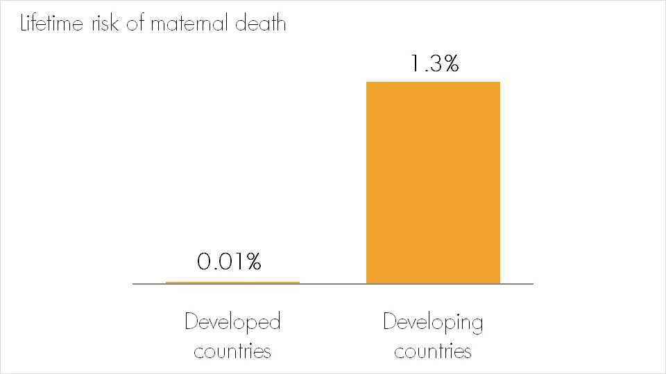
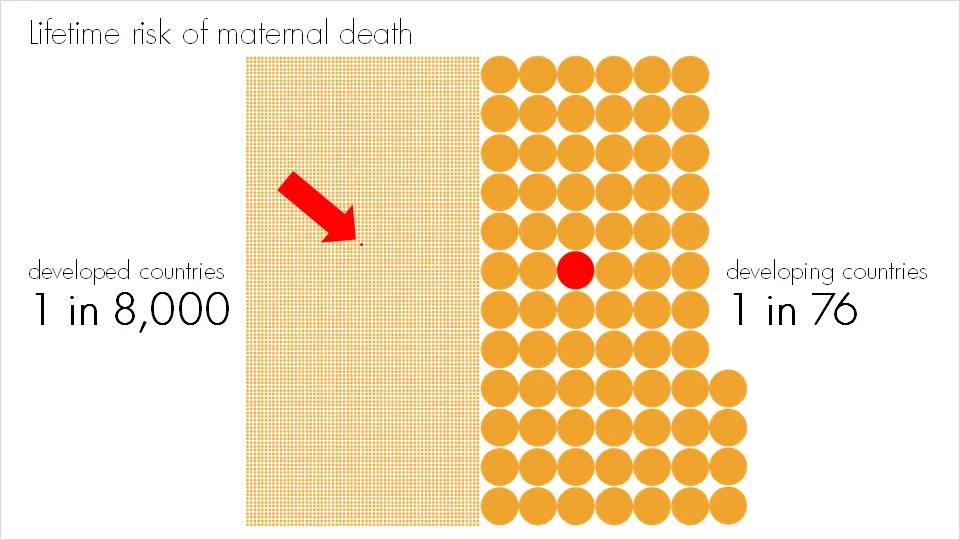
Bar and column charts are my favorite data visualization tools. I do not like pie charts, although they are in theory the best way to highlight relative proportions. Both of these graphs break down when you try to visualize very small proportions. In these cases I fall back on a technique that simply repeats the number of objects on a slide as done in the example below:

Note that especially for small proportions, it is very hard to internalize what things mean. “A 1.3% chance? That’s seems OK. What, 1 in 76? That’s a lot!.” Tap “1/x” on your calculator to translate a probability into a “1 in” number. For example: 2% translates into 1/0.02=50, 1 in 50.

More information on the issue of maternal death here.

·Design

Next up: designing presentations to be viewed on mobile devices?

The mobile phone screen is becoming a mainstream outlet for content. Services such as SlideShare have become so popular to share presentations (=ideas) to mass audiences that presentation designers have begun to adjust their style to suit this type of viewers. What happens if you add these two trends up?

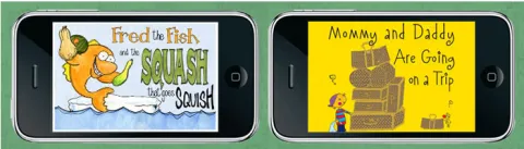
Swiss Miss pointed me towards a new iPhone app: iStoryTime, enabling kids to flick through narrated children’s stories. (The same target segment as Story Bird). Animoto allows you to create beautiful animated videos on your iPhone, it is just another example of a visual language that is suitable for the small screen.

Squinting to read a blog RSS on your phone, scrolling left/right and up/down to understand the big picture of a web site, maybe there is another future for presentations here: the ideal format to spread an idea on a mobile device through a series of clicks.

The constraints are simple: a small screen, and no presenter is present to explain things. I wish we had these constraints in PC PowerPoint:

  • “I better make sure these slides are clutter free and can easily be read from a distance”
  • “I better make sure that people really, really understand what I am trying to say here; I won’t be there to explain it”

That would do a lot of good to many presentations that are written as we speak.

·Design

Consistent shadow and gradient directions

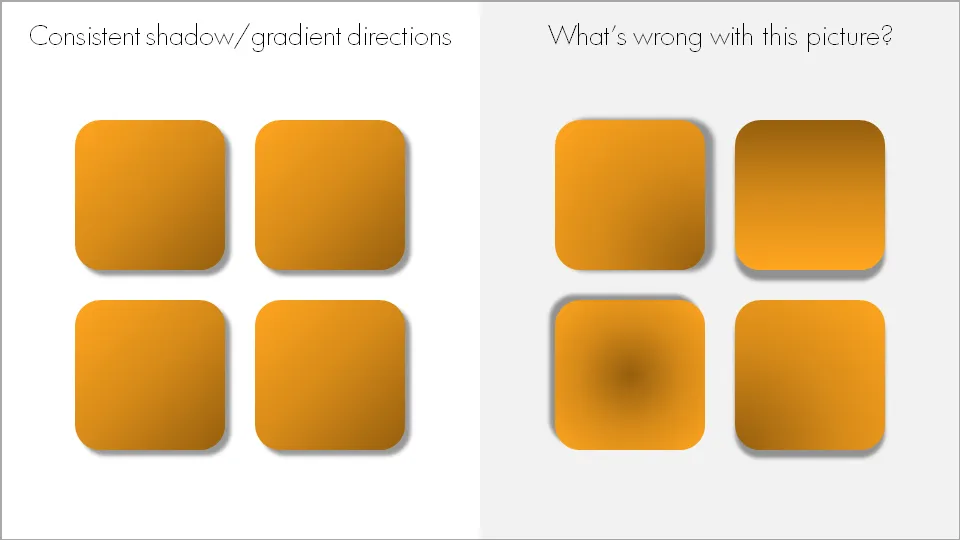
When using drop shadows and gradients, pick an imaginary source of light to guide in which direction you want to put your shadows and/or gradients. And then: use them consistently on the slide and possibly throughout your presentation.

Now that we are on the subject. I am not a big fan of these effects in general. In the example above, I emphasized them on purpose to illustrate the point of direction. Normally, I would use very subtle drop shadows only small chart elements that really need to stand out (example). Gradients, I use only to simulate a 3D effect.

·Design

Don't be a bleary-eyed presenter

Fred Wilson got it so right in a recent blog post: postponing the preparation of your presentation slides to the very last minute and showing up exhausted to the meeting does not pay off. Books such as Brain Rules provide scientific evidence that an exhausted brain is perfectly able to survive (i.e., run away from tigers that chase you), but not really good at coming up with great ideas anymore.

Get organized, finish the work in advance.

And if you are running out of time (these things happen), make the trade-off what would contribute most to a successful meeting:

  1. Fine tuning those bullet points or re-shuffling the deck one more time
  2. Showing up well-rested, energized and able to handle the most difficult questions confidently

Your call.

·Concepts

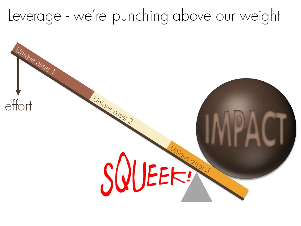
Chart concept - punching above our weight

OK, I admit, a previous chart concept on leverage might have been a bit hard to get for someone who forgot the physics of pulley systems that was discussed in highschool. This chart says the same thing, but simpler.

·Animations

Beautiful motion graphics: "Did you know 4.0" video by Xplane

This video by Xplane (link to their blog with details) is making the rounds on the Internet. (Watch it in the original format on YouTube as blogger cuts off the right side of the wide screen video)

It’s a beautiful example of kinetic type or motion graphics. Some comments.

  • It is made with software available to everyone, the source files are here.
  • There are some interesting visualization concepts, for example pie chart overlays abour 2:30 minutes into the video (thank you Steven Levy for pointing this out)
  • Quotes are great to get one number across. Still I believe that comparing two numbers is not very powerful in 2 consecutive quotes. Rather the good old bar chart does a better job.
  • The real artistic power in this presentation is the subtle use of informal cartoon drawing techniques, I style that I like.
·Design

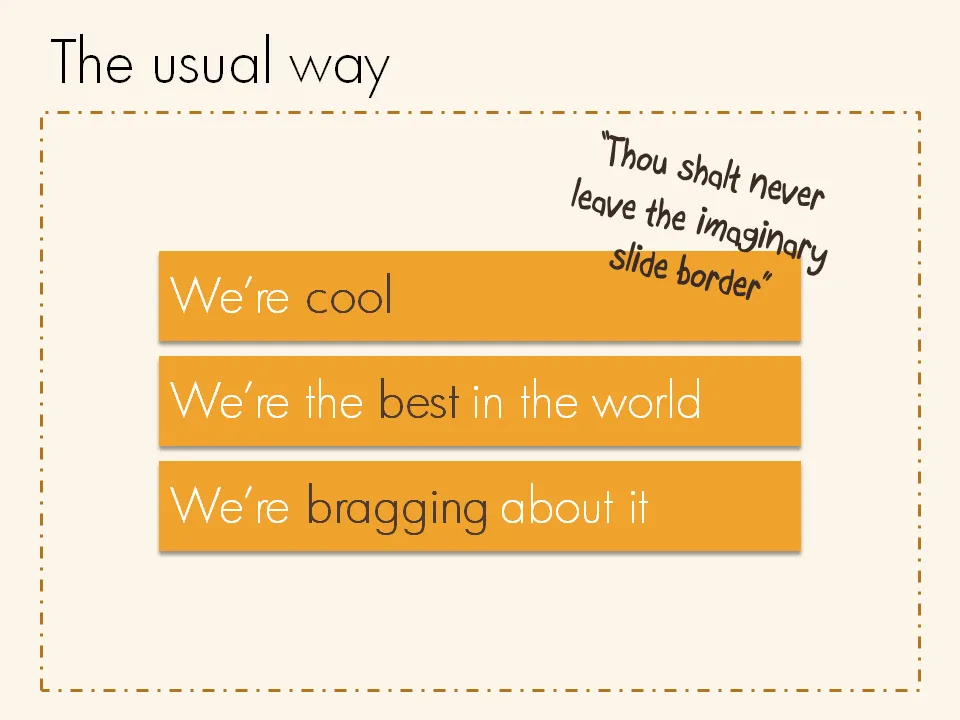
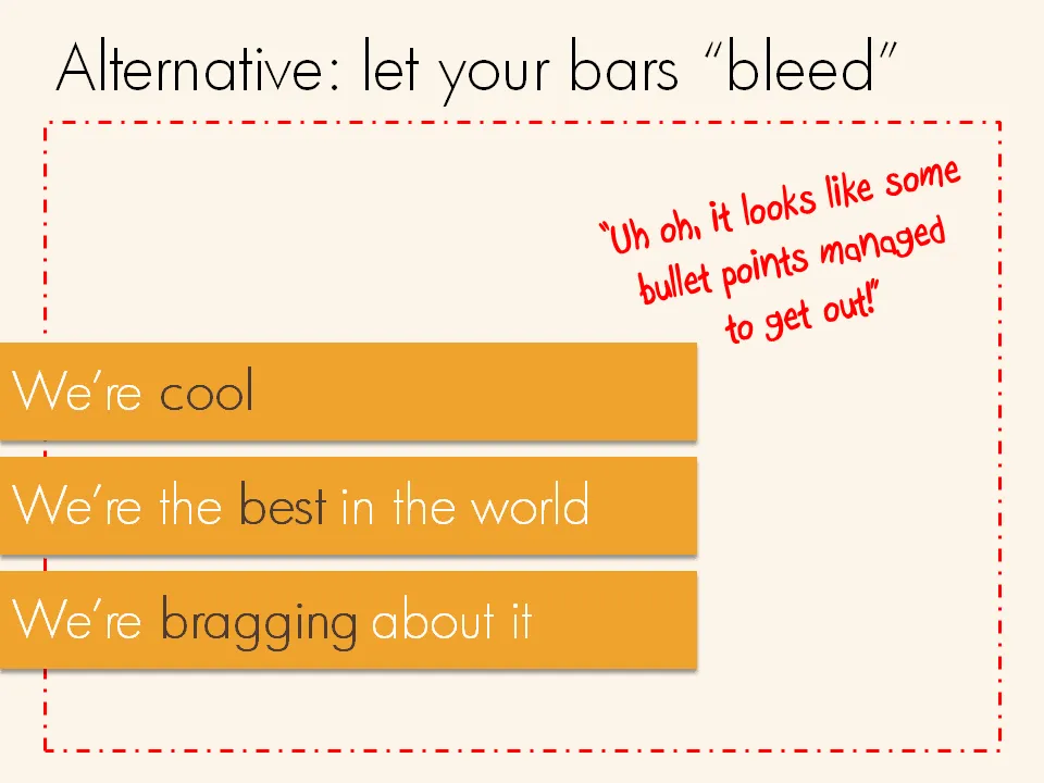
Breaking that imaginary slide border

Pictures are not the only objects that you can have “bleeding” off the slide. Regular text boxes work as well. Especially beautiful over an image.