

Bar and column charts are my favorite data visualization tools. I do not like pie charts, although they are in theory the best way to highlight relative proportions. Both of these graphs break down when you try to visualize very small proportions. In these cases I fall back on a technique that simply repeats the number of objects on a slide as done in the example below:
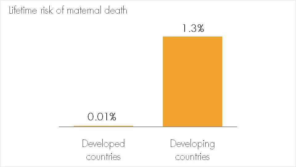
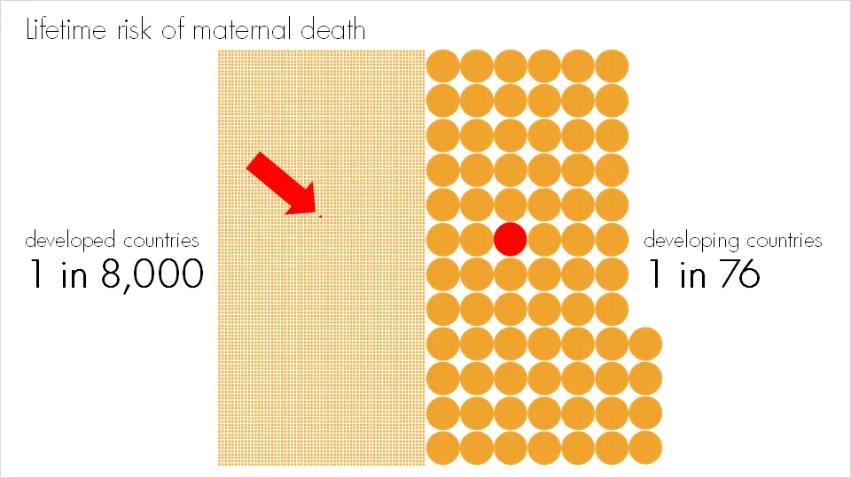
Note that especially for small proportions, it is very hard to internalize what things mean. “A 1.3% chance? That’s seems OK. What, 1 in 76? That’s a lot!.” Tap “1/x” on your calculator to translate a probability into a “1 in” number. For example: 2% translates into 1/0.02=50, 1 in 50.
More information on the issue of maternal death here.