SlideMagic Blog

Frequent updates about all things presentations since 2008. Subscribe to never miss a post.

RSS
all posts

Category Data visualization

·Data visualization

Slide make-over: polarising brands

I am across this chart recently:

This chart can be improved in a number of ways:

  • Actually, take down the brand images, or make the smaller. The different colours and sizes make the chart cluttered
  • It is hard to read what the percentages actually mean
  • The biggest problem is the confusing line up of the data bars
  • The data could be sorted, to create additional structure for the viewer

I replaced the chart with the one below in PowerPoint, using a line graph with big markers instead of the bars.
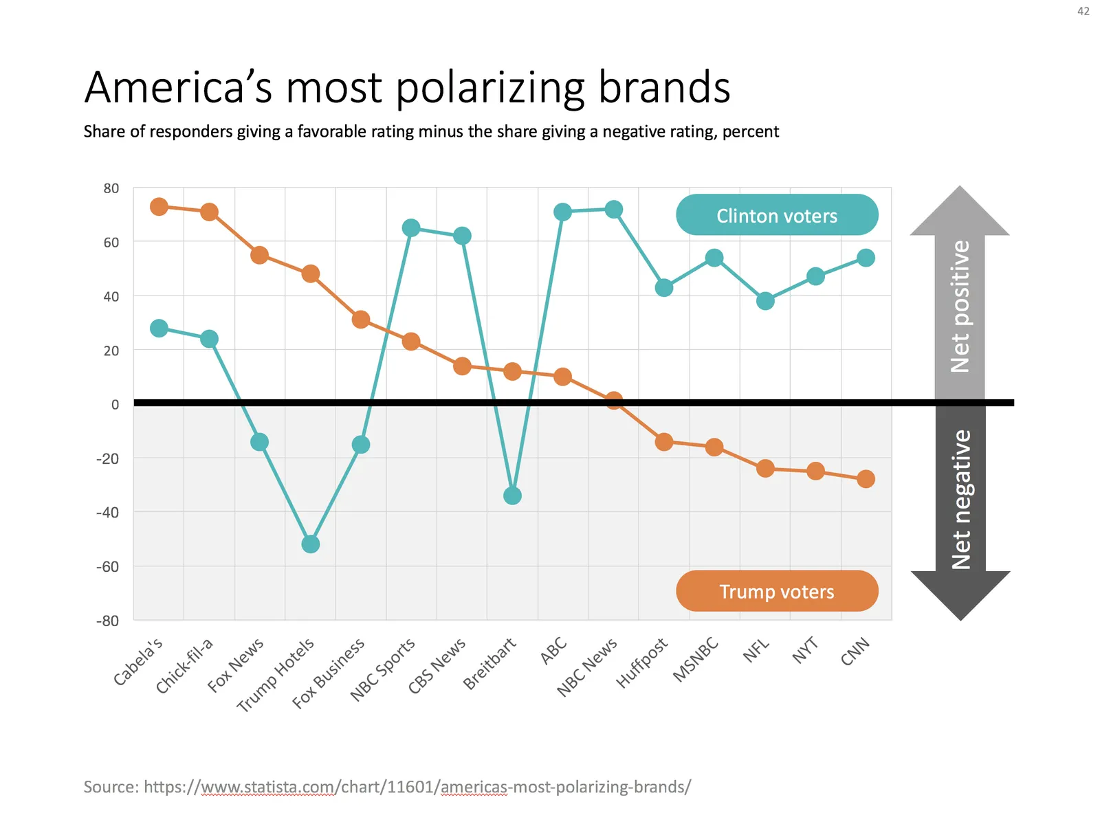
Ideally, I would have like to flip the chart 90 degrees, but this would require quite a lot of PowerPoint surgery (you can probably do it with a scatter chart somehow). The other option is to construct a highly complicated “waterfall” chart.
·Data visualization

Mixed cluster and stack charts

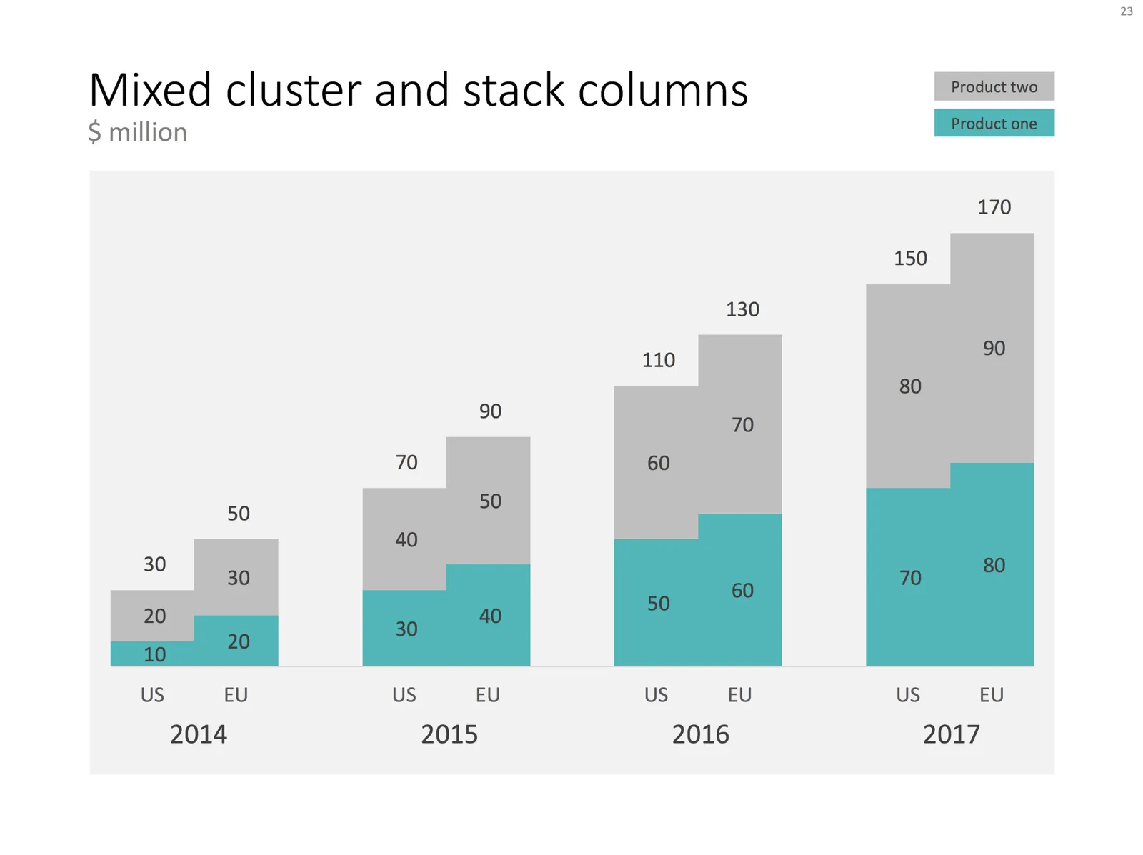
On a few occasions, I had to use a combination of a cluster and a stack chart. This chart is not available as a standard option in PowerPoint. Here is how to make it:

  • Create a regular stacked column chart
  • Set the gap width to 0
  • Blank out the data where you want the gap between the years to be
  • Manually add labels for each of the years

You can create one yourself using the above ingredients, or you can download the one I made in the SlideMagic template store:

·Data visualization

Consistency in financials

Financial projections of new business ideas are totally made up / not accurate, so being of by a few million here and there would not matter? We can make quick changes in our financials in the presentation slides, and then “forget” about updating our financials spreadsheet with the new information.

While the absolute numbers of your financial model might be totally pulled out of the hat, it is the thought process of how you got to them that is still valuable for investors. How does your business model work? What would I have to believe in order for your year-5-dream-scenario to come true?

And that model should be consistent across all your documents: presentations, spreadsheets, budgets, everything:

  • Discrepancies make you look sloppy (a little preview of things to come when you need to work together with an investor on a Board)
  • A consistent model of totally made up numbers makes sure that everything is, well, consistent. If you just slashed sales & marketing cost by 50% but maintain the same amount of sales people, something goes wrong.
  • Inconsistencies make it harder to understand your story for an outsider. If sales are $50m on one page and $49m on another people get confused. You established “$50m” as a mental shortcut for year-5-sales-in-the-most-optimistic-scenario, and all of a sudden you create a new shortcut.

So, even if nobody can predict the future accurately. there is still value to create a consistent financial model the same way as you would for a business in which you know every single detail (next year’s budget of an established company for example).

Continue reading →
·Data visualization

The unit measure

There are endless ways to show financial ratios and benchmarks. Each industry has their own specific ones.

Beer brewers think of the manufacturing cost of beer in terms of cost per hecto liter (not liter, not kilo), but when they think about distribution cost, they think per 6 pack case (not liter, not kilo, not bottle). The cost of sending a letter is usually in weight, the cost of sending a package is usually expressed in terms of volume. Retailers think in terms of sales per square meter. Technology startups think often in terms of per user per month.

Find out what the norm is in your industry and adjust your financials.

·Data visualization

Tedious number updates

I am not a believer in copy-pasting Excel numbers into PowerPoint. Excel is for analysis, PowerPoint for presenting, and presenting numbers is different from analyzing them. The charts I use to present are often so simple (only one data series, rounded digits) that I tap them in by hand.

There is an exception though. If you are the junior analyst on the team, and you are the last step in the “supply chain”, i.e., constantly updating charts with new versions of numbers that roll out of the spreadsheet, it might be time to change working practice. Personally, I remember many McKinsey projects I did as an analyst where I designed a model in week 1 of a project, and ended up updating numbers on slides for weeks after that.

In these cases, add a worksheet to your Excel file, and pull the numbers from the analysis. Apply all rounding, i.e., if the chart or table requires millions, divide by 1e6. For tables, put all numbers in the right order, invert rows, columns if required.

You can go further and actually create objects in Excel that can almost literally be copied into PowerPoint. Create data charts, fix fonts, colors, etc. exactly as in the PowerPoint file. Format Excel cells exactly as the table in your PowerPoint document.

The cost of this effort is time: it will take some effort to get it right, but it will pay off in subsequent number update rounds, and it can prevent you from making mistakes in last minute model changes.

Continue reading →
·Software

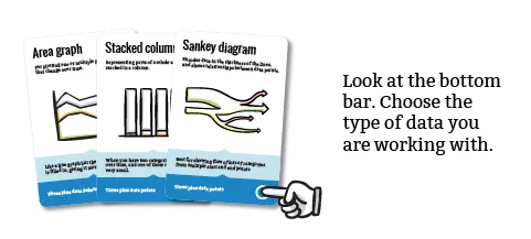
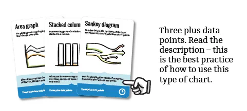
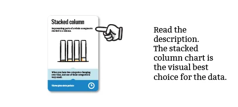
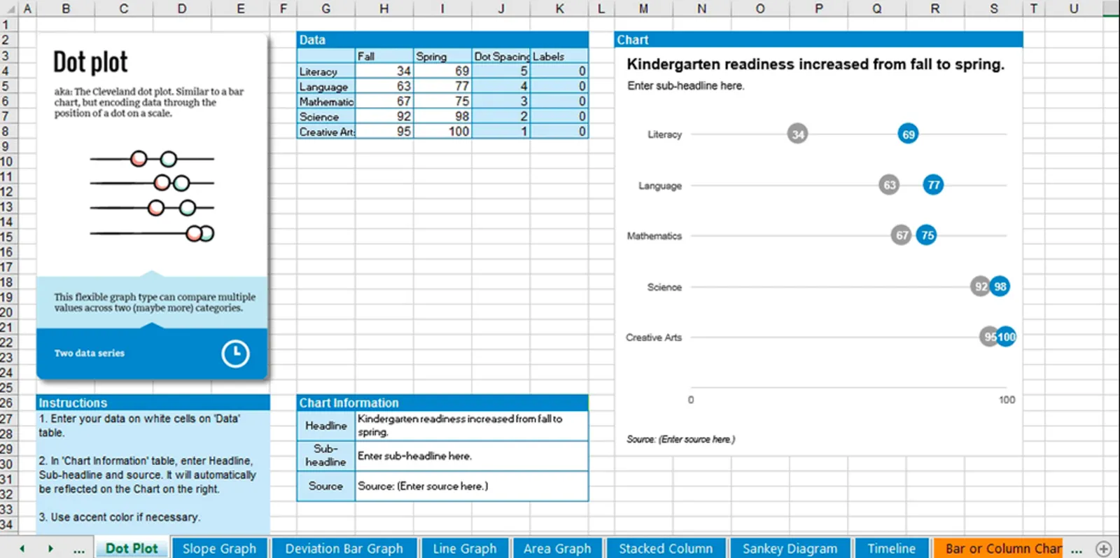
Chart chooser

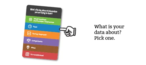
There are endless types of data charts out there: lines, bars, scatters, pies. Which one to pick depends on the type of data you have, and what message you want to convey. Here is a new handy tool that can make life easier for you: chart chooser.

A box of handy cards that guide you step-by-step through a selection process. Excel templates are an optional add-on that could be useful, some of these diagrams are tricky to recreate.

·Data visualization

Investment bank memos

Investment bankers usually prepare the data rooms for due diligence in M&A transactions. Shelves full of information that is usually summarized in an information memorandum. I never found these summaries very useful. It is impossible to create a financial picture in hour head from just reading text with data. “Last year’s sales were x, growth for the 3rd quarter was y, the company is doing business in 3 product segments.” The only way to understand this is to extract the information and put it in tables or graphs to see what is going on.

And that is most of the times exactly what the buying side will do, hire a consultant/analyst to go through the material and start creating these charts, then someone more senior will go through the charts and select which ones are important, and which ones not.

You can accelerate the sales process by anticipating all of this, and do some of the homework of the buy side. In the process, you can spoon feed them the right insights you want them to have.

Similar but unrelated, this is also why wordy descriptions of company results in newspaper articles do not work for me. The journalist took the data tables and graphs and translated them into words, the exact opposite direction of where I want her to go.

Image by Andreas Poike on Flickr

·Data visualization

Visualizing contrasts

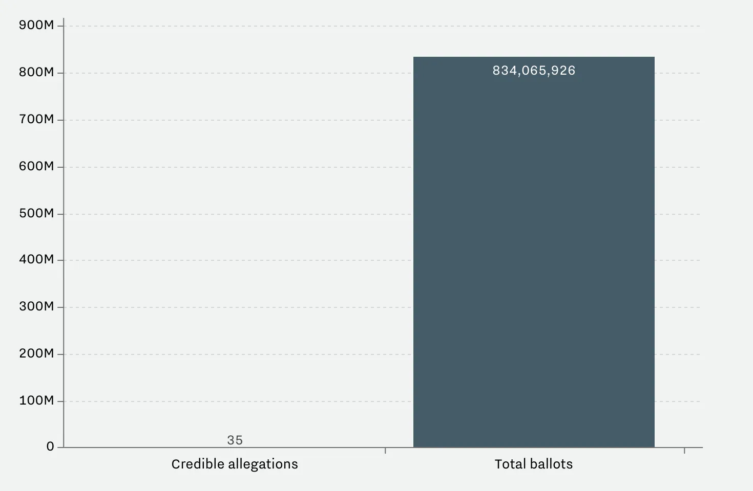
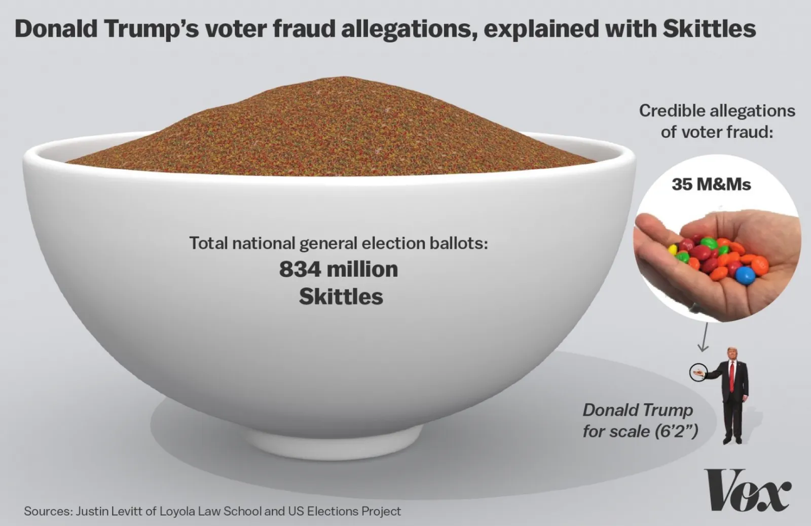
This article on Vox tries to find statistics on voting fraud in the US. I will stay out of politics on this blog, but the 2 graphs it uses show the power of a good visualization.

 A column chart shows the relative difference, but fails to communicate the large overall absolute value of the right column

A column chart shows the relative difference, but fails to communicate the large overall absolute value of the right column

 The image does a better job to depict the statistics. It requires some math and Photoshop skills though to produce

The image does a better job to depict the statistics. It requires some math and Photoshop skills though to produce

The column chart is the correct representation of the 2 values, but it fails to communicate the huge amount of ballots we are talking about in the right column. The image does a better job, but it will be hard to construct for a layman designer.

Image from WikiPedia

·Data visualization

One science is harder to explain than another

Most of my client work involves a presentation with a hard/difficult business or scientific issue to explain. All science is complex, and it requires someone to study for years to understand it. But in some scientific disciplines I can get away with things.

Take medicine for example. Here is what you can do to make things understandable to the layman:

  • Micro focus on one very specific condition/disease, and omit all other 35,000 medical issues a student usually has to go through
  • Simplify, eliminate complex / long / Latin names
  • Abandon commonly used diagrams, and instead make your own, completely non-standard drawings that are solely aimed at explaining a phenomenon.
  • Shrink all the statistical proof into a footnote. It is important for peer-reviewed research, it is not needed to understand the basic mechanism of a drug

This can work in other disciplines as well: economics for example. But it does not work everywhere. Mathematics for examples requires a broad understanding of concepts that are all stacked on top of each other, depend on each other. And there is no easy to simplify formulas.

Image from WikiPedia

·Investor presentation

Words and number consistency

It is impossible to make a correct 5 year business forecast in an investor pitch. But your financial projection is not really a forecast, a prediction of the future, it is a picture made out of numbers. “If our company will be successful, this is what it could look like”.

Mistake number one is to make the projection ultra precise with 5 digits after the comma. It is just a guess, so a year 5 revenue number of $99,234,318 is not more credible than ~$100m.

But oversimplifying is not right either. The fact that you are for sure going to be wrong does not mean that you simply take 1% of a big market number to get to the year 5 scenario.

The trick is to make the words/visuals in your presentation consistent with your financial model. You are going to sell to millions of individual customers, drive the model that way. You rely on 5 big telco operators, put it in. SAAS company with recurring revenues? Model it. One-off perpetual licenses, use it as the basis of your model.

Teaching investors how the business works is more important than getting the point estimate right.