

There are endless types of data charts out there: lines, bars, scatters, pies. Which one to pick depends on the type of data you have, and what message you want to convey. Here is a new handy tool that can make life easier for you: chart chooser.
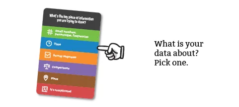

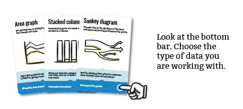
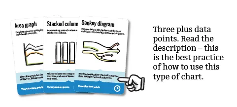
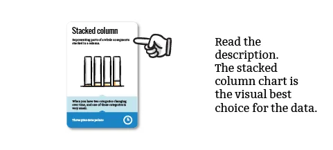
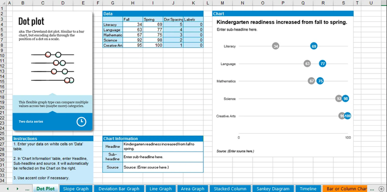
A box of handy cards that guide you step-by-step through a selection process. Excel templates are an optional add-on that could be useful, some of these diagrams are tricky to recreate.