SlideMagic Blog

Frequent updates about all things presentations since 2008. Subscribe to never miss a post.

RSS
all posts

Category Data visualization

·Data visualization

Years in columns, which way?

In financial statements, the most recent financial period is put first, and next to it is the previous period for comparison: 2017 - 2016. To the frustration of some accountants and CFOs, I insist on putting the years the other way around: 2016 - 2017.

  • The eye is used to moving left to right when looking at time series data
  • It makes tables match line or column graphs that are in the presentation
  • It makes it easer to compare data across 3 years or more

I am not trying to change the reporting practices for financial statements. In the annual accounts, the current year is the most important one. It needs to be accurate and is usually shown with far more digits (precision) than I would use in a presentation. A comparison to last year’s numbers is almost an extra, not the main purpose of the page.

Every financial document has its own purpose and own audience: spreadsheets, financial statements and presentation decks. And among presentation decks you can distinguish between quick and dirty documents to discuss (early results), detailed financial information for the investor community, and more generic financial slides for a general company presentation. Different purpose, different slides.

If you want you can check out financial slides in PowerPoint in my template store. Subscribers can download them free of charge.
·Data visualization

Trees!

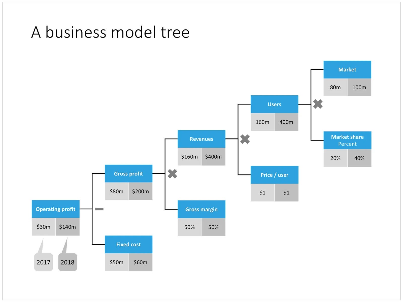
A tree visualises the composition (or decomposition) of a number into a number of factors. They are what I call ponder charts, not to be presented during a TED talk, but rather they are useful for  (complex) studying relationships between different factors.

Below are two examples of these analysis trees. The first is a summary profit and loss account for a company. I often use these a tree like this to visualise the business model of a startup by forcing a forecast year 5 P&L of a success scenario into this format. It is impossible to forecast the future accurately, and investors and founders will always disagree on the numbers, but the tree teaches you how to think about this company. What drives its economics? What would you have to believe for the year 5 scenario to be true? A tree always has to add up and multiply, this often leads to insights when it forces you to fill in boxes that you did not originally take into account (i.e., you forecast your sales, you assume market size, and right in the middle sits your implied market share).

A second example is this return on invested capital tree. It explains how (and more importantly, why) company performance is changing over the years. In this version I added miniature line diagrams to make the annual trends clearer. PowerPoint cuts the vertical axes of these graphs automatically, amplifying the trends in the line graph. Normally, I would object to this form of lying with statistics, but in this case with the very small diagrams, it is actually useful.

Continue reading →
·Concepts

Sensitivity analysis in PowerPoint

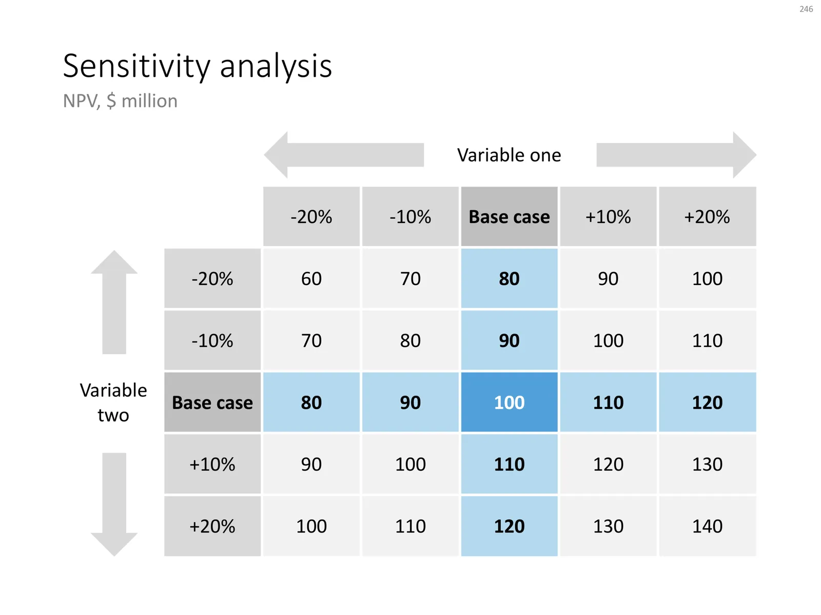
Today, I am adding a simple table to the store to show the sensitivity of an analysis. Each cell in the table shows an outcome of an analysis with a slight variation on 2 critical input variables. I used this type of a slide a lot in discounted cash flow valuation models, where assumptions about discount rates and assumed perpetual growth could make a significant impact on the outcome of your analysis.

The base case scenario is put very prominently in the centre of the table, it is the anchor for the viewer from which to start studying the other scenarios. I prefer making these type of charts manually, and not via a blanket copy-paste out of an Excel sheet. In that way, you have to think about whether each cell in the table is meaningful, and you can make sure that the data is formatted and rounded in the best way.

You can download this sensitivity analysis from the store, subscribers can do so free of charge.

Cover image by Markus Spiske on Unsplash

·Data visualization

Balance sheet in PowerPoint

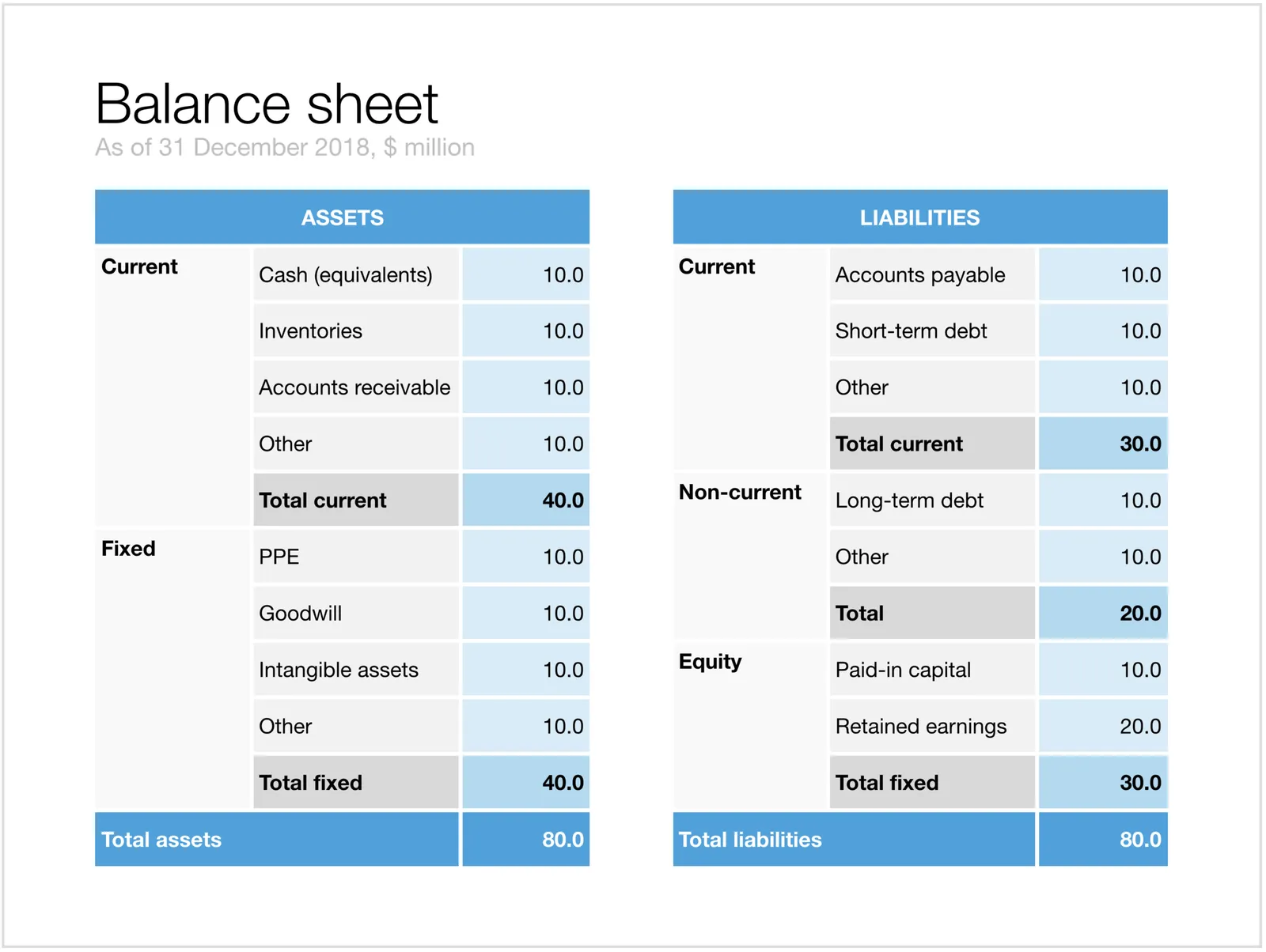
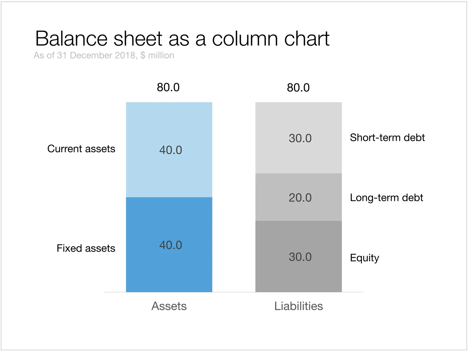
Today, I added 2 slides that show a balance sheet to the template store.

The first is a traditional table format. But this PowerPoint version is a bit different from the a typical balance sheet in an annual report to improve the readability. Usually, the PowerPoint presentation with the financials is not the legally binding one, so we can omit some details that clutter up the page. This table has fewer lines (consolidating multiple entries into one), and the amounts are rounded up.

The second chart is a balance sheet represented as a column chart. Even more details has been taken out and the result is a nice and unusual way to visualise the key balance sheet ratios. Instantly you can see the proportion between current and non-current assets (and liabilities), and you can see the leverage of the company (ratio between debt and equity). This chart is probably easier to follow than the Profit and Loss statement as a column chart which I discussed earlier.

Click on the image to download the slides from the template store. Subscribers can do so at no extra cost.

Cover image by NeONBRAND on Unsplash

·Data visualization

A Pareto chart

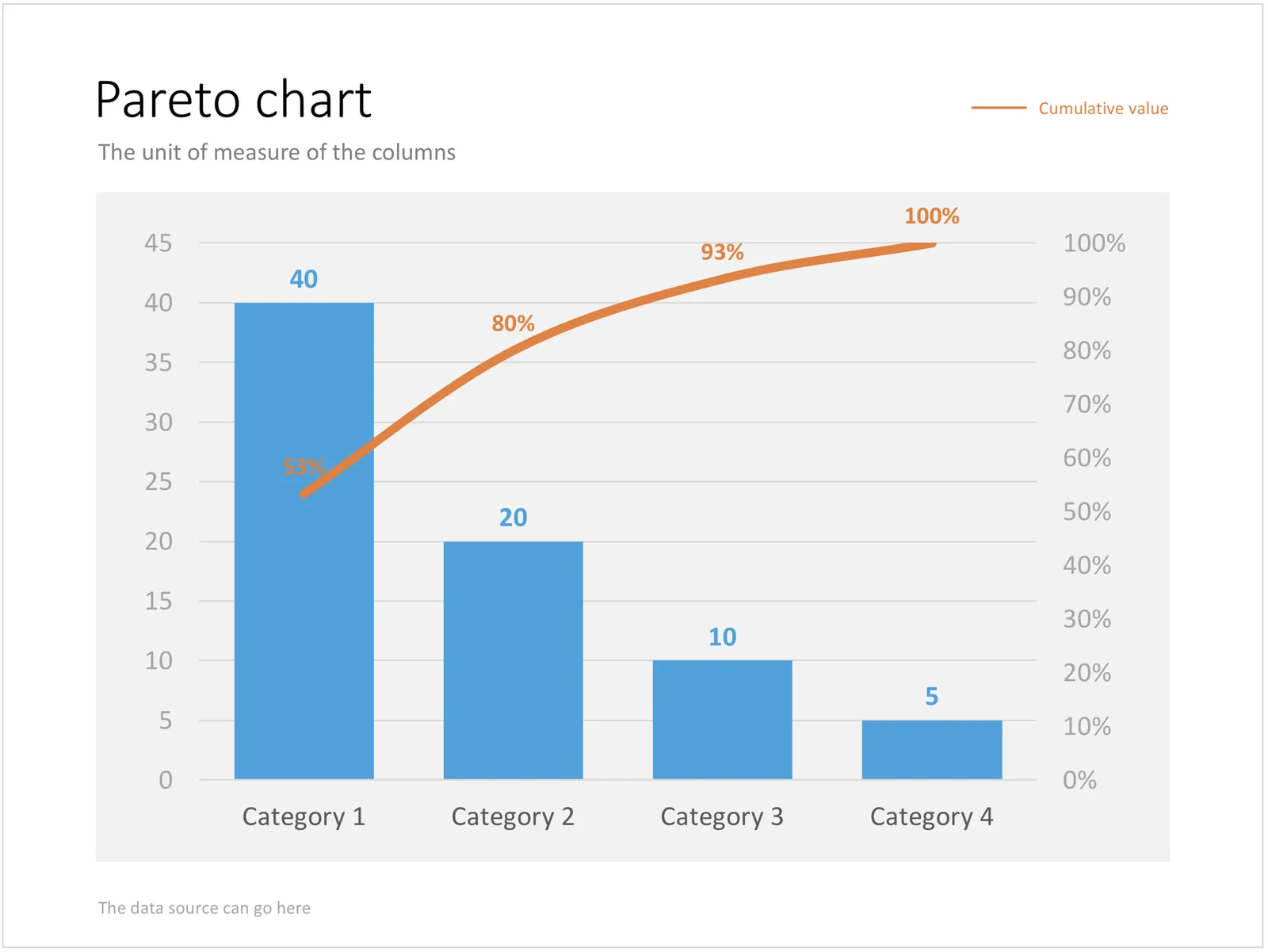
Recently, someone searched for a Pareto chart on my site. I must admit, I had to consult WikiPedia about this type of slide. A Pareto chart shows 2 data series, each with their own vertical axis; the first show the absolute frequency count of something, the second one the cumulative occurrence of the data series, adding up to hundred for the last entry. I have added the Pareto chart to the store.

·PowerPoint

How to format tables in PowerPoint

Tables can carry more data than a data chart and as a result can be less effective in a presentation. For some situations though, there is no point trying to avoid using a table in PowerPoint. For example, when investors want to see the quarterly numbers, they expect to see a table.

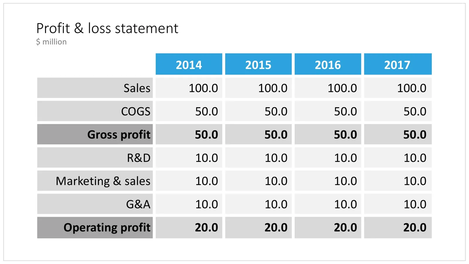
The way you format tables can make a huge difference in how your chart looks. When done well, a table can actually be an effective presentation slide. Have a look at the simple P&L table below.

 A PowerPoint table to present a P&L

A PowerPoint table to present a P&L

This might look like a super simple slide design (it is), but a lot of thought and little tweaks have gone into its design. Let’s take them one by one:

  • Colours have been adjusted to your own colour template, not the standard PowerPoint colours
  • Fonts have been matched to your current template (table can be stubborn sometimes and stick to Arial)
  • Instead of dark lines around boxes, I used lines that match the background colour, making cells a light colour of grey to stand out (or dark, black if you use that background)
  • Totals are bold, and a bit darker
  • The row labels are right aligned
  • The row labels are a bit darker than the cells
  • The data cells are right aligned
  • Numbers are rounded to the same amount of digits, so the dots line up
  • There are not too many digits in the table, enough to convey the data, but not too much to make it cluttered. If the numbers get too big, switch to thousands or millions.
  • There is a bit of inset in each cell, the text does not touch the edges
  • All the rows have the same height
  • All the data columns have the same width
  • The column headings are centered
  • The unit of measure is put at the top of the chart, not repeated inside the data values
  • The table covers the entire frame of the presentation template
  • Double check by hand/calculator: the numbers add up…
Continue reading →
·Investor presentation

Quarterly performance summary: lots of different KPIs on a page

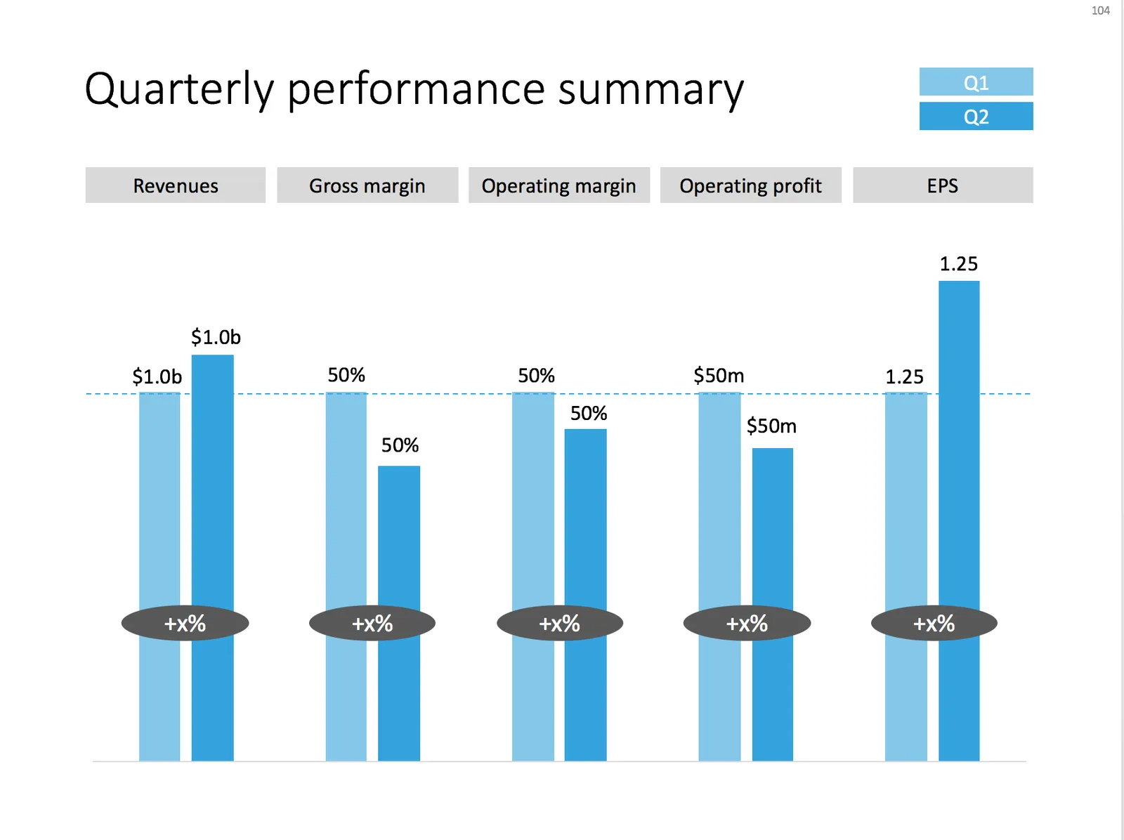
I often use the slide below in quarterly investor presentations for large corporates. How to give a quick overview of the key financials in one chart?

 A chart with an overview of the main financial indicators of the last quarter

A chart with an overview of the main financial indicators of the last quarter

This chart is an example of why often a “manual” chart is much more powerful than a simple copy and paste from Excel:

  • The chart contains values that can differ vastly in range: sales can be 100s of billions of dollars, EPS can be less than a dollar. Margins are percentages, not dollars.
  • Despite this, I forced the Q1 column of each of these values to be the same. In the underlying spreadsheet, they will all say “100”. The other values are calculated as a relative value compared to this 100. To accentuate this in the chart, I connected the left columns with a dotted line.
  • As a result, all labels in the chart need to be filled out by hand, the same for the growth bubbles which I placed over the columns (again a bit unusual)

You can download this KPI chart from the template store.

Photo by Sabri Tuzcu on Unsplash

·Data visualization

Presenting survey results

Here is a chart I usually use to present the result of a survey:

  • Horizontal bar chart, stripped of all axis labels, data labels, etc.
  • Consistent color coding to support the message you want to come out
  • Text place holders for the survey’s conclusion, and the factual info: what question was asked, when it was asked etc.

Feel free to copy the design or download the chart from the SlideMagic template store.

Photo by Alex Kotliarskyi on Unsplash

·Data visualization

How to create a waterfall chart

I am learning a lot from the search bar in my template store, especially those searches that (still) deliver zero results. “Waterfall” is one of those.

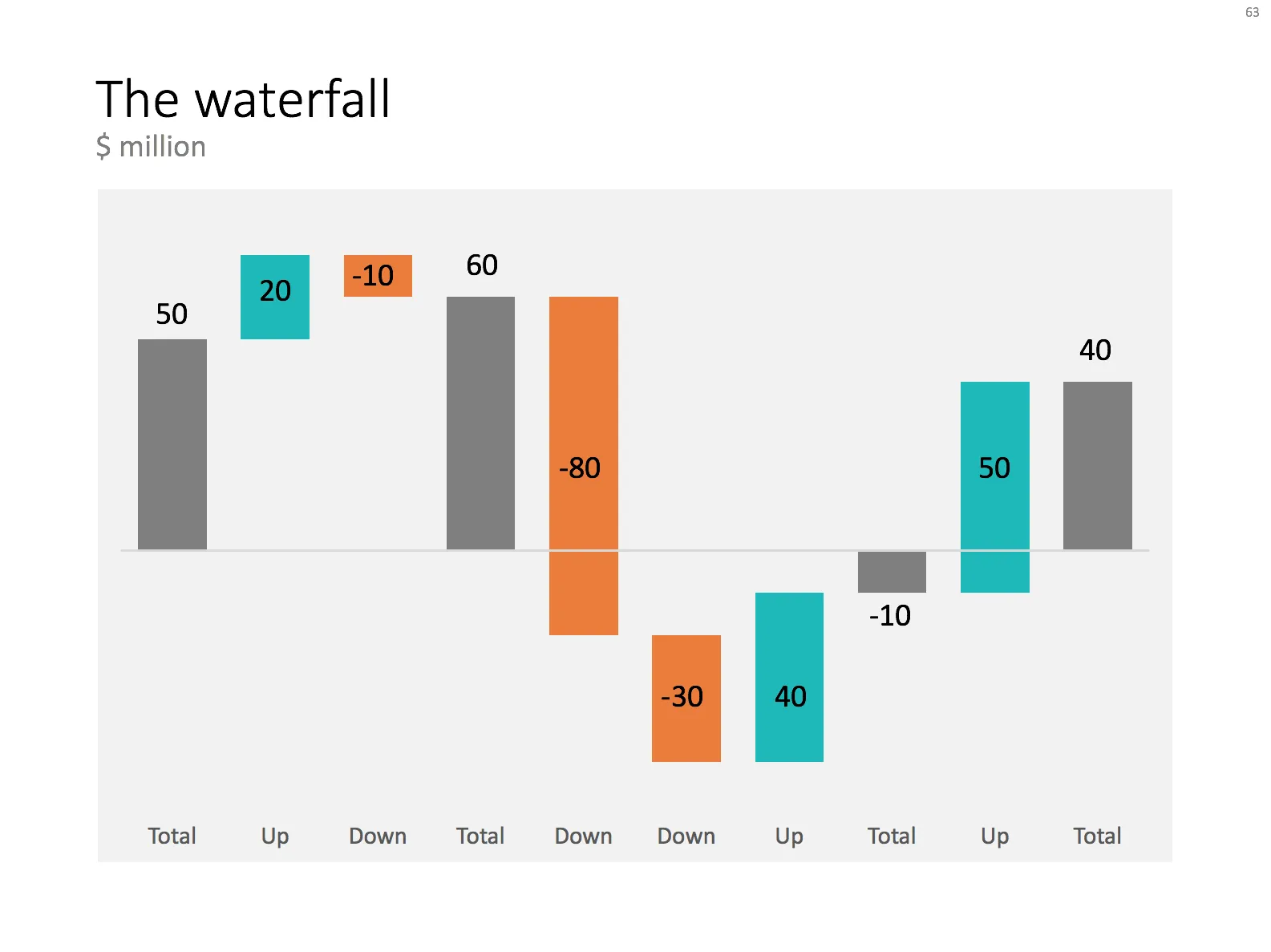
Waterfall charts are the secret weapon of McKinsey and other strategy consultants. They are great to explain the source of change between two values (last year, this year for example). In Excel they are tricky to make, especially if values zoom up and down the zero axis.

In an earlier blog post (all the way back in 2008, nine years ago…), I explained the basics of creating waterfall charts in Excel. The secret is to make blank series in a stacked column chart that create the requires offset for the delta values.

For my store, I am working on an automated tool that creates waterfalls. It is still work in progress though, I want to to be very robust.

In the mean time, I have added a manual version of the waterfall to my template store. I created the general layout, fixed the colours. Still you will have to do some calculations and adjustments to make it fit your specific set of numbers. Also, you will need to add data labels manually. But with a bit of fiddling, you should get a good result.

Work in progress.

·Data visualization

P&L as a column chart

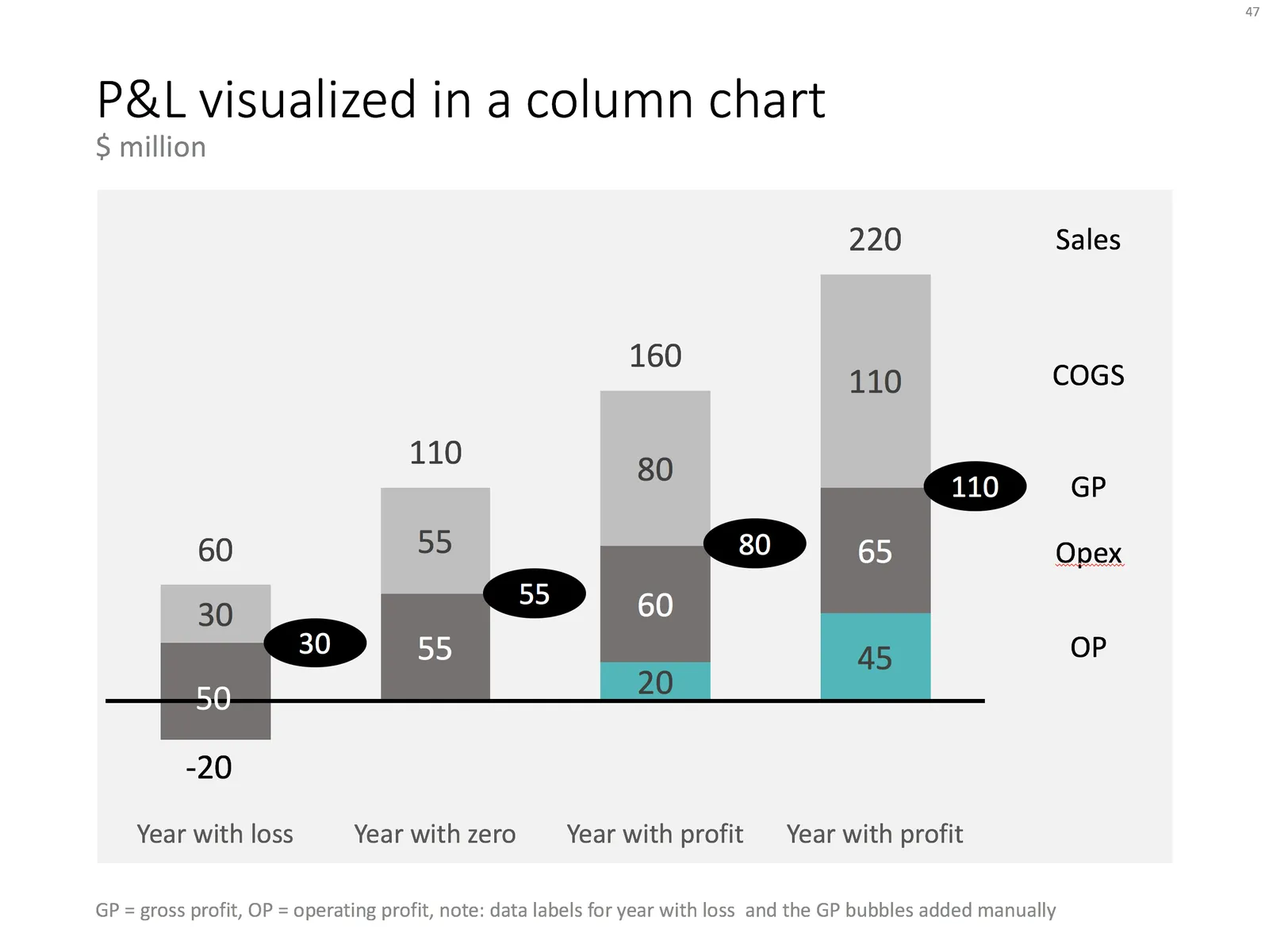
When you want to show a P&L with very few lines, consider using a column chart instead of the more traditional data table. In the chart below you can see how to go about it. Use a bold color for the profit series, a light color for the COGS, and manually add the gross profit as bubbles.

Things get a bit trickier for years where there is a loss. You create a separate data series in the same color as the last cost category (opex in this example), and calculate how much of the opex goes under the line and how much above. Tweak data labels manually. For these types of charts it is best to sketch them completely on a piece of paper, and then fiddle with PowerPoint/Excel to get it right.

The column chart works well, it shows a number of trends in 1 slide: sales growth, profit growth, and how fixed/variable certain cost types are.

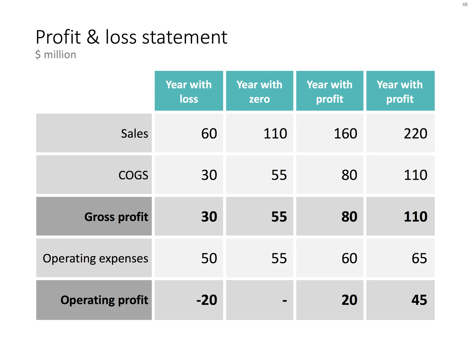
Below is the data I used to create this chart.

You can recreate your own chart with the description above, or download the example from the SlideMagic template bank.