SlideMagic Blog

Frequent updates about all things presentations since 2008. Subscribe to never miss a post.

RSS
all posts

Category Data visualization

·Data visualization

Grasping data charts

Here is what a first time viewer needs to go through when looking at a data chart:

  • What’s the unit on the y-axis
  • What’s on the x-axis
  • What do the legend colours stand for
  • What is “good” or “bad”, are things supposed to go up or down?
  • What is actually happening
  • Is the y-axis broken or does it start on zero?
  • Why is this unexpected, interesting, counter-intuitive, amazing, terrifying?

If you did the analysis then you live and breathe the data in the chart, the only thing you watch out for is how the line/column/bar looks different from the previous version of the chart you saw. For a completely new audience it is a different story.

There are 2 types of data charts:

  1. Charts to ponder and refine research and analysis
  2. Charts to communicate the result of the pondering and refining

If you make a presentation of result, you deal with scenario 2. Make a diagram completely from scratch. Start with “what is actually happening” and only put that piece of data on the chart.

For example if a complex stacked line diagram shows that the % of returning visitors gets smaller over the past 5 years, you can replace all that monthly visitor data with 3 data points: % of return visitors in the last 3 years.

Image by Phil Roeder on Flickr
·Data visualization

Storyfying financials

Most presentations have some sort of written summary on the first page. You often almost skip it when presenting live, but it can be important for an important that reads your slide deck at the computer rather than attending a live presentation.

The one thing that I find really hard to summarise are financials. Prose that goes like “sales were x, up y% compared to last quarter but z% versus the same quarter last year at a slightly higher operating margin of v%” makes me totally lose the picture.

Financial journalists fill pages of the Wall Street Journal with this type of texts. And they are upset that it is now possible for an automated bot to do this job: insert a financial table and out comes a perfectly written paragraph. (Robo journalism)

What do I do as a reader? I reconstruct the table back in my head.

So what to do in a presentation? I recommend a super simple written summary on page 1 (sales were up, but profits down), and then a very crisp financial summary table on the next page. Round up numbers, and use colour coding to show what went up or down.

Image from WikiPedia

·Data visualization

US maps with statistics

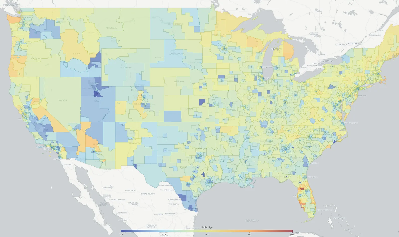
The recently joined web site Data USA (datausa.io) is a great source of maps that can serve as backgrounds for presentation slides.

·Data visualization

Overdoing the animations

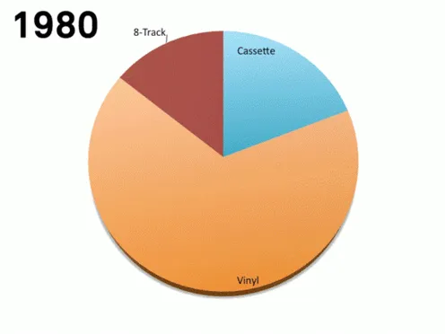
This animation (GIF alert) shows the distribution of music sales over time. Wait a few seconds and you see the pie chart changing for multiple years. This data can be represented much better by a series of stacked column charts. The animation takes too long, and the audience does not have the overview of all the years.

 I copied this image from a Tweet that did not include the reference to the source.

I copied this image from a Tweet that did not include the reference to the source.

There are other problems as well with this chart, gradients, standard Microsoft Office colours, drop shadows, small data labels, and ambiguous labelling (“Internet”, “mobile”, “video”, etc.).

·SlideMagic

Combining tables and data charts

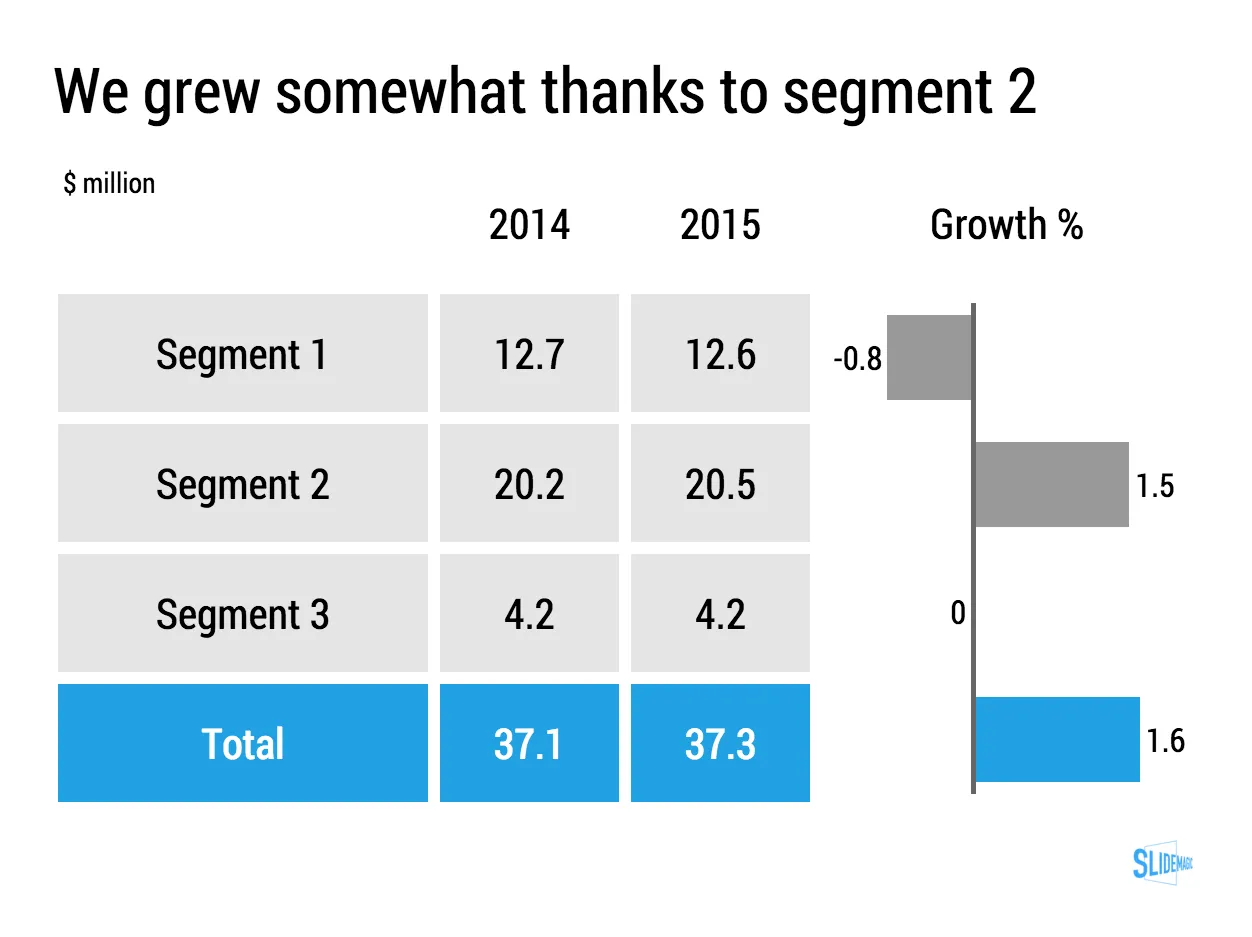
Lining up a data chart and a table in PowerPoint or Keynote is very tricky. And that is a shame, because it is one of the most useful compositions to present data. Just tables, and you cannot really see the trends. Just data charts, and it all becomes cluttered.

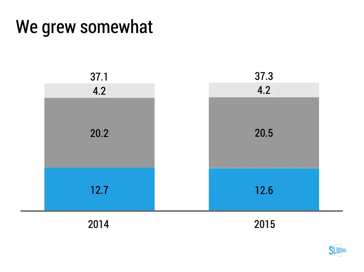
I took the data from an earlier blog post and quickly turned it into a combined table/data chart. You can clone the slides I create in presentation app SlideMagic into your own SlideMagic account by clicking this link.

·Data visualization

Table or bar chart?

Back in the good old days at McKinsey, we tend to put any range of data in a column or bar chart, even if that meant a chart with just one column, or one chart.

A nice clean bar/column chart works beautifully to visualise a data range. Especially if there are big differences between the values of the chart. If the differences between the numbers is not that big (I do not like broken axes), or you have lots and lots of data to present (the data labels just become too small), I resort back to a simple table.

Stick all the data in, round things up nicely, and use accent/shading background colour to make your messages pop.

I must admit, I start using tables more and more. (And that is why they are so easy to make in SlideMagic)

Art: Louis-Philippe opening the Galerie des Batailles, 10 June 1837 (painted by François-Joseph Heim)

·Data visualization

Confusing ranges

A large of the data presented in business presentations is uncertain: future forecasts, market (share) estimates, competitive comparisons. Many people express that uncertainty by presenting numbers as ranges: cost per bottle as between $1.50 and $2.00.

While working with ranges might be required in a spreadsheet calculation, I don’t like to use them in presentations:

  • It clutters the slides with double the amount of data labels, and/or double the amount of text in tables
  • It becomes hard to work with totals, add things up. Five of these 1.5 to 2 becomes 7.5 to 10. Adding negative numbers into the equation will give totals that nobody can work out from the top of their head.

So what to do? I would stick the mid point of the ranges as a point estimate in the presentation, and makes sure it is a nice, rounded number (7.49544 looks to certain). Much simpler and much clearer.

Art: a painting depicting women inspecting silk, early 12th century, ink and colour on silk, by Emperor Huizong of Song.

·Sales presentation

Sales presentations can be technical presentations, and vice versa

Often, clients tell me that they have to present to an audience of engineers, so the presentation should not be a “marketing” presentation.

The bad interpretation of this is: we are engineers presenting to engineers, so we can get away with text-heavy slides and diagrams full of numbers. We engineers understand each other. As soon as we add pictures or try to make the presentation more visual in other ways, we lose credibility.

What is really going on is this: if you are selling a high tech product there is no way you can avoid well, talking about the technology. But the high tech world is full of presentations written by people who do not really understand the technology, for an audience who does not really understand the technology. These presentations lack substance but are rich in marketing buzzwords. Engineers will recognise them in a second, and don’t want you bring “one of those”.

We need to eliminate two misconceptions:

  • Technical presentation content cannot sell
  • A senior (and/or) sales presentation audience does not understand technology

Here are some of the things I do to create technical sales presentations:

  • Insist on explaining how it works in human language without “black boxes” or “secret sauces”. The Einstein quote about a 6 year old who can understand everything if told in the right way applies here.
  • Very focussed data visualisation. Technology advantages are often beautifully simple: things are faster, cheaper, smaller. Rather than writing a bullet point “we are 33% smaller”, put in that very complicated data chart that shows the full richness of your research, but add 2 big bold lines that are 33% apart.
·Data visualization

Keeping things up to date

Some presentations contain a ton of data that needs to be updated all the time. Quarterly results, LP updates of VC/PE funds, the latest sales data. Updating the numbers is time consuming and errors can easily sneak in (especially problematic with presentations to investors).

I do not recommend cutting and pasting Excel data into PowerPoint. You need serious PowerPoint skills to format the data correctly, and most spreadsheets are not build to present data, they are build to analyse it. Hence my approach of cutting the link between the spreadsheet and the presentation software, and creating a data chart from scratch, 100% focused on the audience, not the analyst.

How to deal with the updating?

I would suggest to create a special spreadsheet alongside your presentation. A new worksheet pulls the required numbers from the big “data dump” worksheet, rounds them up correctly. Place the numbers exactly as they should show up in your presentation slide. Now it is easy to update your presentation data. Add check sums to see whether percentages add up to 100%, and breakdowns go back to the total sales figure.

When the new quarter arrives, you over-write the data dump worksheet, and fix any broken/misplaced links.

Art: painting by Ivan Aivazovsky

·Data visualization

How to make a sankey diagram in PowerPoint

Sankey diagrams can be useful to show flows.

They are tricky to make in PowerPoint. The width of the arrow needs to correspond with the value of the stream. The curves of 90 degree arrows in PowerPoint are hard to control. If there is no escaping (maybe you can create a waterfall diagram instead), I create Sankey diagrams using boxes and triangles, see the example below.

UPDATE: I have added a PowerPoint template for a Sankey diagram in the SlideMagic template store:

Art: Minard’s classic diagram of Napoleon’s invasion of Russia, using the feature now named after Sankey.