

I am across this chart recently:
This chart can be improved in a number of ways:
- Actually, take down the brand images, or make the smaller. The different colours and sizes make the chart cluttered
- It is hard to read what the percentages actually mean
- The biggest problem is the confusing line up of the data bars
- The data could be sorted, to create additional structure for the viewer
I replaced the chart with the one below in PowerPoint, using a line graph with big markers instead of the bars.
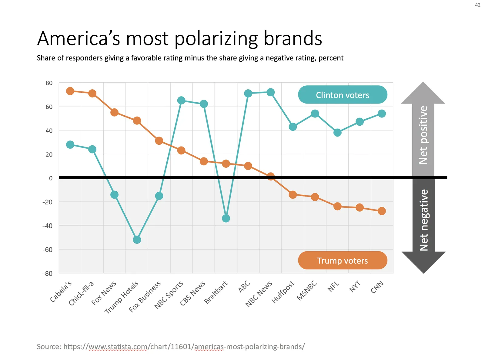
Ideally, I would have like to flip the chart 90 degrees, but this would require quite a lot of PowerPoint surgery (you can probably do it with a scatter chart somehow). The other option is to construct a highly complicated “waterfall” chart.