

This article on Vox tries to find statistics on voting fraud in the US. I will stay out of politics on this blog, but the 2 graphs it uses show the power of a good visualization.
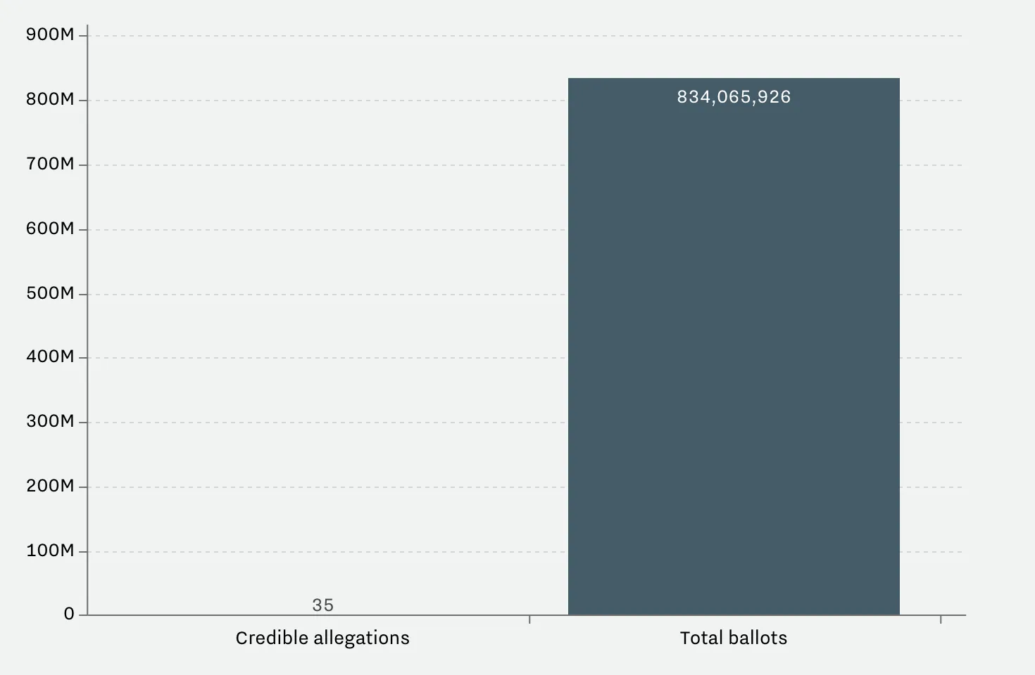
A column chart shows the relative difference, but fails to communicate the large overall absolute value of the right column
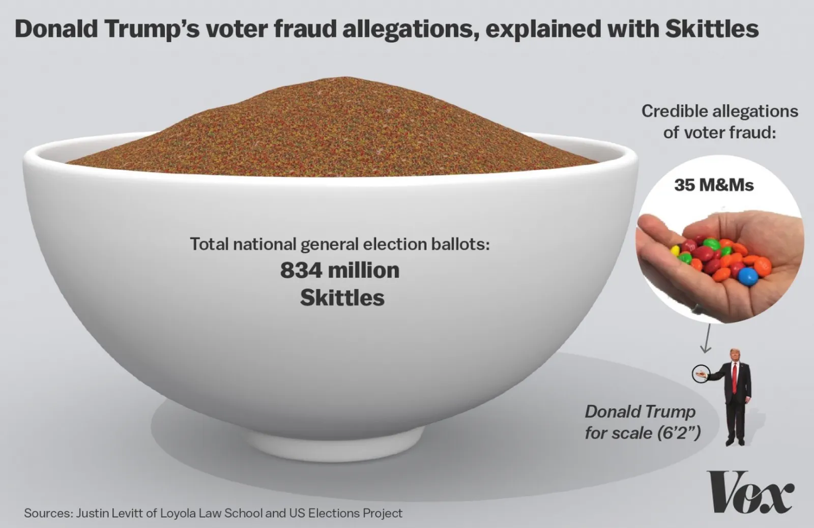
The image does a better job to depict the statistics. It requires some math and Photoshop skills though to produce
The column chart is the correct representation of the 2 values, but it fails to communicate the huge amount of ballots we are talking about in the right column. The image does a better job, but it will be hard to construct for a layman designer.
Image from WikiPedia
