SlideMagic Blog

Frequent updates about all things presentations since 2008. Subscribe to never miss a post.

RSS
all posts

Category Data visualization

·Data visualization

How to design management dashboards

The number of app installs of SlideMagic 2.0 is still small, but the graph has a similar shape as the exponential graphs we all have gotten used to over the past weeks.

Modern analytics tools allow you to track literally everything under the sun in your app and/or web site. Instant information overload supported by colourful graphs that look good, but don’t say much. This overload of data is similar to the ones I would encounter as a consultant at McKinsey. And now, 15+ years later, I find myself following a similar approach to making sense of it for my own app.

Most case examples about analytics are built for established apps and web sites with huge customer flows you can micro analyse whether the check out button should br green or red. SlideMagic is not there yet.

  • I find myself going through a certain cycle. It starts with a basic question, “how many people did actually install the app”, which results in a daily manual routine to find the latest number, which then gets translated into a proper query in an analytics app. I check whether my analytics tool is consistent with the numbers I can dig out of my own server. Slowly, slowly, I get a sense of how the app behaves with a consistent set of data that I can recognise.
  • Slowly, slowly, I start adding more questions to the picture, and make sure that I keep a picture of how they relate.
  • Each factor has a specific visualisation: some are lines, some are bars, some uniques, some totals, some cumulative, you need to play around with it.
Continue reading →
·Data visualization

Bar versus column charts

Sparked by this tweet:

My guideline:

  • Columns to show trends over time. The shape mimics that of a line chart, you don’t need much space for the column labels (usually years, or months)
  • Columns for breakdowns. More horizontal space for complicated labels, and a stacked column is a more natural format than stacked bars.
  • Bars to rank things. The shape mimics a “top 10” top to bottom list, and you can make more space for labels that usually describe things

In this case: bars are better than columns.

Photo by Sophie on Unsplash

·Books

Visualising quantum mechanics

That is an ambitious title to start my first blog post after my return from a summer holiday in Asia!

Through a series of coincidences I ended up reading through a number of popular science books about quantum mechanics. I remember getting all carried away in the briefing session of a presentation design project for a startup in the field of quantum computing. My academic knowledge of this field was basically high school chemistry, so I added this topic to the list of things that needed a refresh. A holiday was the perfect occasion. I am sure I was the only one at the side of the pool dusting of theoretical physics knowledge.

From a presentation perspective, the fascinating problem that quantum mechanics struggles with a the lack of either a visual or verbal language to describe concepts. The mathematics is water tight and has proven to be really useful (lasers, semiconductors, LEDs, etc. etc.). But when you try to take a step back and want to understand what it actually all means in the context of your daily routines, things get confusing.

It is all the result of some form of Anamorphosis, projections of phenomena that get scrambled when angles or dimensions no longer line up. Every scientist is looking for that ultimate simple underlying concept that can explain/visualise/link quantum on a small scale to the more traditional physics that we see everywhere around us at a human scale.

In case you are interested, here are 2 books on the subject: Beyond Weird, and What is Real?.

Continue reading →
·Data visualization

Farewell to static charts? Um, no.

A quote from a Venture Beat post that paints a bright future for BI (Business Intelligence) dashboards:

Say farewell to static charts pasted onto presentation slides — the new standard is shareable data stories

I have heard it many times before. Your new BI system plugs into whatever data you have, you click and browse through the data, and automatically the most insightful slides and tables are generated, on the spot.

I think BI vendors are mixing up a few quite different activities:

  • Analysis is finding the problem and solving it, presenting is communicating the results and getting people to act.
  • Freely flowing in data, slicing, dicing, charting, is analysis. It is actually pretty hard to find what is going on in a business, especially with an overload of data available. This is definitely not something you do in front of a live audience.
  • Once you have identified the problem, and even found the solution, it is again pretty hard to craft that one chart that explains it all in less than 5 seconds. You need to take exactly the right data, cut it the right way, and highlight the right trend. Again, something that takes too much time to do live.

Where I see role for these type of dashboards, is after you did the hard work: you figured out what data is important, what statistics to track, what charts to show. Then, you can use the power of modern BI systems to pull together slides on the spot. You get instant updates about the state of the business today, or you can apply your methodology to other business units, other geographies and see what you can learn.

Continue reading →
·Data visualization

Waffle charts in presentations

I never have been a big fan of waffle charts:

  • I find it harder to read them then straightforward bar or column charts (in a similar way, pie charts are less readable)
  • They are a pain to maintain in PowerPoint/Keynote (counting boxes)

But, what people do to show the results of the US elections is clever. by adding the semi-saturated colours in, you get a nice sense of how things are developing:

·Data visualization

2x2 matrix overload

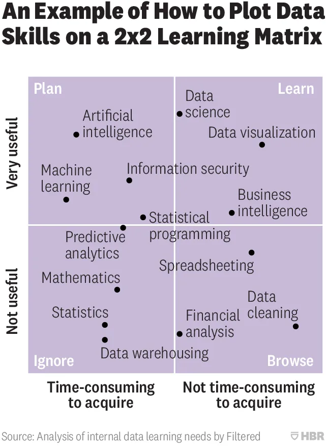
This 2x2 chart is hard to understand (source on HBR)

From a design point of view:

  • Axes labels are hard to read
  • Axes labels are too blunt, mathematics has its uses
  • Too many dots at locations that are too precise
  • Typography of the labels goes across the boxes
  • The 4 quadrant labels do not stick out enough

And that’s the design part. More importantly, the content… The title of the chart seems to suggest that it is just an example of how to use 2x2 matrices, but I think people are serious about its content. A comparison of apples and oranges. I need to start casually learn how to do data cleaning, and not yet get into AI but be prepared for it, and to use AI, I don’t need to understand statistics at all.

Cover image by Nick Femerling on Unsplash

·Investor presentation

Logarithmic scales

In the 1980s, I remember plotting the results of science experiments in high school on millimeter paper. Logarithmic scales came in handy: they allow you to plot data series with big variabilities accurately, and/or they can show mathematical relationships beautifully (a completely straight line on a logarithmic scale for example).

Scientific charts are for pondering at your desktop, a different setting from a 20 minute all or nothing investment pitch. When you show a boring growth line and have to alert the audience that the tiny labels on your y axis are in fact on a logarithmic scale, you have lost some of your fire power. It looks less spectacular, and more importantly, it requires additional thought steps in the brains of your audience. The hockey stick simply works better.

If you are dealing with serious science, consider 2 charts right after each other, the first (populist) one showing the raw growth, then followed by a logarithmic one that takes the responsible scientific approach.

Cover image by Sawyer Bengtson on Unsplash

·Data visualization

Mary Meeker slide makeover

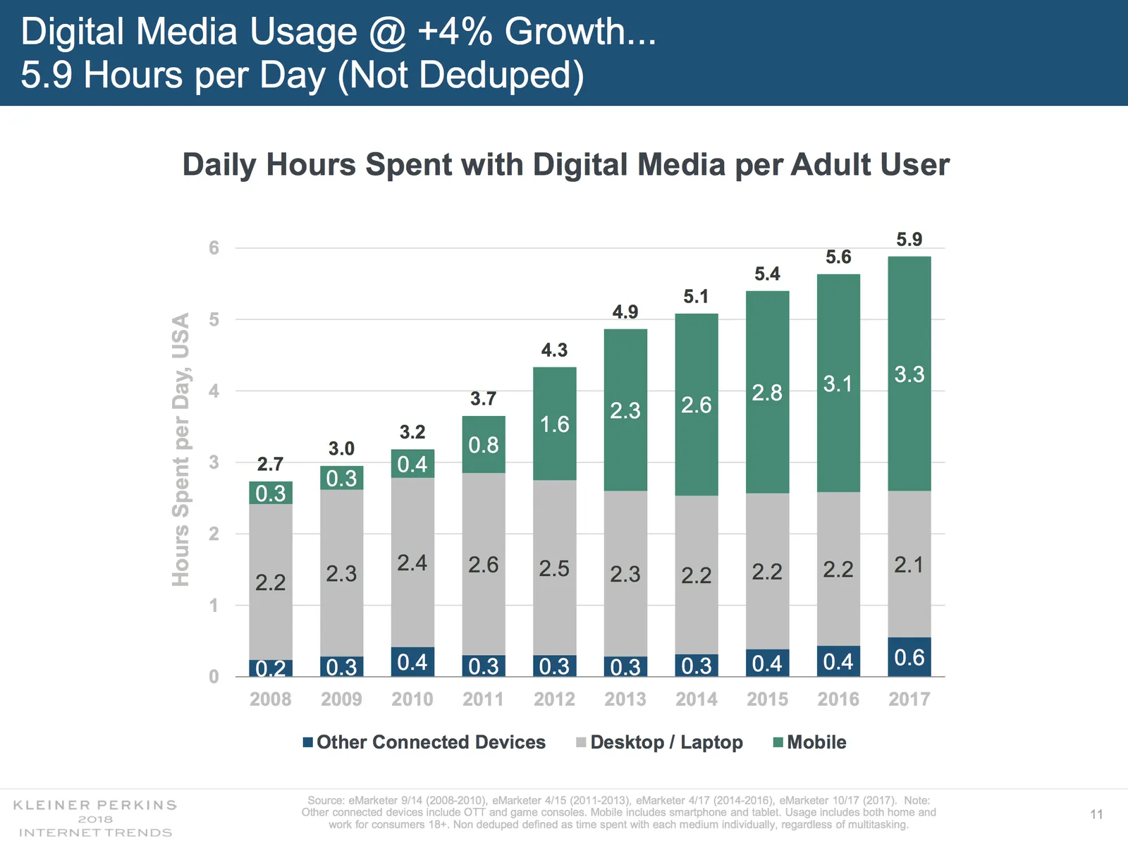
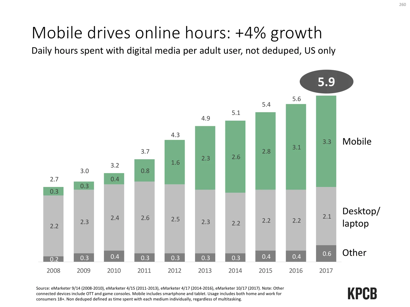
Mary Meeker published her 2018 Internet Report: hundreds of PowerPoint slides filled with dense information. This is a presentation for pondering and study, rather than seeing it as a backdrop for an entertaining TED talk. For this purpose, the slides look pretty decent. I picked a random slide from the beginning of the deck and tried to improve things a bit in “SlideMagic-style”

Here are some things I changed:

  • The KPCB template features the very heavy coloured bar at the top of the page, I took it out, and tried to apply the fresher green colour that was used for the branding of the web site of the document
  • The duplications of the titles were eliminated
  • The vertical chart axis and grid lines are not required, I took them out
  • I edited the title to make it shorter, put the growth point in the title, the absolute hour value as a bubble
  • The columns don’t add up because of rounding, I left it that way, but usually, I would change the value of the biggest column segment to make the numbers add up, it somehow looks sloppy when there are “calculation errors”
  • The legend was hard to read and difficult to link to the data series, I moved them to the right
  • I made the mobile data series pop more with stronger colouring
  • I stretched the data chart a bit horizontally to use the maximum possible space

A complete purist would argue that this chart is actually the wrong one to support the 4% growth point, there are no growth percentages anywhere on the chart.

Continue reading →
·Data visualization

Quantification as a communication tool

The backbone of almost any management consulting project (and final presentation) is some sort of quantification of options. In essence, the quantification is the communication.

Strategic options can be hard to compare, evaluate. Uncertainty, risk, lack of information, dependencies, short term, versus long term. Throw these in an average politically charged management meeting and the outcome is almost certain: indecision.

A quantification is convenient: simple rank the “score” and the answer rolls out. Every option can be compared objectively. Well, objectively to a certain extend. With all the wild assumptions and predictions, you can pretty much force an Excel model to go anywhere.

But that might actually be useful. The process of debating assumptions, seeing how much they actually matter, which ones are certain, which ones are a bit uncertain, and which ones are wildly speculative, weighing all the factors, is the communication process a consulting team and client will go through. At the end, the point estimate of “Option 3 wins with $52.3b value creation in 2035” might not be correct, but the thought process that went into the estimate means that option 3 is probably the most sensible option to take.

Why do people need to hire expensive consultants to lead them through this process?

  • Some sort of objectivity, an outside party who has the run the numbers with a credibility at stake
  • Raw horse power: knowledge how to run complex calculations involving risk and options (and an infinite supply of available human capacity in a certain time span)
  • Privileged access to information: data from another country, disguised industry benchmarks, etc.
  • And the guts to make broad “20% of the effort, 80% of the result” assumptions where it is appropriate
Continue reading →
·Data visualization

Halving and doubling

This tweet made me scratch my head, it seems so counter intuitive:

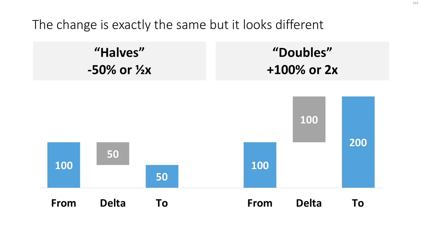
If you create a little waterfall, you can see the effect better. In both cases, the delta is half the size of the bigger column.

Yes, using logarithmic scales would be the correct mathematically thing to do, but they are very hard for people other than mathematicians to get their head around.

Read an earlier blog post about constructing waterfall charts in presentations. Cover image by Ross Findon on Unsplash