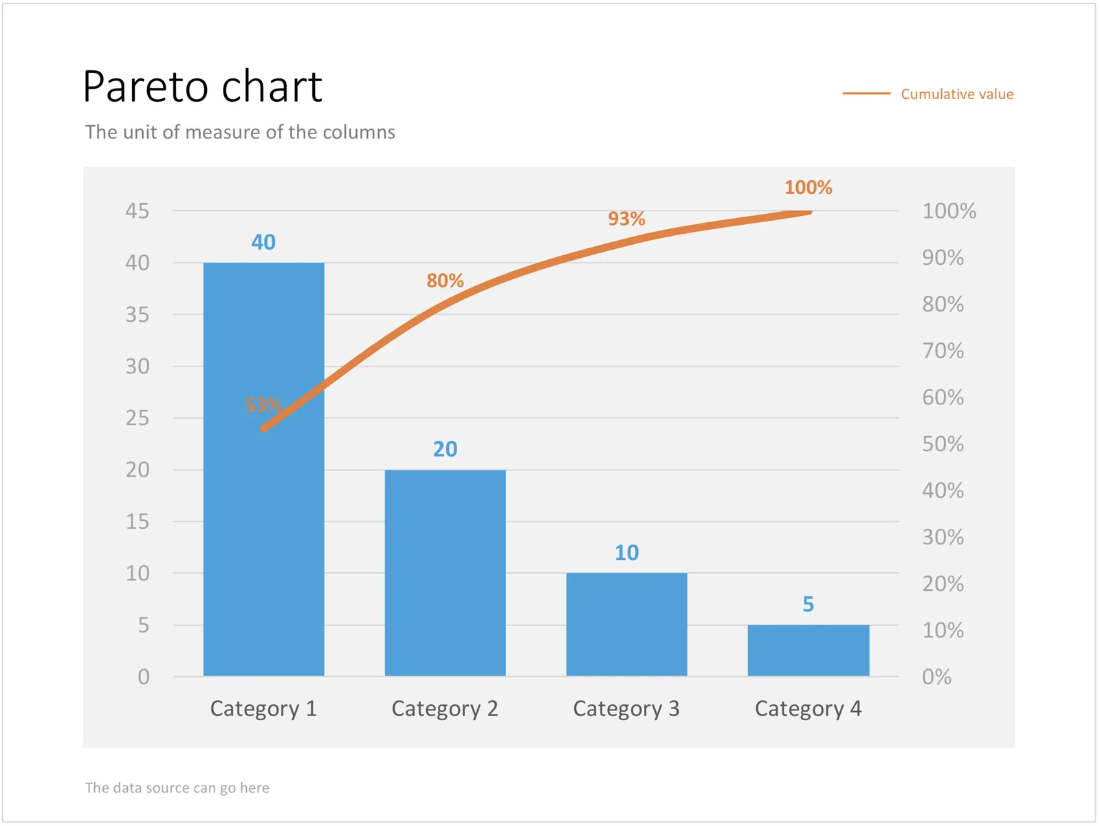
Recently, someone searched for a Pareto chart on my site. I must admit, I had to consult WikiPedia about this type of slide. A Pareto chart shows 2 data series, each with their own vertical axis; the first show the absolute frequency count of something, the second one the cumulative occurrence of the data series, adding up to hundred for the last entry. I have added the Pareto chart to the store.