

I often use the slide below in quarterly investor presentations for large corporates. How to give a quick overview of the key financials in one chart?
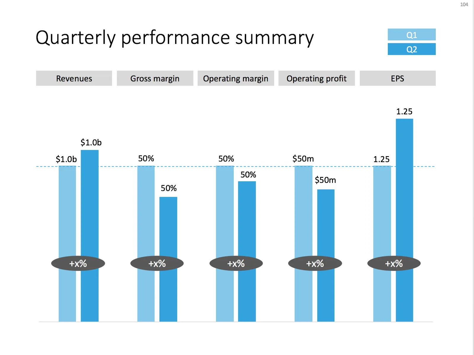
A chart with an overview of the main financial indicators of the last quarter
This chart is an example of why often a “manual” chart is much more powerful than a simple copy and paste from Excel:
- The chart contains values that can differ vastly in range: sales can be 100s of billions of dollars, EPS can be less than a dollar. Margins are percentages, not dollars.
- Despite this, I forced the Q1 column of each of these values to be the same. In the underlying spreadsheet, they will all say “100”. The other values are calculated as a relative value compared to this 100. To accentuate this in the chart, I connected the left columns with a dotted line.
- As a result, all labels in the chart need to be filled out by hand, the same for the growth bubbles which I placed over the columns (again a bit unusual)
You can download this KPI chart from the template store.
Photo by Sabri Tuzcu on Unsplash