

Visual emphasis is important in graphics design: it creates a sense of hierarchy, what should be viewed first, and what are less important details. In many draft presentations I see, people use tiny variations in font size to create emphasis. For example, the first sentence of a text block might be in font size 16 rather than 14.
This approach does not work. The viewer will hardly notice the difference in font size, and worse, small differences in font size give the text block an unbalanced look when seen from a distance.
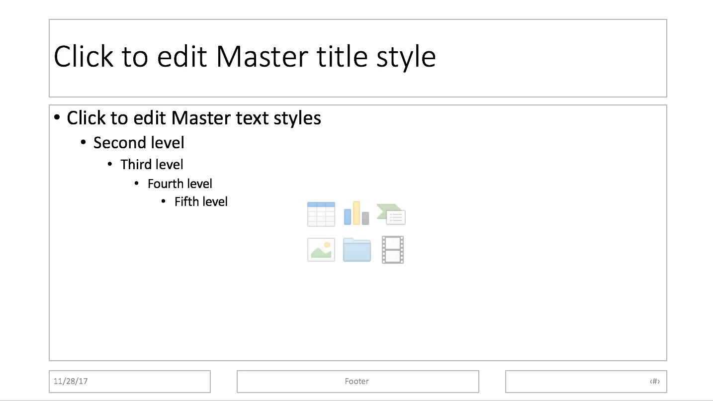
It would not be fair to blame the amateur designer for this though, the standard PowerPoint bullet point template has this font size hierarchy baked in.
So, what is a right way to do it?
- Try to avoid having to resort to this, make your text blocks short enough so they can stand on their own
- Use white space and location on the slide to differentiate headings from other text blocks
- For headings, pick other differentiators: bold, all caps, and use the style consistently through your presentation.
- Inside a text box: subtle use of bold and color (main text dark grey, emphasis black) works great
- Another don’t: underlining, on a computer screen it almost looks like a correction (or a hyperlink from the 1990s)
- For major headings (such as slide titles), it is perfectly fine to use font size as a tool, just make it a big size difference when compared to other text elements on your slide.