SlideMagic Blog

Frequent updates about all things presentations since 2008. Subscribe to never miss a post.

RSS
·Story

Legal presentation arguments

Sometimes I work on presentations that border on legal or regulatory disputes. Two parties need to convince some independent party or regulator that they are right, often with the help of independent experts.

The briefing presentation at the start of a project usually is a left over of the original project presentation, it makes the case for the project in general but buries the actual smaller issue that is being discussed now, for example environmental impact.

What follows is a verbal discussion with the old slides as a background: then we did this, then we hired her, then we installed this technology, then they disputed the data, then we did a test (but changed it a bit), they came up with these counter arguments, that do not really apply to this situation. To the outsider who has not been part of the process it is completely impossible to understand the arguments.

In a situation like this:

  • Start from scratch and build a presentation in which 95% of the time is spent on the issue at hand
  • Make sure that your flow of logic is clear
  • Separate the arguments that are undisputed, from more contentious issues
  • If the other party has a major counter argument, there is no point in hiding it, you might as well put it in your presentation prominently, and with your solid argument why it is not a valid point
  • Pick your battles, if the other side has a point that is pretty much true and hard to disprove, don’t spend energy trying to make an impossible case against it. You will loose credibility when making other points that really count
Continue reading →
·Concepts

Risk matrix in PowerPoint

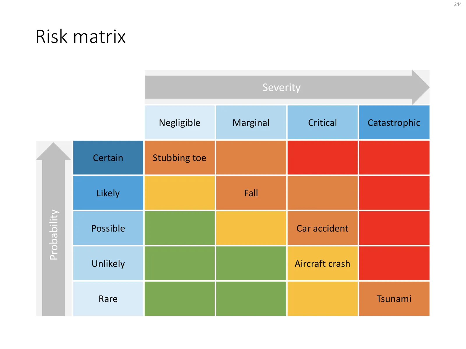
I am continuing to tick off the standard presentation frameworks in the store, yesterday I added a PowerPoint template for a risk matrix. The matrix has 2 axes: one for the probability that a disaster happens, the other one how severe it would be if it were to happen.

The matrix is designed in true SlideMagic style: not very fancy, but highly symmetrical, usable, and adaptable to your everyday presentations. You can download the slide here, subscribers can do so free of charge. Feel free to adjust the axis titles, labels, or dim the bright traffic light style colours to your taste and needs.

Cover image by JC Dela Cuesta on Unsplash

·SlideMagic

Mysterious shipping charges

It is very hard to tell eCommerce platforms, Google shopping, tax authority and other sites that digital downloads do not require shipping of physical stuff. Deep down in the bowels of my system $20 shipping charges were still present for some countries. I think I cleaned everything up now. Let me know if you see any other irregularities. If it looks wrong to you, it probably is wrong.

Cover image by chuttersnap on Unsplash

·Concepts

A prism that shows what's inside

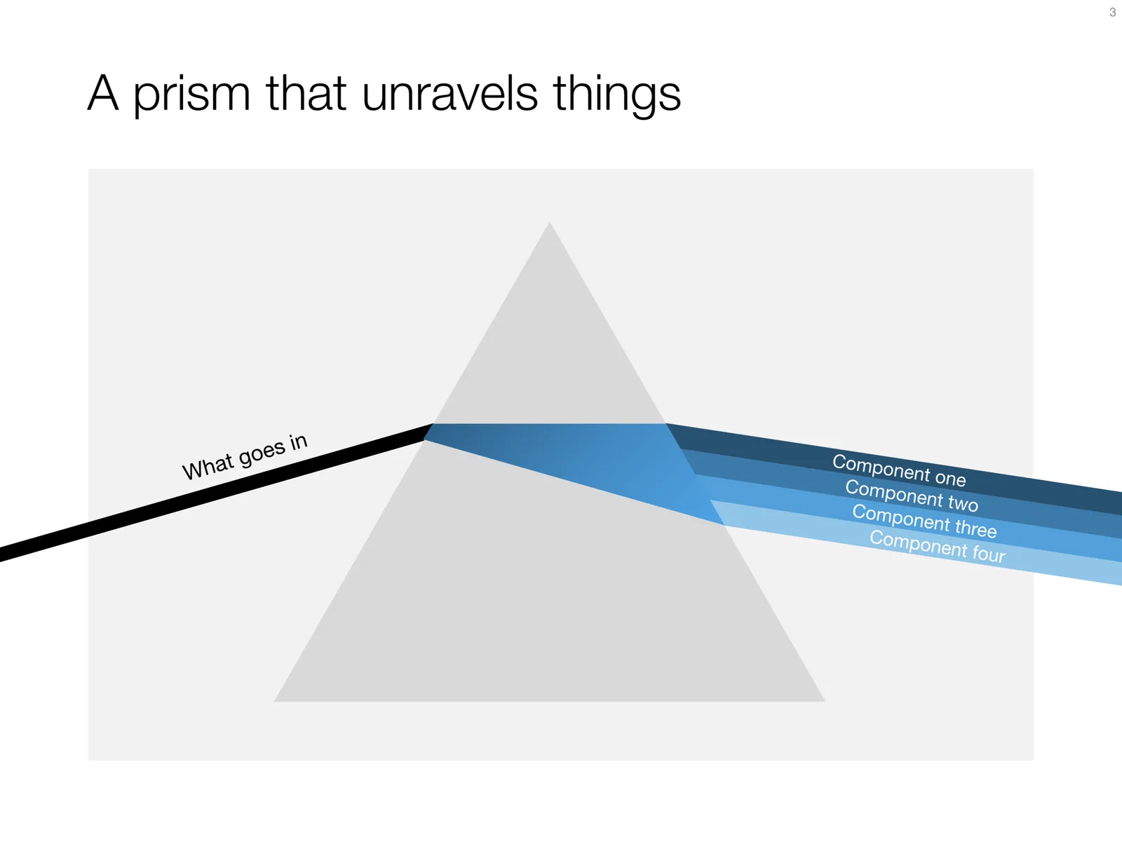
I have used the prism visual metaphor a few times in my client’s presentations to show how rich, intricate, subtle components are present in a service or product that might not be apparent from the outside. Below is an attempt at a minimalist pyramid in PowerPoint (roughly modelled based on the cover of that Pink Floyd album).

I simplified the laws of physics here and there, the tricky bit was to get the blue shape inside the triangle right. I added the slide to the template store yesterday, you can find it ready for download here, and subscribers can do so free of charge.

Cover image via WikiPedia

·Concepts

Hmm, what do you think?

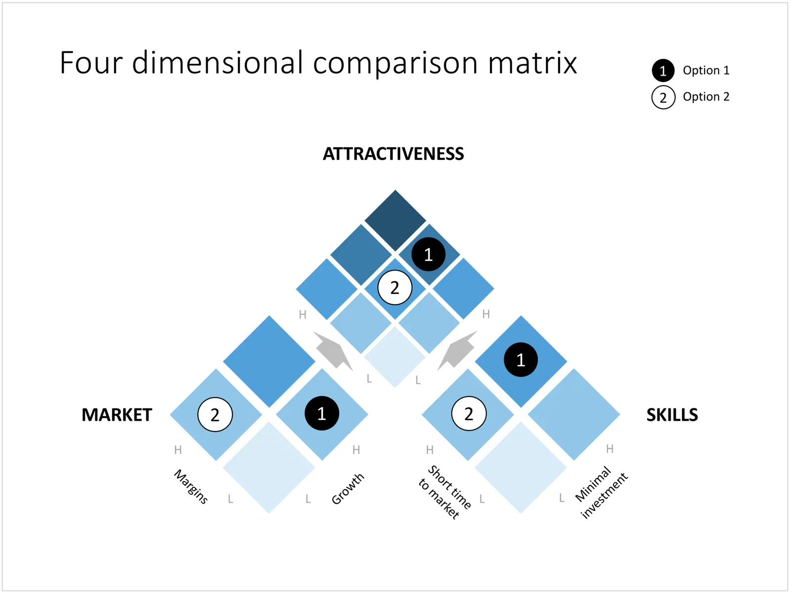
The chart below is an attempt to create a comparison matrix that can deal with 4 dimensions. Two dimensions get consolidated into another one, which are put on another matrix. The results is mathematically correct, but does it work as a slide? Maybe it is pushing things too far.

You can download the four dimensional comparison matrix by clicking the image, subscribers can do so free of charge.

Cover image by Amy Reed on Unsplash

·Investor presentation

Pitching your startup

Here is a nice post on the Stripe Atlas site about pitching your startup. It is written from the perspective of a very early-stage startup pitching for a seat in an incubator such as Y Combinator. (If the entrepreneur is not yet that experienced, an achievement like having climbed Mount Everest adds a datapoint about persistence).

Here are some quotes that struck me from the post:

  • “Explain assumptions in your pitch like you would to a smart friend in a different field.”
  • “The investor is not your user, so pitching users and pitching investors are completely different.”
  • “This pitch says nothing, in 18 words: COMPANY will help e-commerce stores sell more products using cutting-edge AI-enabled algorithms and machine learning.”
  • “Clarity is particularly important when you’re tackling recently popular ideas, like blockchains or machine learning”
  • ‘Your reviewer will read literally thousands of data points today–the average pitch includes more than 10. No one can remember that many arbitrary numbers, so reviewers compress them to “zero”, “non-zero”, and “impressive.”’
  • 'Nobody has ever written in their comments on a company “Wow, their sign-in screen blew me away. I want to invest in that sign-in screen.” ’
  • “Risk-taking is encouraged in startups; stupid risks are not. Walking into the office of a person in a position of authority without a meeting scheduled is a risk, but it suggests ambition and sales ability. Describing crimes you’ve committed generally suggests poor judgment.”

The people evaluation bit of this Y Combinator screening process seems very similar to the way we were on the lookout for new talent in McKinsey. Especially for young hires with little work experience, you had to comb for indicators of possible future success, fit. In every interview you really wanted the candidate to succeed. And the dialogue with the candidate, the way she responded and thought was very important.

Continue reading →
·Investor presentation

"Familiar" investment ideas

Investors keep on insisting on simple and short pitches, cut pages, cut time, simplify. I don’t think that there is a problem with the investor’s IQ, there is not reason to dumb down your story.

What might be happening is that your business actually is very familiar to the investor. She has heard similar stories a thousand times before. A gig economy idea in a new market segment, a me-too business in a different country, a new Internet security technology, semi conductors that are a factor 10 faster, a new private equity fund that promises to be really hands on with portfolio companies.

While your business is new, the investor has learned 90% of the context in previous presentations. Talking 10 minutes about how successful Uber is and how this idea can be applied to other sectors is a waste of time.

Simplify/shorten your deck means: I understand already a lot, let’s go to the interesting bit.

Cover image by Dan Gold on Unsplash

·Data visualization

Balance sheet in PowerPoint

Today, I added 2 slides that show a balance sheet to the template store.

The first is a traditional table format. But this PowerPoint version is a bit different from the a typical balance sheet in an annual report to improve the readability. Usually, the PowerPoint presentation with the financials is not the legally binding one, so we can omit some details that clutter up the page. This table has fewer lines (consolidating multiple entries into one), and the amounts are rounded up.

The second chart is a balance sheet represented as a column chart. Even more details has been taken out and the result is a nice and unusual way to visualise the key balance sheet ratios. Instantly you can see the proportion between current and non-current assets (and liabilities), and you can see the leverage of the company (ratio between debt and equity). This chart is probably easier to follow than the Profit and Loss statement as a column chart which I discussed earlier.

Click on the image to download the slides from the template store. Subscribers can do so at no extra cost.

Cover image by NeONBRAND on Unsplash

·Data visualization

A Pareto chart

Recently, someone searched for a Pareto chart on my site. I must admit, I had to consult WikiPedia about this type of slide. A Pareto chart shows 2 data series, each with their own vertical axis; the first show the absolute frequency count of something, the second one the cumulative occurrence of the data series, adding up to hundred for the last entry. I have added the Pareto chart to the store.

Almost there

I love to use this golf-related concept to visualise a situation where something is almost done, it just needs a little push.

Visually, the image is highly recognisable. Similar to resolution in music (the listener is just craving the moment when the unstable note resolves into a stable / root one), here the eye can already mentally see the ball disappearing in the hole. There is tension, anticipation of movement in the chart without any video or animation effects.

The second advantage of this composition is that golf courts by design provide an abundant amount of white space (the grass) on which to put your text.

In my slide, I reconstructed the golf ball using a PowerPoint shape, a circle with a touch of gradient and a shadow constructed from an oval shape. As a result, you can control the size, position, and colour of the ball precisely. Feel free to borrow the design or download the ready slide here. Subscribers can do this free of charge.

Cover image by Andrew Rice on Unsplash