SlideMagic Blog

Frequent updates about all things presentations since 2008. Subscribe to never miss a post.

RSS
·Investor presentation

First attempt at a generic startup pitch flow

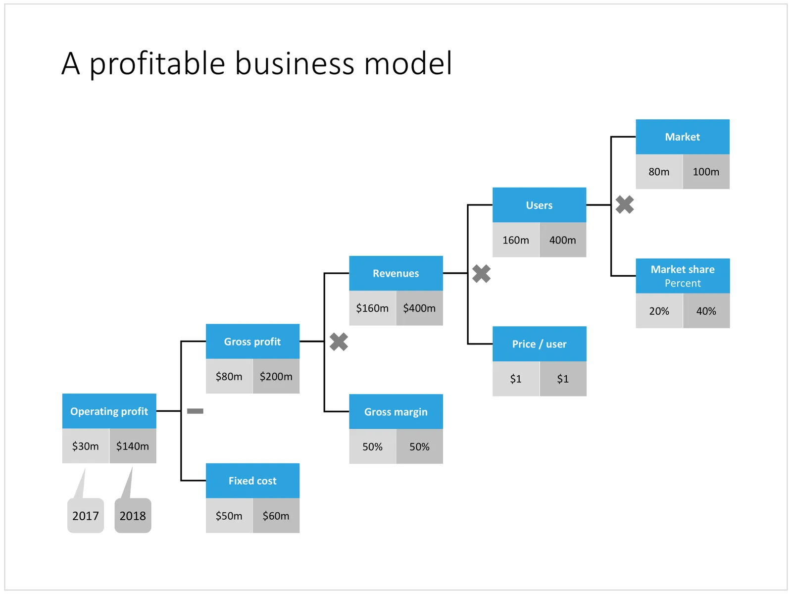
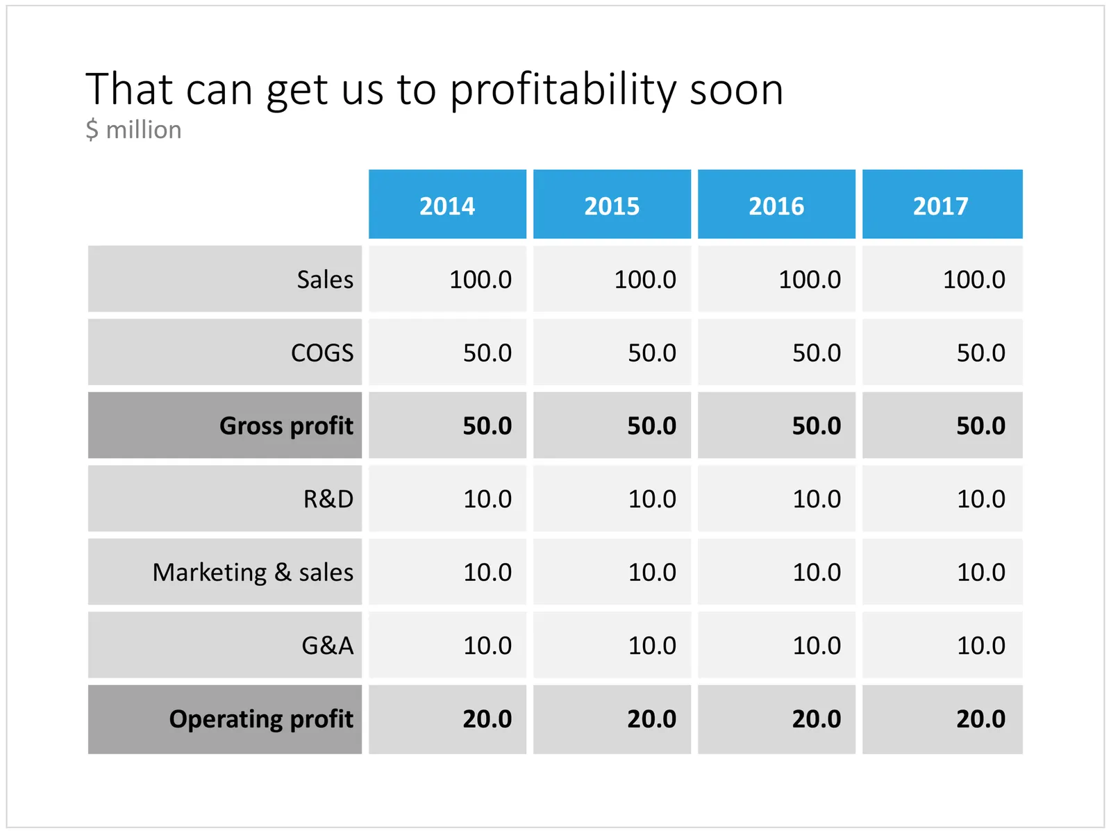
Below is an example of how you could stitch (I don’t want to call it “Frankenstein”) a startup pitch deck together using the slides that are available in the template store. It is tricky to design a generic startup up, the upfront bit of these decks is highly specific to the company and the marketing it is operating in. Towards the back, things get more generic (team, financials, pipeline, roadmap, etc.).

I will give this template a bit more thought, and I will also turn my attention to other standard presentations such as quarterly results presentations, kick off documents, Board meetings, etc.

The deck above can be pieced together from individual slides in the template store, or downloaded in one go here (4:3 PowerPoint only for the bundle). Have a close look before you do to make sure this is the flow that fits your company. Subscribers can download at no extra cost and experiment freely.

Cover image by Jomjakkapat Parrueng on Unsplash

·PowerPoint

Improved search

Slowly, slowly, I am moving closer to the goal of creating a searchable slide bank bank that is actually useful. Here are the various steps that I have gone through:

  • Designing a slide template that looks good/professional AND blends in easily with existing corporate PowerPoint templates
  • Creating a “boxy” design language that is easy to manipulate and edit, even for non-designers
  • Cutting down the universe of slides to come to a collection of basic slides that can cover almost every possible common business concept that is out there
  • Anticipate the majority of possible search queries to find layouts for every possible angle
  • And now: find a smart grouping slides that creates a really smart way of suggesting related/similar slides

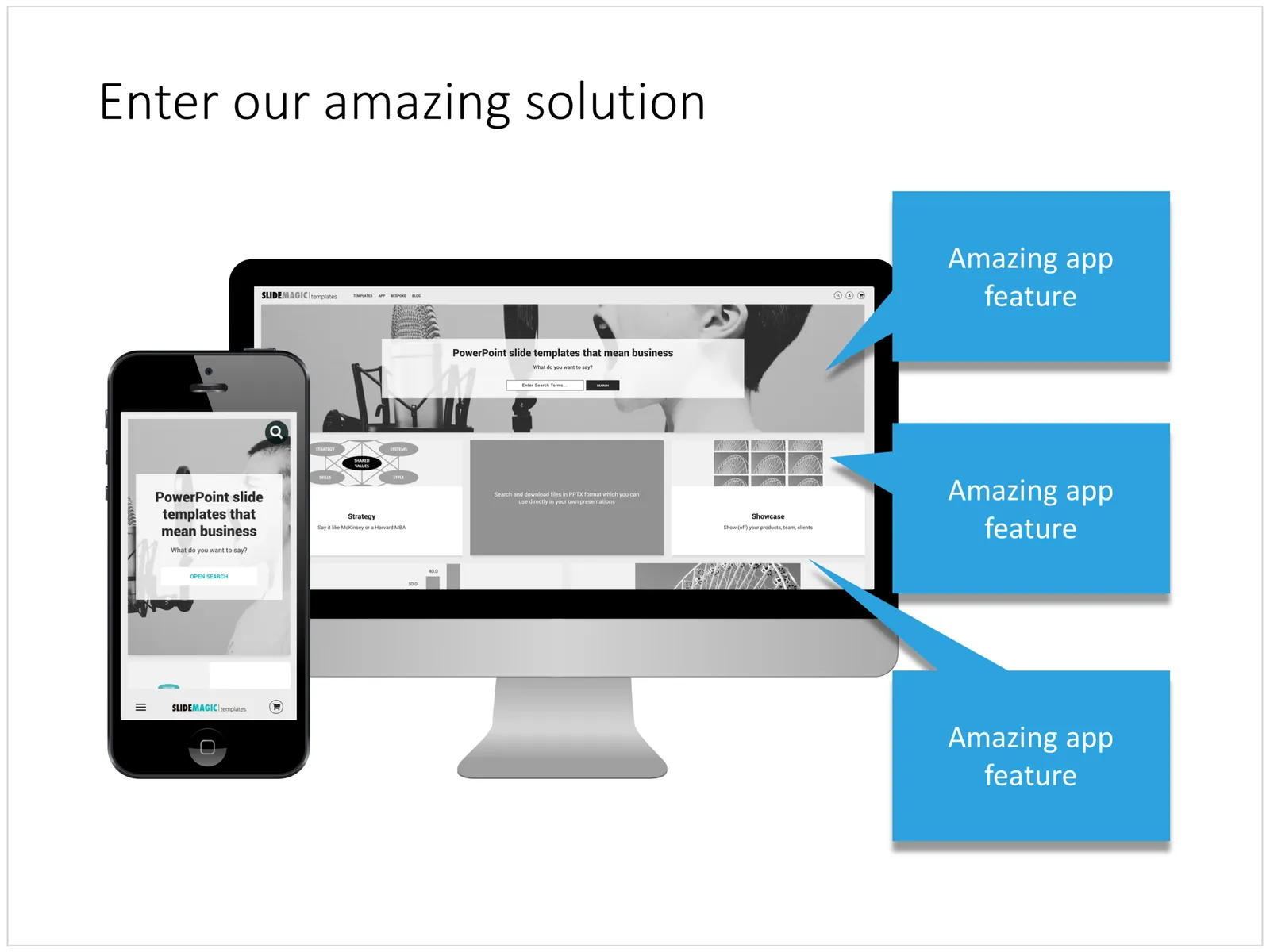
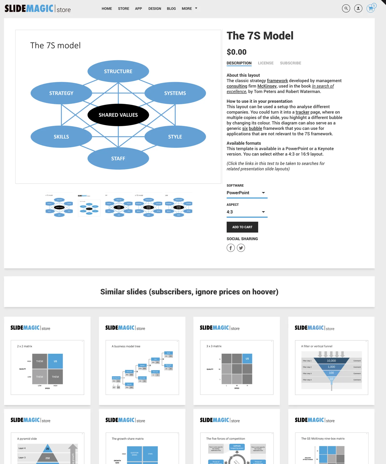
Below is an example of a product page in the store now:

Now that I have automated subscriptions, plus sorted out the search algorithms it is time to clear the last automation hurdle: VAT management globally for both consumer and enterprise customers (the EU has created a nightmare for small digital content stores as it is going after tech giants such as Apple). After that, all attention will be focussed on adding more slide content.
Cover image by Anthony Martino on Unsplash

Between a rock and a hard place

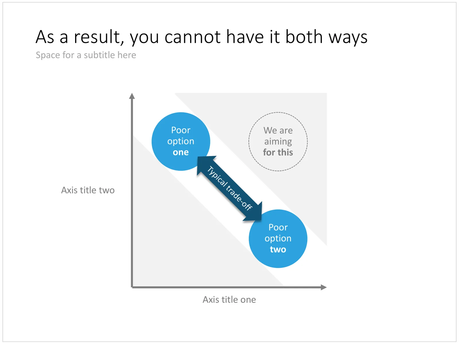
This variation on a 2x2 matrix slide can be a good way to visualise being stuck in a choice between two poor alternatives. Two balls move in a corridor and are trapped so they cannot reach that ultimate, best of both world position which sits at the top right of the chart.
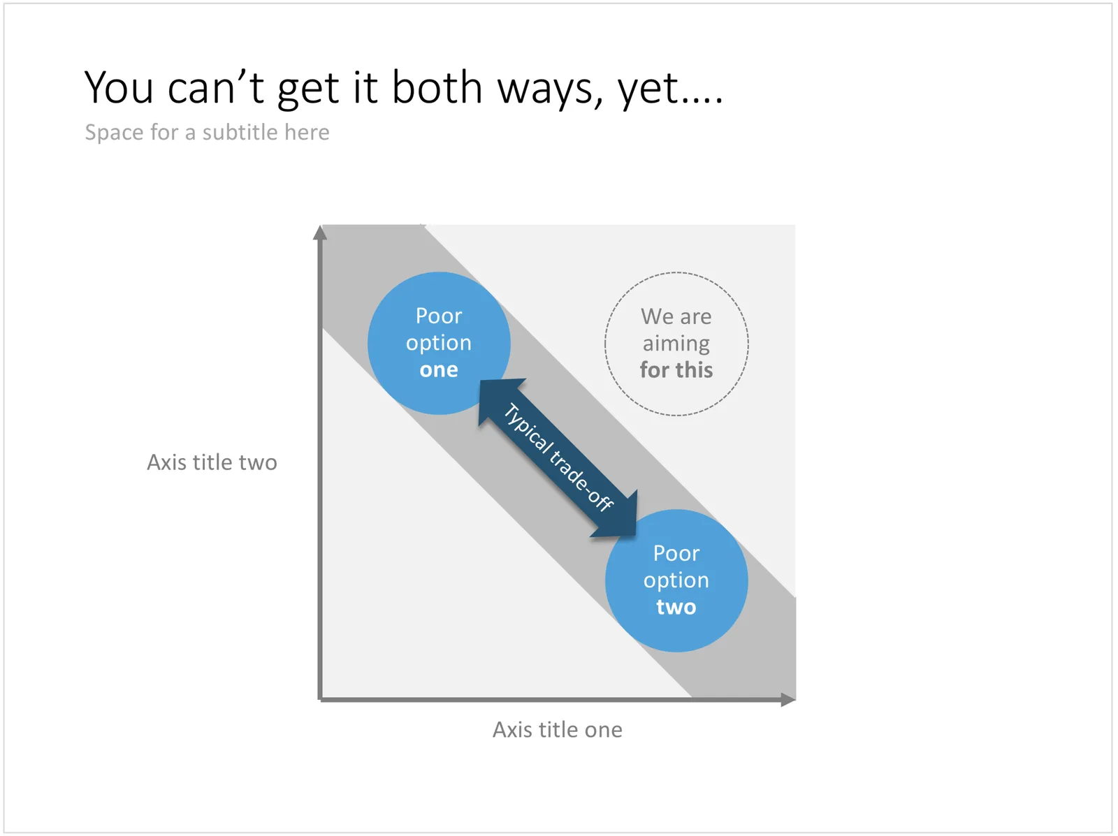
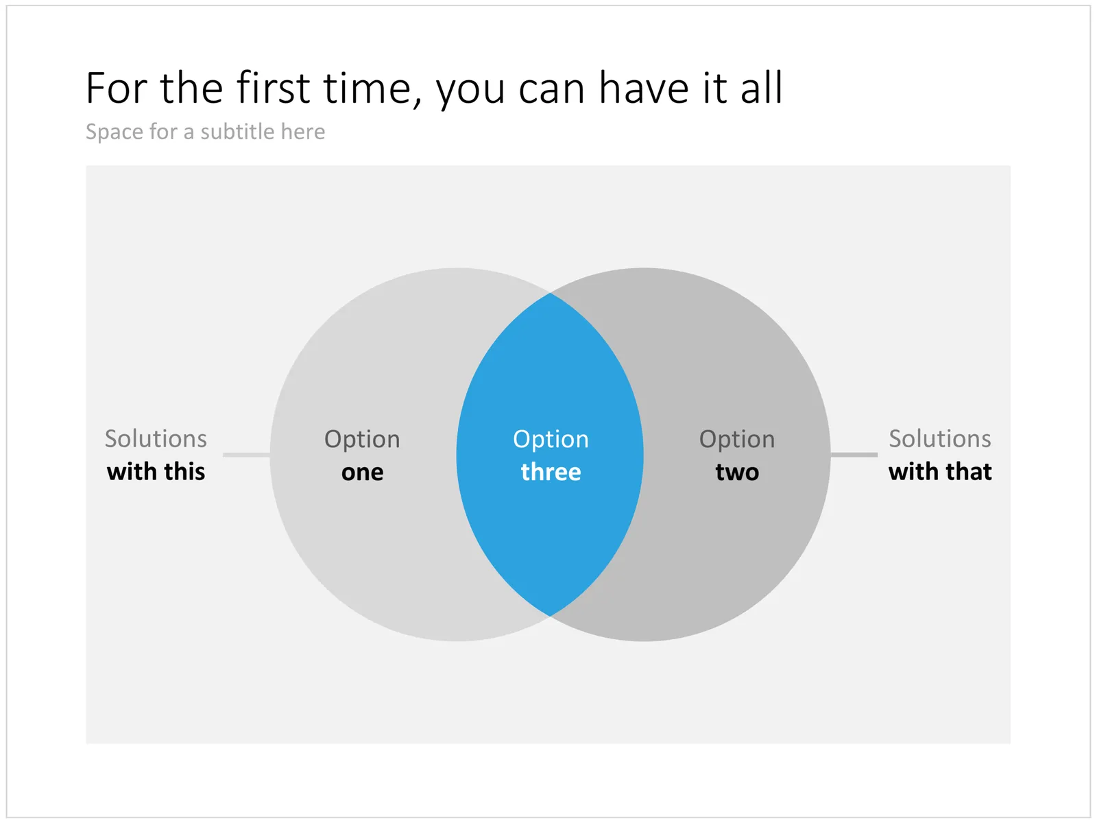
In a follow-up chart you could use the exact same design as a basis, but have the corridor break open as you introduce your solution. Other layouts to show a best-of-both worlds situation are Venn diagrams or 2x2 matrices. You can download this trade off chart here, subscribers can do so free of charge.
Cover image by Martin Reisch on Unsplash

Good slideocuments versus bad bullet point slides

PowerPoint (and Keynote) can be very useful alternatives to word processors:

  • It is easy to set up a document quickly, using empty pages with headers to organise your ideas
  • It is easy to move things around
  • It is easy to combine text, graphs, images, and data
  • It is easy to collaborate with others in this well-known user interface

As a result, many of my clients use “slideocuments”, presentations that are meant for reading, discussing, and decision making, rather than being the backdrop of a stand-up presentation in front of an audience.

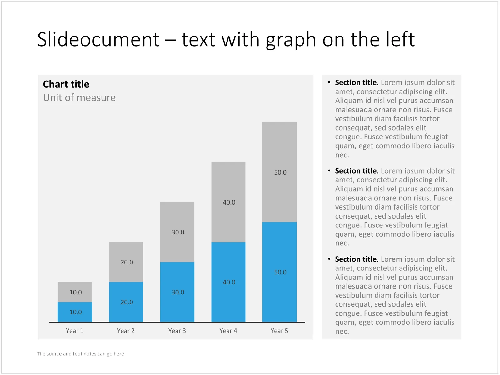
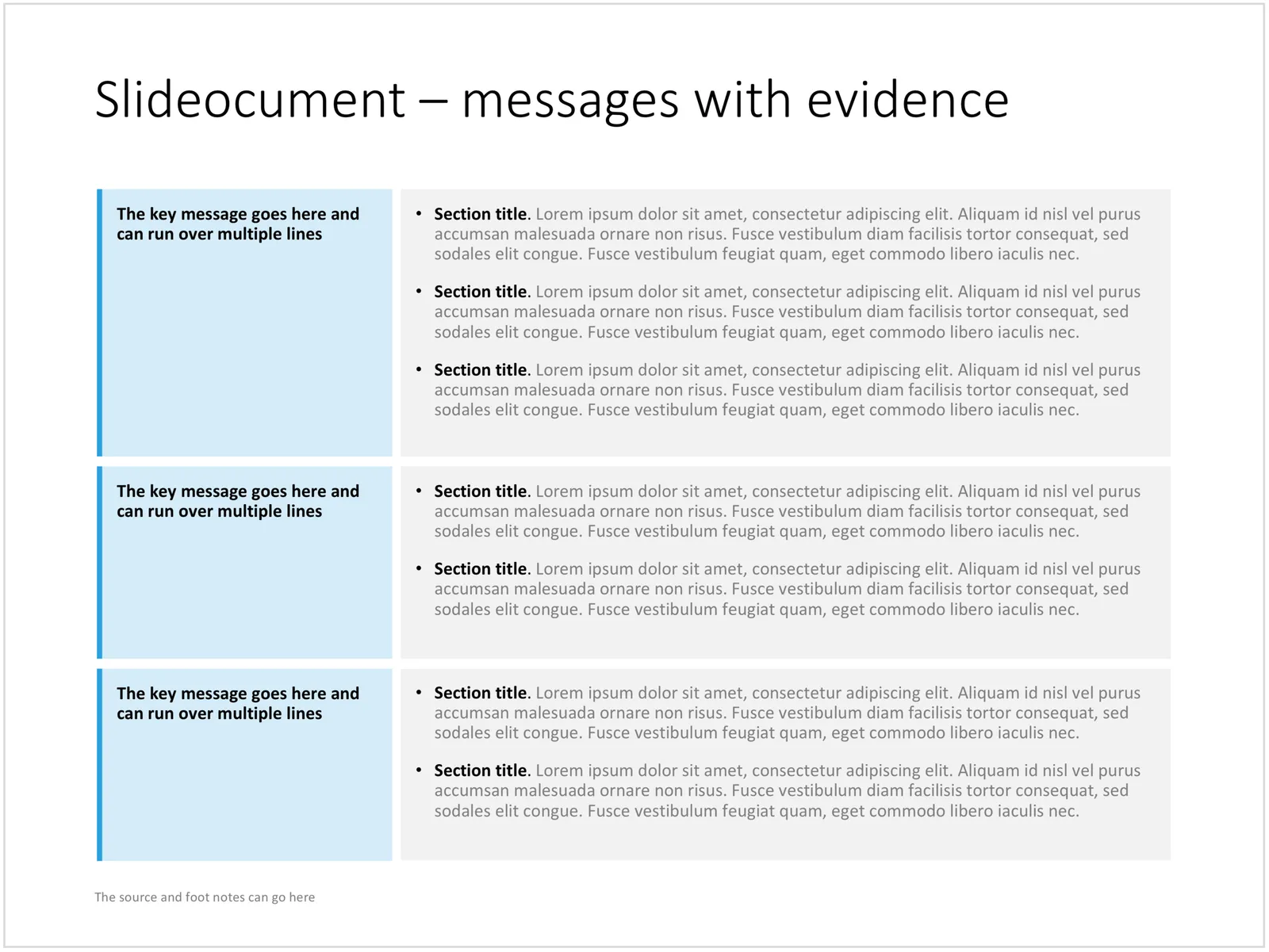
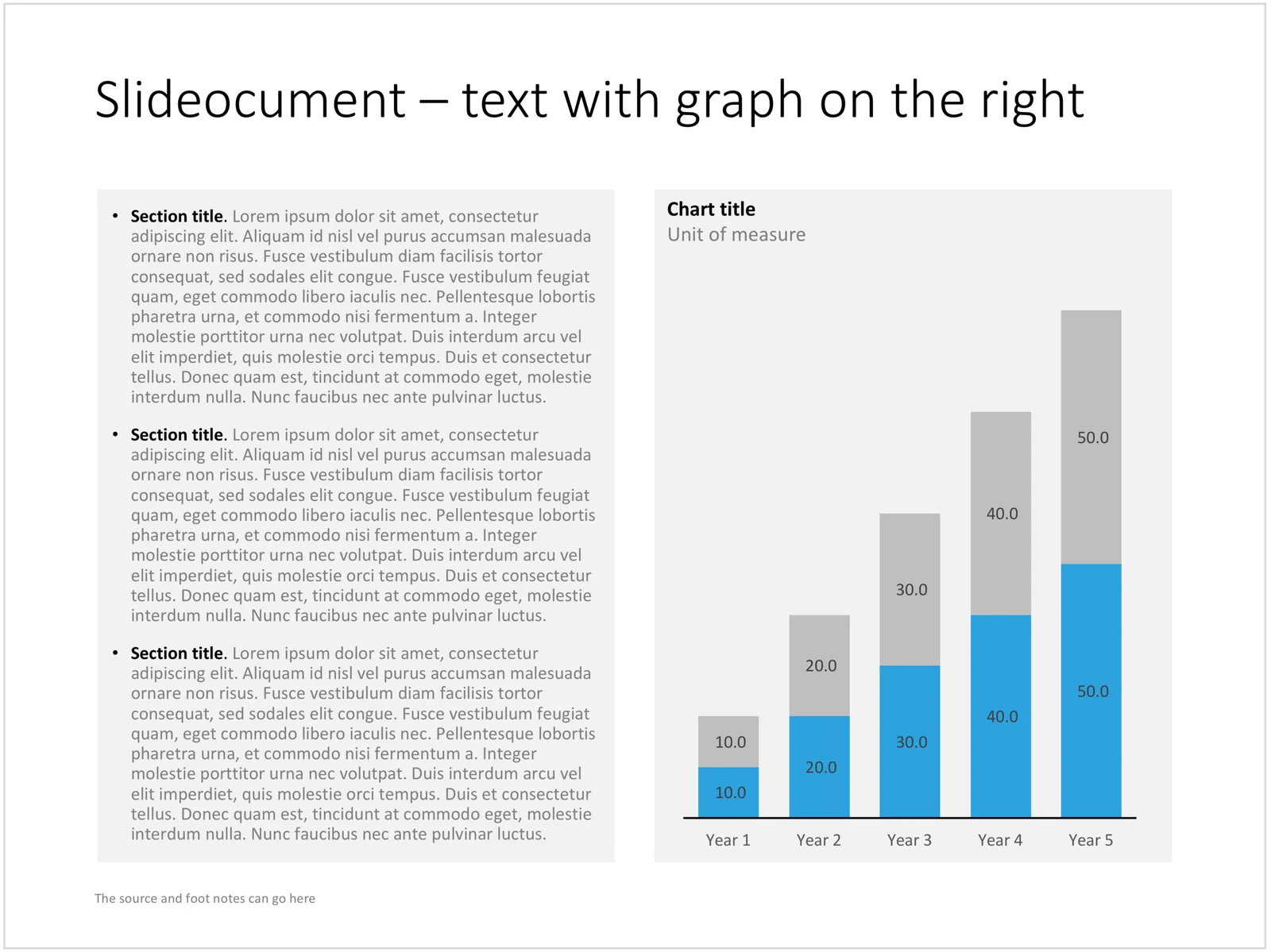
A good slideocument slide with dense text is different from a poorly designed bullet point slide (with dense text). It follows the layout principles of print design: white space, text in readable columns. Poor bullet point slides usually have a font size that is too small for a live presentation and too big for reading. Text runs from left to right across the entire screen, which makes it hard to read, especially in wide screen format. The structure of bullet points is not clear. The text of the bullet points is too long to be a headline, and too short to be a clear paragraph.

I added a few slideocuments to the SlideMagic store recently. Feel inspired to copy the design, or click on the images to purchase a ready slide. Of course, subscribers can add the slides to their collection at no cost.

Cover image by Laura Kapfer on Unsplash

Should you use "one more thing" in your presentation?

Here is the cross post of an answer I gave on Quora:

No, don’t use Steve Job’s famous “one more thing” at the very end of your presentation

  • When you are starting out with pitching your venture and you do not have the track record of Steve Jobs (yet), it is not smart to leave your biggest point to the last minute
  • It is very hard to assess whether using humor in a presentations will work given the meeting dynamics. Hard-wiring a “joke” in the sequence of your slides removes the flexibility of playing it safe and pulling the joke when the mood in the room just does not feel right
  • Around most of Apple’s releases there was some sort of anticipation of something big and new that was coming. Often, details of product were leaked in the press. The product had actually already been pitched before the presentation started. The audience was just hungry for the details. In a pitch or interview this is probably never the case.

Cover image by Ben Miller on Flickr

·Story

"There are people who get it, and people who don't"

The other day, one of my clients simply wanted to give up on explaining his concept to the typical 50% of people who “simply did not get it”.

In life there are many situations where you “give up” on certain people. Students who fail the entrance exam of a university, job applicants that did not make the cut, athletes who miss the qualifying threshold for the Olympics, contestants who did not make it to the next round of American Idol.

When presenting your company, you need to put the blame not on the audience, but on your presentation. Your targeted audience should understand your message. And that audience can differ: a presentation to a general audience, journalists, scientific experts can build on different levels of pre-existing knowledge and background.

Often, as a presenter you suffer from the curse of knowledge, you are so deep into your own story that you cannot possibly imagine how someone who is new to the subject cannot get it. Another reason for the disconnect is different types of reasoning/thinking of people. When people frown in disbelief, it might not be because that they did not understand what you are trying to say, they might have a valid different approach to evaluating your pitch that you have not yet covered in your presentation.

When you leave the room, your chosen audience of high school students or elite academics should understand your message. Whether they agree with it, that is a second challenge, but they understood where you are coming from.

Continue reading →

Subscriptions are now done properly

That was an interesting effort. The subscription platform for SlideMagic has now been put in place. Given that many payment platforms are not available in Israel (a tiny end user market that is a low priority for most tech companies), I have incorporated in The Netherlands, and integrated a subscription payment platform, a subscription app, and a pricing app into my store platform. The result: you can now subscribe to SlideMagic, after which all prices in the template store drop to zero when you log in (no more discount codes to enter), and you manage all your address details, credit cards, invoices, (and yes cancel your subscription) from a panel that is integrated into my site.

It is incredible that in 2018, a 1-person operation can pull this of, a few years ago this would have required a very substantial development team.  I will continue to focus on developing the content of the SlideMagic store (which makes it unique versus the 1000s of cosmetics-only templates that are out there) while I monitor how the technology is holding up, keeping marketing efforts modest at the moment.

If you want you can still join the beta subscription program for $100 by going to the subscription page.

Cover image by rawpixel.com on Unsplash

The grass hopper slide

Now and then I use an empty slide with small grasshopper at the bottom to visualise an underwhelming market response to a major announcement. The lonely chirping of a grasshopper is often used in the The Simpsons and other movies to represent an (awkward) silence.

Here is an example of a slide design that might be too simple to buy on my store (you can if you want), you can easily recreate it yourself, subscribers can simply snap it up at no cost. Cover image by Elegance Thika on Unsplash

·Layout

McKinsey's presentation template

I did not know this, but McKinsey has put its entire visual branding guidelines online. Beyond the usual instructions about fonts and colours, there are interesting documents about formatting exhibits and data charts. Most of it seems to be focused on print or web content, but overall it provides an interesting insight into template management of an organisation which basically produces presentations as its main product.

Using bullet points...

Reading out endless slides with endless lists of incoherent bullet points is the ultimate disaster presentation. But bullet points can happen to the best of us, and I admit that I am still designing bullet point slides here and there in my client work. But not all bullet point slides are born equal.

When to use bullet points. Bullet points are a list or a ranking of some sort. When a product has 3 features; it is fast, cheap, and beautiful, or an agenda has 5 discussion points, or a project plan has 4 steps, or you have 3 key priorities for next year, it does not make sense to spread each point out as a different slide. The message of the slide is: we have 3 competitive advantages, which is different from: 1) we are fast, 2) we are cheap, 3) we are beautiful.

A bullet point chart is often a set up for more elaboration to follow. We introduce the 3 points, then immediately click through to the next 3 slides that will take each of these points in turn.

When you know you should not use them. There are a number of pointers that tell you your bullet point slide does not express a message of a list or ranking, but rather it is a list of speaking points.

  • The points are merely paragraphs in a story. And then this…, but that…, taking into account this…, we tried these…
  • The points are not roughly the same length, bullet 2 is 3 sentences, bullet 5 is 2 words, the bullets are not similar
  • Related to this, the bullet points start to become complicated sentences / stories in their own right, you are not able to understand them in a second.
  • Again, related to this, you are in the wrong territory when your points take a lot of time to explain. Bullet one: “we are fast” followed by a 10 minute elaboration on acceleration times of competing vehicles with the “we are cheap” and “we are beautiful” still on the projector is the wrong slide for the message.
  • Most of my bullet point slides have 3-5 points, with 5 already pushing it. If you need more, you are writing speaker notes, instead of designing a slide.
Continue reading →