SlideMagic Blog

Frequent updates about all things presentations since 2008. Subscribe to never miss a post.

RSS
·Investor presentation

Pitch deck alternatives

Venture capitalist Fred Wilson describes 3 alternatives to the traditional pitch deck:

  1. Short video
  2. Short podcast interview
  3. A well-written letter

They are all great suggestions, some observations:

  • All these are substitutes for the “first shot” pitch deck, where the VC is absorbing your idea for the first time, as Fred says to find out: “if they are a fit with our thesis and of interest to me and my colleagues at USV” He will spend a few minutes max on these pitches. You still will need other, more elaborate materials in the next stages of due diligence.
  • See how important information about you, the founder is: videos and podcasts give away a lot about you as a CEO, entrepreneur, people manager, Board Member
  • All of the above are as hard to get right as a good traditional pitch deck (especially the letter is really tricky). Just recording a video in itself will not give you a better chance to succeed. Seeing the first 10 seconds of a poor video, or reading through the first bullet of a poor slide deck are equal turn offs.

Cover image by Daniel McCullough on Unsplash
·Story

The point is that there are many points

Everyone knows (from experience) that bullet point charts full of text don’t work. Still, now and then, I need to make a chart that is full of points, literally.

Why?

To make the point that there are tons and tons and tons of arguments in favour of something. The business, the abundance of points, IS the message of the chart.

How do I keep it readable?

Separate the chart that makes the point that there are lots of points from the slides that actually explain the points:

  • Show the overview chart that lists all the points, but not as written out sentences. For example, you can use circles with short descriptors in them: “low cost”, “quick”, “beautiful”. Resist the temptation to go into detail about each of the circles,
  • Bring all (or a subset) of the arguments to the forefront with individual slides, here you can show your cost comparisons, speed comparisons, etc.
  • After the supporting slides, bring back your original chart with a slightly different headline

Note that this is an exception. Most arguments can be nailed with 3-5 decisive points. Rarely, I encounter the logic that “Each of these points are ‘mah’, but if you add them all up, a compelling case arises”. In that case, use the above approach.

Cover image by averie woodard on Unsplash

Improve your English

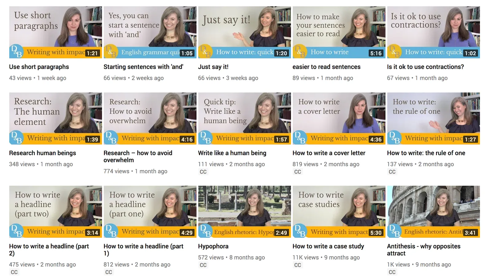
I have been a follower of Clare Lynch on Twitter for a while, and recently started watching her quick videos with tips how to improve you English as well. They are worth watching! She takes a very pragmatic approach when it comes to business writing, giving us permission to break some of the rules we were taught back in high school in the interest of clear and concise writing.

Lower post frequency

I will be taking some time of over the next week with my family and some good friends, and blog posts will be less frequent than usual. Most of my blog posts are almost live, and as a result I don’t have a long post buffer that I can use to pretend that I am writing 365 days in the year.

Cover image by Vesela Vaclavikova on Unsplash

·Delivery

My presentation training in 1996

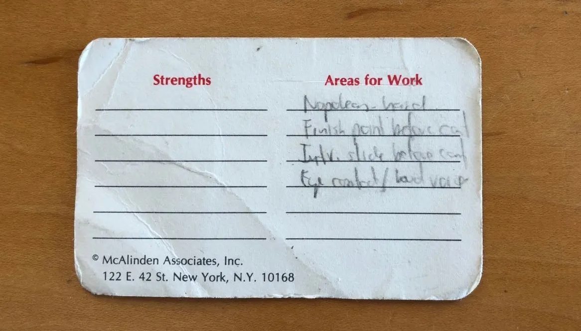
In the middle of the house and office declutter exercise, I found my credit card-sized reminder of things I should work on which I wrote after a communication training at McKinsey, back in 1996 when I just returned from INSEAD:

  1. Avoid the “Napoleon hand”, I seemed to have difficulty finding a natural position for my right hand
  2. Finish a point completely before jumping into the next slide / topic
  3. Introduce a slide before putting it up (McKinsey data slides can be overwhelming)
  4. Maintain eye contact with the audience
  5. Use a loud (maybe confident?) voice

I think I had a few strengths as well, but did not bother to write them down (I hope :-) ).

That little card might survive the declutter tornado.

Cover image by Margarida CSilva on Unsplash

·Images

Cartoons in presentations

Want to use a cartoon in your presentation? Here are some things to consider:

  • Humor in a presentation can work, but be careful what sort of jokes you pick. A cartoon that was very funny late last night when you prepared the slides, could not fit the meeting context the next morning after that earlier remark that did not go down well. If you hardwired the wrong cartoon in your slide deck, make sure to click-skip really quickly.
  • Do you have the copyright for the cartoon you just found on Google Image search?
  • Does the cartoon actually add something to the presentation, or is it a business cartoon cliche?
  • Can the audience actually read what is written on the cartoon from the back row?
  • And finally, do you give the audience enough time to read it? As soon as you put a cartoon on the screen, everyone will start squinting to read what Dilbert has to say, and no one is listening anymore what you say at the same time. It might be best to pause your presentation until the first giggles start emerging from the audience. And remember the audience reads the cartoon for the first time, and needs more time than you to understand it. If you have to, you might have to read out the cartoon to the audience.

Cover image by Samantha Lorette on Unsplash

All over the place

A debate about a contentious complex issue with lots of people in a room is unlikely to go anywhere. If you are asked to make a presentation to run such a meeting, here is what you need:

  • Data slides with one issue per slide that clearly state how data (or logic) supports your point. One issue per slide is important, you want people to really understand what you did, and more importantly, you don’t want other debates about other issues when getting people to buy into your analysis.
  • A logic flow that chains all these data slides together into a coherent argument. This is your typical stand up presentation: clear visuals, that deliver a compelling presentation
  • Then, when the fireworks start, a slide that actually groups all the issues and arguments on one page, even if this means cramming in more information than you usually would on one slide. Don’t try to put all the data on this slide, but give each issue a physical location on the slide. Maybe project it on a whiteboard so  you can write on it, and spot when people making the same point again, discuss a completely unrelated issue, disagree about the validity of the source data, dispute the validity of the analysis, etc. etc. Collapse the issues people agree about to create more space for the contentious arguments.

Good luck!

Cover image by Peter Nguyen on Unsplash

Decluttering

We are going through a small refurbishment of our home at the moment, it was badly needed after our kids spent the first decade of their lives in our place. This all causes some disruption, but also has some upside: I need to pack up every single item in the house (and office), and make a conscious decision whether to put it back or not.

I tried doing a (minor) clean up 3 years ago, and can now see the exact items I decided to keep sitting at exactly the same spot where I left them. This was a great encouragement to do things properly this time.

Highly recommended, even if you do not need to repaint your home and office.

Cover image by Ashim D’Silva on Unsplash

Creating your own presentation style

SlideMagic is all about cutting the time that people spend on creating and sitting through presentations. Most presentation decks are decision documents where people need to agree on a deal, budget, or plan. Things need to look decent, but most of all, they should be effective and simple to put together.

What can help a lot is developing your own visual language. A very limited set of slide layouts that look good, and you know how to manipulate and customise to the specific situation. You will be surprised how few templates you need to build a business presentation. Most slides show an image of something, make 3 points, compare 2 options across 4 dimensions. It only takes a few layouts to cover these.

So with your own (small) slide template library:

  • You work faster
  • You can invest time to make them look good, it will pay of when you use them again
  • You create presentations that are very recognisable “you”

The standard slides in the SlideMagic template store are pretty much my personal template library. (By standard I mean the tables and text grids, not the slide with the herd of sheep for example). As a professional presentation designer, my required library is probably far bigger than the one you need.

·Data visualization

Years in columns, which way?

In financial statements, the most recent financial period is put first, and next to it is the previous period for comparison: 2017 - 2016. To the frustration of some accountants and CFOs, I insist on putting the years the other way around: 2016 - 2017.

  • The eye is used to moving left to right when looking at time series data
  • It makes tables match line or column graphs that are in the presentation
  • It makes it easer to compare data across 3 years or more

I am not trying to change the reporting practices for financial statements. In the annual accounts, the current year is the most important one. It needs to be accurate and is usually shown with far more digits (precision) than I would use in a presentation. A comparison to last year’s numbers is almost an extra, not the main purpose of the page.

Every financial document has its own purpose and own audience: spreadsheets, financial statements and presentation decks. And among presentation decks you can distinguish between quick and dirty documents to discuss (early results), detailed financial information for the investor community, and more generic financial slides for a general company presentation. Different purpose, different slides.

If you want you can check out financial slides in PowerPoint in my template store. Subscribers can download them free of charge.