SlideMagic Blog

Frequent updates about all things presentations since 2008. Subscribe to never miss a post.

RSS
·Layout

Quora answer to "How to design a good presentation slide for business?"

Someone requested me to answer: “How do I design a good presentation slide for business?” Here is what I suggested:

This is a very generic question that is hard to answer without the specifics of the point you want to get across. Having said that:

There are many web sites, blogs, and books out there that advocate the principles of good slide design: minimal use of bullet points, use images, no clip art, use graphs, use white space, etc. etc. Everyone can spot a poor slide vs a good slide. The tricky bit is how - as an “amateur designer” - to make a (reasonably) good looking slide that still captures everything I want to say.

Some guidelines:

Find a basic look that seems to work, you can “borrow” from Apple, or other presentation styles that you think look decent and stick to fonts and generic slide layout rules. Personally, I like the style that Swiss graphics designers used in the 1960s a lot: Helvetica font, with a few simple colours. Very easy to copy to today’s presentation software.

Write the headline of what it is that you want to get across. Important: it can only be one message, not 2, not 3, just one key point that the audience should remember. If your whole slide fails, you (and your audience) still have that title to hang on to

Now, think about what you actually need to show to make that point. Here is where people lose it. They addd info, details, data, graphs, that do not contribute or support the headline at all. In that whole spreadsheet, there could be 2 numbers that you need. Be religious about this: you want to make a point, what visual do you need to support it. If you want to make other points, put them in other slides.

Consider more ways to express an idea than words. Use very simple graphics to simplify text. If there is a choice: put 2 boxes with the options with a double sided arrow in the middle. If there is a consequence, but 2 boxes with a single sided arrow. If there is an overlap of interests, use 2 overlapping circles. I would call this “visual verbs”: very simple shapes that instantly communicate what you want to say.

(Product plug: I am developing a software tool that supports some of this, you can check out SlideMagic, which has a free option, to find slide layout to get you started).

Good luck!
Continue reading →
·SlideMagic

How to make a CV slide

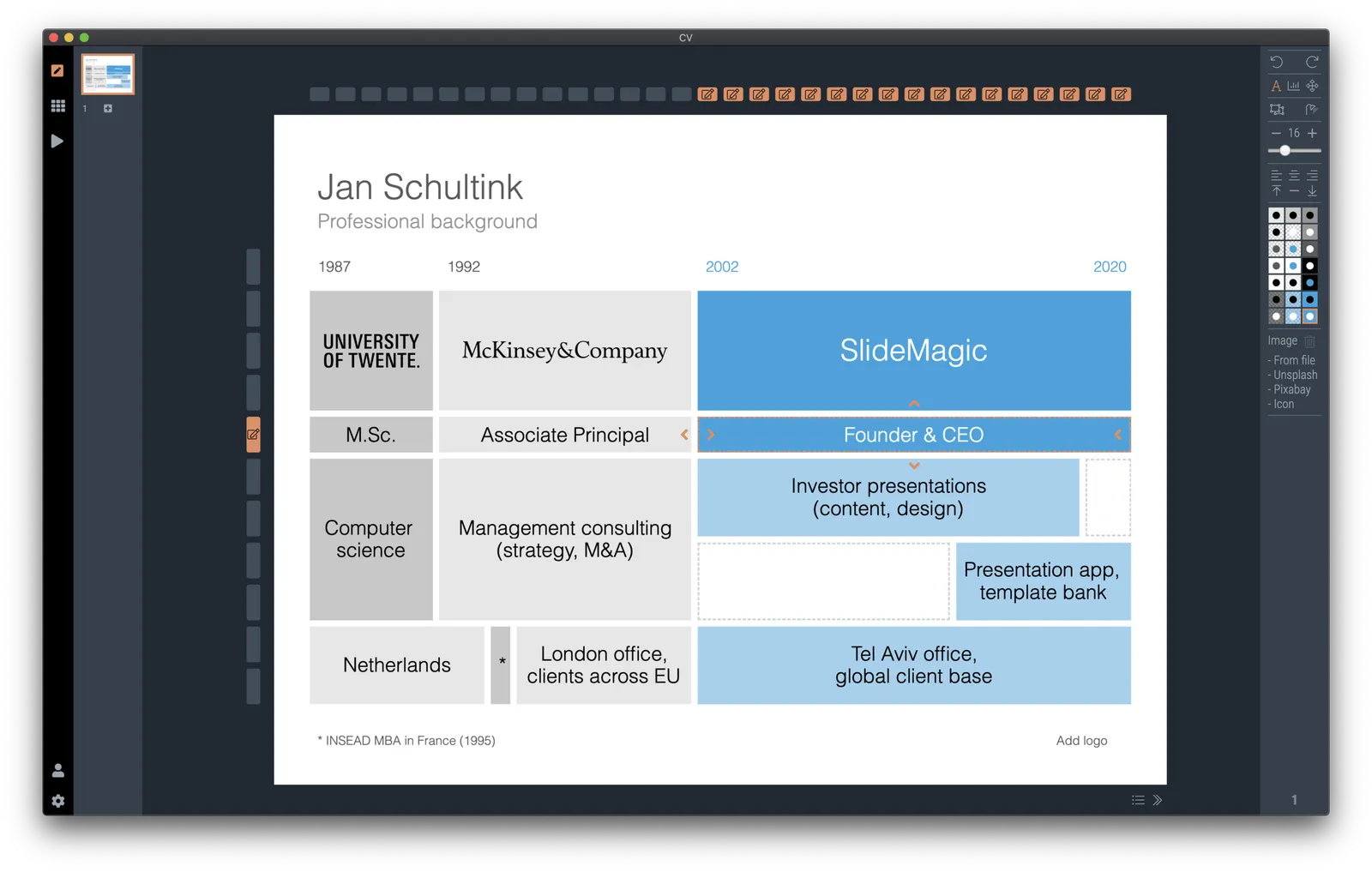
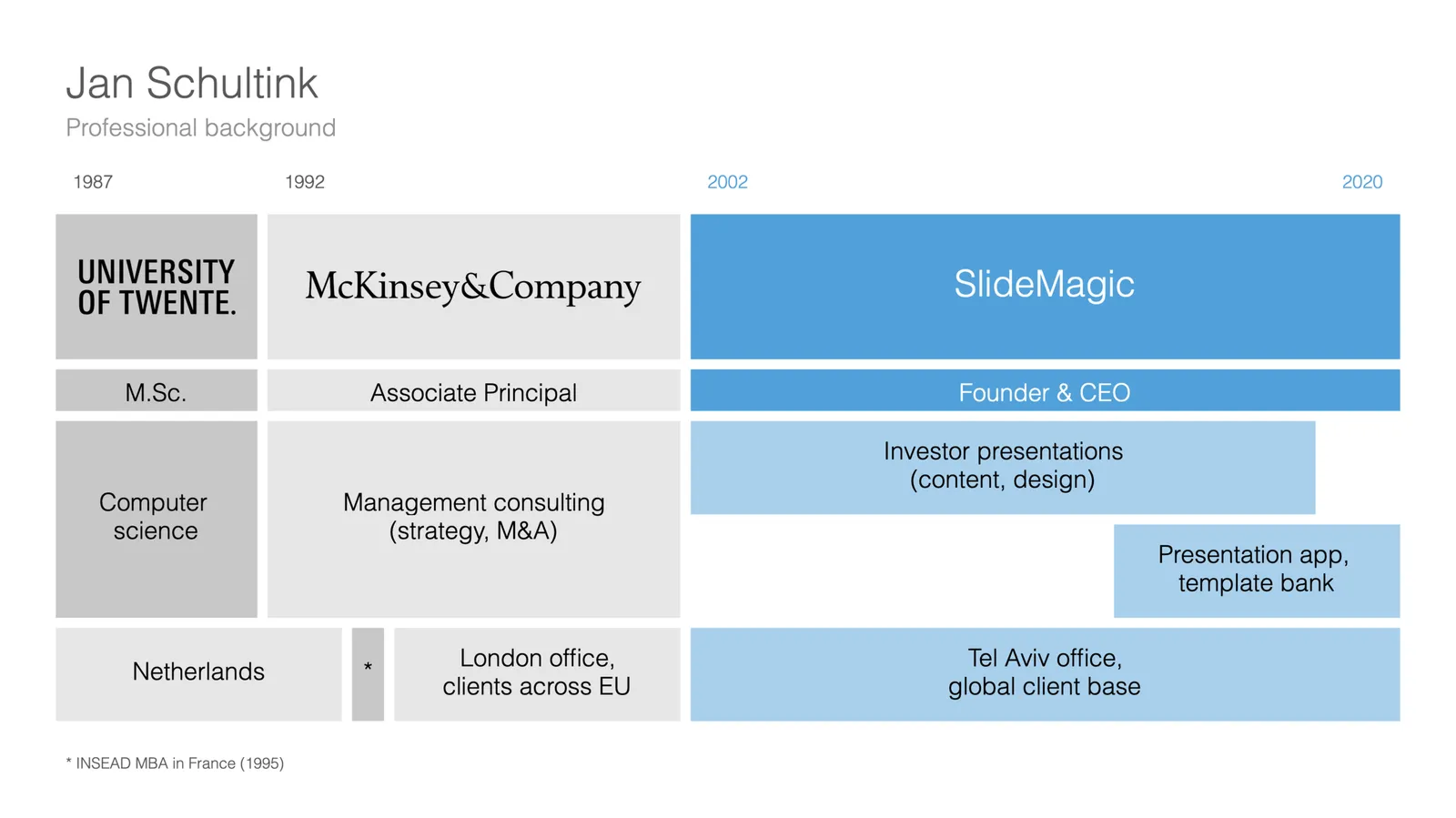
I am starting to work on a standard slide deck to present your CV, with me as the test subject. The first page is done. I like these type of time lines, because they communicate a lot of the basics about a person (years, employment, locations, education, etc.) in one slide, without making it too crowded. The rest of the presentation will cover more background.

They way to set the slide up is to start with a fine grid, create the major divisions based on your professional work history, then start refining. Notice how I left the consulting-style table labels (‘Employer’, ‘Role’, ‘Location’, etc.) out because it is very obvious from the chart what the rows mean, and these labels would take valuable space/destroy the balance of the layout.

In general, I think 4x3 slides look better than 16x9 ones. 16x9 is made for movies, 4x3 has a more pleasing balance for graphic design. These type of timelines are an exception though, the amount of left-to-right information makes the 16x9 format very useful. SlideMagic switches back and forth at the press of a button.

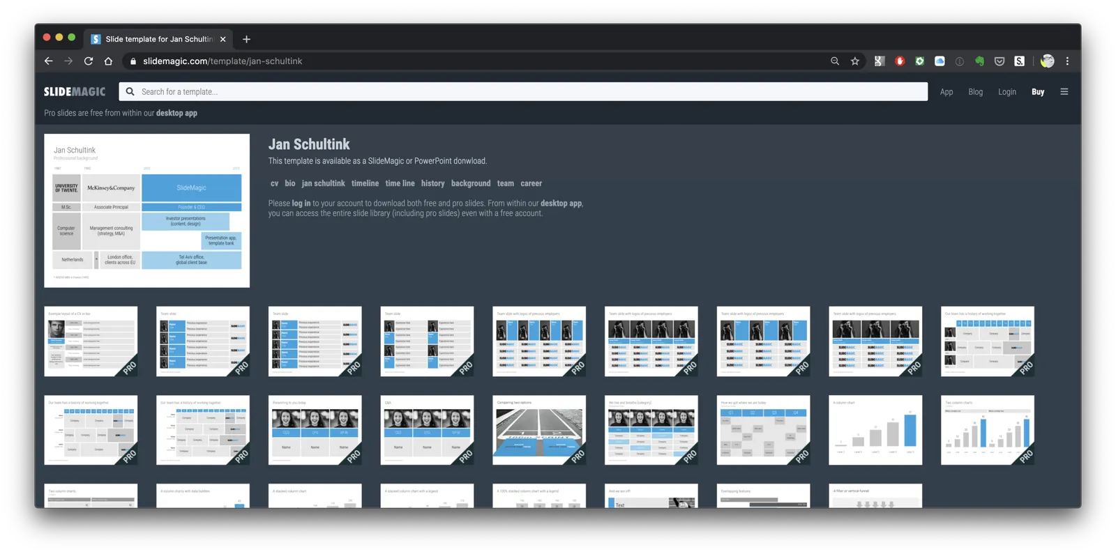
You can find the slide here in the template store, or simply search for “CV” in the desktop app.

You see how the search algorithm recommends other slides for highlighting career backgrounds and teams.

There is more work coming up on the CV slide deck, stay tuned.

·Layout

New slide templates

A busy day today: i completed a 2nd submission for the PowerPoint plug in, hopefully ticking all the boxes (well, except one that is actually an issue with the Microsoft Javascript API). Let’s hope for the best.

So no long-read, deep blog post today, still I found a few minutes to upload some new slides into the database. Soon, I want to get 1,000 layouts in the database, and we are making good progress towards to that goal.

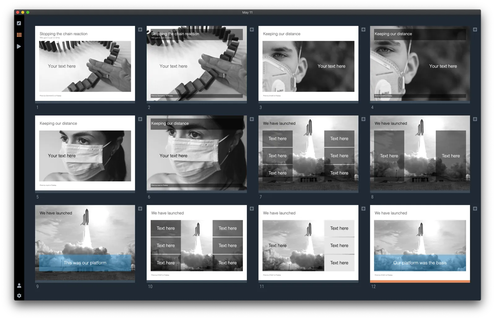
Here are today’s additions. Remember that you can bring the colour of the images back once you download them into the desktop app.

Image by 272447 from Pixabay

·Concepts

COVID-19 exit strategy in slides

Uri Alon and other researchers at the Weizman Institute just south of Tel Aviv here in Israel have been working on an innovative idea for a COVID-19 exit strategy: intermittent working: let people work 4 days, and go into isolation for 10 days. Even if someone gets infected on day 1 of the work shift, the person will only become infectious during the isolation time, after which symptoms will appear. In that way, the economy can get going, while the infection rate of the virus will come down.

I think the idea is great, but I cannot see it adopted at a country level by politicians. For a specific sector (education?), or a specific company (a retailer with lots of client-facing staff), it could get adopted. Another (maybe even likely) application is to combat a likely second wave of the virus towards the winter. Rather than slamming the full brakes on the economy, go for the intermittent approach.

Communication of this idea is hard though. The researchers started with their scientific paper. Lots of graphs and analysis that shows the statistical impact of their research, including all kind of variables such as the percentage of people that actually stick to the rules. Next up is a video that explains the concept in a much more intuitive way.

I am constantly looking for new charts to the SlideMagic template database, and made a few simple charts that communicate this idea. All of this is done in the spirit of SlideMagic: very simple charts that are really quick to put together. Nothing fancy, but looking decent and doing the job of getting your message across.

Continue reading →
·Images

Unlimited access to Unsplash images

SlideMagic was approved by Unsplash for full access to the API, no more hourly rate limits for searching images. Thank you!

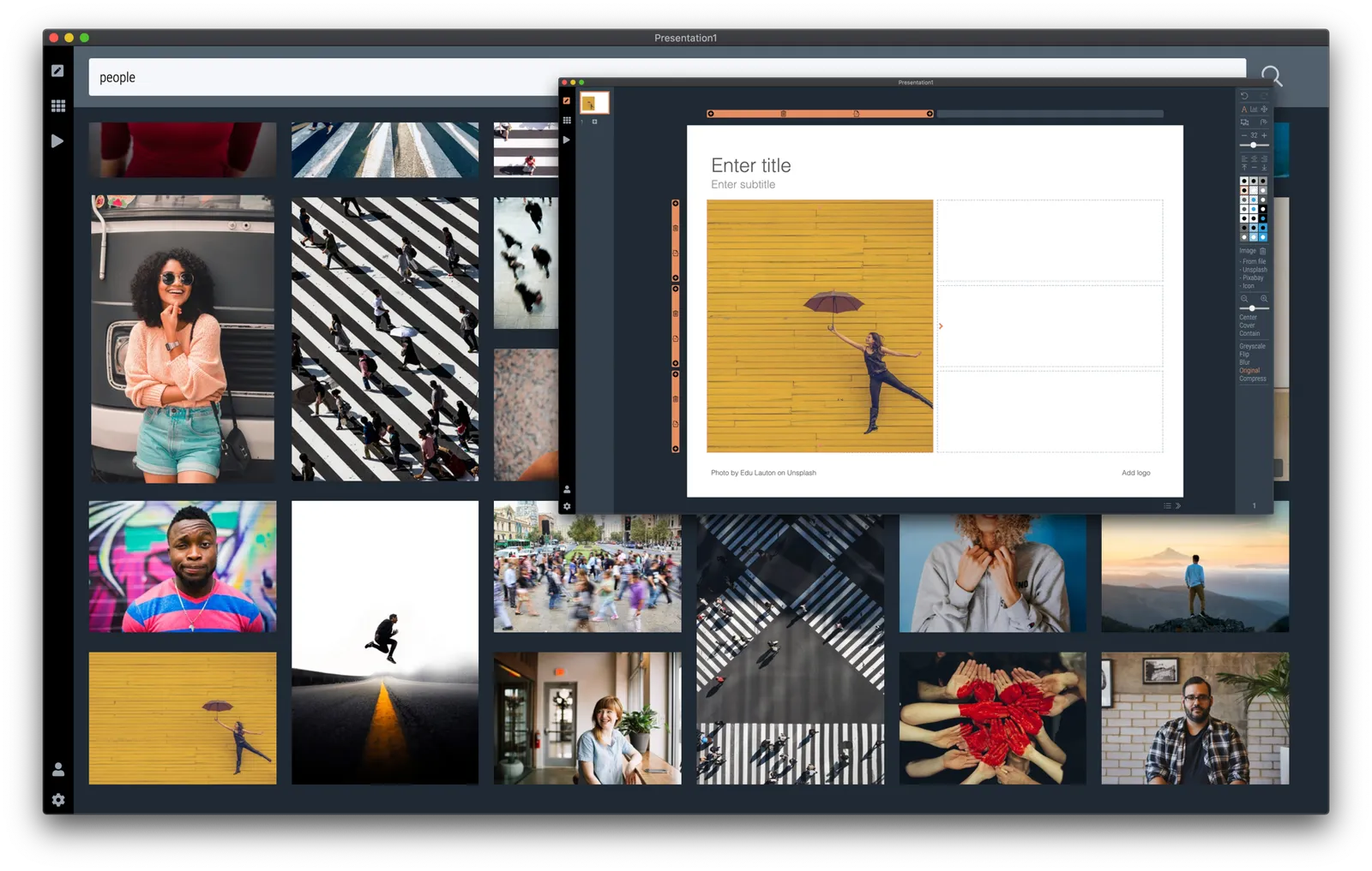
Version 2.3.9 of the SlideMagic desktop app also offers a more minimalist image search interface. The selected image gets put straight into your slide, in a proper grid so that it always lines up with the other elements on the page. In the app you can zoom in or out, and move the image (inside its container). The image credit also gets placed in the footnote of the slide (not required by Unsplash as it is a remixed image, but still nice to the photographer, the main obstacle for crediting images I think is not that people don’t want to, but it is a hassle to find the details and put them in your designs).

Hitting an empty search returns a set of random images (because I could :-)).

The video call is the new call

Some positive culture changes in this time of remote working, from my own experience, and observing my venture capitalist wife:

  • Calls that were, well, just calls, are now almost all video calls
  • Things start on time, on the dot (Germany-style)
  • Small talk formalities are shorter, but much more effective with the video picture present
  • Investors can size up the management team of a startup earlier in the process
  • Body language makes it easier to adjust the flow of the presentation (in cases of boredom, confusion, and/or excitement and interest)

Photo by Thomas William on Unsplash

·PowerPoint

PowerPoint plug in update

An update on the development of the SlideMagic PowerPoint plugin. One of the main reasons my first submission to Microsoft was rejected is that the current version of the plugin does not run on PowerPoint 2013 and the Windows 7 operating system, largely because I pretty much ignored Internet Explorer as a browser option. Microsoft itself does not really support Windows 7 anymore. The other problem is that it is actually hard to debug a plugin for Office 2013, I tried actually buying a copy, but you cannot get it anymore… On top of that, it turns that you cannot run multiple versions of Office on one computer. The strange situation is now that in order to develop add-ins for the latest versions of Office, you actually need to do that on a super old machine. If there is anyone reading this who can help, please reach out.

But OK, challenge accepted. I will begin to ‘dumb down’ the server response to calls from within Office applications. I can test the rendering of the screens in Internet Explorer 11 (just installed it), and have to hope that rest works in Office 2013 without testing. Hopefully the second submission will get accepted.

The current version still works but requires some level of computers skills and courage to get it to work.

Image by Masaru Kamikura

·SlideMagic

App features in a row

I created a few new images to show the features of the SlideMagic presentation app. I am started to feel very good about where SlideMagic is going. This post is a bit like a 1980s Dutch consumer product commercial where “We, people of [product] recommend… [product]. I, the developer of SlideMagic recommend…. SlideMagic.

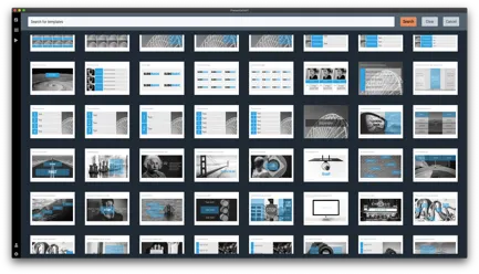
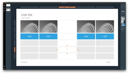
 Search templates directly inside the app. Currently, the app gives free access to all slide templates in the SlideMagic database

Search templates directly inside the app. Currently, the app gives free access to all slide templates in the SlideMagic database

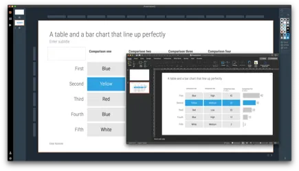
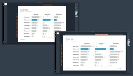
 Instant PowerPoint conversion

Instant PowerPoint conversion

 Integrated online image search

Integrated online image search

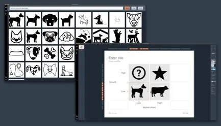
 Integrated online icon search

Integrated online icon search

 Patented user interface keeps everything lined up

Patented user interface keeps everything lined up

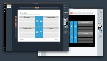
 Dark/light background colour switching

Dark/light background colour switching

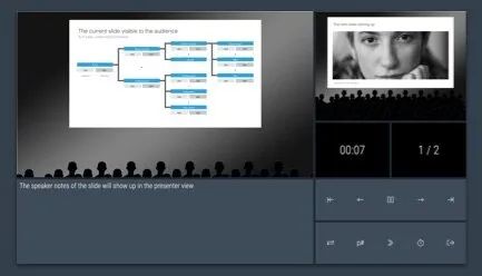
 Collapsable slide explanation panel when you cannot present in person

Collapsable slide explanation panel when you cannot present in person

 Dual monitor support

Dual monitor support

 Distortion-free aspect ratio conversion

Distortion-free aspect ratio conversion

Photo by Yunming Wang on Unsplash

SlideMagic is a desktop app, and it isn't

“What, you are making a desktop app in 2020? Well, we (the U.S.) have moved totally into the cloud now, everyone is using Google Docs to collaborate. Maybe people in less developed countries might find your product interesting if it is offered at a low price (i.e., people who cannot afford Google Docs and/or are using pirated copies of PowerPoint. Your next challenge is to make your product available in non-English languages and get sales distribution in these markets (do you need some contacts?).”

OK.

I now start to feel first hand what entrepreneurs go through when talking to others (especially investors) with their product. I am not raising money at the moment, but here is a possible way of answering a question like this.

  • On the one hand SlideMagic is a desktop app, on purpose. Presentation design requires a super snappy interface, and deep access to the operating system (dragging things between 2 files open in a window for example).
  • On the other hand, SlideMagic is not a real desktop app. It is written in HTML and Javascript and runs on Google Chromium, the current web development setup, and the app is updated very frequently in the background (sometimes daily).
  • SlideMagic focuses on 1 (huge) issue in presentations: story clarity and design, not online collaboration, not enterprise security, not cloud file storage, not data analysis, not stunning animations, not knowledge storage and search, not intra-employee information sharing. All these are important issues that have great software products built for them, by billion dollar companies.
  • SlideMagic’s economic setup allows it to do this: a super lean cost base, and a former strategy consultant, presentation designer, computer scientist brain combined in one head to try and get product-market fit for what no one has managed to do: get people to make better presentations. Millions of dollars of VC money, huge teams of people with the objective of dethroning Microsoft or Google is not what were are doing here. SlideMagic needs very little to turn profitable, SlideMagic can afford to take its time with product iterations to get there. Only when the formula catches on, investing is growth is on the agenda.
Continue reading →

Warren Buffett's investor presentation slides

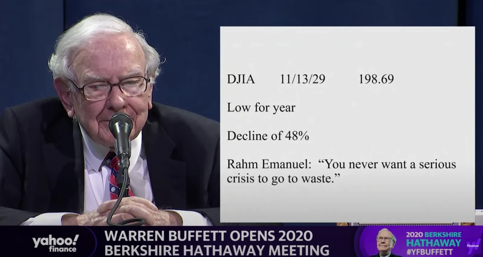
This tweet flew by about Warren Buffett’s slides during his annual investor meeting.

A sans serif font and centering the text would have made it look better, but overall, this slide is actually not that bad. One big message without distractions. (If Warren had used SlideMagic with this template, his slide would have looked like this)

Other slides are less crisp though, as seen in the example below:

But, Warren does not read out the bullet points, he tells a story starting with background about his father. People will read the slide for 2 seconds, wonder about the quote, and then focus all attention back on him.

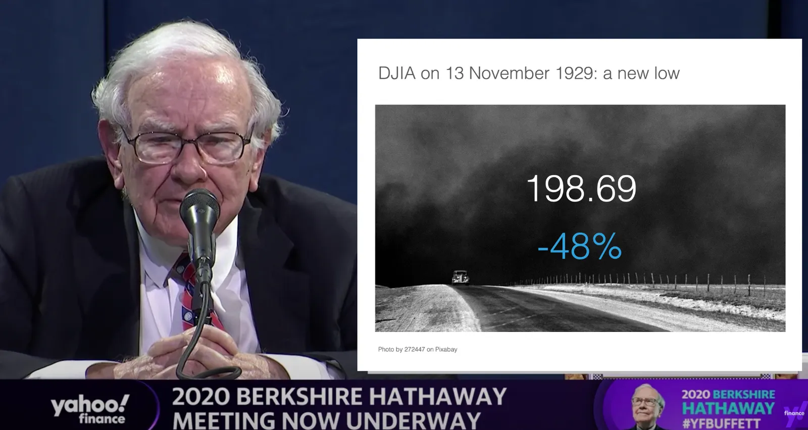
OK, I could not resist, SlideMagic would have produced the following slide (a quick search for “1930” in the built-in Pixabay image search delivers good results)

I would put the quote on a completely separate slide, if at all.

Coming back to the first tweet. If you are Warren Buffett, then you get away with pretty much any slide design. On the contrary, making it all too fancy is a direct contradiction to his modest life style. If you are not Warren Buffett, putting in 2 seconds worth of effort with SlideMagic will definitely make a difference.

I tagged these 2 slide examples with “buffet” in SlideMagic, you can use them in your own designs and find them in the presentation app, or download them here.