SlideMagic Blog

Frequent updates about all things presentations since 2008. Subscribe to never miss a post.

RSS

Working from home and the problem of coaching

The big Working From Home (WFH) experiment has shown us over the past months that many industry sectors can function perfectly well in the absence of offices. And not only introverts discovered the benefits of not having to go through the commute/dress-up ritual of daily office life.

One thing will fall through the cracks though: coaching of junior people. Our education system produces people that can pass tests, not run companies. New recruits need to look over the shoulder of more experienced people to see how things are done.

When it comes to presentations, anyone can teach herself how to design slides using online resources (and useful tools such as SlideMagic). Learning how to pitch, making a convincing argument, sensing the feel in a room, these are all things that come with experience.

The emerging profession of the highly skilled, highly paid, independent freelancer (I was one of those for more than a decade), consists mainly of people who learned how to do things in a regular company setting, and then broke free. Doing this straight out of school is not possible for most people. You lack the skills, and the credibility to become a service provider.

A good example might be my venture into coding apps. I really understand the target market and the need, the Internet and a 1992 engineering degree taught me how to code, and the result is a usable software product. While I probably could run SlideMagic as it gets bigger, I might not be the person who can run a 200 person strong software engineering team, since I have never been one of these 200 programmers in the trenches working together to manage a very large system.

Continue reading →

V2.3.11 - Improved story view drag and drop

Version 2.3.11 of SlideMagic just went up and should install automatically (if not you can force a download here). The main updates are to dragging and dropping in story view, that now includes a small animation before you drop a slide into place.

Blunt dragging and dropping can be disorienting as your computer re-renders the story view and you are wondering what just happened. No longer with this small animation. I have experimented with many Javascript libraries to include this effect before, none of them really worked well for my unusual situation: complex slides instead of straightforward images. In the end, I wrote the thing myself and control every aspect of it.

Photo by David Monje on Unsplash

Making a presentation when you know you will not even use it

In many cases, a face-to-face informal (video) meeting is more effective than a formal presentation of slides where you drag your prospective investor or customers through page after page of information.

But just going in for a chat with no clear plan what you are going to say does not work either. You cannot wing a sales or investor pitch. Here you are start missing your slides. A poor use of slides is using them merely as a reminder what topic you are going to address next right at the moment when you are talking. “Ah, yes, of course, the market size, well here we have some interesting stats that show the phenomenal growth of online video and social media…”.

A good use of a presentation is to let the slides make you think about your story (days or even weeks) before the presentation. How to sequence your points, how to explain the technology, how to address the white elephant in the room (and other tricky questions).

Once you are done designing your slides, you are also prepared for the meeting (with, or without the actual slides). The presentation was an excuse to organise your thoughts.

(Product plug: in the SlideMagic desktop app you can make presentations very quickly with lots of templates available and less design details to worry about, it might fit right in for this purpose).

Photo by Faris Mohammed on Unsplash

How to make an agenda presentation slide

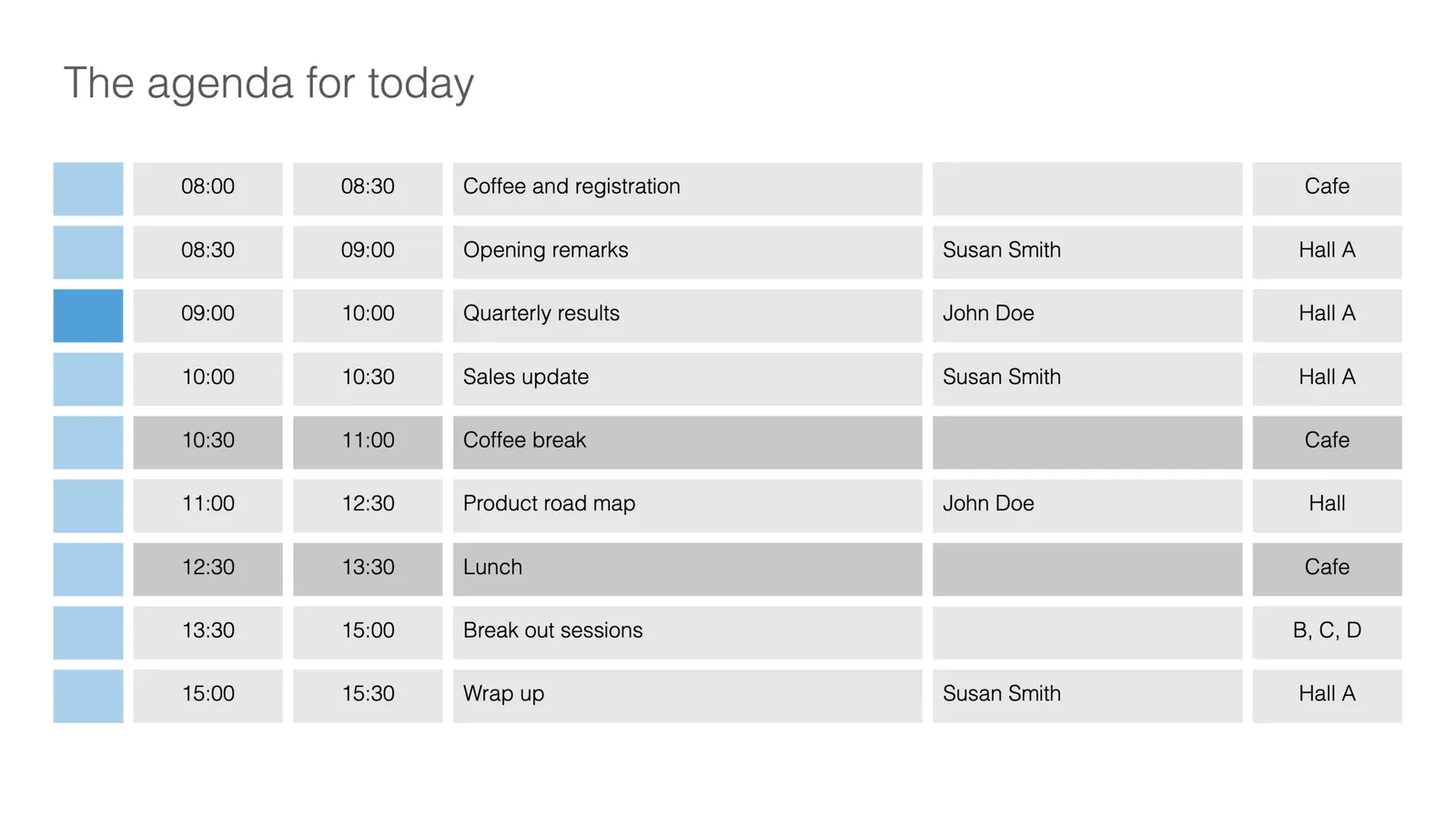
I just added a few more slides to the SlideMagic template database. This time an agenda slide that comes in a number of variants.

Agenda slides are very easy, and very tricky at the same time. Easy, because, well, it is a simple table that does not seem to require any eye for design and/or sophisticated graphics. But, in most design applications getting those boxes to line up properly is an absolute pain. And, agendas change all the time, right up to 5 minutes before the kick off. So you finally got your layout of boxes, when the request comes in to add another line…

This is where SlideMagic shines. The new agenda slide is here, or check out a generic search for agenda slides.

This slide variant is a slightly busy one, with all the information about times, topics, speakers, and locations. Still, I think it can work, people need to know these things in a conference. The SlideMagic library contains other, more minimalist, slides that are better suited as tracker pages to separate sections of a slide deck.

As an introduction offer, access to all slides is free from within the desktop app. Pro users can download or convert to PowerPoint slides. If you are interested in working with these type of layouts and save time, but your colleagues are not (yet) you can quickly make your slides in SlideMagic, and export the slides in order to copy-paste them into a traditional PowerPoint file.

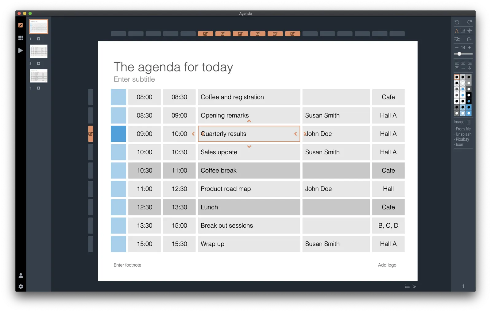
 It is easy to make adjustments to an agenda slide in SlideMagic: simply add or remove rows or columns, and the entire grid lines up properly

Continue reading →
·Layout

Quora answer to "How to design a good presentation slide for business?"

Someone requested me to answer: “How do I design a good presentation slide for business?” Here is what I suggested:

This is a very generic question that is hard to answer without the specifics of the point you want to get across. Having said that:

There are many web sites, blogs, and books out there that advocate the principles of good slide design: minimal use of bullet points, use images, no clip art, use graphs, use white space, etc. etc. Everyone can spot a poor slide vs a good slide. The tricky bit is how - as an “amateur designer” - to make a (reasonably) good looking slide that still captures everything I want to say.

Some guidelines:

Find a basic look that seems to work, you can “borrow” from Apple, or other presentation styles that you think look decent and stick to fonts and generic slide layout rules. Personally, I like the style that Swiss graphics designers used in the 1960s a lot: Helvetica font, with a few simple colours. Very easy to copy to today’s presentation software.

Write the headline of what it is that you want to get across. Important: it can only be one message, not 2, not 3, just one key point that the audience should remember. If your whole slide fails, you (and your audience) still have that title to hang on to

Now, think about what you actually need to show to make that point. Here is where people lose it. They addd info, details, data, graphs, that do not contribute or support the headline at all. In that whole spreadsheet, there could be 2 numbers that you need. Be religious about this: you want to make a point, what visual do you need to support it. If you want to make other points, put them in other slides.

Consider more ways to express an idea than words. Use very simple graphics to simplify text. If there is a choice: put 2 boxes with the options with a double sided arrow in the middle. If there is a consequence, but 2 boxes with a single sided arrow. If there is an overlap of interests, use 2 overlapping circles. I would call this “visual verbs”: very simple shapes that instantly communicate what you want to say.

(Product plug: I am developing a software tool that supports some of this, you can check out SlideMagic, which has a free option, to find slide layout to get you started).

Good luck!

Continue reading →
·SlideMagic

How to make a CV slide

I am starting to work on a standard slide deck to present your CV, with me as the test subject. The first page is done. I like these type of time lines, because they communicate a lot of the basics about a person (years, employment, locations, education, etc.) in one slide, without making it too crowded. The rest of the presentation will cover more background.

They way to set the slide up is to start with a fine grid, create the major divisions based on your professional work history, then start refining. Notice how I left the consulting-style table labels (‘Employer’, ‘Role’, ‘Location’, etc.) out because it is very obvious from the chart what the rows mean, and these labels would take valuable space/destroy the balance of the layout.

In general, I think 4x3 slides look better than 16x9 ones. 16x9 is made for movies, 4x3 has a more pleasing balance for graphic design. These type of timelines are an exception though, the amount of left-to-right information makes the 16x9 format very useful. SlideMagic switches back and forth at the press of a button.

You can find the slide here in the template store, or simply search for “CV” in the desktop app.

You see how the search algorithm recommends other slides for highlighting career backgrounds and teams.

There is more work coming up on the CV slide deck, stay tuned.

·Layout

New slide templates

A busy day today: i completed a 2nd submission for the PowerPoint plug in, hopefully ticking all the boxes (well, except one that is actually an issue with the Microsoft Javascript API). Let’s hope for the best.

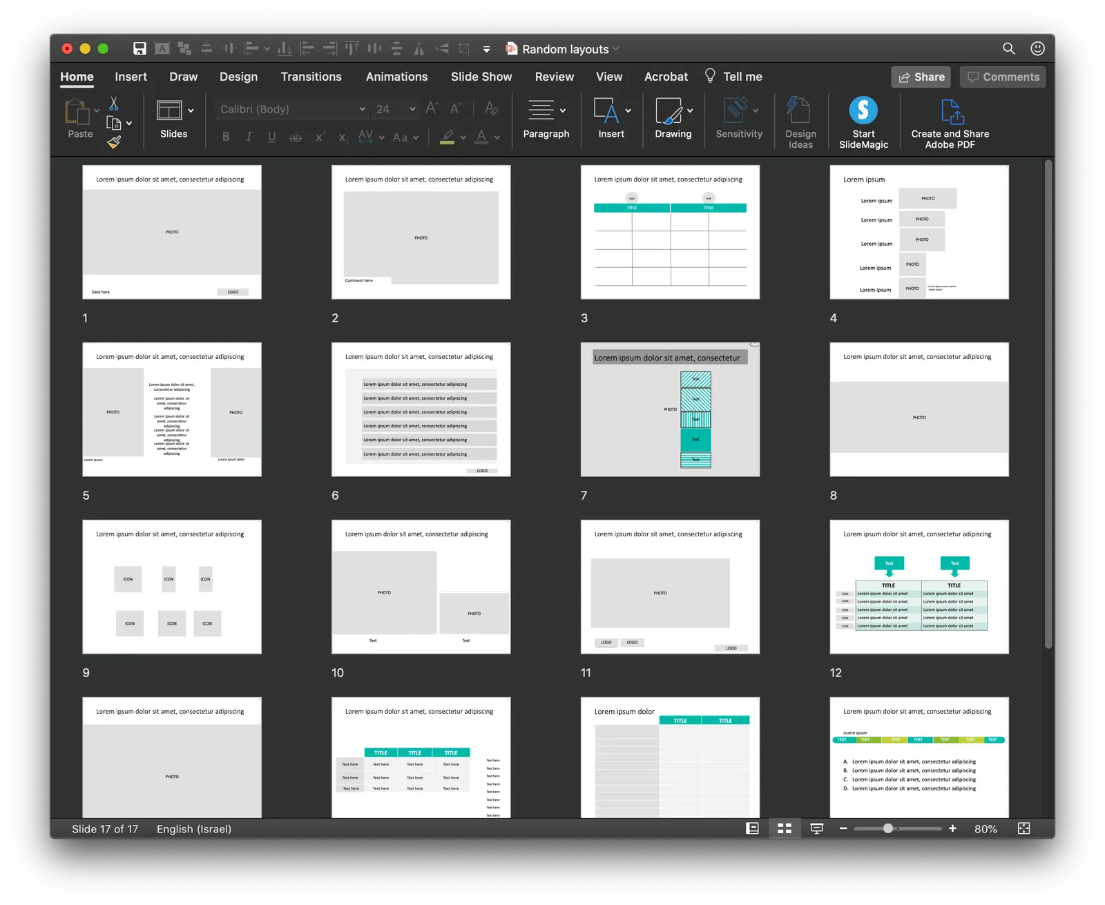
So no long-read, deep blog post today, still I found a few minutes to upload some new slides into the database. Soon, I want to get 1,000 layouts in the database, and we are making good progress towards to that goal.

Here are today’s additions. Remember that you can bring the colour of the images back once you download them into the desktop app.

Image by 272447 from Pixabay

·Concepts

COVID-19 exit strategy in slides

Uri Alon and other researchers at the Weizman Institute just south of Tel Aviv here in Israel have been working on an innovative idea for a COVID-19 exit strategy: intermittent working: let people work 4 days, and go into isolation for 10 days. Even if someone gets infected on day 1 of the work shift, the person will only become infectious during the isolation time, after which symptoms will appear. In that way, the economy can get going, while the infection rate of the virus will come down.

I think the idea is great, but I cannot see it adopted at a country level by politicians. For a specific sector (education?), or a specific company (a retailer with lots of client-facing staff), it could get adopted. Another (maybe even likely) application is to combat a likely second wave of the virus towards the winter. Rather than slamming the full brakes on the economy, go for the intermittent approach.

Communication of this idea is hard though. The researchers started with their scientific paper. Lots of graphs and analysis that shows the statistical impact of their research, including all kind of variables such as the percentage of people that actually stick to the rules. Next up is a video that explains the concept in a much more intuitive way.

I am constantly looking for new charts to the SlideMagic template database, and made a few simple charts that communicate this idea. All of this is done in the spirit of SlideMagic: very simple charts that are really quick to put together. Nothing fancy, but looking decent and doing the job of getting your message across.

Continue reading →
·Images

Unlimited access to Unsplash images

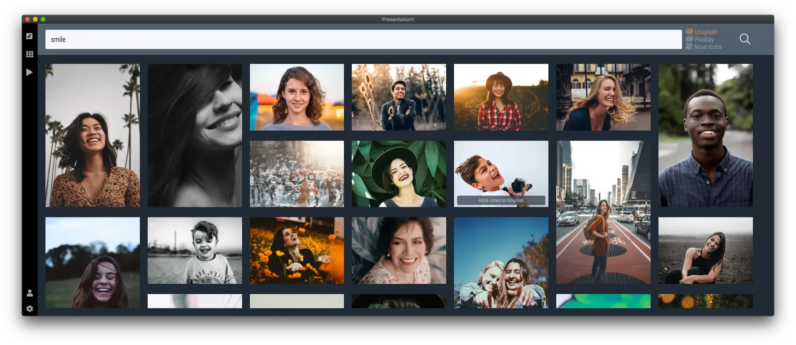
SlideMagic was approved by Unsplash for full access to the API, no more hourly rate limits for searching images. Thank you!

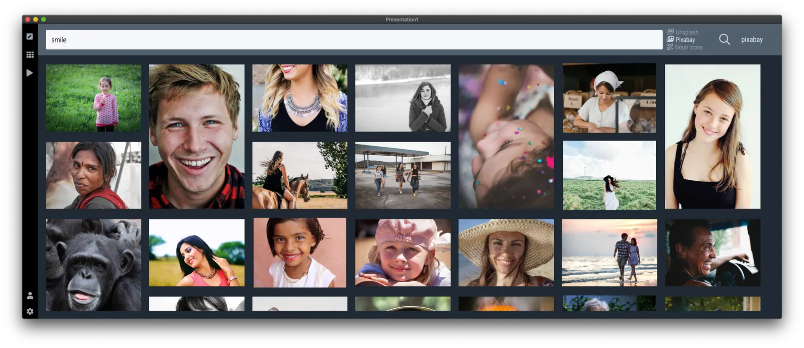
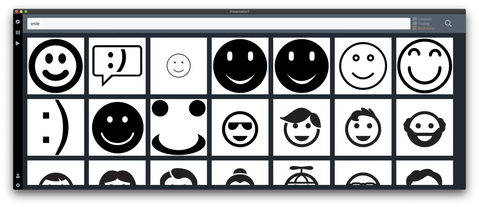
Version 2.3.9 of the SlideMagic desktop app also offers a more minimalist image search interface. The selected image gets put straight into your slide, in a proper grid so that it always lines up with the other elements on the page. In the app you can zoom in or out, and move the image (inside its container). The image credit also gets placed in the footnote of the slide (not required by Unsplash as it is a remixed image, but still nice to the photographer, the main obstacle for crediting images I think is not that people don’t want to, but it is a hassle to find the details and put them in your designs).

Hitting an empty search returns a set of random images (because I could :-)).

The video call is the new call

Some positive culture changes in this time of remote working, from my own experience, and observing my venture capitalist wife:

  • Calls that were, well, just calls, are now almost all video calls
  • Things start on time, on the dot (Germany-style)
  • Small talk formalities are shorter, but much more effective with the video picture present
  • Investors can size up the management team of a startup earlier in the process
  • Body language makes it easier to adjust the flow of the presentation (in cases of boredom, confusion, and/or excitement and interest)

Photo by Thomas William on Unsplash