SlideMagic Blog

Frequent updates about all things presentations since 2008. Subscribe to never miss a post.

RSS
·SlideMagic

V2.2.9

A new version of the SlideMagic app is now available for download with very detailed improvements to how the app responds to clicks. These are not earth shattering new features, but are incredibly important to make the app workflow even better. You can visit the download link to force a new install, otherwise, your app should update in the background.

UPDATE: Make that 2.3.0, now with direct full access to the entire slide database from within the app. (PowerPoint conversion and downloads require a pro subscriptions)

Photo by Harpal Singh on Unsplash

·Templates

Startup Board update deck

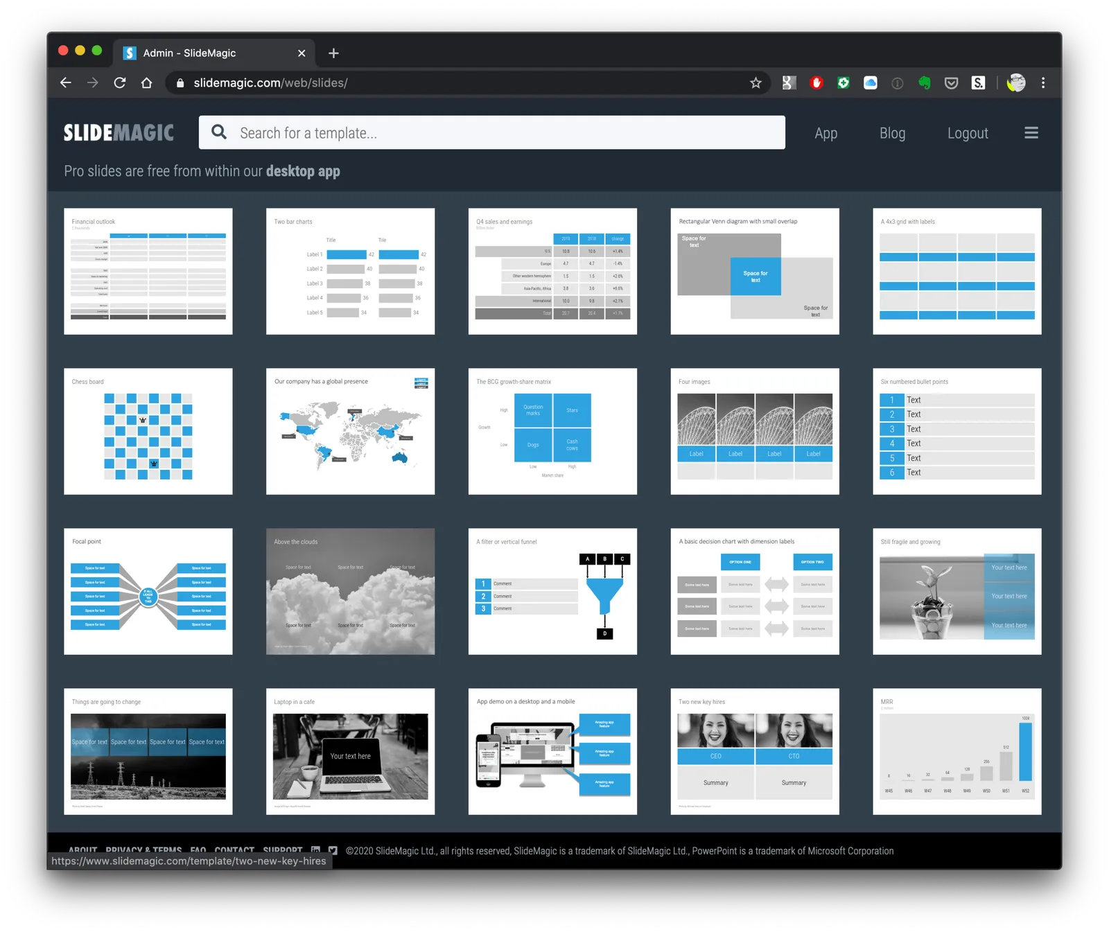
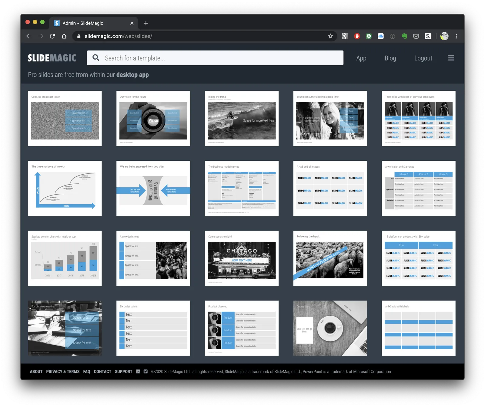
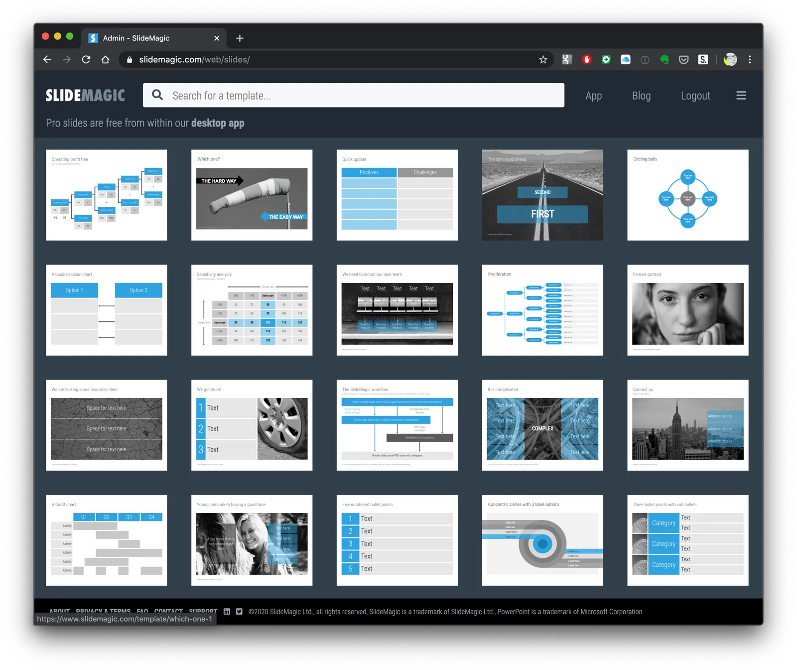
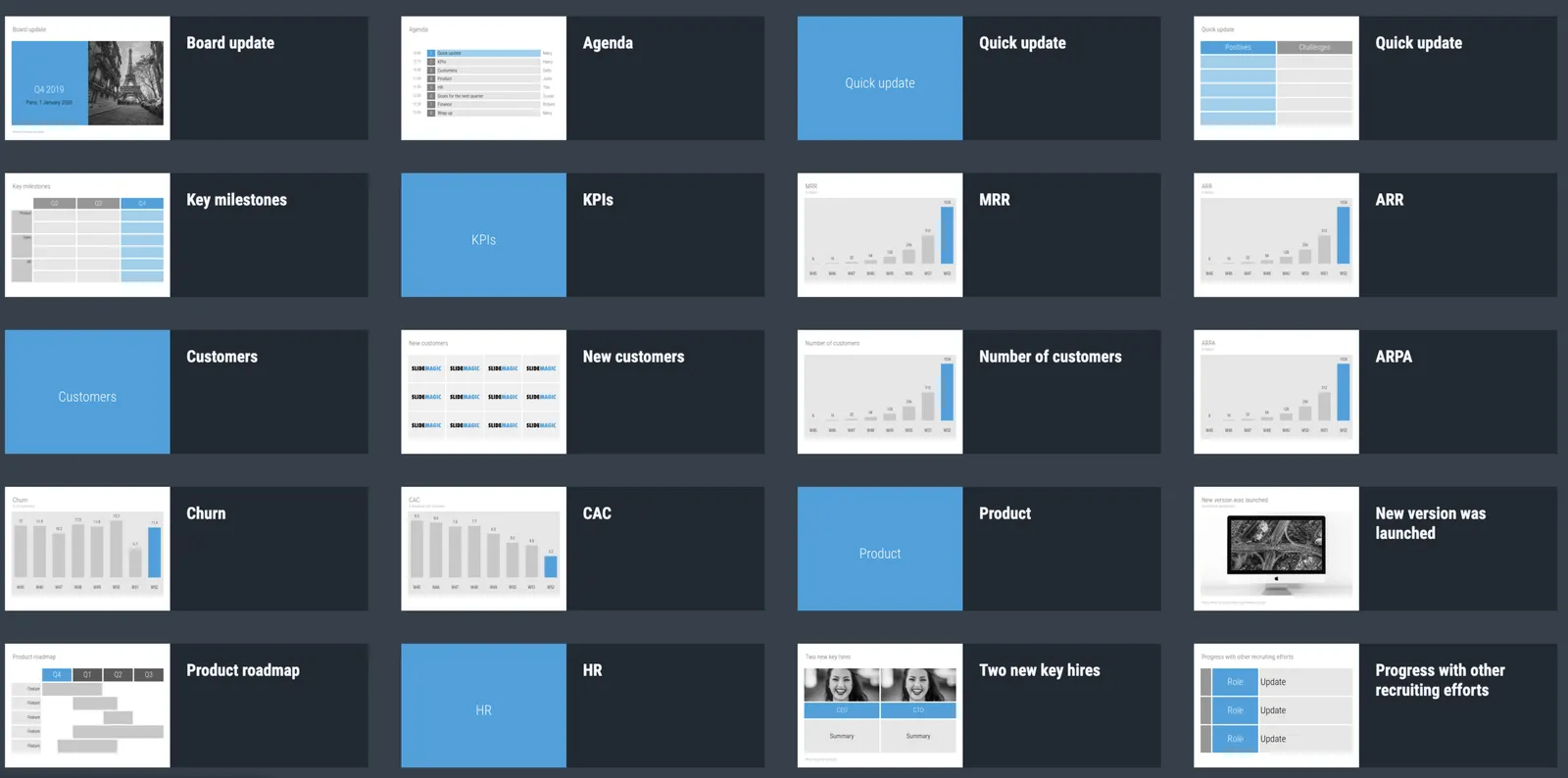
You can now access entire slide decks (“stories”) from the home page of SlideMagic. A few days ago I added a slide deck template for a startup Board update. As I upload the new slide decks, individual slides will get added with the right tags to the slide database as well so they will pop up when you search for relevant layouts.

More slide decks to follow. Let me know if you have any special requests.

Squeeze

Here is a sign that says “elevator 6” down in the parking lot of the building I live in. The designer took the functional approach: squeezing the words “elevator”, “6”, and an icon for an elevator and an arrow all in one line. That resulting graphic had an aspect ratio that did not match the sign. Solution: stretching and distorting the text so that now, it does fit all the available space.

Other solutions:

  • Use a sign with a longer aspect ratio
  • Leave white space above and below the text
  • Leave out information that is not required: the word “elevator” is not needed when you put a logo, the arrow does not add much if the sign is straight next to it.

·Delivery

Why does Merkel's explanation work?

Why does Merkel’s explanation of the virus “R0” (basic reproduction number) work so well?

She makes abstract mathematical concepts very tangible. Instead of talking about R0 being 1.0 or 1.2 and the resulting number of patients, she explains:

  • If that ratio is 1, it means that every patient infects one other, hospitals are full in October
  • If that ratio is 1.2, it means that out of 5 patients, 4 infect another one each, and one infects another 2, we are out of beds in July

No graphs needed.

·Investor presentation

Corporate earnings call deck

I am in the process of adding more full slide decks to SlideMagic. Now all the investment in automation starts to pay off. Creating slides is incredibly fast in the app, after that the server takes over and creates thumb nails, organises tags, uploads both individual slides as well as the full deck for download, in powerpoint 4x3, 16x9, and of course .magic format.

Today, I added a possible layout for a big corporate quarterly earnings call deck, loosely based on a recent earnings presentation of a large pharmaceutical company (these presentations are obviously in the public domain).

SlideMagic subscribers can download the earnings call presentation template here.

Let me know what other type of slide decks you are looking for.

·Investor presentation

The asterisk

I am preparing a few more stories to add to SlideMagic, one of which will be a sanitised box-standard quarterly earnings presentation template for a typical manufacturing company. Just stumbling on this tracker page. It probably started out good, but then the legal department got involved and put in all the disclaimers… “36 consecutive years of growth” sounds a bit better… I would have put that in the slide, and then clarified the “adjusted earnings” part all in the foot note.

36 consecutive years of adjusted operational earnings growth*****

·SlideMagic

Testing the first SlideMagic stories

I reshuffled the code on the server, so I can now stitch entire decks (I call them “stories”) together that you can download in one go. I think these stories can complement the offering of individual slides.

  • Slide templates are focussed on one particular design or image that cover a certain topic
  • Story templates are all about well, the story. I expect them to contain mainly very simple slide layouts, what matters is what is written in them, and in what sequence they are put together.

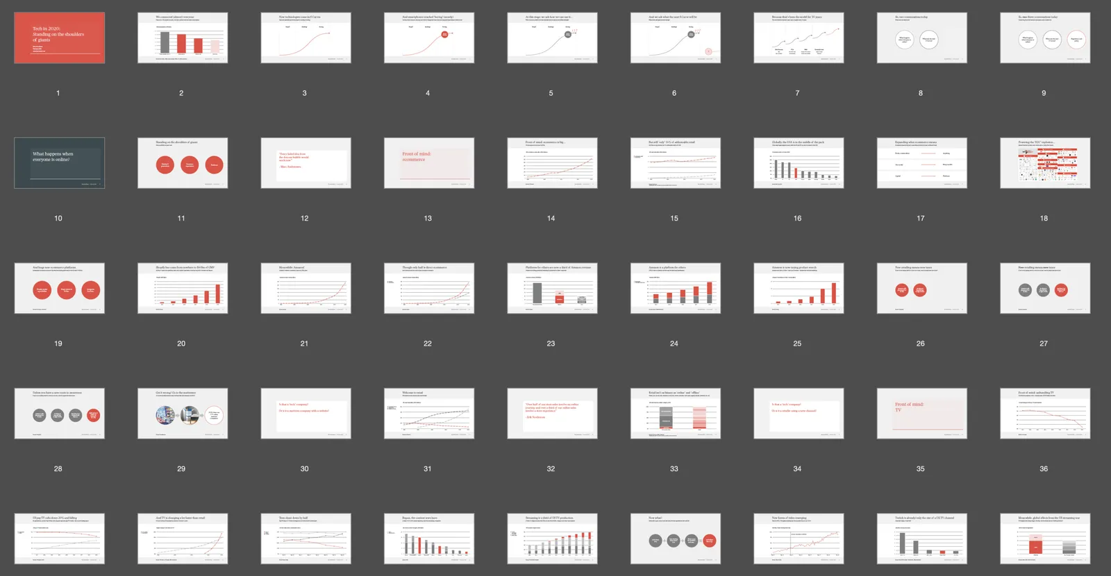
I am starting with a quick make-over of the YCombinator seed deck,you can download it for free here. See the original post on YC for the background.

It is available both as a .pptx and a .magic file, but it with these simple slide layouts where the power of SlideMagic comes in: quickly adding or deleting rows without messing up your slide layout. You know which I would pick :-)

There is still work to do, you can’t get to the stories easily from the top slide menu. Also, the user interface can be confusing now when as a user you are not sure whether you are browsing slides or stories. Also, in-app story downloads are not your implemented . Work in progress.

Pop out of the box

The NYT used this pop out technique as a data visualisation tool on the front page. The NY virus casualties literally spike outside the graph, even over the newspaper’s logo.

Similar to a graph about unemployment benefits from last week. You could use something like this in your presentations as well.

I have a few slides on SlideMagic (example here) that use this pop out effect. They are PowerPoint-only though, since the style police of the SlideMagic app protects you against yourself breaking the rules of good graphics design. In 99% of the cases, that is a good thing, this is an example of the other 1%.

·SlideMagic

Stories coming next

I am using the current quiet to beef up the usefulness of SlideMagic. Next up are stories, bundles of slides with a coherent story that stitches them all together: startup pitches, board updates, budget plans, CVs, strategy reviews, etc.

The slide decks are easy for me to create, I need to solve a technical and a design challenge:

  • Technical: the whole SlideMagic architecture is based on individual slides, I need to start linking them together to stories.
  • Design: I need to come up with an intuitive user interface to browse and select stories easily.

Work in progress.

Photo by Erik Brolin on Unsplash

·Story

The side track trap

Now that I am teaching my kids how to code with the help of online courses I can see where instructors take the wrong turn. By now, I mastered the material myself, and can put myself in the position of someone who is trying to understand it (I was there myself a year ago).

One mistake is a side track trap. You introduce a completely new concept, but before explaining roughly what it is about, you introduce a few exceptions or unusual use cases where you could also apply this new concept, that the presenter has not fully introduced yet).

From a logic flow perspective, this could look great: we cover all the use cases together. From a teaching perspective, this is confusing. A reference video (‘How did that work again exactly?”), is different from a 101 introduction video.

I am not sure the instructor does this intentionally. Maybe videos get edited later and she needed to find a place to insert this specific concept, “plop”, this seems like the right spot.

Notice the difference between detail and side track. If you need to go into the details to explain something, a newbie can probably follow along as long as you stick to the one specific use case of pieces of information that reinforce each other. Leaving things at a high level (i.e., no details) but lots of different tangents can still be very confusing for the newbie.

This relates to the blog post earlier this week, where I discussed answering questions with the risk of tripping up your story line.

Continue reading →