SlideMagic Blog

Frequent updates about all things presentations since 2008. Subscribe to never miss a post.

RSS
·Delivery

Appearance

Wearing a mask in times of the virus (probably) protects you somewhat from catching the virus, (probably) protects others from you. Individually, the change in odds are probably not that big, but as a society as a whole (the perspective of the government), a small change in infection rate can have an incredibly positive impact (exponential mathematics).

But there is something else, a mask has a social function

  • A mask signals that it is not rude when you don’t shake my hand
  • A mask signals that you are probably a careful person in general and therefore OK to be with (from 1.5 meters distance)
  • A mask makes others think (feel guilty) whether to do the same

The mask signals who you are.

This ‘appearance’ also applies to your presentation. You can have the perfect story line, slides with little text, clear and crisp headlines. But the look and feel of your slides says a lot about the culture of you and your company, irrespective of their content.

With SlideMagic, the look and feel is sorted.

Photo by Fran Boloni on Unsplash

·SlideMagic

URL juggling

Some readers noted that the slidemagic URL sometimes returns an error. As a result I am juggling the URLs fo the app, template store and blog once more. The slidemagic.com URL will now point to the main site and app, the newly acquired slidemagic.blog will point to the blog that I host with squarespace. The blog.slidemagic.com URL will be phased out.

I am putting redirects in place so that everything keeps on working as it should. My main focus is the 10+ year archive of blog posts. My SEO ranking might drop a bit, but this is not my main worry (yet), as I am still focussing on getting the users that are trying out the SlideMagic app to keep on using it, before ramping up marketing. SlideMagic is not a catch-convert-sell slide template business (there are thousands of those), but an attempt to find a way to change the way people make presentations, which requires some patience.

If you are interested in the details: squarespace does not really work well with subdomains (blog.slidemagic.com, instead of www.slidemagic.com), and does work well with the Cloudflare content delivery network + DDOS protection (Israel-based web sites are not always popular). Pointing a blog.slidemagic to squarespace, also means that you have to point the “naked domain” slidemagic.com to squarespace, which then clashes with my server etc.

Let’s hope it all goes back to normal soon.

Photo by Harrison Moore on Unsplash

·Investor presentation

What is the forward email?

The most effective introduction to investors is via a referral of a mutual connection. When this mutual connection is ready to put her personal credibility on the line and forward your pitch to an investor, the pitch changes. No small talk, no waffly market backgrounds, and actually, no (or very little) structure, they get straight to the point.

The forward email is likely to be something like this:

  • I know this person from ….
  • She did this in the past and delivered on all fronts
  • Here is a new idea, it is something like an X for Y
  • It looks interesting, the obvious question mark is Z, but W could be the wild card that can make the difference
  • It could fit nicely with your other investment V
  • Have a look and let me know what you think.

Maybe it is a good idea to already think about what your forward email is going to look like, before you ask someone to send it.

Photo by Matt Ridley on Unsplash

·Images

Working on improved image cropping

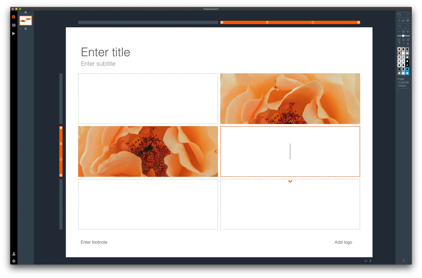
Working with images is turning out to be one of the most powerful uses of SlideMagic. The built-in image search gives access to an endless flow of great images, and the grid makes it really easy to layout these photos in a beautiful and consistent way on a slide.

Aligning images has always been difficult in presentation software (it is only worse in word processors), and that bit is solved by the SlideMagic grid. Next up is image cropping. Most design tools use some sort of overlay that allows you to mask/reveal an image. Even as a professional designer, I still struggle with this.

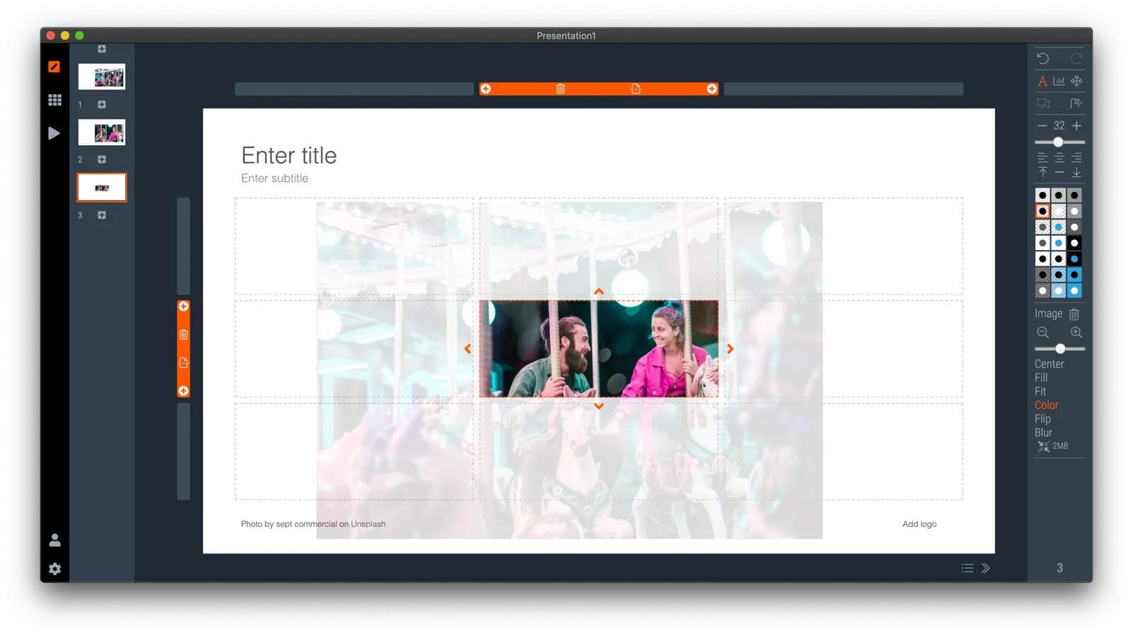
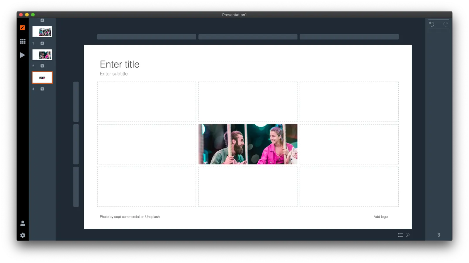
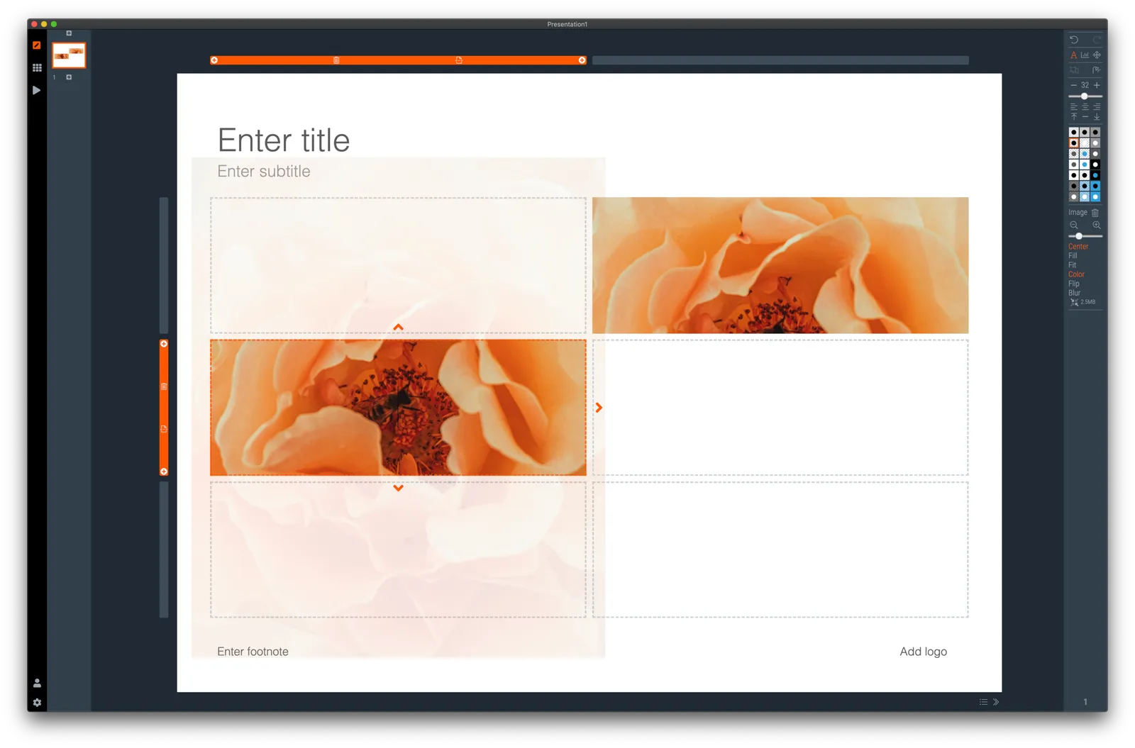
In SlideMagic, you simply drag an image around in a box to decide what part of the photo you want to reveal. I am working on 2 improvements:

  • Showing the entire image in semi-opaque when you are editing/dragging it around to give you. a better orientation of what you are doing
  • Creating a way to keep the image focused on the most relevant part regardless of changes to aspect ratios or zoom levels of the photo. At the moment, I store to image positioning versions (one for 16x9 and one for 4x3), but in future releases I want to automate this

The challenge here is to offer something that works without turning SlideMagic into a complicated photo editor. Work in progress.

·Templates

Real estate (fund) pitch presentation template

SlideMagic is very suited to make decks that promote real estate projects or funds. It is easy to manage pictures of properties and add boxes with information about square feet and returns. I have added a template for a real estate fund pitch to get you started.

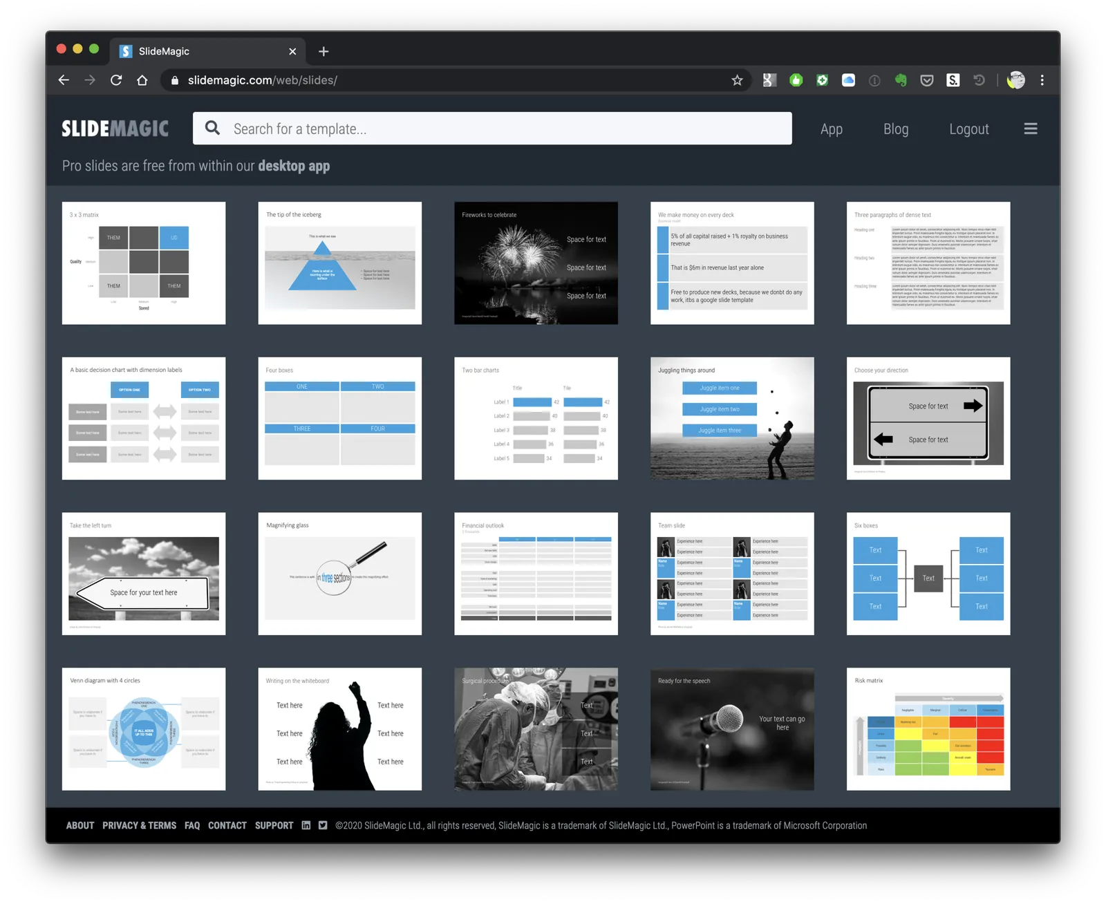
Note that when searching for slide templates, you do not need to resort to keywords such as “real estate” (it will give some results now though), any layout that shows lists, or grids, or portfolios, or screenshots will do. Real estate presentations use very generic layouts.

A trick to make more relaxed portrait photos

See below the secret of a pro photographer (follow Scott). To get the most natural and relaxed images of people (for example your team) for your presentation, say the photoshoot is over, and then take a few more shots… (Click the arrow to see the next image)

A nice team photo is so much better than a page with headshots in inconsistent formats.

If there is no alternative (traveling to get everyone in one room is hard during this pandemic), there is always SlideMagic with lots of team slide templates that can help you make those headshots look as consistent as possible!

Photo by Uyen Nguyen on Unsplash

·Concepts

Organisation charts

Organisation cultures are changing. Traditional hierarchies becomes less important, and project teams often become the engine of doing things. Also outsiders such as freelancers do not fit in nicely in big structures. At my time in McKinsey in the 1990s, we could have full meetings about whether a line should be dotted or not, and who would have to be drawn slightly higher than someone else on a page. Mistakes here were especially painful in a presentation to the management team.

Organisation chars in presentation are tricky for two reasons: it is hard to get all the boxes right on the page from a technical point of view, and it is hard to make everyone happy that the hierarchy and lines of the boxes reflect reality.

At the request of a user I have added a few more organisation charts to the SlideMagic slide template database. Complex organisation diagrams are not SlideMagic territory (if they are. hard to draw, the audience must also find them hard to understand). Instead, I created a few simple templates that can lay out the structure of an organisation in simple way, cutting the amount of lines, and increasing the size of text boxes.

If you present your chart as a a rough summary of the organisation rather than an exact reflection of hierarchy, you might just get away with it. If you pretend to be precise, people will nitpick…

The “connector” element in SlideMagic is still the weakest drawing tool and I am thinking about a new diagramming user interface now that my front end HTML design skills have improved significantly over the past year. As usual, the problem is not technical. Also in PowerPoint with its more sophisticated diagramming interface, it is hard to get connecting. lines to do what you want. They always angle and bend in a different way than you want them to.

Continue reading →

TAM slides now in SlideMagic

A SlideMagic user could not find a TAM (total addressable market) slide and used a service I am offering that not many people take advantage of: request them to be added. You can find 4 new slides about TAM here.

About the layouts:

  • Unlike most of the traditional TAM slide templates, I did not go for concentric circles. Yes, SlideMagic does not do circles (yet), but I find these hand drawn circles always misleading. It is very hard to get the circle size to be accurate. Hence the more simple bars.
  • TAM is a bit of a buzzword, I hence I tried to avoid using TAM (available, or addressable?), SAM, target market, etc. and use normal English instead.

About TAMs.

Watch out with using TAM slides in your investor pitch. Yes, it is included in many template guidelines, but believe me, investors do not really respond well to the type of analysis where we identify a $15 billion universe, $100m or which we can address, and $200k sales we are going to get in year 5. Also, most of them do not like buzzwords.

A TAM-like concept is useful when you want to introduce a new market (i.e., a bucket that does not exist in any Gartner report yet). Rather than calling it TAM, or trying to relate it to any of these buckets, maybe provide a simple analysis instead of what people in the world could spend on services like this. Show the assumptions you made, bottom up. This does not try to create a new Gartner bucket, but instead educates the investor how to think about your market.

Continue reading →
·Concepts

Pretty template, ugly slide

Most corporate presentation templates are designed starting from an empty slide. The designer feels the urge to spice things up a bit with logos and other graphical elements. Now when you actually use that template (designed for a blank page) with everyday presentation content, things start to clash.

The same things must have happened to the designers at BMW, who forgot the license plate that would be plastered over the front of their new car design….

The next time you brief a designer for a new PowerPoint template, give her a full slide deck including content, let her create a design you like, then strip out all the elements and see what you are left with.

<!— Sponsored content: with SlideMagic, there is no need to worry about a presentation template that fits your corporate branding —!>

·Software

Some UI improvements

Version 2.3.18 went up with a few improvements including 2 noticeable ones:

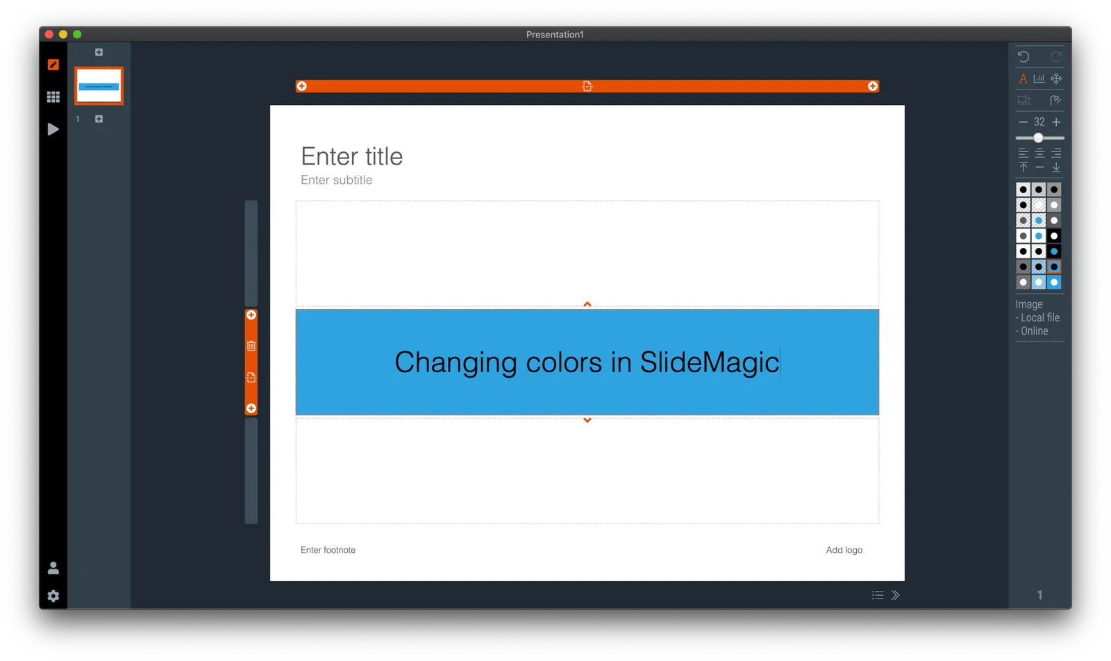
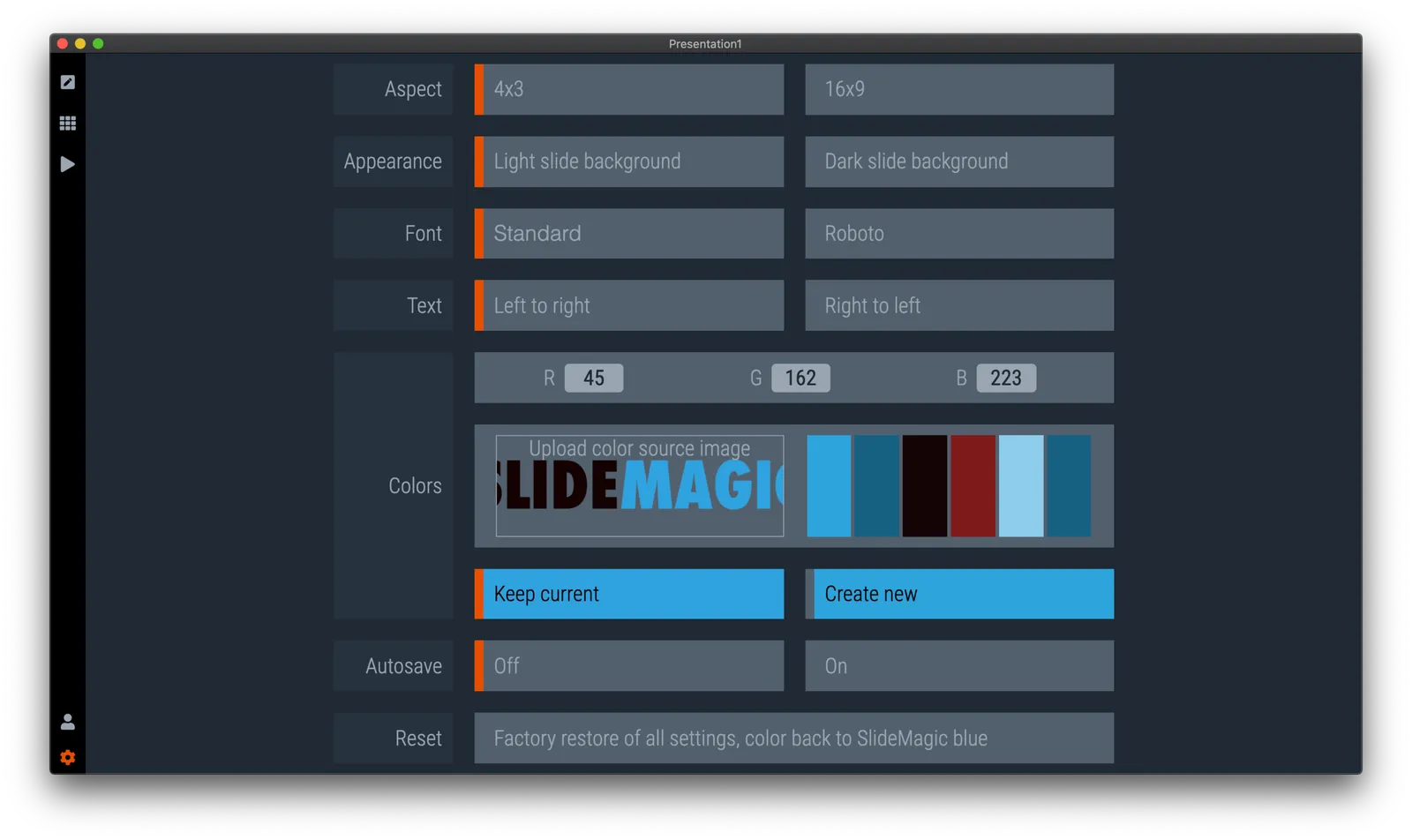
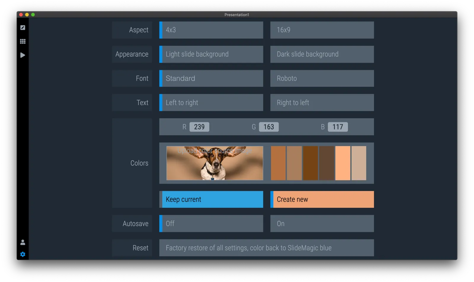
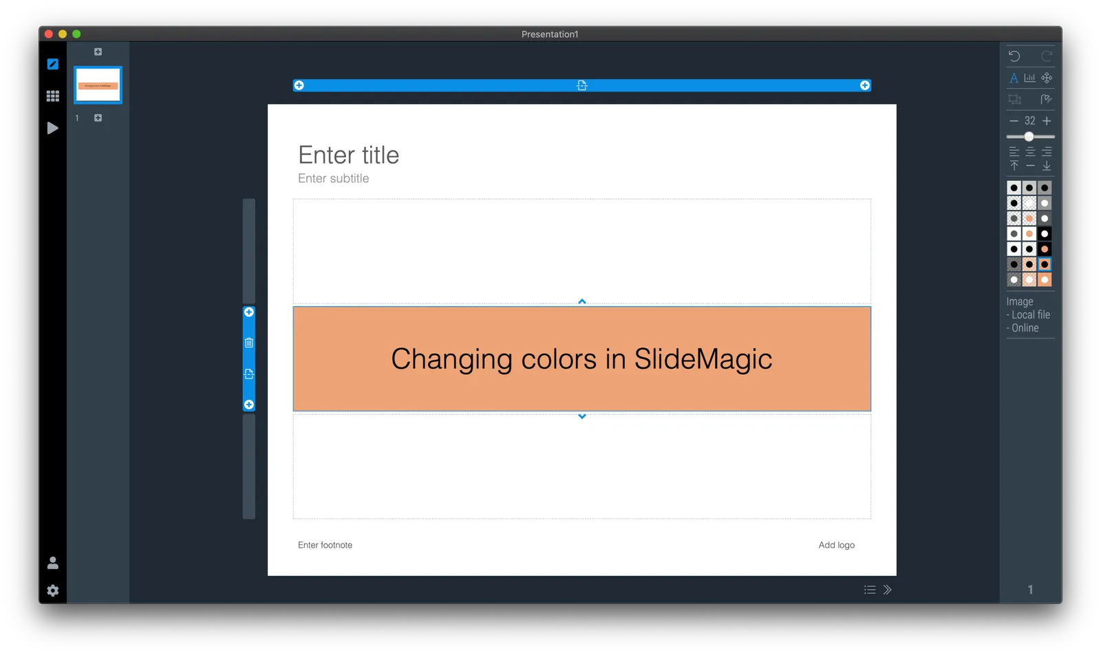
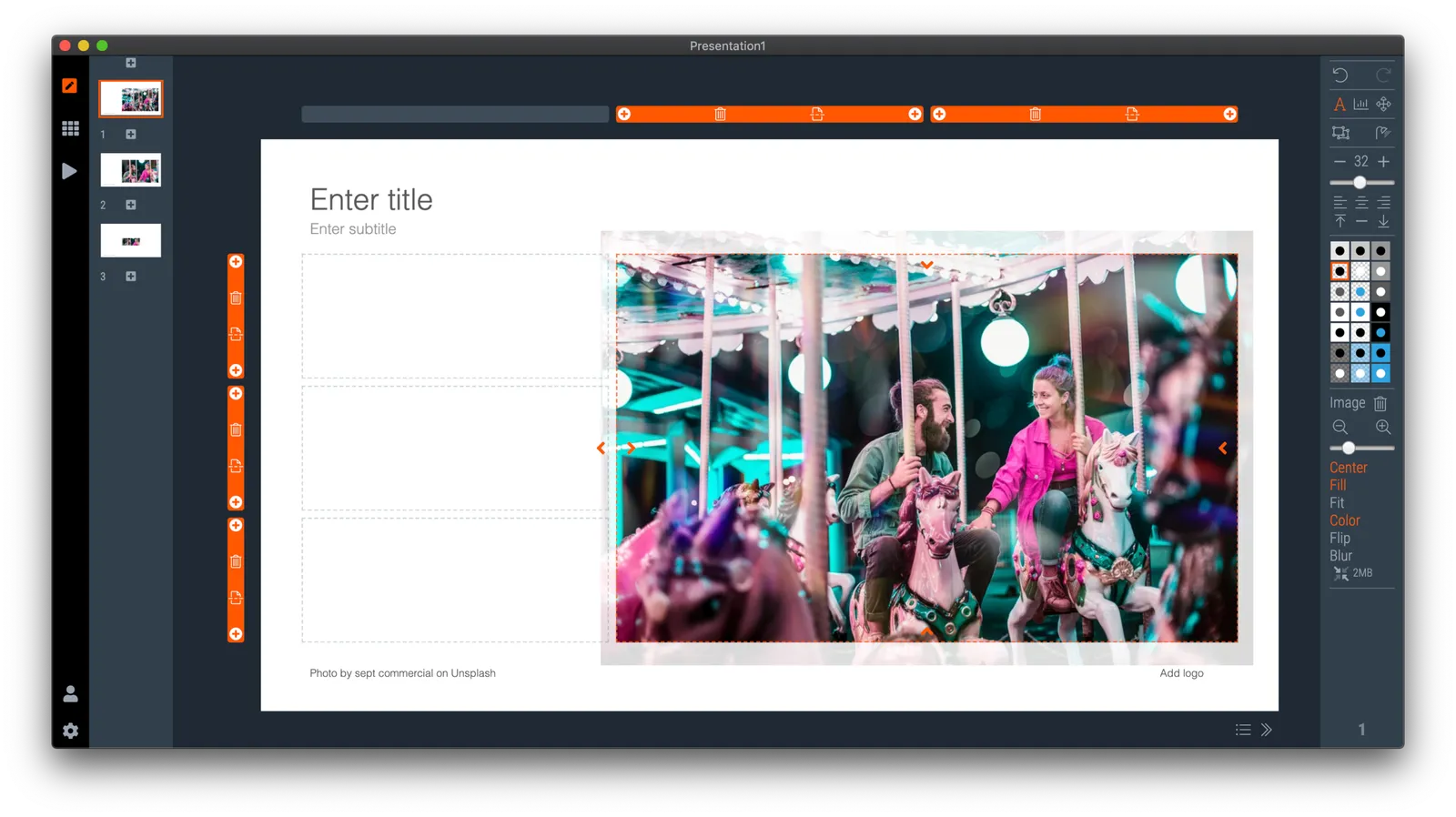
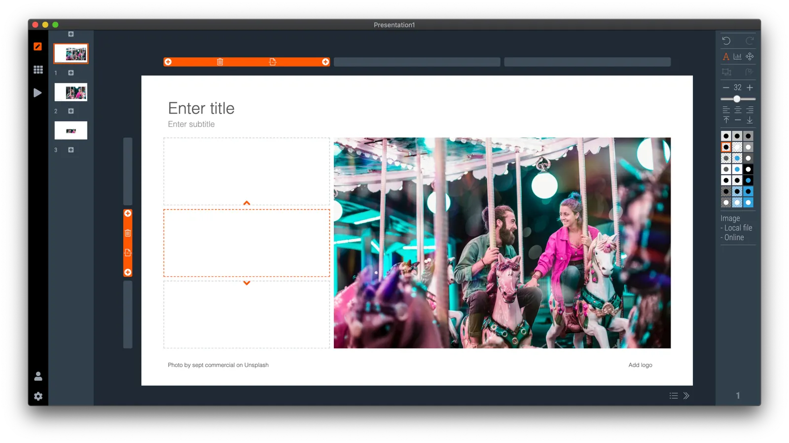
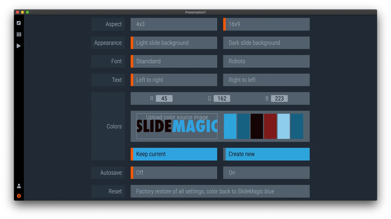
  • A much brighter app user interface colour. As you know, SlideMagic mirrors the colour you use in your presentation: if your presentation uses blue, the SlideMagic app accent colours (to show things you selected for example) will turn to its complement: orange. Up until v2.3.18, this was the exact colour opposite, creating problems for users with muted, very dark accent colours. In the latest version I forced up the brightness and saturation of the app accent colour so that it clearly stands out in all cases. Look how that orange is now popping out for my SlideMagic blue colour.
  • An improved image user interface, where the crop modes “center”, “contain”, and “cover” are now clearly highlighted. Also, SlideMagic now shows the mega bytes an image consumes as soon as you select it. Sometimes, a very large image is actually not that big in storage, but the opposite happens as well, that tiny image on your slide takes up 10MB of space and as a result you are compressing down the entire slide deck. Now it is easy to catch these memory eaters quickly and compress the image if needed. Compression no longer “flattens” the image effects (greyscale, blur, flip), so you can re and undo these on the compressed image as well.

Download the latest version of SlideMagic for Windows or Mac to try it out.