SlideMagic Blog

Frequent updates about all things presentations since 2008. Subscribe to never miss a post.

RSS
·Investor presentation

"We are never going to invest, but how can I help you?"

If you hear this from an investor as the very first sentence she says, this could either be:

  1. A gutsy negotiation tactic to get the valuation of the shares in the B-round preferred equity shares down
  2. She will not invest in you but wants to be helpful anyway

In 99% of the cases it is scenario number 2, so launching with full energy with your pitch (page 1/50, “market developments”) might get you cut off.

In these cases, I would still clarify, ‘OK, but why?’. The answer is probably: “You are in stage x in market y, we invest only in stage w and market v, but we have a friend in common so I agreed to take the call”. No chance of scenario 1…

All is not lost though. Switch tactic immediately and find out what this investor can do for you. Useful contacts. Ideas for investors who would fit the bill. Time is probably limited (she is doing you a favour, so hold back with arguing or discussion, take notes and put all the feedback in the perspective of the person it is coming from.

The notes might actually contain something that is new to you, and you will have left a very good impression for when you guys meet again in a situation where there is a better match.

Photo by kyle smith on Unsplash

·Software

Preserve image positioning when switching between 4x3 and 16x9

SlideMagic swaps instantly between traditional and widescreen aspect ratios. The slide content stays nicely in the slide frame, everything stays aligned and you can revert instantly.

Because SlideMagic does not distort aspect ratios of images (no stretching or squeezing), the positioning of an image changes slightly if you switch between a narrow and a wide screen layout. This can be annoying for images where positioning is a big deal (compare the lined up eye lines of a series of portrait images versus a long-distance shot of a mountain range). If you switch aspects 5 minutes before your meeting, your presentation is misaligned. (This is obviously still a lot better than PowerPoint where everything would stretch and move to unpredictable places when picking a different screen format)

Well, SlideMagic fixed this last hitch as well. I just released V2.3.17 (download SlideMagic here for both Windows and Mac) which now keeps 2 sets of image size and crop frames, one for each slide aspect ratio. You switch back and forth, so will the image positioning. Make sure to double check each image once in both aspect ratios, and the settings will be saved together with the presentation.

For future releases I am studying more advanced image analysis, where I could automatically recognise a face in an image for example, and lock in the position of the eyes (maybe the first true “AI” application in SlideMagic).

·SlideMagic

Dynamic slides generated on the fly

Version 2.3.16 of the SlideMagic presentation app went up last night (download it here for either Mac or Windows). The major new feature in this release is the dynamic generation of slides (at least, the first steps).

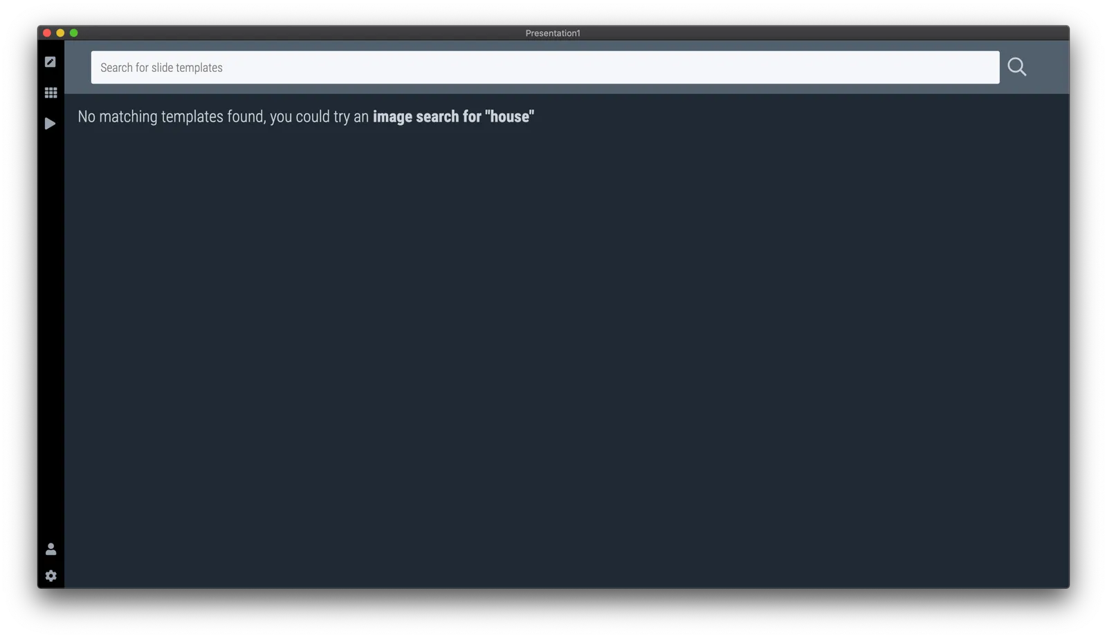
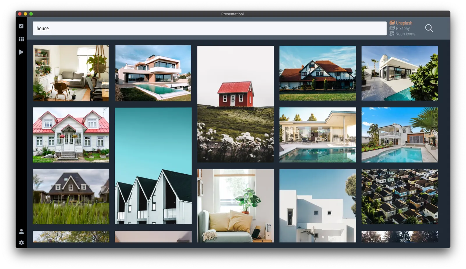
There are different types of template search queries entered on the SlideMagic server. People look for a specific framework (e.g., ‘BCG matrix’), a specific layout (‘3 bullet points’), but then there is a whole lot of more descriptive queries to are a better match for an image search site (‘house’ , ‘diabetes’). While I could populate the database with hand-made slides for each of these terms, it is more efficient to let technology do the work for you.

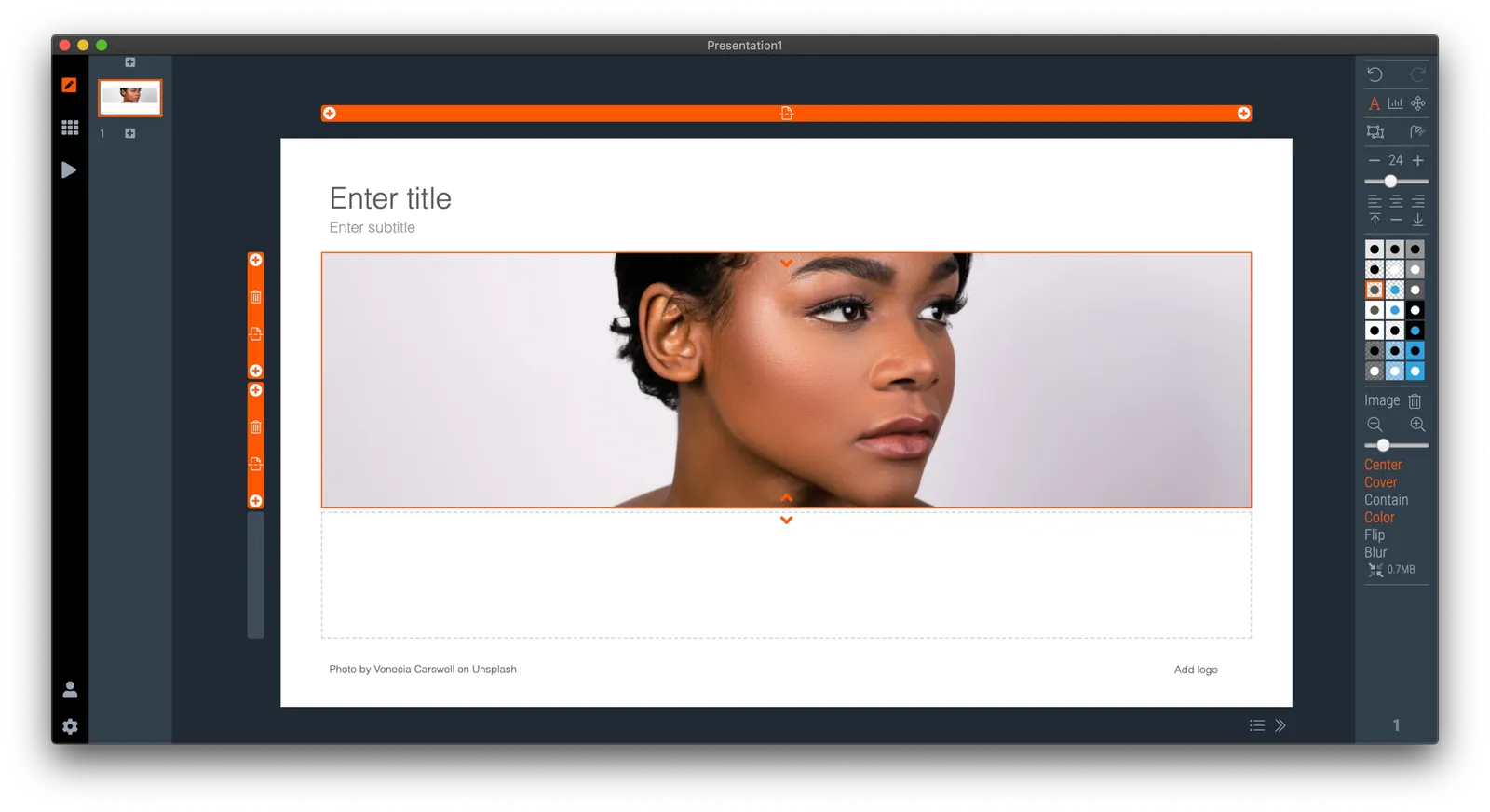
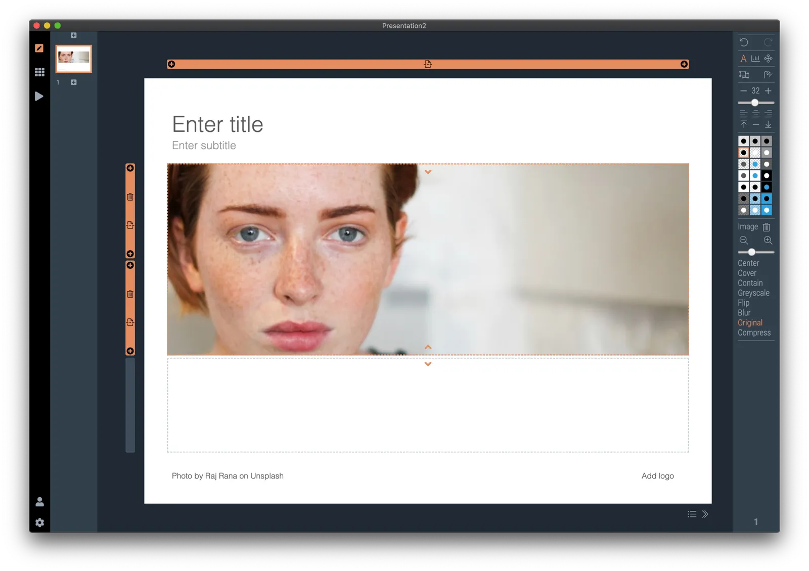
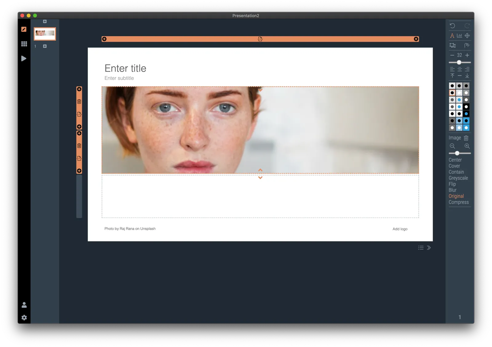
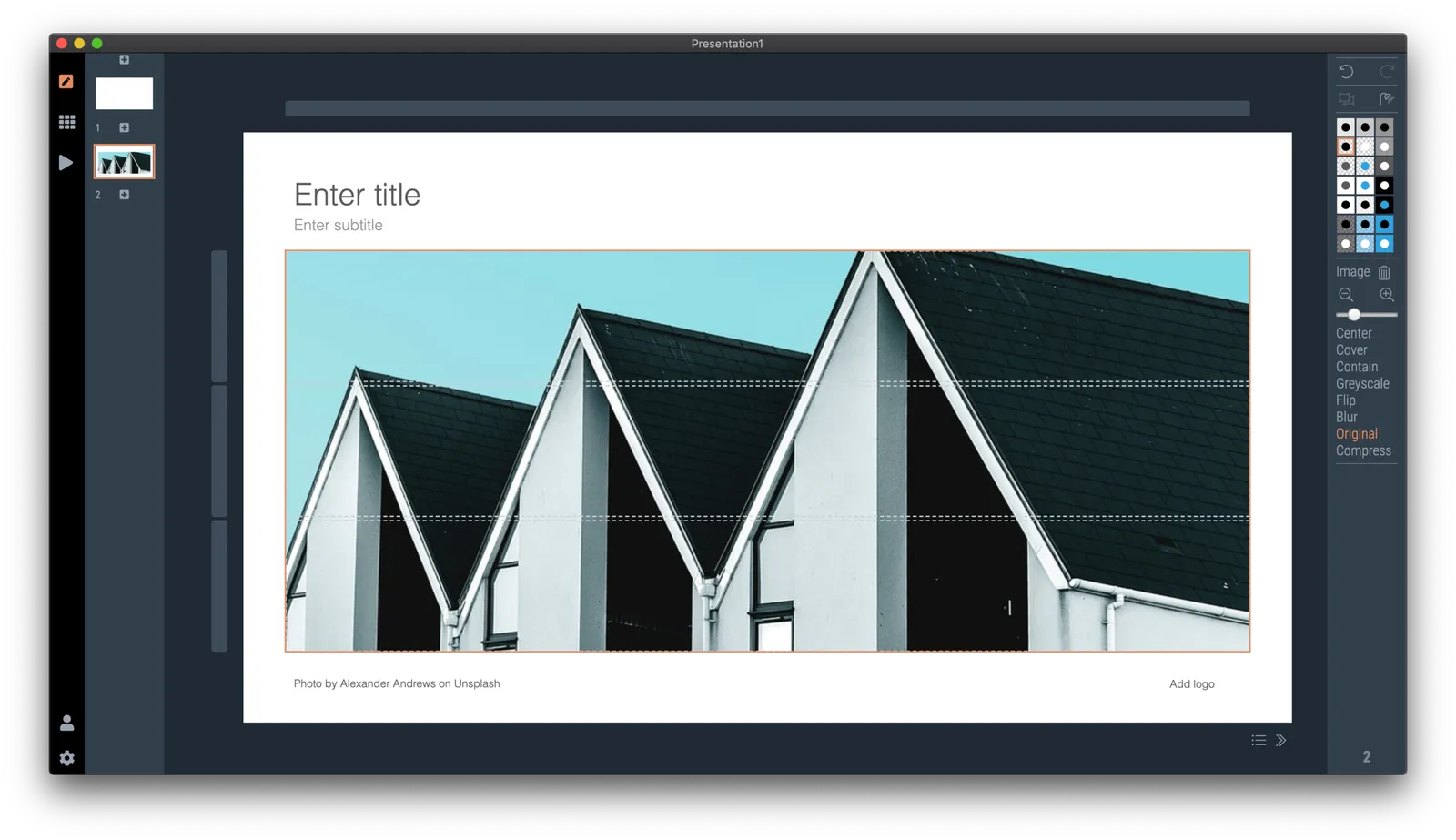
So at the moment, when the server gives up and returns a “no slides found” message, the user gets offered the option to run an image search instead with the same keywords. After picking an image, the SlideMagic app turns it into a framed slide with proper image credits that can form the basis for a new slide design. This slide is created on the fly, without the need to store templates on my server. So the number of slides that SlideMagic can produce now goes into the millions rather than hundreds.

The screen shots below give an overview of the flow as it stands at the moment:

Obviously a slide with a simple image is still pretty basic. I am looking into expanding this approach with colour matches, and more interestingly analysing images for white space, with suggested pre-population of text placeholders on the image.

Continue reading →
·Sales presentation

Being too eager might not always work

Most sales have 2 pitches:

  • The first is the seller pitching to an employee of the client
  • The second is that employee having to make the case to her colleagues

(A similar situation: first the startup pitches a partner of a VC, then that partner has to convince her other partners)

I never discuss that second type of pitch here very much. In most cases an employee or VC partner probably has a deep conviction that a certain deal needs to be done (otherwise you would not put your reputation on the line for it). So all of a sudden, these people are the ones pitching the idea to a potentially unenthusiastic audience.

In these situations it is important to keept that impartial distance from the deal. A colleague who is aggressively countering every possible small objection to the deal loses a lot of trust and credibility. “Hmmm, she must have been brainwashed”. Instead, layout your case objectively. Point out the strengths, but also show the risks, doubts, and possible elephants in the room, and make the case why you think these can be overcome and this is a good bet to take.

P.S. This shows startup/product pitchers who the role of their contact person at a client/investor is changing. First you need to convince them, then you need to coach them how to pitch your idea themselves. If in this second phase of the process, you get a question, she is no longer doubting the idea, but collecting evidence to convince her colleagues. It also shows that bypassing that junior analyst and calling her boss directly might back fire instantly, you just lost your major supporter.

Continue reading →

The typos that matter

The tweet “ruin a band’s name by changing one letter” is spreading at the moment. Everyone makes typos, including me on this blog. And typos are hard to spot, especially for people who are totally immersed in their writing efforts. They stop seeing the individual words, they somehow become a placeholder for a specific thought. “Ah, this paragraph covers the competitive positioning”.

In my early years at McKinsey as an analyst, it was my task to correct graphics designers who were working on the team’s slides. I was never really good at it, and always wondered why the senior partner could walk in, look over my shoulder, and catch one. I would never have been a good lawyer.

Certain typos are more important than others. Typos on page 1, sit there for everyone to see on the projector when the room fills up over the course of 30 minutes. Typos in the potential client’s name are never helpful. Typos that turn around the meaning of an entire sentence (forgetting ‘not’ for example) are an issue. And typos in financial data can be catastrophic.

If these financial typos are completely disconnected from reality, you probably get away with them. Buying an oil refinery for $25 rarely makes sense. But if values are close $3.3b versus $3.5b (oops, number from the previous model), it gets trickier. It’s “just” $200m… (That same senior McKinsey partner would always go to the last page to check the fee number in the project proposal).

Always double check that acquisition bid or price list and maybe cover yourself with some small print somewhere.

Continue reading →
·Images

Even better image search

I made improvements to the image search interface in version 2.3.15. Removed clutter from the side bar, and you can now switch between Unsplash, Pixabay, and the Noun Project (icons) from the image search page. Search keywords are carried over to the other image provider. Existing users should see the update automatically on your machine or can download (like anyone else) here.

·Layout

Make any presentation look better

I took a recent draft presentation that came across my desk (in PowerPoint) and took out all the specific / confidential information and images, replacing them with dummy text and boxes.

This was by no means a final deck, but it highlights something that most people get wrong when creating a slide deck: tidying up your layout.

Some slides have a white frame, others having images bleeding off the page. Icons are different sizes. Things are not properly aligned. Get all these things right, and your deck will instantly look good, even without fancy fonts, graphics, colours.

This is easier said than done. In PowerPoint, you have the freedom to place anything, anywhere you want. You realise in the last minute that that particular text needs to go in, well it will always fit.

SlideMagic will not let you get away with this. Grids are strictly reinforced. Many users complain about that lack of freedom. I need that 5th box, and now the whole slide layout cannot handle it. And this, exactly, precisely, the process a professional designer has to go through. Unlike you, she does it instinctively and switches the slide layout. With SlideMagic, you will be reminded (kindly) as well.

Here is a quick layout of what a deck like this in SlideMagic should look like. This is not “super design”, SlideMagic helps you make a decent looking deck in the minimum amount possible. “Super design” requires a lot of investment (time and money), which gets you a great looking deck, but one that is sort of set in stone, it is very hard hard to make changes to it. Great for your IPO road show, less so for an every day presentation.

Continue reading →

Microsoft does not consider SlideMagic templates compelling...

The SlideMagic office add in for Microsoft PowerPoint got rejected for a second time. There are still some technical issues with getting it to work in Office 2013 (I cannot install this old software anymore to test things), but there were a 2 other reasons given:

  • your offer demonstrates insufficient interaction with our service”. While the Javascript API for other Office solutions (Excel, Outlook, Sharepoint) is very extensive, the only thing you can do in PowerPoint is add an image, add a text box, and add an entirely new presentation in a separate file or browser window. (The latter is what I am using to serve my template, Microsoft does not give me the option to insert slides into an existing presentation.
  • “Our product team have reviewed your offer alongside our validation team and believe that should your offer contain more compelling templates, it would be possible to allow the offer to be published without interaction with the open PowerPoint presentation” I think what Microsoft means is that if my slide layouts were more interesting, users would not have a problem that (the more interesting) layouts would open in a completely separate presentation.

I will continue to try to fix the technical issues where I can, but it is hard to change the fundamental characteristic of SlideMagic: offer really simple templates that save you time to make presentations…

Anyway, the workflow of simply downloading slides from the web site is actually not that bad. Also, Many users actually use the current version of the PowerPoint plugin, the only difference is that it does not appear in the official Microsoft store. I had a quick look at the Google Slides API, which is far more flexible than Microsoft’s one. I think Microsoft leaves a big opportunity untouched by de-prioritising PowerPoint when it comes to the Office Javascript API, hopefully it will change its mind.

Continue reading →
·SlideMagic

All the way back to 2008

Now and then I dive back into the 12 year archive of my blog and see some or the early slide layouts I made. This Google image search pops up many of them.

While many of these layouts are now still available as templates in SlideMagic, some of them, especially the early ones are a bit different:

  • “Slides that stick” orange and brown
  • Lots of hand written fonts
  • Unusual visual analogies
  • Most of them are definitely not for the layman designer…

Yes, I made have been a bit more “daring” back then (and remember, most of these designs actually were taken from actual client work), but I still think that I am on the right track with my current sober, simple, easy-to-make layouts. Less artistic, but far less time wasted by smart people that can use their energy to do more useful things that creating presentation slides.

·Software

Do you need Excel training or model training?

This tweet caught my attention:

I spent a decade as a strategy consultant at McKinsey crunching spreadsheets, mostly company valuations. And all of those, I did with the very basic Excel functionality: simple calculations between 2 cells.

Like PowerPoint, Excel is packed with fancy features that actually distract form what you are really need to worry about: setting up a proper model. Complicated formulas collapsed in one cell create opportunities for bugs to sneak in. Also, when you need to expand or adjust your model, it is a lot easier when everything is neatly laid out in front of you. In all my models, I could understand the flow of calculation line by line.

The golden rule of analysis applied: “if it looks wrong, it is probably wrong”. (In the 1% of cases this is not true, you are probably on course to receiving a Nobel prize for a major new insight).

I did invest some time in finding a way to make my spreadsheets look good. Numbers rounded, cells aligned. If you are staring at something that looks scrappy, you will treat it as a scrappy back of the envelope.

The exception to all of this might be cases where you treat Excel as a database application. Setting that up properly will require some training.

Photo by Wonderlane on Unsplash