SlideMagic Blog

Frequent updates about all things presentations since 2008. Subscribe to never miss a post.

RSS

Rounded edges

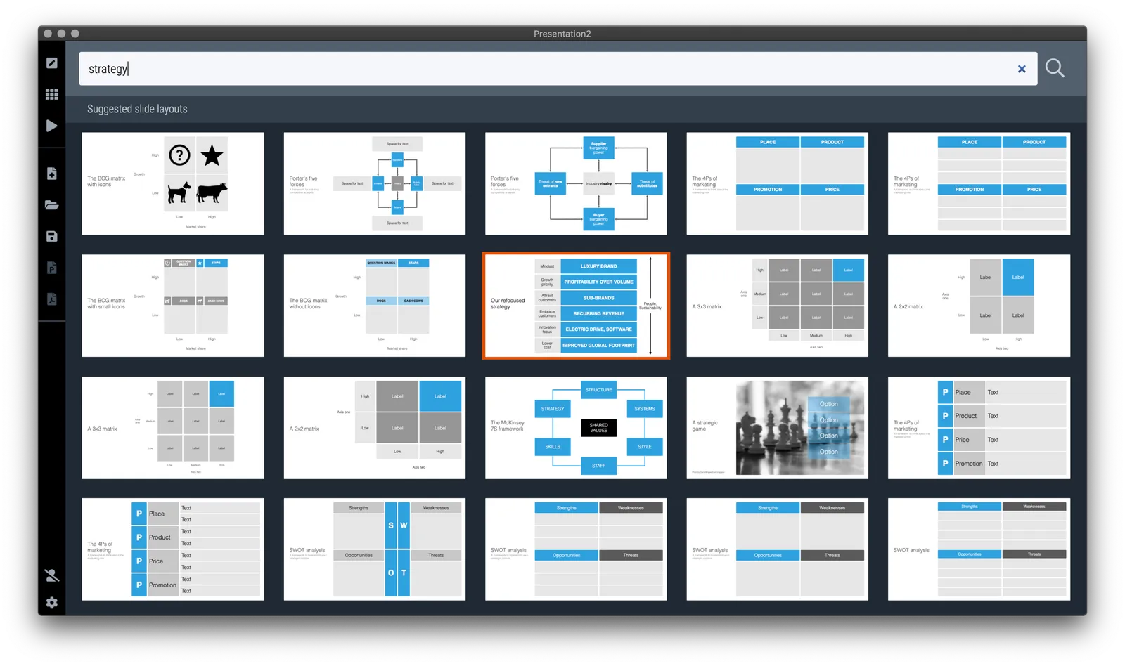
In the latest version of SlideMagic, all boxes now have slightly rounded edges. You actually need to look carefully to see it, but the impact on the overall slide layout is dramatic, things look more friendly.

Apple is a big believer in round edges in its designs. It claims that sharp edges do not appear in nature and are not natural shapes. (Well there are crystals). But I think Apple is overdoing it. The camera unit on the back of an iPhone for example has too large of a corner radius, and in many of the app screen designs the corner radius of the window, hardware, and icons clash.

In PowerPoint and Keynote the default setting for a corner radius is also too big, and there is no way to adjust them precisely to the same value (you can only drag with a mouse).

The edges in the SlideMagic PowerPoint conversions stay sharp for the moment, I can programmatically tweak regular shapes in PowerPoint (so no more mouse dragging), however for images I still have an issue.

The latest version of SlideMagic is 2.4.45 and you can download it here for free (Windows and Mac).

Photo by Eddy on Unsplash

·SlideMagic

A more precise image zooming engine

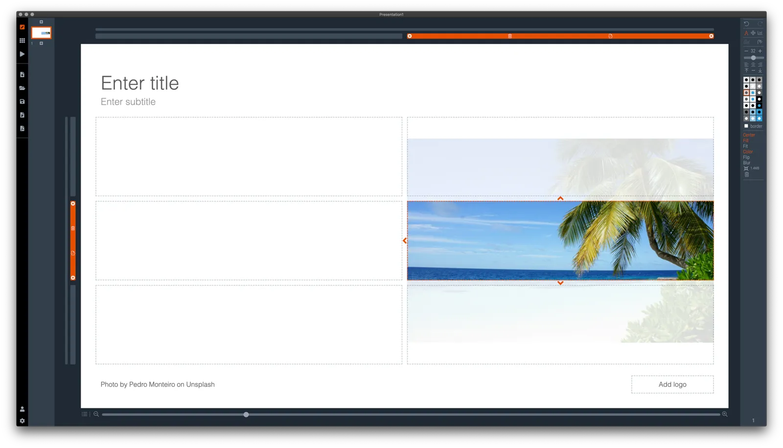
I just released a new version of the SlideMagic desktop app with an important update: a more precise engine for panning and zooming images. It was a very big update (a completely new image rendering engine) and to most users, there will hardly be any visible difference to the app.

But more advanced users will notice how image fills and fits now exactly, exactly fill the shape boxes, and how to (much bigger) image zoom slider is much more precise.

(For those interested: the old image rendering engine was still based on CSS background images with their obscure placement interface, a left over from the web-centric architecture of SlideMagic v1.0)

Photo by Pedro Monteiro on Unsplash

·Story

Convincing the center

The pattern repeats in demonstrations and political debates:

  • The other side is clueless
  • Everything the other side does , does not make sense
  • We are right, they are wrong (always)
  • Etc.

You will never convince people who are deeply attached to their beliefs. The people who can swing the majority are in the center. Questioning the intelligence and making fun of the people just across the line of the center (and their friends) is not going to make it easier for them to switch.

Preaching to the converted with a megaphone won’t help. Listening to, understanding, and engaging with the doubters possibly could.

This is true for political debates, but also for sales and investor pitches.

Photo by Chris Slupski on Unsplash

·Data visualization

Log scales?

With all the talk about exponential growth of the virus, logarithmic scales are popping up in graphs everywhere.

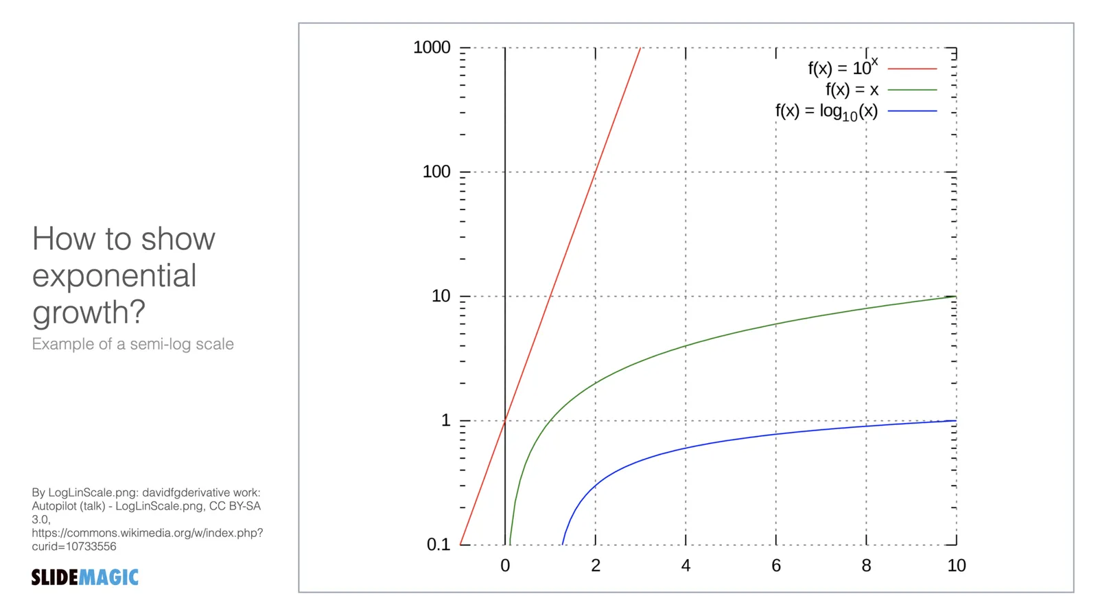
What is a logarithmic scale? Unlike those on a linear scale, the units on a logarithmic scale change. See the chart below.

The result is that the normally speaking rapidly growing line 10^x now appears as a simple straight line.

Exponential functions can be hard to graph, analyse and compare. Toning down the scale makes things more manageable. I remember in high school, I used log mm paper to plot graphs from physics or chemistry experiments. By measuring the incline of the line, I could estimate exponential coefficients, and compare them.

While logarithmic scales are a great practical tool for scientists, I think they are less useful in presentations to a more general audience. “Look at this straight line, but in order to understand how fast tings are really growing, look at the small numbers that reveal the axis measurements”. People simply don’t grasp the concept of a logarithmic scale. If the virus grows exponentially, well, show an exponential line.

If you need to compare exponential growth, make a bar chart of the growth rates, rather than drawing straight lines on logarithmic scales.

Tutorials are ready

I completed the first version of the SlideMagic tutorial, describing the basics of how to get started, and uncovering some hidden features such as keyboard shortcuts for advanced users. The latest version of the desktop app is now also linking to these pages. Let me know if I missed anything.:

Tutorial page 1 - The basics

  • Installing the software
  • The top menu modes: edit, story, play, account, settings
  • Adding slides and searching templates
  • Formatting text, colours
  • Adding images

Tutorial page 2 - Advanced

  • Branding: your own colour and logo
  • Changing the slide aspect ratio
  • Export to PowerPoint and PDF
  • Images and colours in the slide background
  • Shapes: boxes, arrows, data charts
  • Presenter view and speaker notes
  • Keyboard shortcuts
  • Installing updates

Tutorial page 3 - Data charts

  • Adding columns and bars to data charts
  • Formatting data charts
  • Making waterfall charts

·Software

Starting to work on tutorials

Now that SlideMagic 2.0 is nearing completion I have turned my mind to putting together tutorials. For the moment, I am keeping it short and to the point, you can follow my work here: www.slidemagic.com/tutorial. This is all still work in progress.

·Layout

Bullet point alert

Bullet point slides are a no-go, they are boring, hard to understand, and look ugly and SlideMagic tries to discourage you from making them.

Still, SlideMagic is not dogmatic and recognises that there will now and then be an occasion where you need to put 3 things on a slide (agenda items, next year’s strategic priorities, the fact that your product is faster, cheaper, and lighter). In the SlideMagic desktop app search for “list” and you are presented with lots and lots of list-style templates (yes, bullet point slide templates).

But in these templates, each list entry is a new shape, a new row, to make the slide visually more appealing. And SlideMagic’s grid engine makes it super easy to add and delete rows. If the message of your slide is “we need to do 3 things”, one of these templates will do the job perfectly to communicate that.

Often though, bullet points creep in when you are not really designing a list-type slide. “Ah, where do I put these points as well?” The points are not important enough (are they?) to merit a new slide, or drastic surgery to the layout of the slide. You end up adding a few quick dashes to a text box.

The moment you have to resort to this emergency bullet point solution, it should trigger an alarm bell. If it looks like I should change the fundamental slide layout, or even create a new slide, maybe you should…

·SlideMagic

Spell checker

I added a spell checker to V2.4.40 of SlideMagic. Incorrectly spelled words get a little underlining, right clicking gives you access to some spelling suggestions, and the option to add a correctly spelled word to the library.

This feature was high on the list of priorities of my daughter, who is using SlideMagic a lot for school projects.

Photo by Edurne Chopeitia on Unsplash

·Data visualization

Architecture diagrams

I am starting to experiment with different chart types in SlideMagic. One experiment: IT architectures that consist of users, servers, databases, clouds and lots of lines.

The built-in icon search, combined with the new line drawing feature does a pretty good job actually. And while SlideMagic is not a dedicated tool to design network architectures, it might actually force you to make better architecture diagrams in presentations. Let me explain.

Detailed network diagrams have the same problem as detailed spreadsheets when it comes to presentations. They are project work tools to run analysis and plan work, they are not tools for communication. When I need to make a data chart, I always disconnect from the spreadsheet and resist the temptation to copy-paste. Instead, I pick the 10 numbers that matter, round them up to the relevant precision, and plop them in a very simple bar/column chart that tells the story.

The same is true for IT architectures. If you want to present an architecture overview on a slide, that slide needs to be understood almost immediately when putting it up (like all slides in your deck). If tangled connections, boxes, servers make that hard, then the only thing your slide communicates is that your architecture is complex, not much more.

Again, disconnect from the working papers. Think about your message: ‘my architecture has 3 layers’, ‘my system connects the systems of 15 suppliers’, ‘my system is entirely on premise’, whatever that message is, make a simple chart that supports it.

Continue reading →
·SlideMagic

Spoon feeding detail

Different types of audiences, different types of questions, and/or different phases in your interaction with the audience require different types of slides.

  1. In the first meeting, you introduce an idea with a big, bold, minimalist data chart
  2. In a follow-up meeting, you are answered a question about assumptions behind the numbers, or, in a Zoom meeting, your audience sits very close to her screen and has time / visual ability to dig deeper into the visuals than she would be able to when sitting in a big room.

For these occasions, you can make slide variations of the same slide. Seen an example below:

Clicking back and forth between the slides will give the illusion of some sort of animated popup, while in effect the audience is looking at two different visuals. In practice, I would design the busy slide first, then cut things out to create your minimalist slide.

Note how easy it is in SlideMagic to toss things around and add (remove) complications to your slide without breaking its visual grid