

Most financial slides show an absolute number and its percentage growth for things like revenues, gross profit, operating profit, and operating income. But they also show margins: operating profit, gross profit, operating income as a % of sales. If the gross margin grows from 50% to 55%, is that 5% growth, or 10%?
Microsoft did it right in its last earnings presentation: explicitly name increases in margins as ‘points’. So going from 50% to 55% gross margin is a 5 points increase. See the example slide below
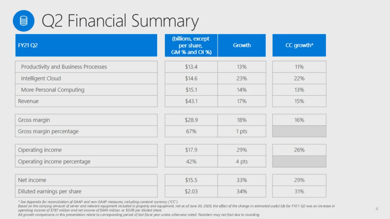
Mmm, now that we have a slide here, let’s talk about it. What is good:
- Clean font, clean layout, even without a logo
- Numbers are rounded up
What could improve:
- Use the full space of the slide, the table (probably coming out of Excel) is tilted to the left
- The titles of the table are a bit “heavy” with that blue colour splashed on them. It is better to use an accent colour to highlight a piece of data that is important for your message
- The dark grey font on light grey background looks sophisticated, but hurt the contrast that is important in financial slides
In SlideMagic, I put the following together quickly (in the SlideMagic spirit)
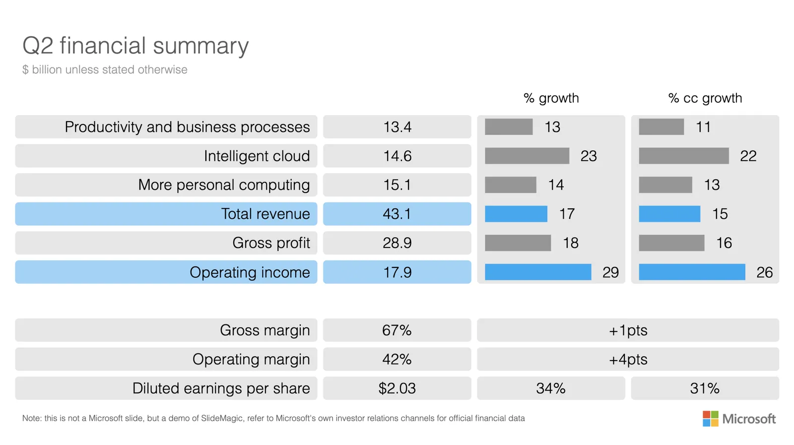
What did I do?
- Use the entire slide
- Accent colour is used for important data
- Light column headings
- Re-shuffled the order of the table items, yes, gross profit and gross margin are related, but I think it works better to group billions and margins
- Add small bar charts to highlight the comparison of the growth numbers
I have added my slide to the template bank, you download it for free, or simply search for ‘Microsoft’ from within the SlideMagic app.