SlideMagic Blog

Frequent updates about all things presentations since 2008. Subscribe to never miss a post.

RSS

Avoid jumping slides

“Jumping” is caused by slight differences in the position of similar items on consecutive slides. When you flick through your presentation quickly, it looks like these items “dither” (like in a cartoon). Try to avoid it for a calmer presentation. Jumping often happens in:

  • Slide titles
  • Vertical (y) axes of data charts
  • Animation buildups spread over multiple slides

To avoid it:

  • Use the drawing guides
  • Control-C an object on 1 page and copy it using control-V on the next to create the exact same position
  • In the worst case use size-position to set the exact coordinates of an item

·Templates

Chart concept - look-through white board

I used this image today in a presentation. Great to put on the side when drawing black shapes, or support informal, hand-writing font text on a white page. Make sure the pen touches the last “shape” or “word” she drew.

Better PowerPoint title pages

Title pages are important, they are the first impression you make on your audience. Some suggestions on how you can make them better.

  • Write an interesting title (like a newspaper heading that invites to read), followed by a small subtitle explaining what your presentation actually is (i.e., the 2nd quarter financial results)
  • Include information for the people in the audience wondering who this person is on stage adjusting his/her microphone (your name, company, function, presentation occasion, date and place)
  • Avoid heavy bold fonts, they use “fat” when used in big font sizes, instead use bigger regular fonts, they look more elegant. If necessary use a darker (or lighter) shading of the text color (preferably not black) to emphasize.
  • Use a page-wide image, preferably in colors that are similar to the ones you use in your presentation (you could add a color overlay if you can’t find the right image). Make sure the image has enough empty space for text. If not, leave bars either above or under the image (movie on 4:3 screen look), or a rectangle to the left or right. I like images of people looking into the lens, but they are not suitable for all types of presentations.
  • Align text left or right (not centered) somewhere along the “golden proportion” of the slide

Obviously, if you are bound by the prescribed PowerPoint template of your company there is not much room for chance.

·Design

How to align bullet points in PowerPoint

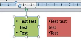
One of the PowerPoint annoyances is that bullet point paragraphs are not aligned properly when overflowing to the next line. It’s easy to fix.

Display the ruler (view menu), select the text, and move the little markers, leaving the top one to the left, and the bottom one at the desired indent. (See the image to the right).

That bullet points are NOT the main design concept to make PowerPoint presentations is clear, but a completely separate subject.

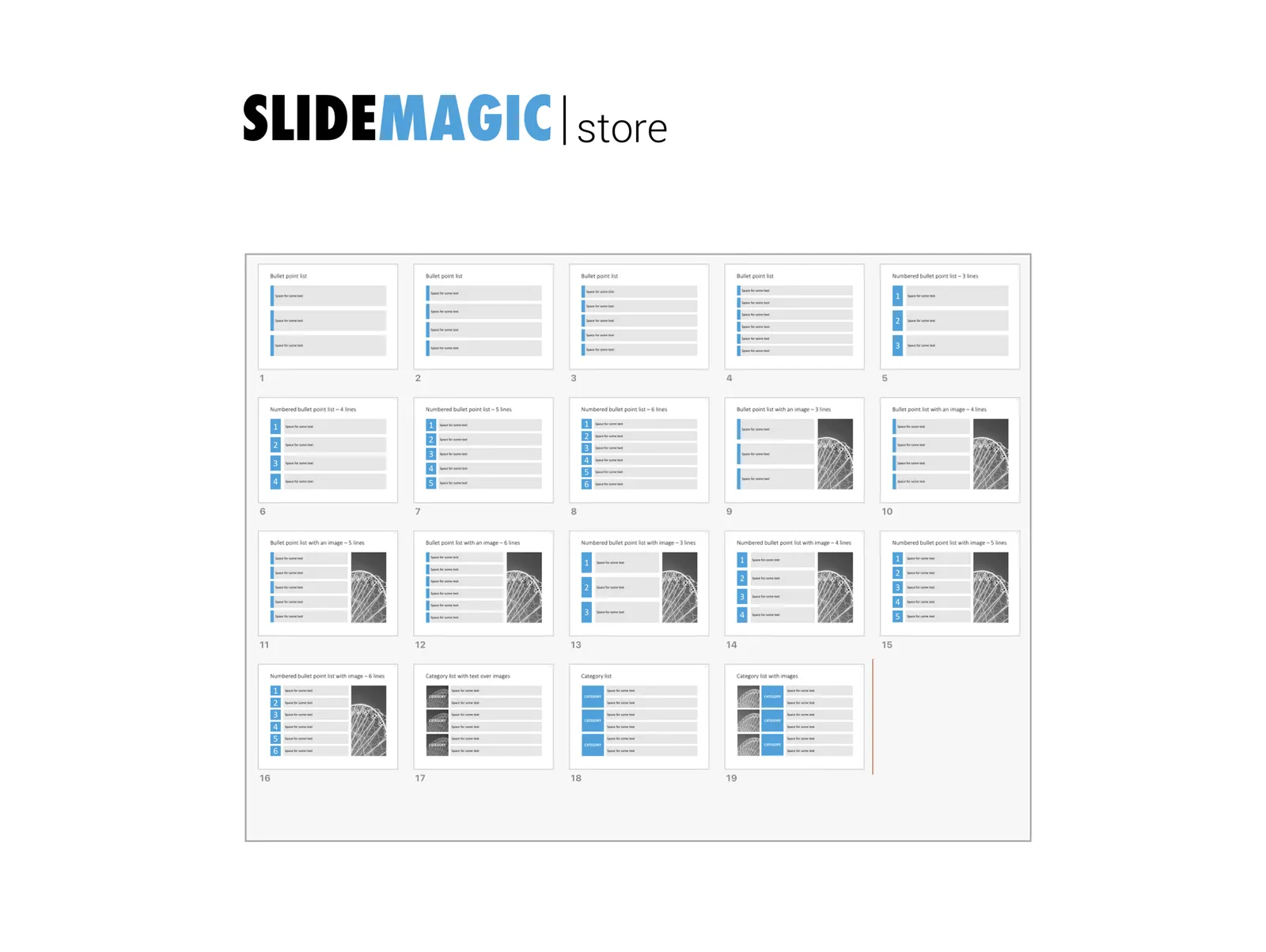
UPDATE February 2018. Another way to align bullet points in PowerPoint, is to use boxes with a very light background. This background shape gives the page a grid-like structure, compensating for differences in the length of text in a bullet point. Even if some bullet points stretch over 2 lines, and others consist of a few words, the page still looks evenly distributed.

I have added some examples of this layout style to the SlideMagic template store.

·Software

Slideboom - more online PowerPoint sharing

Mashable features a brief review of Slideboom. There are now many, many of these services for sharing presentations out there (Mashable listed some here). Criteria to evaluate them are usually:

  • Do they actually have enough capacity to work (Slideboom seems to be suffering from the attention last night)
  • Do they convert all possible PowerPoint features and effects including animations (Slideboom seems to be doing good here)
  • Do they have their own proprietary presentation design interface: Slideboom just takes PowerPoint presentations, which makes sense I think, teaching people a completely new user interface might be too much of a challenge (maybe with the exception of applications that focus on specific features, such as Flypaper and Flash)
  • Do they have a big and rich following and sharing community (Slideboom as at a disadvantage from players that are already established)

This looks like a useful service, but the worlds only needs one or two good ones. These good ones should be able to deliver presentation quality that can be put on an overhead beamer and allow for Webex-style meeting/presentation orchestration features. Let’s wait and see how the shakeout plays out.

·Software

Flawed 12 August PowerPoint update

Microsoft admitted that some versions of the latest PowerPoint security update were wrong. It only seem to affect people who have downloaded patches manually from the Microsoft Download center though, automatic updates were correct. Maybe run Office Update again just to be sure.

·Sharing

Publising a PowerPoint presentation online

There are multiple ways to share PowerPoint content online. To put the content of a presentation online directly, you can use SlideShare (or a similar service), or save the presentation as an HTML file and upload it to your site. In the case of my company website (www.axiom.co.il) I used a PowerPoint presentation (this one) as a basis for the entire web site, adding text and links to explain the slides verbally. To do this. Some basic HTML editing skills are required. Pick a clean open source web site template (I used andreas01 designed by Andreas Viklund) and customize it for your own needs (title image, and content sections). Then take each slide in your presentation and save them as individual JPG images. Put the appropriate images with explaining text in the content sections and your company web site (a copy of your company PowerPoint presentation) is ready!

·Images

Chart concept - a new beginning

This image from iStockPhoto is great to illustratie “make-overs”. Add minimalist text either in the white or the yellow (depending on whether you want to highlight the old or the new).

Skilled Photoshoppers can change the color into something different than yellow.

To create more yellow space. Make a copy of the image. Crop only the yellow wall, align it to the right of the main image and stretch until the right margin. Again, in PhotoShop this can be done more professionally.

Disclosure: no commercial interest

·McKinsey

The McKinsey - or any consulting - presentation

The vast majority of Google traffic that lands on my site is looking for advice on how to write a “McKinsey presentations”. Let’s discuss them a little bit more, including my logic why they might NOT be suitable for just any communication situation. Why do they look so good and professional? A few reasons (some of which are good recommendations for any presentation you prepare)

  • They stick to a strict slide format: every page is laid out exactly the same, making the whole document look very consistent
  • Pages have muted colors and no spectacular animations.
  • Consulting presentations are almost always all about numbers, and this quantitative data is displayed and structured in simple and clean data graphs (i.e., not an ugly, busy cut and paste from Excel), and numbers are rounded
  • Each chart has a single message, which is written out in the chart title and clearly supported by the numbers in the chart body
  • They (sometimes over-)use a lot of frameworks to structure information: a time line, the impact of a number of forces, evaluation of pros and cons, strenghts and weaknesses.
  • The presentation has a clear logical structure, taking you step by step through an argument. A lot of energy is invested in the PowerPoint slide sorter: re-shuffling charts until the story is lined up the correct way. This process is not only for communication purposes, it is an integral part of problem solving. Trying to articulate a logical story will inevitably highlights flaws in logic, sending you back to the drawing boards to do additional analysis or change your recommendations.
  • It is full of summaries. If you have 30 seconds to read a document, you will find the full story on page 1, if you have 5 minutes, you can read the summaries of the next subsections (each section explaining 1 paragraph of the summary in more detail), if you have more time you can read the whole document.
Continue reading →

Chart concept - growing a new idea

I have used this sort of image a few times to create a chart for startups that have a new promising idea that is still in an early stage of development. Add a few simple big font words in the white space.

Disclosure: no commercial interest