SlideMagic Blog

Frequent updates about all things presentations since 2008. Subscribe to never miss a post.

RSS
all posts

Category Sharing

·Design

HTML5 and presentations

HTML5 is a major revision of the HTML language that powers web pages (Wikipedia link for the details). You can find an example of a presentation designed entirely in HTML5 here. Use the cursor left and right keys to navigate between slides. The presentation does not have a good design, but it gives a flavor of the capabilities of HTML5.

Could HTML5 become the default file format for all presentations, decoupling software that creates presentations, environments that display them, and sites that build a social infrastructure for sharing on the web?

  • As file sizes become larger, and internet connections become always available, a “in the cloud” file format for presentations becomes more likely
  • I expect the position of Microsoft PowerPoint to go down somewhat, as smaller niche presentation design tools make inroads (Prezi, etc.)
  • New devices with touch interfaces will add a whole new dimension to animations in presentations, HTML5 seems very well suited to deal with those.

I am curious to hear the perspectives of readers which a stronger technical background than mine.

Thank you Eyal Sela for suggesting this link.
·Design

SlideShare kicks off the 2009 World's Best Presentation contest - some thoughts

The World’s Best Presentation contests on SlideShare have become the closest thing we have to the annual world championship in presentation design: a lot of submissions, high-profile judges. This year’s edition just kicked off (deadline September 8).

SlideShare World’s Best Presentation Contest 2009

The bar is moving up. Everyone has learned where to find stunning images. Everyone has learned how to accomodate the fast-clicking online viewer by dragging charts out over multiple slides. Everyone has figured out how important the first page is in catching attention.

It is a shame that SlideShare did not set a subject for the contest, this would level the playing field. Part of the competition now is to find a compelling story, many presenation design gurus are probably in writer’s block as we speak.

The winner will be selected based on a professional jury, votes, and on the distribution of the presentation in social networks. So part of the effort is to design the content, part of the work of a contestant is to run an election campaign.

In the next edition SlideShare should run a finale similar to American Idol, in which the finalists have to present their slides in front of an audience/video camera.

I hope the winner of the contest will be a presentation that touches people, and makes them change their behavior in some way or another. This is not neccesarily the presentation with the most beautiful pictures, motion typography or amazing professionally crafted cartoon characters and sketches.

·Design

"Excuse my English" - slides that cannot stand on their own

I put the slides I used for a presentation on SlideShare despite that they actually do not stand on their own very well.

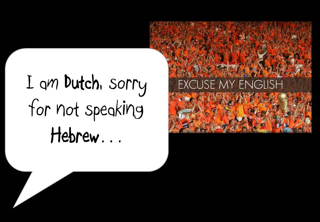
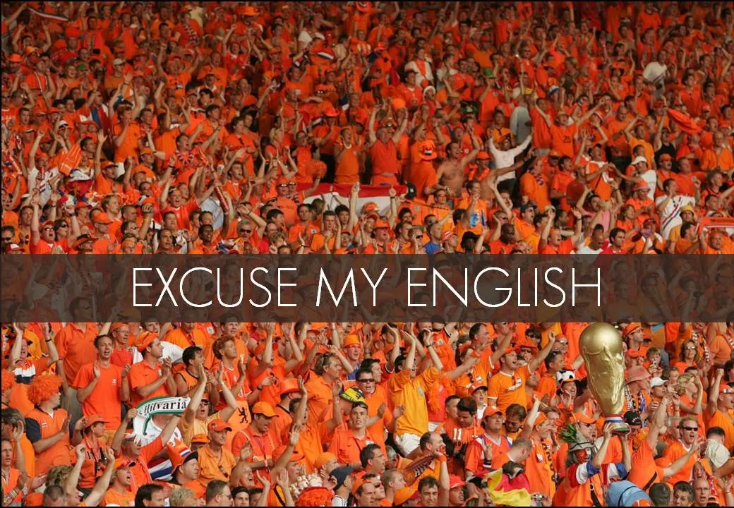
One piece of feedback I got is that I should not apologize for speaking poor English on the first slide. Rather as a presenter, you should radiate confidence. Makes perfect sense. This is actually not what the slide with the Dutch soccer supporters was meant to say… I was apologizing for not speaking Hebrew.

In this context, the mismatch was harmless and even funny. In other situations it might not be.

I enjoyed receiving so much positive feedback on the SlideShare slides. Thank you very much. The benefits of sharing the slides far outweigh the drawbacks in this case.

·Design

Designers and developers sitting in a tree...

This presentation was uploaded to SlideShare yesterday. Simple colors. Beautiful fonts. No stock images. OK, some bullet points, but nicely formated. A great example of a presentation that can stand on its own, without the presenter being present.

Designers & Developers Sitting in a Tree (Web09)

More on picking the right presentation style for the right presentation occasion in a previous post.

·PowerPoint

Remote presentation tool: Dimdim - the best one around?

I need to host an international web-based PowerPoint presentation and I searched around to find Dimdim.

  • It’s free for meetings up to 20 people.
  • Neither the host, nor the participant needs to install any software on his/her computer.
  • And it’s open source.

Sounds great. Does anyone have experience with this tool, or alternatives? In any case I will report back.

·Design

SlideShare ribbon for tight integration into PowerPoint

Today, SlideShare launched a ribbon for PowerPoint, integrating its functionality more tightly with the desktop office application.

·Design

Using "paste as PNG" to wash out complex PowerPoint objects

Going a bit (only a bit) against the “Zen” presentation philosophy, I have argued before that overwhelmingly complex PowerPoint charts could be used in a large keynote presentation, if (big if) they are positioned well.

One way to use it is as follows:

  • Put up the overwhelmingly complex chart, message: “it’s complex, don’t even try to understand this now”
  • In a subsequent chart, wash out the original object
  • Start highlighting individual components for further explanation

You can use the “paste as PNG” function in PowerPoint to transfer any object (including complex groupings) into a picture and subject it to the regular picture manipulation tools available to you: resize (a pain for complex PowerPoint objects with text in them), crop, and of course re-color.

Recoloring the image with a very light overlay creates a wash out effect that you then can use as a background for subsequent highlights. I have tried to explain all this in the following SlideShare presentation (click on “screen” image at bottom right for full screen mode).

·Sharing

Reviewing the SlideShare financial crisis presentation contest winners

The winners of the SlideShare presentation contest about the financial crisis were announced a few days ago.

  • My general point about SlideShare-style presentations being great for online viewing but not always the best solution for live audiences still stands.

  • The content of the winning presentation is not surprising, most of us will have picked up the messages from the newspaper. It is a shame that none of the winners used visualization of data from original analysis to give us a really new insight in the subject matter.

  • It is great to see how contests like these can spark so much creativity in people submitting their work.

Having said that, let’s discuss the graphical execution of the winners:

The winner:

The Financial Crisis: an Historical Perspective

I like this presentation, especially the use of images (the historical paintings look great, the falling knife almost makes you feel the pain in your own hands.)

Number 2:

The crisis 101 (US economy 2008) - put simple serie

Not judging the content here, I like the execution of this presentation less. The link between the text and the images is not that strong.

Number 3:

Cooking up an International Global Finance

UPDATED. While I generally do not like simple graphics like clip art in presentations, this presentation uses this technique beautifully. All graphics are custom-made. They have a consistent style, and the “simplistic” graphics provide a good tongue-in-cheek contrast to the really complicated subject matter and the whole thing hangs together well.

·PowerPoint

Why SlideShare will turn into a major platform for spreading ideas

More and more I come to the realization how online presentation sharing tools such as SlideShare will become one of the main platforms to spread ideas.

  • An image says more than a 1,000 words. Long pieces of text do not work for an impatient Internet audience suffering from information overload. Short blog or Twitter posts cannot capture complex concepts. LOOK AT THIS SHORT POST AND MANY PEOPLE WILL ALREADY DECIDE IT’S TOO LONG TO READ

  • Images are a pain to manage in HTML, especially when you want to add text, shapes, etc. SlideShare makes it easy to put up a sequence of images. Slideshare makes it easy to embed, share this.

  • Presentation Zen ideas about good presentation graphics are spreading into the mainstream: more and more people know how to leverage presentation software correctly

  • SlideShare enables some remote “flow control”. People click frantically, but follow the script better than when scrolling down a column of text only eye balling bold words, or abandoning a YouTube (or TED) video mid-way

Remember, a good SlideShare presentation is not the same as a presentation for a live audience. See my earlier post on Not all presentations are “Zen”.

  • A SlideShare audience is as impatient as any, but it does not sit in a room where it is impolite to walk away mid-presentation. Every slide should invite watching the next one.
  • People watch SlideShare presentations on a very small screen, like sitting in the back of a huge conference room: large images, big fonts are even more important
Continue reading →
·Sharing

Flowgram - stitching web content together into a presentation

Ars Technica is featuring this review of Flowgram, a tool to create a sequence of web content (sites, Flickr photos, audio voice over) into one presentation-like format. Flowgram’s founder has written a flowgram about - you guessed it - what is a flowgram here. This new tool seems particularly useful to develop presentation content that is loaded on a web page and designed for individual viewing. In a strange way, some of these web 2.0 presentation tools take some of the interactivity out of the internet and bring the online experience back to something that is called TV… Sit back and enjoy. UPDATE: Tony from Flowgram has a good point in the comments, Flowgram preserves the ability to click links during the presentation, so not that passive after all.