

The vast majority of Google traffic that lands on my site is looking for advice on how to write a “McKinsey presentations”. Let’s discuss them a little bit more, including my logic why they might NOT be suitable for just any communication situation. Why do they look so good and professional? A few reasons (some of which are good recommendations for any presentation you prepare)
- They stick to a strict slide format: every page is laid out exactly the same, making the whole document look very consistent
- Pages have muted colors and no spectacular animations.
- Consulting presentations are almost always all about numbers, and this quantitative data is displayed and structured in simple and clean data graphs (i.e., not an ugly, busy cut and paste from Excel), and numbers are rounded
- Each chart has a single message, which is written out in the chart title and clearly supported by the numbers in the chart body
- They (sometimes over-)use a lot of frameworks to structure information: a time line, the impact of a number of forces, evaluation of pros and cons, strenghts and weaknesses.
- The presentation has a clear logical structure, taking you step by step through an argument. A lot of energy is invested in the PowerPoint slide sorter: re-shuffling charts until the story is lined up the correct way. This process is not only for communication purposes, it is an integral part of problem solving. Trying to articulate a logical story will inevitably highlights flaws in logic, sending you back to the drawing boards to do additional analysis or change your recommendations.
- It is full of summaries. If you have 30 seconds to read a document, you will find the full story on page 1, if you have 5 minutes, you can read the summaries of the next subsections (each section explaining 1 paragraph of the summary in more detail), if you have more time you can read the whole document.
Where do these presentations work best? Not surprisingly: to present the results of a consulting project. The “answer” on page 1 supported by all the backup and analysis for people who need to be convinced, or to find the source of that 1 number a year after the project is finished.
What can you learn from them? Even if you are not a strategy consultant, your presentatations greatly benefit from consistent formats, colors, 1 message per chart, clean data graphs etc.
Where can you be different? Still assuming you are not a strategy consultant, your presentation style could be different in a number of ways.
- Don’t completely give it all away on page 1. Especially for large audiences, try to create interest and take people along an interesting story only giving a hint of what you are going to do.
- Structure is not all about logic. A story line should be interesting and surprising for the audience, not a mathematically tight proof of a solution
- (Standard) frameworks are boring. Frameworks are great for solving problems, and not very good for communicating solutions. To be avoided.
- Summaries are not repeats. Don’t give your presentation 3 times: on page 1, the body, and on the last page
- Use creative graphics, professional images, be more bold
- Avoid lingo, use your own language
In short, make the presentation your own!
Cover image by Ben Rosett on Unsplash
UPDATE February 2018. I have now added many slides that are typically used in consulting presentations by McKinsey and other firms to the SlideMagic template store. You can run searches such as “consulting”, “McKinsey” and have a look at the slide designs that come up.
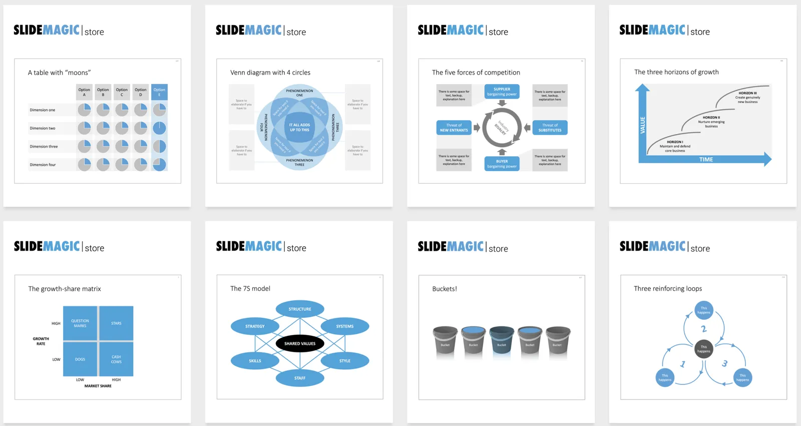
Examples of PowerPoint slides that are typically used in consulting presentations
1 comment
But the one guideline that I would follow is the use of slide titles - McKinsey's tend to be descriptive, giving a summary of the slide content in one sentence.