

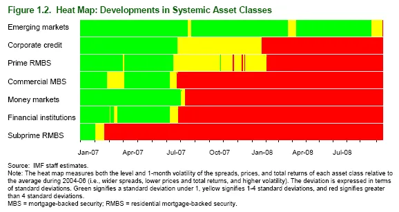
The current financial crisis is a “gold mine” for data visualization. Below is a heatmap taken from a recent IMF report on the world’s financial (in)stability. The chart shows how the troubles have spread from subprime mortgages to other asset classes over the course of 2007 and 2008.
Many more data visualization examples related to the financial crisis can be found on Paul Kedrosky’s “Infectious Greed” blog. I discussed a financial crisis primer in PowerPoint earlier here. More on heatmaps here and here.
1 comment