

See this chart:
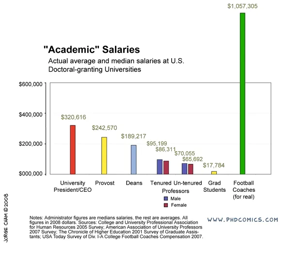
It breaks a number of rules. The most obvious one is the bar towering out of the chart frame. But hey, it helps make the point!
Original chart can be found on PHD Comics. I found it on Junk Charts
UPDATE: this chart does violate some other basic design rules that are better corrected, see an earlier post about cleaning up Excel/PowerPoint data charts.
2 comments
Really, though, I don't think the bar extending past the range of the chart is the most heinous offense, here. Lots of design rules got broken...
I have quite a few problems with the way text is treated, for instance. I found it hard to read in many cases.
And I don't think a separate color for each entry was really necessary. The point (football coaches make way more money than anyone else) could be made just as easily if the chart were in black and white.
Then, the male/female difference sort of muddies the waters. What's the point of the chart again?
The best designers will always break rules when they need to, but the rest of their work will adhere to good design principles.
So I'd say "If you break rules all the time, you don't get style points when you do it for a good reason. Only break the rules when it serves your design objective."
Another way to approach this chart is through an image. Maybe a parking lot. A line up of regular cars with arrows indicating the salary of the owner. Then at the end, we have the stretch limo taking up 3 parking spots :-)