

Weekend reading (1 day earlier than the rest of the world in Israel). I stumbled on this great ad for Adobe Photoshop CS4.
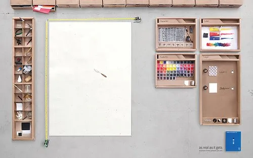
It shows what graphics and presentation design is all about, a creative process working with shapes and colors and a blank piece of paper. Computers make it easier to work, but in our mind we should go “back to basics” now and then. Go to this Flickr stream for more detailed/hi-res images. Agency Bates141. Via Zurb.