SlideMagic Blog

Frequent updates about all things presentations since 2008. Subscribe to never miss a post.

RSS
·Investor presentation

The psychology of images

An almost 50 page scientific article was published last month that looks at the impact of images, on financial investment decisions. A quote from the article:

We demonstrate that positive images significantly increase and negative images significantly decrease investment, despite the fact that the images do not provide additional information relevant to the investment tasks and should be disregarded by rational investors.

It all seem statistically relevant and scientifically sound.

It makes intuitive sense as well. A boring presentation without any images is not very effective. But people sometimes ignore the ‘mood’ of an image. Even if the visualisation of a concept is perfect, but you picked an image that is ugly, scary, gross, its visual impact will be the opposite of what you want it be.

Does this mean that you should plaster an financial presentation with meaningless pictures of rainbows? Probably not, everything in moderation.

See the results of the study here.

·Sales presentation

What your audience does not know

It is a waste to spend presentation on things your audience already knows, or already assumes is the case.

  • Already knows: common knowledge among informed audiences. A specialized investor who invests in crypto knows the basics of what is going on in that market.
  • Already assumes: something that people guess instantly, you IPO-ed both of your 2 previous startups, so the question can she be a startup CEO does probably not need any more time

You can score the obvious points very quickly with a snap reminder slide. Now it is time to move on to things that might surprise the audience (in a good way).

But remember, things can work the other way:

  • Already knows: “It is impossible to make good returns in healthcare diagnostics”
  • Already assumes: “She looks like she just got out of college, she cannot sell to big pharma”

Put yourself in the shoes of the adience.

·Data visualization

Don't make them study the graph

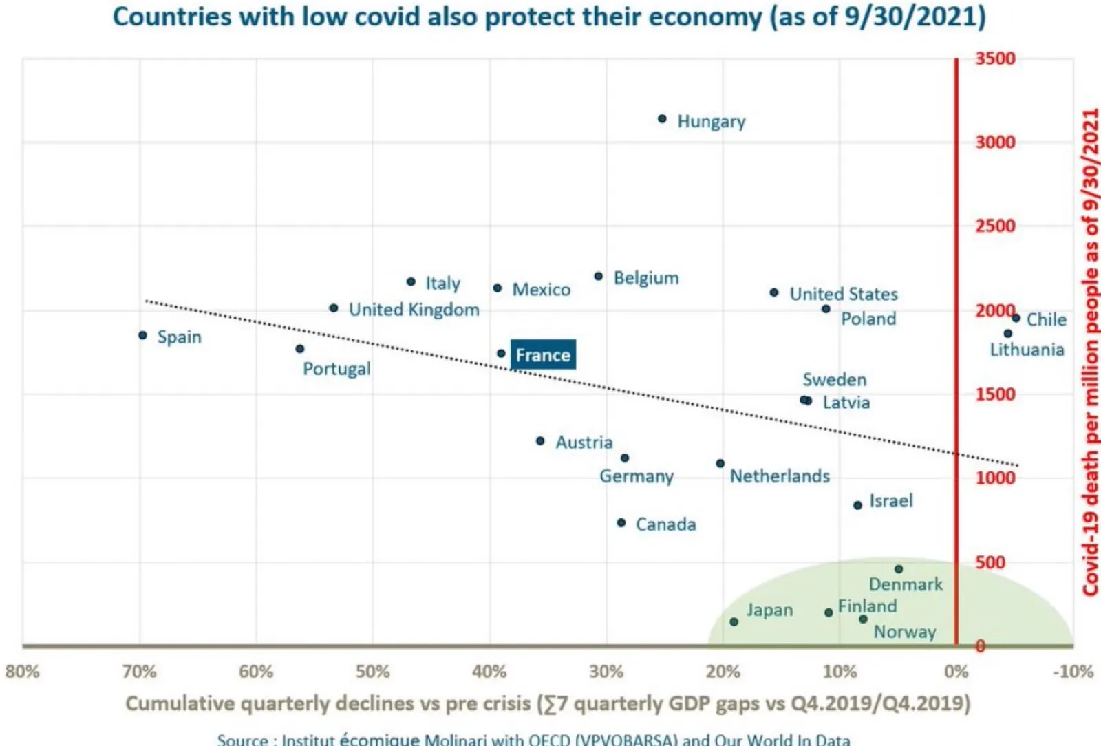
A random chart on Twitter made me pause to see what is actually graphed. The chart title suggested a positive correlation, but the line is actually sloping down.

On closer inspection you see that the vertical axis is “low is good, high is bad”, and the horizontal axis is “left is bad, right is good”, also the horizontal axis talks about “decline” instead of “growth”, so a positive number is actually a decline.

To analyze data, it is OK to ponder and study a chart. In a presentation of final results, not.

·Typography

Sorting text by length

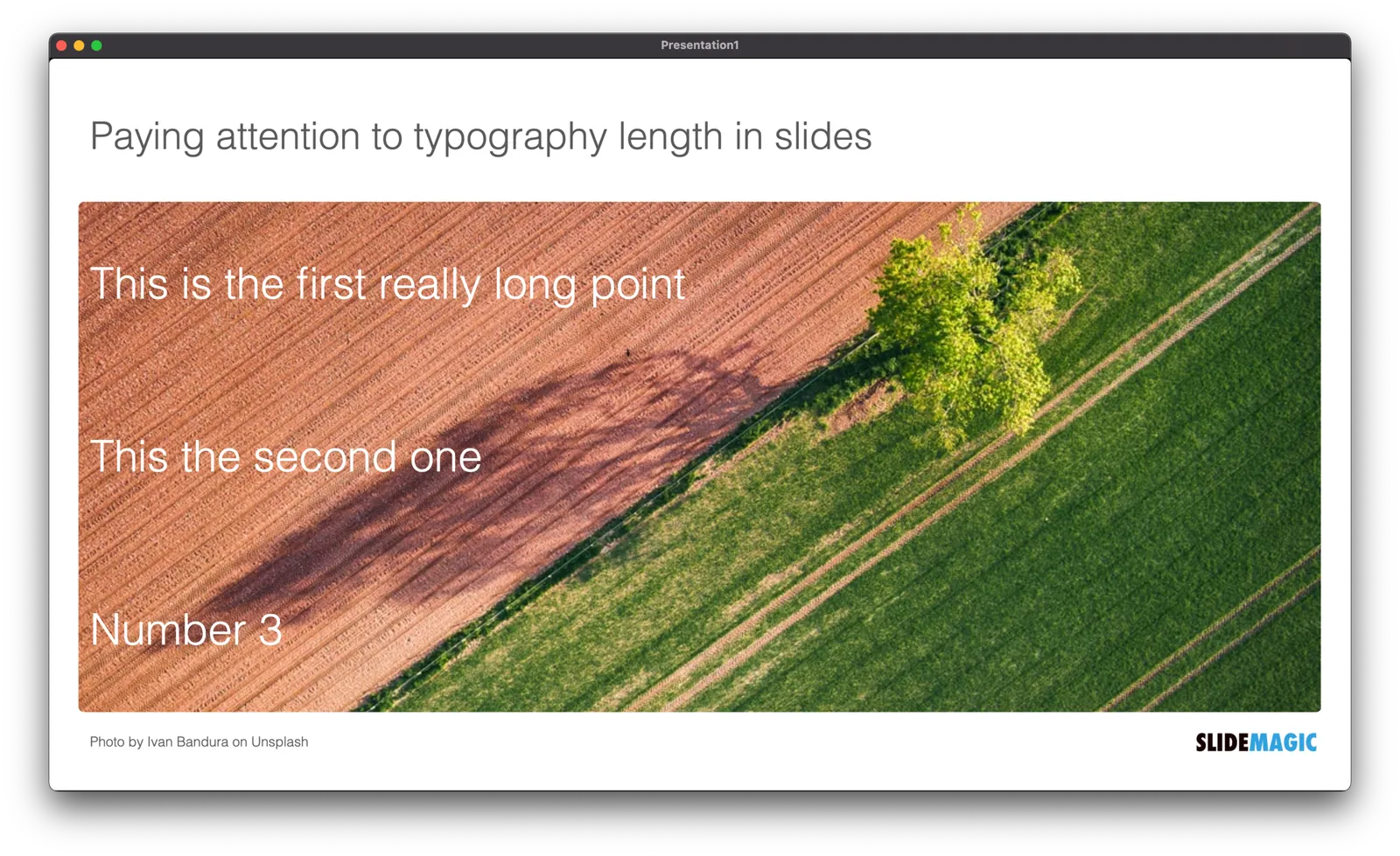
In slide design, every detail counts. Pay attention to the length of text blocks when putting them on a page. Sorting them by length can give an interesting visual effect. Or the other extreme, picks words on purpose so that the length of each text box is more or less the same.

PS. How did I get the picture? Search for “diagonal" in the SlideMagic app and you get lots of suggestions

·Images

Smile with your eyes

The current requirements to wear masks in public places shows that you can still smile without revealing your mouth. Do it when posing for a picture with a mask, and without one!

 Me and my (disguised) daughter in Paris

Me and my (disguised) daughter in Paris

In art, smiling with your eyes is taken to another level entirely though…

Stuck!

I needed a chart today that showed how things are in a deadlock, everyone is waiting for each other, and as a result, nothing happens. I added this new design to the SlideMagic library for you to use.

·Delivery

The interviewer who wants you to shine

Unless you are a politician, powerful CEO, or another controversial person, most interviewers for podcast, video interviews, TV interviews, conference panels probably want you to shine on stage. She is likely a media pro, you are not appearing on screen every day.

A good interviewer has a little chat with you before the show, gets a quick ideas of the interesting points you can share with the audience, and then will proceed to give you the best possible setup question to tell your story.

In this friendly environment, you can patiently wait for the question to finish, and deliver the punch line that you might have practiced before (practice it a lot in order to be spontaneous). No need to jump in early, deviate from the question, or be surprised because you did not see the question coming and need to think about the answer after you started answering the question.

In some sales or investor pitches, the role of this friendly interviewer might be the person you convinced of your story, and now needs to sell it to her superiors. Help her out if you can.

·Creativity

The brain is predicting

Here is an interesting article about how our mind works. The brain is constantly predicting impressions to save energy. It has a number of layers. A higher layer creates a prediction based o a lower layer. The lower layer can report inconsistencies to the layer above, in case we can go a level deeper.

This is probably the same mechanism that intuition uses, as long as we observe something that is in lie with our prediction, we maintain low energy mode, if things start moving apart, we add brain power.

Remember that this is how an audience will be looking at you when presenting.

·Layout

Fitting text in circles

It is very tricky to fit paragraph text into a circle. Line breaks are never smooth, especially when you have long words. My approach is to use a larger circle, but fit the text inside an imaginary square that just fits inside the circle.

For math geeks, the ratio between the side of the square and the diameter of the circle is the square root of 2. I had to use this proportion recently to fix a web site layout.

Obviously very short headings fit perfectly well inside a circle.

(Yes, yes, circles will come to SlideMagic)

·Colors

Changing the color of the French flag

President Macron of France changed the blue color of the French flag. He made the blue darker again, after it was set to be the same blue as that of the European Union flag back in the 1970s. (Then president Giscard d’Estaing thought the different shades of blue clashed during photo ops).

I agree with Macron, the darker blue looks better, flags have a history, and i don’t think the two shades of blue clash at all. When doing design work, pay attention to flags. They have very specific colors (like logos), and very specific aspect ratios.