

Blog post

Even better than I did

December 9, 2021 ยท by Jan Schultink
โ† all posts

This Venn diagram is a great visualization of why you still see vaccinated people in the hospital.
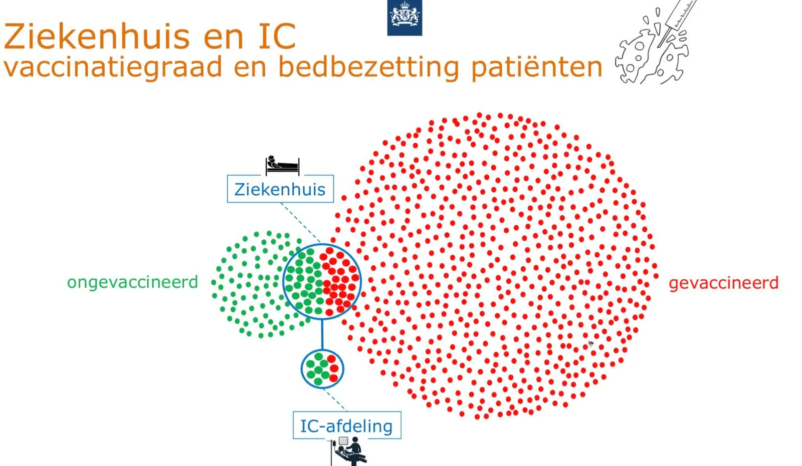
I gave it a go myself a while ago, but this visualization is better. Source of chart: RIVM, source of image. One improvement suggestion: switch the colors red and green.

Data visualization

About this blog

Notes on all things presentations โ€” design, storytelling, and AI workflows.

Subscribe now to never miss a post.

RSS

About SlideMagic

A platform for business presentations.

A free student plan is available.