SlideMagic Blog

Frequent updates about all things presentations since 2008. Subscribe to never miss a post.

RSS
·Design

Organized randomness

This is a tricky thing to do: create a layout of seemingly random elements that look good together. I need to deal with this now for the new venture I am setting up

It is a process of constant iteration. Put one type of elements, put another. Add text and titles. They shift the weight of the page, so everything has to move around again, different screen aspect ratio, another shuffle. Repeat, repeat.

Subconsciously, your brain is scanning for anomalies in the unwritten rules of a layout. You don’t know what they are, but you see it when you break them. For example, including one angle in the path above that is “sharp” (i.e., smaller than 90 degrees, would stand out.

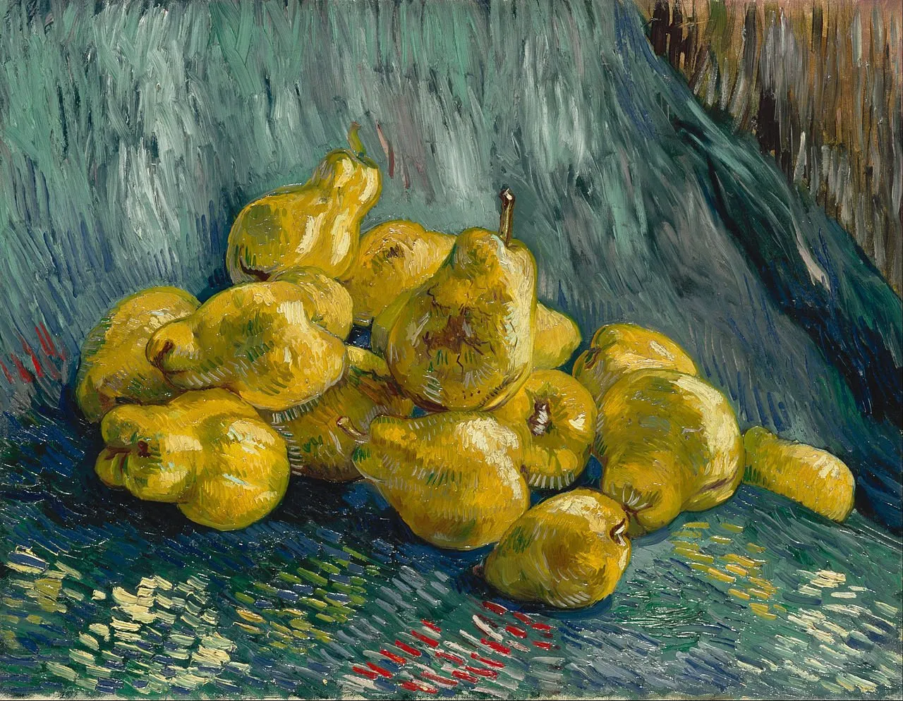
Architects have to deal with this a lot, or painters laying out the “random” elements of a still life painting.

In the end, we are all artists.

·Delivery

On-screen app demos

I just went through a live on-screen application demo, some things I learned, some things I knew already.

  • If the meeting is very short, consider doing a demo using screenshots on slides. This prevents losing time in technology glitches and the less interesting part of your app (logging in etc.). Have a live version of your app running on your machine as a proof that the real things is there.
  • Rehearse the exact scenario you will be running. Which demo users will log in, what will they do, in what sequence. Again, this will eliminate technical issues, but also makes sure your story fits with the overall pitch (no dead ends, no duplications, repetition of things you already explained using slides).
  • Make sure that the app looks right. For some apps, this is a full screen rendering on a very large monitor, for other apps this might be rendering of your app on a smaller screen on the big monitor. In the latter scenario, remove visual distractions from your laptop desktop.
  • Pay attention to the details of your demo environment. Add avatars for your demo users that fit nicely with your app colors. Fill out optional text (even with lorem ipsum) that might not be crucial to your app, but make the whole screen look more balanced.
  • Laptop track pads feel strange when you have to look at a giant monitor at the other end of the room. Consider bringing a mouse so you can ignore your laptop all together, or mirror your screen.
  • Pay attention to your monitor configuration when using dual screens. If the big screen is to your right, make sure your computer thinks it is there as well. Every time you have to “think” where your mouse is, you take your attention away from the pitch.
  • Think of your “background screen”, what is the view of the app you want to be sitting on the monitor when the demo is not really running. A blank login screen, or a blinking cursor of your localhost server does not do much to pitch your app…
·Images

The genie is out of the bottle

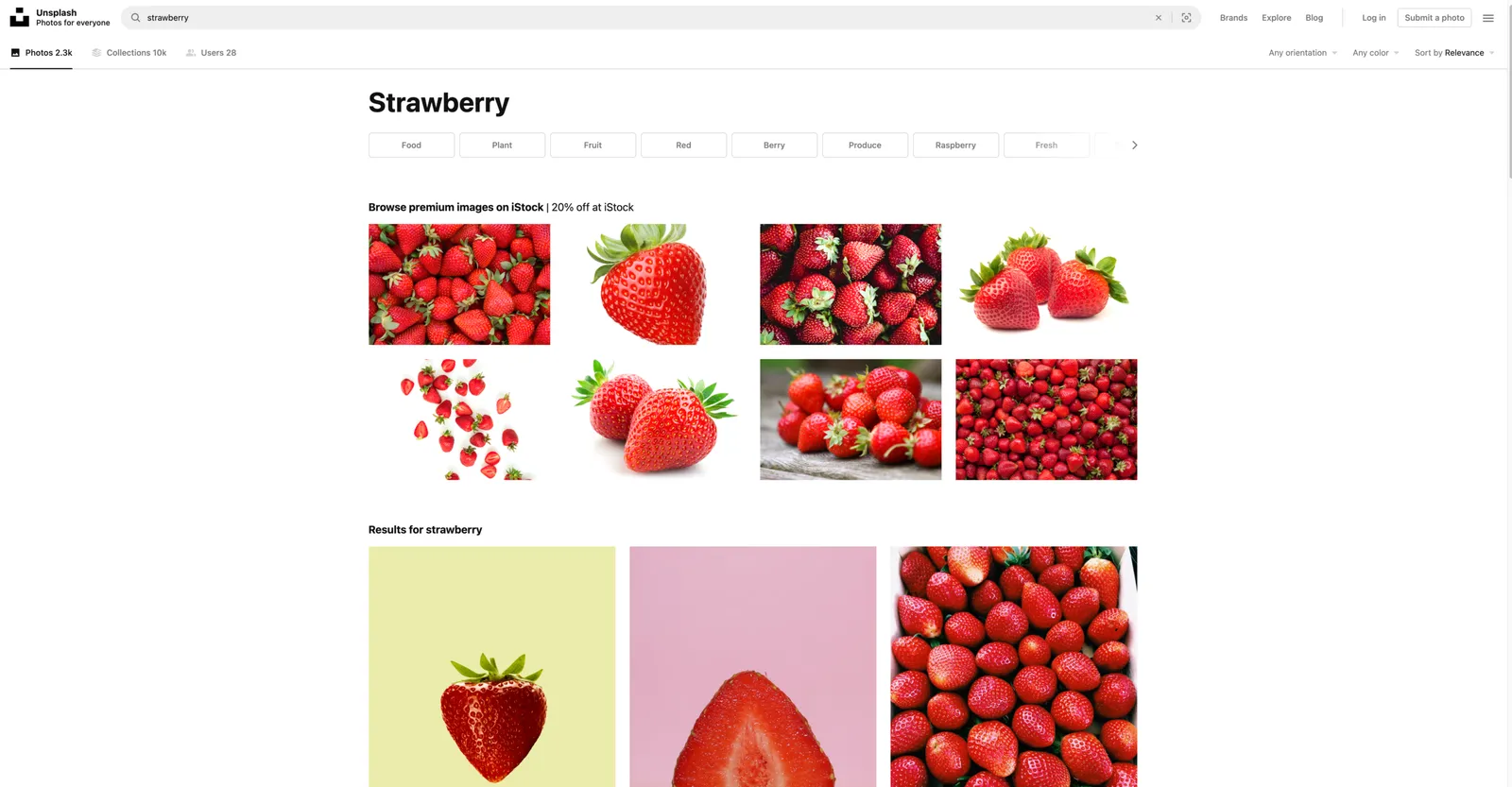
I wasa bit worried about Unsplash after the Getty acquisition, and the current home page of my favorite photo site confirms some of these worries, 50% of the space above the fold is devoted to promoting iStock (scroll down and they take another chunk at the bottom of the page). I think the genie is out of the bottle when it comes to free, open source images. And this page actually shows that there is no quality difference at all between images for which you pay, and images that are free. Unsplash has a responsibility to all the photographers that made their images available under a certain expectation of the spirit of the site. Hopefully it can find a suitable business model that will work for everyone. If Unsplash does not succeed, a new Unsplash will emerge somewhere.

·Creativity

Changing the engine while driving

This is the approach I take when making drastic changes to computer code, a presentation, or a spreadsheet. When you decide to turn a big piece of work upside down, you can’t simply tear up the whole thing. Instead, you change things carefully, constantly monitoring whether the program keeps functioning, and/or the spreadsheet still produces more or less the same answer. When it does, take the old stuff out bit by bit.

This is the only way to manage mistakes. If you changed 5 things and see that all of a sudden your average price per bottle is way off, you cannot tell which of the five is the culprit.

What if all of a sudden your boss, customer, or user wants an intermediate new version of the model. If you are mid-way in some major rewrite, you cannot produce it quickly.

Or, maybe you discover halfway through that the 2nd change of the 5 you pushed through actually does not make sense. Unwinding everything is hard.

·Templates

Another slide makeover

McKinsey’s social media activity provides an excellent stream of slides to work on. The one below could have come straight out of SlideMagic.

I created a proper SlideMagic version with a few improvements:

  • Emphasized the “from to” theme of the chart with arrows, and two contrasting colors, and a bigger distance between the two options
  • Lighten the colors a bit, especially the dark top row of the original puts a lot fo weight in the chart
  • Actually reduced the font size a bit to give the text more breathing space in the boxes
  • Re-shuffling the bars to get a more pleasing overall composition
  • I eliminated the left column, the audience can guess the description, to add more balance to the composition and gain some extra space

SlideMagic users can use this chart, simply search for a relevant keyword (operations, consulting), and it will pop up for you to adjust to your own project.

·Layout

Dynamic layouts

For my next venture, I am actually getting into a lot of “slide” design work: displaying financial data in a web browser with totally unpredictable screen sizes and screen aspect ratios. This problem has been solved for traditional web sites with text and pictures. (That is pictures where you do not really care how they are cropped).

For financial information, this is not the case. Spreadsheet-like tables that look good both on a 27” widescreen monitor and a smartphone screen, for example. All this layout work is not the core of what this venture will be about, but I am learning a ton that can feed back into SlideMagic. And vice versa, the SlideMagic chart engine, could take data from this new system and create presentations pretty much on the fly.

To be continued.

·Data visualization

McKinsey slide makeover

A saw a slide by my former employer coming by:

It has a very sophisticated image effect: look how the background of the bars in the chart are part of one image. Still, there is room for improvement. I quickly replicated the chart in SlideMagic with a few changes.

  • I brought back the more traditional, very in-your-face alternate coloring of the bars, blue for 2021, grey for 2020 and a legend, instead of the repetitive text labels with the years.
  • I increased the size of the industry sector labels
  • By replacing 910b and 582b by 0.9 and 0.6, I could get rid of the “t” and “b” in the bar label.

But the analysis of the slide can be pushed further. The main point of the slide is how markets have bounced back over the past year, which is independent of the ranking of the market capitalizations of the sectors. As an alternative, I constructed the combined table/bar chart below, de-emphasizing the absolute value of the market capitalizations, and using the bar chart to highlight the % increase in market valuation. The inside here is that all sectors grew more or less the same over the last year (except fashion, probably reflecting less dressing up for work.

I have added the slide to the SlideMagic slide library, look for “COVID” and they will show up. Emails subscribers: if the slide images don’t show up in the email, please open the link to the full blog post.

·Images

Selecting the right photos

The photo shoot from a few weeks ago delivered almost 900 images. We are still selecting the ones to use. Here is the approach I take to go from 900 to 10…

I uploaded all images in a good photo organizing app (I use Google Photos). This enables me to scroll really fast through lots of images. (Desktops are slow to generate thumbnails). Also, it easy to mark images and share those. Trying to copy file names is a pain. Finally, I uploaded all images in full size, so that the photographer can download them in case touch ups are needed.

The I take different zoom levels: zoomed out, which ones have a great composition that pops out as a small picture, without seeing the fine details. Which images have lots of white space that I could use to overlay text. Zoomed in, which images instantly “speak to me”, where is the camera gaze just right, without paying too much attention to details. In a short period of time, I mark a lot, a lot of images.

Then the selection process switches to the “favorites folder” and it becomes a matter of “deselecting”. Take out the obvious mistakes (closed eyes, etc.). When images are similar, force yourself to pick one. If you really like an image, go back into the big pile to get all the images that were made around that time to get the best one. Step by step, you get closer to your 10 final images…

If possible do all of this on a desktop machine with a very large monitor and mouse with fast scroll wheel.

·Colors

Messaging group avatars

“Upload a profile picture” is the question you often face when creating a new messaging group for an upcoming event, a school parent group, etc. Most people go for a relevant picture, for example the class group photo of last year’s end of school year party.

But avatars are tiny and often have a circle shape. What jumps out most to the user is the dominant color of the image. So the best solution for avatars for these temporary messaging groups is a big bright colorful square (will be come a circle after uploading) with a big bold letter or number. “52” on green for the birthday party, 2 on purple for the 2nd grade parent group. Easy and effective.

(Pro-tip: use SlideMagic to create your avatar…)

·Layout

Not a very good Apple slide....

This Apple slide from a recent product launch event looks very non-Apple…

  • Busy, lots of information
  • Font sizes all over the place
  • Big 13x, 11x, 2x, but hard to read what is improved
  • Rounded edges are too rounded
  • The grid is broken
  • Imbalance: some boxes have heavy dark images, bleeding off the edge, others have no images…
  • Look at the font styling used for “thermal”

The people and design budget at Apple can do better than this…