SlideMagic Blog

Frequent updates about all things presentations since 2008. Subscribe to never miss a post.

RSS
·Layout

Eyeball the thumbnails

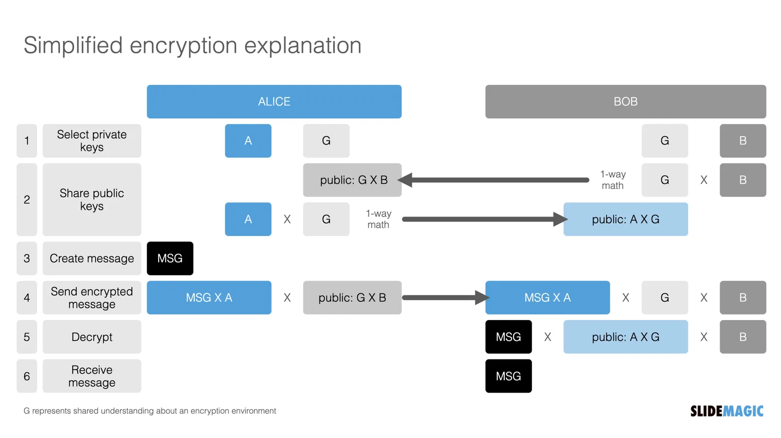
The thumbnail strip to the left of most presentation software is not only useful for switching to other slides, it also is a good feedback mechanism for slide layouts. It is like sitting in the back row of a big auditorium, or viewing the slide in a small preview window on a Zoom call.

·Story

The short repeat break

I took my daughter to Paris a few weeks ago (just before the new COVID wave) for a very short trip (Thanks Giving). She found it far too short, while I agreed that it was short, but still felt it was a nice and restful break.

The probable reason? I have been to Paris many times before, even lived right next to it for a year. For me, going back to it simply triggered a memory of all the stories and experiences I had there before. (A tip for prioritizing short holiday destinations).

The same happens with a presentation slide. For the person / team that made it that bullet point sentence (or even word) makes perfect sense, because it packs the entire 3 months worth of effort. For the first-time listeners, it is a cryptic sentence.

·Layout

Out of the frame

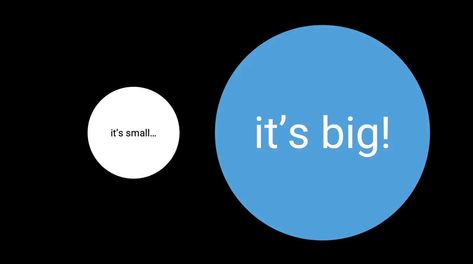
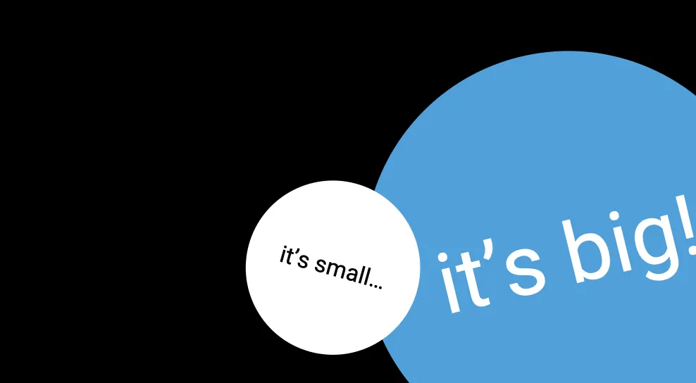
If you are daring, you can consider letting shape go off the page, or tilting text in them to make your slide look more alive. And/or tilt things a little. Text could even run a bit out of the page frame. The good thing about circles is that tilting text does not impact your overall slide layout.

(Yes I know, no circles (yet) in SlideMagic.)

·Typography

Typography is everywhere

The building manager finally installed a house number on our building, to reduce the amount of desperate calls I get from couriers. Still, I wished he had asked me for a suggested position where to put it. “Bleeding off the page” is not the right concept here…

·Layout

Your pitch deck on the home page

Happy 2022! I am returning to blogging after the holidays. Over the past week I have been busy designing the web page of our new medical startup (still in stealth, so I cannot show it to you yet…).

The more I thought about this page, the more I came to the conclusion that the web presence of this company at this stage should be a pitch deck to potential partners, rather than the usual feature list and headshots of the management team.

Most “presentations” on web pages are either a static gallery of images/screenshots, or an embedded video., but this layout does not look very good across a wide range of unpredictable screen sizes. For a chart to look good on different screen sizes, and more importantly different aspect ratios (phones are portrait, computers are landscape), you need to break the fundamental layout of the page.

Most slides have the classical title-on-top, content-in-a-rectangle-below layout. For my site, I changed that to 2 squares, one of which takes the role of the slide title with a big written message, and 1 with a supporting graphic. The layout changes depending on the device you are watching the site.

This layout change is common on web sites, but it is used a bit randomly. Pictures and text blocks move around disconnected depending on the screen size. For a “presentation” you need tighter control.

Another major problem for a web designer is rapidly changing content. It is common to make small and big changes to pitch decks all the time, while websites are relatively static. To solve this, my experience with SlideMagic came in very handy. I wrote a simple chart engine that reads “slides” with their titles and shapes in a simple format, and then renders them on the screen in the desired aspect ratio.

Continue reading →
·Creativity

The bullet point trap

How do we end up with so many presentations that are mainly slides with bullet points?

A pitch usually has 2 types of slides. The clear cut ones: head shots of the team, columns with revenue forecasts, pictures of the product, screenshots of the app, table of the budget.

Then there are the ones that are less clear, the ones that need to tell the story behind your idea. When we start off,:

  1. we don’t exactly know what they need to say,
  2. we don’t know exactly what they should look like

These are 2 big challenges. It is not obvious to craft the story line with messages, and after you did that, it is not obvious to design a slide that delivers the message.

What happens? We open a slide editor and start putting in sentences on slides, move slides around. We can’t think about design, because we don’t know the content of the slide yet. As a result, the default bullet point list becomes the design that actually sticks.

We work really hard on the messages, get our colleagues to comment on them, get our boss to “sign off” that exact message (after we added the qualifying comment on line 3). And more and more, the presentation starts to make sense to us (the writer). The slides become mental placeholders, and in our bullet point frame of mind, every new slide will look exactly like the previous one. This is the mental model we are working with.

Continue reading →
·Creativity

6 months, then 30 minutes

We have been iterating a presentation for our new venture for months and months, and then just before we had to send out the first deck to a very serious potential partner, I re-wrote the whole pitch in just 30 minutes. New format, new colours, new sequence, new everything.

Unfortunately, you need those 6 months of pondering in order to pull of 30 minute trick. There are no shortcuts.

But on the positive side: if you have been using a deck for a very long time, you could give it a try and come up with a completely new visual approach for your story.

·Data visualization

Even better than I did

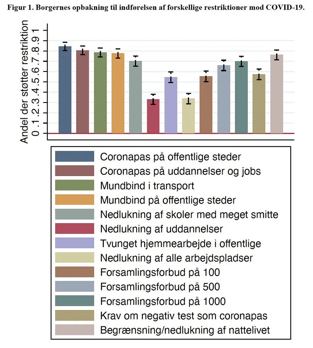
This Venn diagram is a great visualization of why you still see vaccinated people in the hospital.

I gave it a go myself a while ago, but this visualization is better. Source of chart: RIVM, source of image. One improvement suggestion: switch the colors red and green.

·Data visualization

The case for not rounding numbers

In 99% of slides, it is better to round financial data. $1.9m is easier to read than $1,898,456.34. Also the rounded number is more in line with a financial model that relies on rough assumptions. If you project your company sales in 10 year down to the dollar, you lose some credibility with your audience.

In some situations, the opposite approach can work. Look at this poster below of an Israeli anti-vax group who makes the argument that the money that is spent on encouraging hesitating Israelis to get a vaccine, could have been used better in a different way. (I leave pro and anti-vax debates out this blog, although you might guess in which camp I sit).

Here the big number actually works. Anyone looking at this big amount of money instantly starts comparing it to other lump sums you know: how much do you make as an individual in a year, how much does a car cost, how much does an apartment cost. Also, the precision and suggested accuracy of the number adds to the drama. This is a similar effect that National Debt Clocks try to convey.

The correct way to look at these numbers is to relate them somehow: $ per citizen, % of total corona-related cost, compared to other government advertising campaigns, etc. etc. After that, you might still conclude that it is high, but you used the correct metric.

·Investor presentation

No pitch is the same

The internet is full with standard layout for pitch decks. Yes, they mention all the ingredients of your story that should be covered. Many of these topics will be “hygiene checks”, the audience will get them instantly and you can cover them with a placeholder slide.

Where your story is different from others, you have to elaborate with some good visuals.

  • A business model that nobody has ever seen before (think eBay when it just started out)
  • Photos of your the prototype of your hyper car which prove that it actually exists
  • A detailed CV timeline to show that you are perfectly able to run this company at the age of 21
  • A collection of the standard KPIs for online retailers that every investor is expecting
  • A market size that nobody realized existed, “wait, what, $5b per year on erasers?”
  • Etc.