SlideMagic Blog

Frequent updates about all things presentations since 2008. Subscribe to never miss a post.

RSS
·Data visualization

To stack or not to stack?

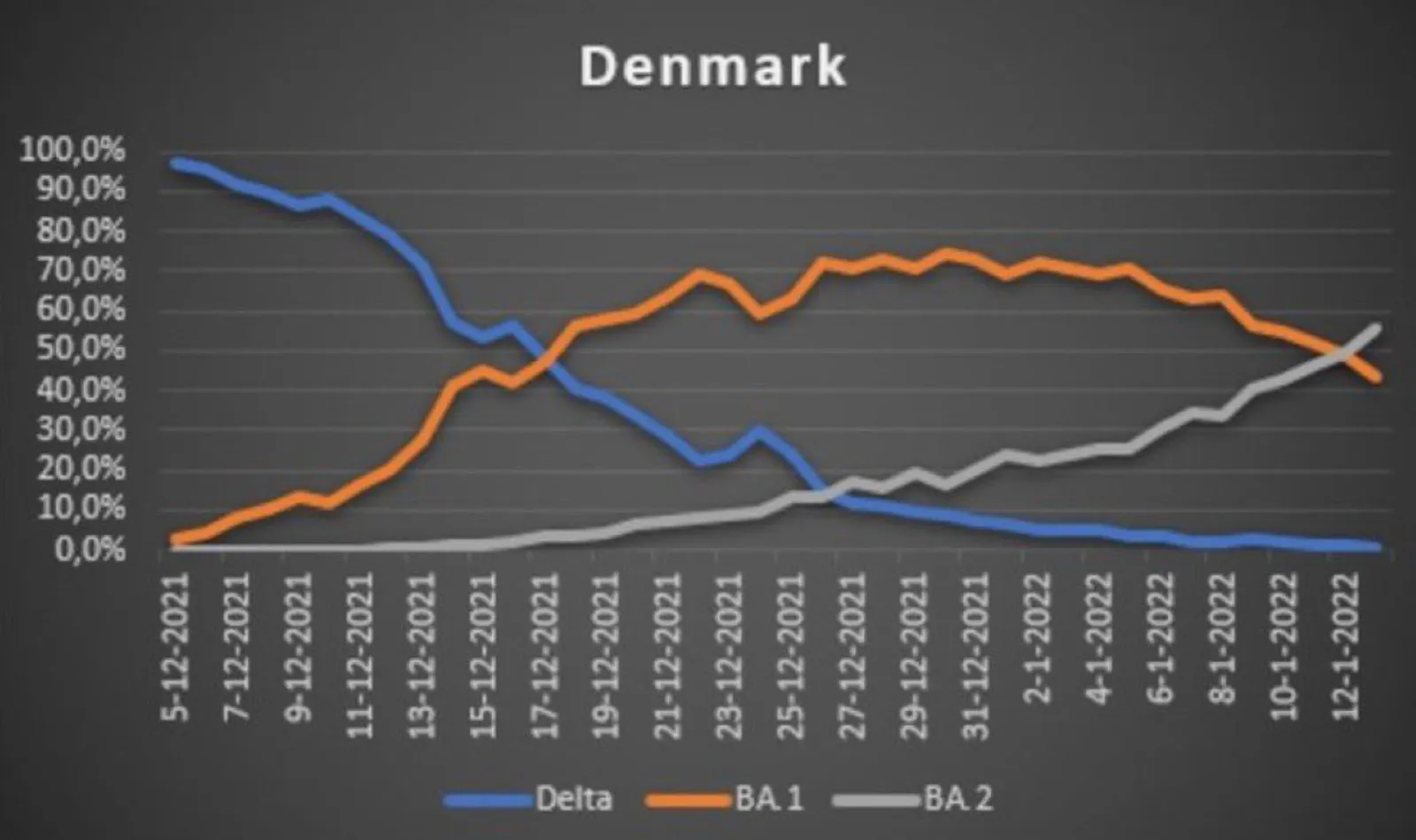
Two charts about a new sub-Omikron (BA.2) variant in Denmark. This line graph shows 3 variants as a % of all sequenced samples in Denmark.

  Source: https://twitter.com/DrEricDing/status/1485456877723045891

Source: https://twitter.com/DrEricDing/status/1485456877723045891

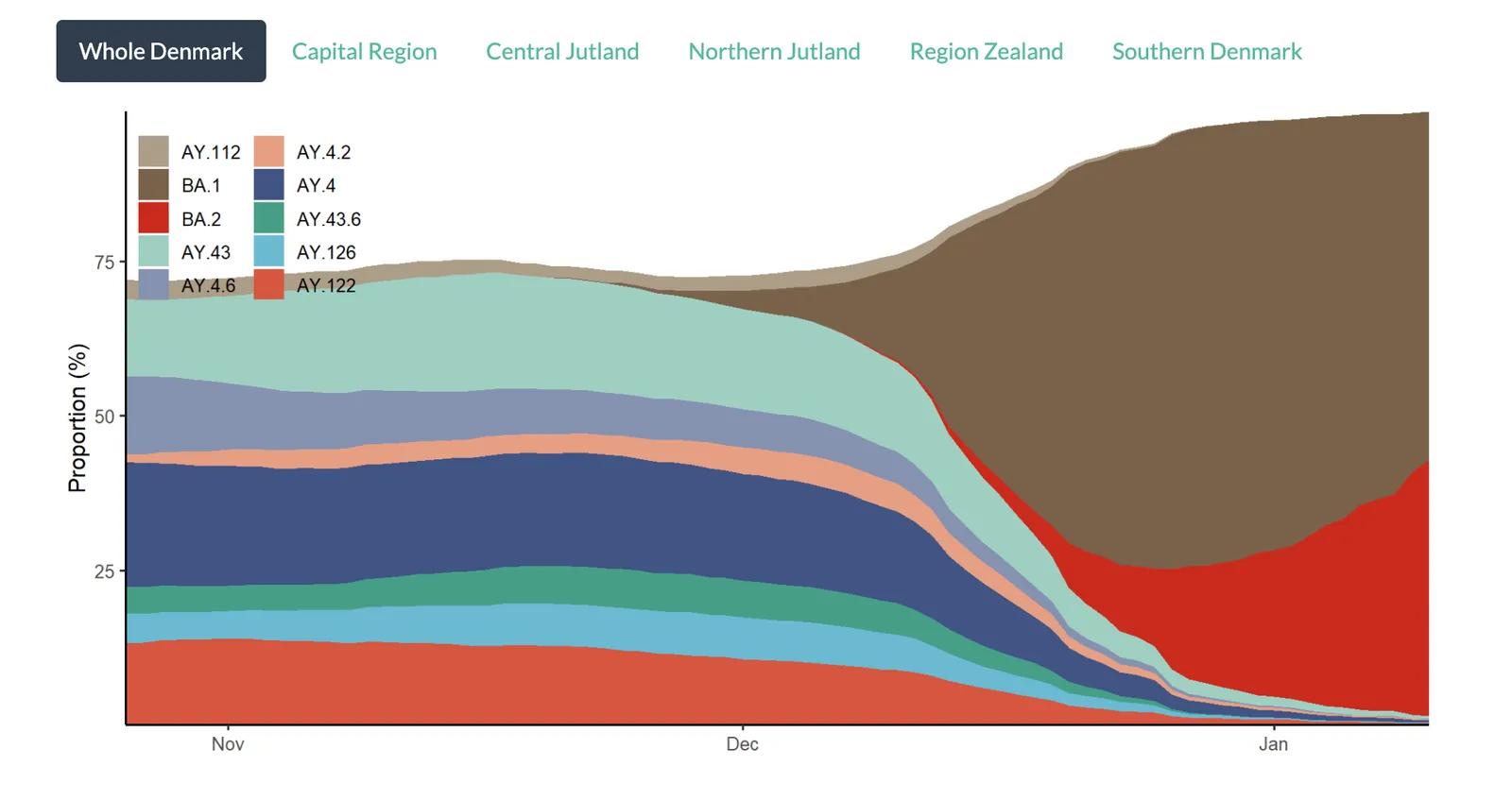
The chart below shows the total number of variants found in the samples. The stack approach does a much better job to give the full picture of what is actually going on,.

  Source: https://www.covid19genomics.dk/statistics

Source: https://www.covid19genomics.dk/statistics

With just one data series, showing a share of the total as a stack or line (column) is the same chart. As soon as you have more than one, pick a stack chart so the audience can see the data in context.

·Creativity

Opportunity for freelance presentation designers?

Many of you readers are independent presentation designers. Having done a large number of online courses now, I think these udemy, coursera, etc. instructors could be great potential clients for you. Most of them talk through a set of poorly designed bullet point slides with a picture in picture video super imposed on them.

  • These slides can obviously be improved, by a lot
  • The narration and creative brief is there for you: the instructor gives verbal instructions as audio and often in a transcript
  • These presentations can have a huge audience, and the overall visual quality can make a big difference in their marketing strategy: if the free sample lessons look really good, students will convert and buy the course
  • As a presentation designer, you can specialize in a certain field: you start a self reinforcing loop: you understand the subject area better, you do better work, you can attract more work in that same speciality area as a result.

I myself don’t have the time to all this design work, therefore I leave it up to you :-)

A smart online instructor can do 2 things:

  1. Outsource design work to a great freelance presentation designer
  2. Do the slides herself, but in SlideMagic
·Concepts

Template: binary confusion matrix

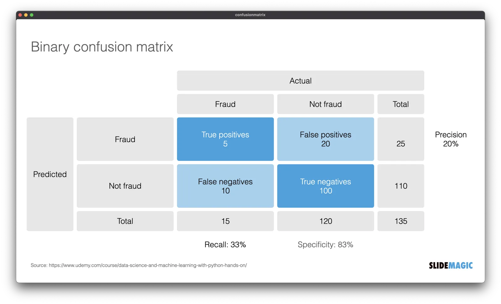
I am dusting off my knowledge about machine learning and data science, and stumbled upon this handy definition of false positives, false negatives, and a bunch of definitions (I always find it hard to keep them apart). I turned them into a slide template that is not part of the SlideMagic library for you to use in your own presentations.

(I use this course if you are interested)

·Images

Backgrounds

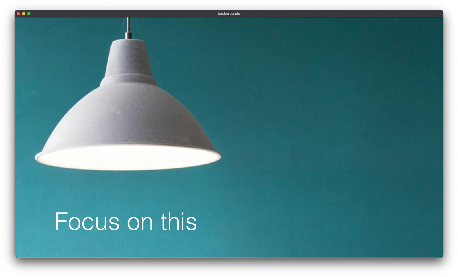
Some of the best images you can use in a presentation are those with lots and lots of white space. Photographers tend to crop images to make their subject stand out. Great for the image, but often less ideal for the layout of your slide.

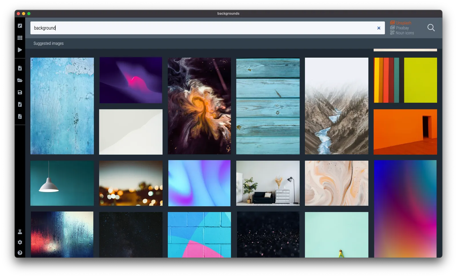
Instead of searching for functional or descriptive words such as “car” or “bucket”, search for “background” or “wallpaper” in SlideMagic and something unexpectedly useful might show up.

These examples are pretty straightforward to recreate in SlideMagic, with your own background images and text. Still, I added them to the library so you can use the min your slide designs

·Images

Extreme wide angle effects

Online, I currently get bombarded with “ads” that contain city landscapes for some reason. What they have in common are unusual perspectives: the pictures draw your attention. (At least mine).

What is going on? You are seeing familiar compositions and/or places you recognize, but the camera angle seems different. Most shots use an extreme wide lens effect, might have been taken by a drone rather than from a standing position on a building, add a very strong zoom, only using a very small crop of the center of the original image and put an object in the front (either photoshopped or real).

All interesting techniques to learn from, I think soon we will see these types of images more on open source image collection sites, so you can use them in your presentations as well.

I discussed this effect earlier in this post about the “Corona crop”, with extreme zooming, you can make almost any public space looked packed with people.

·Delivery

The... ...prof... ...writes... ...the... ....point...

Academics and other teachers like to write out their points in full sentences on black boards, so that students can copy them in their notebooks. This could actually be useful, the slowly spoken sentence, combined with the hand writing, gets burnt in memory easier. Also, that sentence becomes a sort of mental placeholder on the big collection of black boards. To refer back to it, you can simply circle the sentence, and the text itself reminds the audience what is meant, but more importantly, it is that “geographic location” of memories around that sentence that creates the right context.

As I ‘sat’ through’ a 1.5 hour video on encryption technology of an academic lecture last week, the teacher took it to the extreme though: not making his big point before starting to write it down…. “That… makes… it….”, what will it be “possible” or “impossible”?

I would pop the suspense, before writing things down…

·Data visualization

Bar versus column chart

The chart below could have been made a lot better using a bar chart. You can avoid the many legend labels, which have a 1-to-1 relationship to the columns

Image source

·Sales presentation

John Mayer's marketing video

Guitarist John Mayer starred in the launch video for a more affordable version of his signature guitar for PRS Guitars. Some interesting presentation lessons in here.

  • It worked, the video gets even linked to on a presentation blog
  • A naked and vulnerable pitch. A bare bone background, just him and the instrument, putting his entire reputation at stake by recommending this guitar. “Skin in the game”. Different from celebrities wearing a watch, driving a car, or holding an espresso cup.
  • A very nice use of the “best of both worlds” storyline. Up until now you had to choose between A or B, but as of today, you can have both.
  • Very clever addressing of target audiences. Hard core guitar players that admire John for his skill, and die hard fans that admire John for his songs are included implicitly. But parents buying guitars for their kids (and maybe secretly for themselves) are addressed directly with a clear excuse to go and get one.

A great sales pitch

·Concepts

Understanding something tricky...

For another project, I had to get a better understanding of the blockchain and various encryption algorithms. This summary helped me a lot, how it is possible that a total “stranger” can verify the validity of a digital signature without sharing confidential information.

Still this explanation suffered from an issue with almost all explainers and technical presentations: certain critical steps that are blatantly obvious to the expert, but very hard to get for the novice get skipped over. The big online YouTube stars in education are masters in getting it right: anticipating what an audience is likely to struggle with.

Anyway, in the process, I added a chart to the SlideMagic library with the very basics of encryption:

Search for “encryption” in SlideMagic and it will show up as a slide template.

·Design

Furniture ads

Why does furniture always look great in ads? The beautiful castle or villa as its backdrop is only a small reason. The big visual trick is space: lots of it, not only square meters, but also very high ceilings.

Most houses and apartments are designed functionally, rooms with just enough space to put a sofa and chairs against the wall to sit a normal sized family with a few guests. If there is more floor space available, we tend to add rooms rather than giving the furniture more space to breathe.

The same is true for museums. Huge open spaces with big white, clutter-free walls. Paintings are made to look good in museums. Put that masterpiece (or a copy) on your kitchen wall, and it looks less impressive.

When making presentations, you are not constrained by white space, so add it freely.