

Two charts about a new sub-Omikron (BA.2) variant in Denmark. This line graph shows 3 variants as a % of all sequenced samples in Denmark.
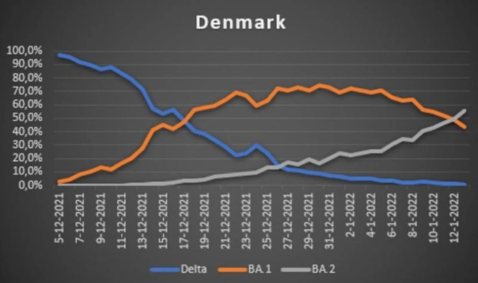
Source: https://twitter.com/DrEricDing/status/1485456877723045891
The chart below shows the total number of variants found in the samples. The stack approach does a much better job to give the full picture of what is actually going on,.
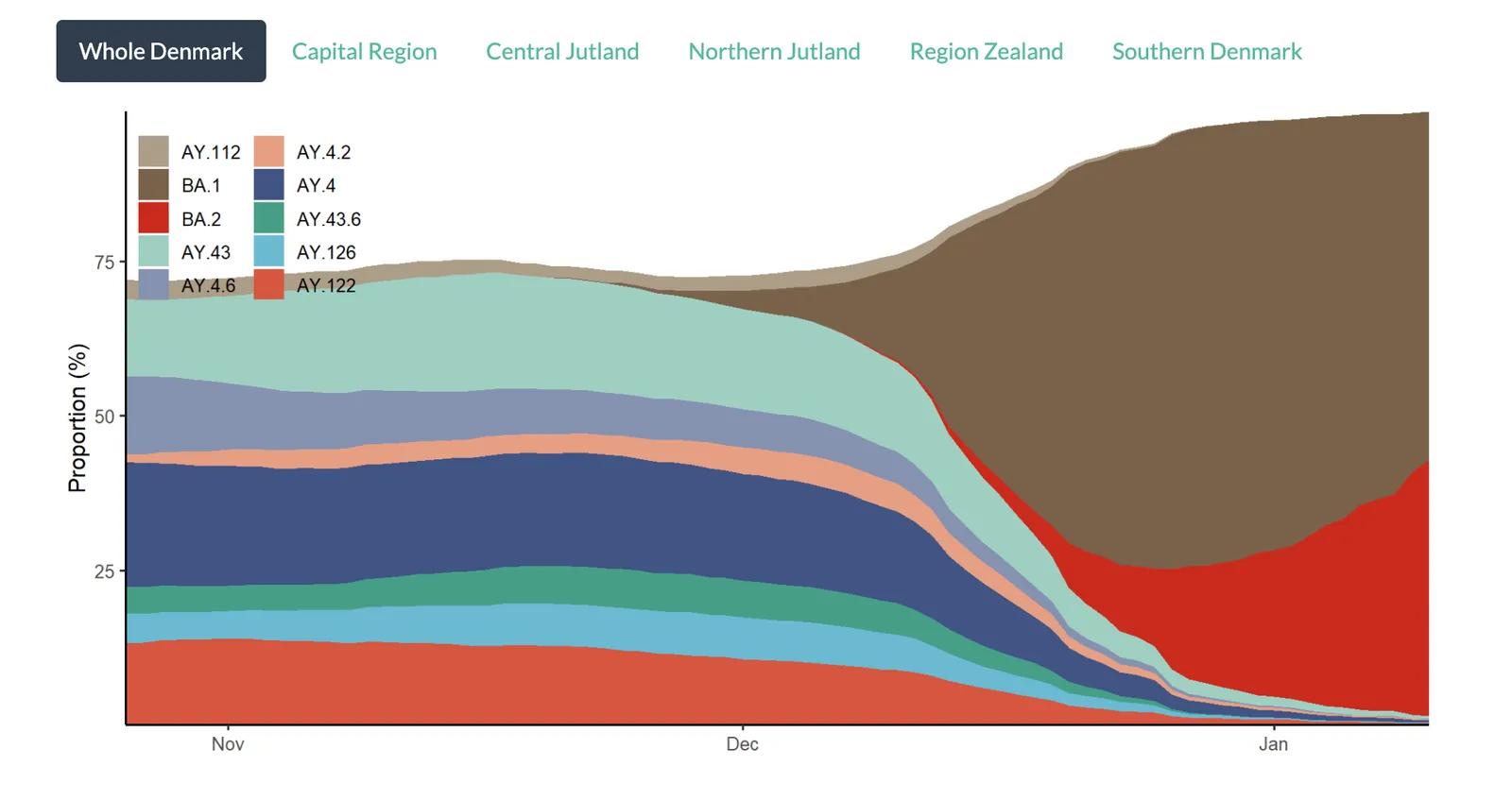
Source: https://www.covid19genomics.dk/statistics
With just one data series, showing a share of the total as a stack or line (column) is the same chart. As soon as you have more than one, pick a stack chart so the audience can see the data in context.