SlideMagic Blog

Frequent updates about all things presentations since 2008. Subscribe to never miss a post.

RSS
·Data visualization

Follow the chart

For the analysts who are in the trenches crunching the numbers behind slides (often after 18:00).

Presentations of financial data often evolve. You start with a relatively naive model, create some slides and iterate the numbers. Slowly, your team starts understanding what actually matters and discovers with drivers to focus on.

Instead of the exact numbers in your spreadsheet, your manager asks you to group this, that, and that into one number, quickly offline. Then another scenario, put that number in, quickly off line. Then another one.

In each round, you re-run your model, take out a calculator, scribble the summarized numbers, and update your slides. This takes a lot of time and is prone to errors.

Instead, build a quick layer on top of your ‘old’ model that spits out the required numbers quickly. In fact, make it a habit that every number in your presentation is pulled directly out of a cell in a spreadsheet.

My financial models would usually have these layers:

  1. Data dump: straight copy-paste of raw input data, or data entered straight from a financial report without thinking, make sure the total is correct at the bottom. You get a new set of data: simply overwrite the entire worksheet, or add a column.
  2. Model engine, this one does the hard lifting and runs your analysis
  3. Bridge: this worksheet pulls numbers out of the engine and produces the required numbers for the charts (relevant to the scenario I described above)
  4. (Optional) Slides. A small box that matches exactly every page in your presentation, with the exact numbers that appear in each slide. Useful if you need to run periodical updates of your presentation (weekly, monthly, quarterly results for example).
·Layout

'Ponder' charts in the age of Zoom

Most presentation experts (me included) describe the ideal slide layout as something similar to what Steve Jobs used to use in his big product announcements. Super minimal.

This type of slide works in auditorium or conference room settings. People sit relatively far from the screen, and the slide is competing for attention with the physical speaker (gestures, eye contact). Glance at chart, understand it in 5 seconds, focus back on speaker. The speaker and the slide are probably about the same size for someone sitting in the back of a conference room.

In a video call , the setting is a bit different. The slide is “in your face” on the screen, and the presenter is usually a small “talking head” in the corner of the screen (if present at all). Maybe the slide can carry a bit more information than the words “1.5 billion installs”.

I am not arguing to bring back the dense bullet points. The audience can read them faster than you can present both in a live setting and in a video call. But a Zoom call does open the way for slides that carry more information. Breakdowns of financial data, matrices with competitors plot in them, pros and cons tables.

Consider building them up in multiple slides to slowly add detail to support your story.

Image credit

·Software

Vintage presentation software

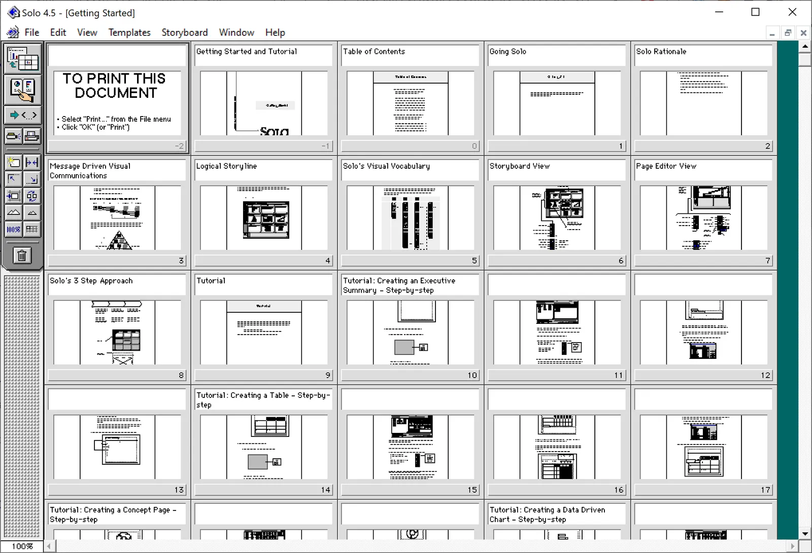
At McKinsey in the 1990s, we used ‘Solo’ presentation software to make slides. It was far ahead of its time (before PowerPoint became the standard). It had a very advanced template engine that enabled you to recreate charts in the McKinsey style. The software required some skill, and charts were usually created by professional graphics designers who took hand-drawn charts as an input. Back then, Solo would run on Macs only. Which was the reason that McKinsey issued Macbooks to their staff at the end of the 1990s, so that consultants could edit (and create) their own slides if they had to.

Ultimately PowerPoint was the end of Solo. Not because of its capabilities, but because McKinsey’s clients would have this installed on their machines, and these clients wanted to edit slides themselves. And with the advent of PowerPoint, the slide format became less consistent in McKinsey. (Both the result of a less sophisticated template library, and the reduced influence of professional graphics designers to create the slides).

I checked this morning, and Solo is still around, here is the web site: https://www.axoninc.com/. Support has ended in 2020 though. I tried installing the demo on Mac, but failed. The PowerPC engine no longer works. It does work on Windows 10 though, but I had to click a button 587 times because the license of the trial version expired 587 days ago (on 7 February 2022). Those clicks were rewarded with some good memories though, I have added some screen shots.

Continue reading →
·Advertising

Vintage ad

This vintage ad explaining the benefits of aerodynamics is making the rounds online. It is promoting cars by Czech manufacturer Tatra, which at that time, looked dramatically different than other vehicles.

Tatra could have been a very different car manufacturer today if the communist government did not force it to switch to building trucks…

A great resource for vintage advertising is the Vintage Ad Browser, careful with copyright though.

·Delivery

The anchorman in the days of Zoom

Up until the early 2000s, TV programs in The Netherlands would be announced by an ‘anchorman’, often a woman (Dutch people can refresh their memory here).

I was reminded of them by watching a number of high schools pitching themselves to my son via Zoom. Some schools had a fully prepared introduction video, linked by a pre-recorded ‘anchorman’. Others had a live anchorman that connected the various videos together.

The latter approach worked much better in my opinion, creating a stronger bond with the audience. But you got to rehearse that switching between anchorman, slide show, and video stream though. In the 1980s, this was the job of the TV control room…

·Data visualization

De-cluttering axes

In scientific documents, there are chart making conventions that make sense, clearly labelled axes, titles, etc. etc. Use these charts in your article that you submit for publication in a prestigious paper. For an on-screen slide show however, you could deviate from this standard. Your objective is to communicate the findings as best as possible, referring to the paper for the details.

See the example below (source), lots of duplication in axis labels.

You can make the page a lot calmer be omitting some of these labels. I quickly cut and paste the elements in the image below. (This is not a makeover, just a super rough reshuffle to show you what I meant).

·Story

What, how, why?

I saw these headings of a well-known story line structure being put up literally on a website in a big font size. What? Paragraph of text, how?, paragraph of text, why?, paragraph of text.

I like to use these frameworks in a more indirect way. Use them as guidelines to set up your story. Use them as a checklist to see that you covered everything, use them as a starting point if you are stuck in writer’s block, and most importantly, if they don’t work for your specific situation, pick another one or use your own.

The same applies to visual frameworks (SWOT, etc. etc.). They are designed to help you get started with grouping ideas, but if you find yourself forcing things in boxes that do not really fit, pick another one.

·Data visualization

Statistics: vaccine effectiveness might seem higher than it is

I love digging into COVID-related statistics. Recently, this paper was published that shows how vaccine effectiveness in local communities can be a lot lower than at the national level. Seems counter intuitive, but this chart explains the math.

I have added this slide to the SlideMagic library, so you could use it in your own presentations as well.

·Data visualization

Public corona data dashboards

BI (“Business Intelligence”) dashboards with data used to be a corporate thing. Firms such as my previous employer McKinsey would advice clients what metrics to put on them, and how to display them. This is tricky, there is an infinite amount of data to choose from, and even more options to slide and dice the figures.

The COVID outbreak has created many country-wide public dashboard with data. In Israel where I am based, a large tribe of “amateur” statisticians has emerged that runs and discusses analyses on Twitter. The other dashboard I had a look at is the Dutch one (part of my family still lives there).

The approaches are different, and I prefer the Israeli one.

  • The Dutch board looks very pretty, has lots of explanations in text, and has useful maps of regions with color coding. The problem is that it stretches out over many, many, pages, and priotises static data over time series.
  • The Israeli one is just one page, with lots of time series graphs, so you can see things develop over time. And not for basic statistics such as overall cases, benchmarks can get very specific. Benchmarks are normalised so you compare apples with apples (i.e., cases / 100,000 by vaccination status). Also, government policy and benchmarks are tightly integrated. The government wants to encourage parents to vaccinate children, so there are statistics specifically aimed at that target segment. Another example: after discussions whether to close the airport or not, stats about airport tests were published (split by country, so citizens can make the call to travel somewhere or not based on their personal risk appetite).
Continue reading →
·Creativity

Back into AI and machine learning

I looked briefly at Artificial Intelligence and Machine Learning for SlideMagic a couple of years ago, but never really pursued specific ideas. Recently, I revisited things and was surprised by the amount of progress that has been made. Not so much the actual technology itself, but more how accessible it is for anyone to use.

“AI” and “ML” are big buzz words at the moment and many of you are probably be wondering what it could mean for the industry you are working in. You read some blogs, books, watch some videos, but don’t really get it.

I would recommend to actively dive in and follow an online video course. The actual coding knowledge required is now very minimal, it is all about learning how to select and apply models. Sometimes, all the “AI” you need is basic statistics and regression. Sometimes, highly advanced image recognition software has already been cracked and can be used and accessed with a few lines of code.

Such a course is great fun, helps you understand what these technologies could really mean for your business, cuts through the buzzwords and makes you a better manager in case you are hiring people or service providers to build things for you.