SlideMagic Blog

Frequent updates about all things presentations since 2008. Subscribe to never miss a post.

RSS
·3D

LiveSurface

Putting objects on realistic 3D image surfaces requires a good eye to find an image on a stock photo site and some skill in PhotoShop. LiveSurface aims to make life a little bit easier, if focusses just on these types of images and the file you buy has everything you need (layers, filters). Still, you need to know what to do in PhotoShop though and you pay for the extra work through a higher image price.

The above was created from an iStockPhoto image that has increased in price since I purchased it a number of years ago (see earlier post)

·Colors

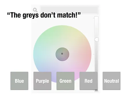
The greys do not match!

A few days ago, a friend posted a “complaint” on her facebook timeline that her husband always failed to spot fashion imperfections, in this case grey tints that did not match.

Grey colours sit in the center of the color wheel with equal balance of Red, Green, and Blue. But tipping the balance of the color mix a little bit instantly makes your grey look different. Use it as a design option to create a matching set of colours, watch out if it is not what you intended to do.

The same is true in black and white images, not every BW image is really pure grey, but it is easy to correct it, just have PowerPoint or Keynote turn it into a proper black and white image.

·Keynote

The story page

Many corporate web sites still emphasise 1990s-style content on their home pages: mission statements, contributions to the community, corporate history. I really like this deck with design concepts for 2013, including a suggestion to turn your home page into your story page.

Trends in interactive design 2013 from Prophets Agency

·Images

Stock image pricing

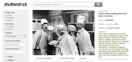
There are big pricing differences between stock image sites, especially for snaps that are different from the over-used smiling call center rep head shots. For example, iStockPhoto uses tiered pricing for images that have a more interesting composition. Shutterstock still uses flat rate pricing. These pie throwing chefs will cost you as much as an image of an orange isolated on a white background. It is worth to give Shutterstock a try. (No, I was not paid to write this).

·Software

Phasing out Excel

In email, I went from Lotus Notes, to Microsoft Outlook, to gmail. And now it is the turn of the spreadsheet: from Lotus 1-2-3, to Microsoft Excel, to Google Spreadsheets.

Excel has too many features. Even at my time at McKinsey where I built very complex spreadsheet models (mostly company valuations), I only used the very basic functions (numerical operators) to ensure that I completely understand what is going on in the model. Bugs could mean billions of dollars for my clients.

The features come at a price, on my Mac Excel 2011 has annoying delays when entering even the most basic of calculations.

The design of the Google apps have come a long way. Especially for spreadsheets, collaboration with multiple people is important. And finally, the Google spreadsheet is perfectly accessible on a mobile device.

Goodbye Excel.

·Keynote

Zoho Show mini review

Zoho is a web app suite targeted at small businesses. One of the apps is Zoho Show, a presentation design suite. Yesterday, I gave it a test ride.

A cutting-edge presentation design tool is not the key selling point of Zoho, it is just one of the components of a broader offering of business software with different benefits: attractive pricing when compared to Microsoft Office, access to your files from any location with an Internet connection, and easy collaboration on documents with colleagues.

You do not notice that the Zoho slide design interface is run in a web browser. Interactions are smooth and fast. The application is designed to resemble Microsoft PowerPoint, menu colors look similar, and menu options are stored in familiar places. Unlike Google Docs, Zoho does allow you to crop images (a very important feature).

The basic PowerPoint user will have no problem working in Zoho Show, with one big exception: the ability to create data charts. In Zoho, you need to create them in the spreadsheet application and port them across using an image. This is an issue for people that live and breath bar and column charts day in, day out. (Google Docs has the same issue, it is probably complicated to include a full spreadsheet chart engine inside a presentation app).

For more advanced presentation designers, there are certain things missing. Template management is poor (same as with Google), and you miss the ability to align objects, snap them together on the screen. Font selections are limited, and as with all web apps it is hard to configure a tool bar for fast access to functions you often need (aligning objects, etc.).


Continue reading →
·Colors

Creative commons Flickr search

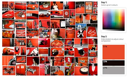
TinEye Labs has developed a cool image search engine. Select multiple colors (unlike Google image search), and the tool will mine 10 million Flickr images with a creative commons license (unlike Google image search).

Image by Mitali Mokerjee

·Keynote

What is your advice?

Sometimes, people ask you one question that forces you to focus. Yesterday: “So, what is your most important piece of advice to design better presentations slides?”.

Without thinking, I answered that he should forget about the way PowerPoint slides are supposed to look, and view it as a canvas that he can use in whatever is best to make his story stand out.

Hmm, that is what came out. Maybe still a bit concentrated and hard to act upon for a design novice, but that is actually what it boils down to.

·Data visualization

Shape fill with a data chart

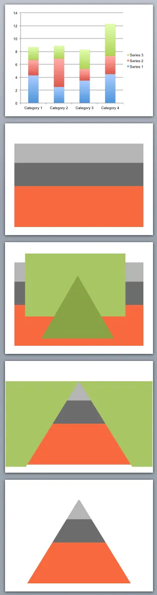
You can use shape cut outs as masks to create unconventional data charts. Here is how I created the pyramid-shaped stacked column chart:

  1. Insert a standard stacked column chart
  2. Cut away clutter until you are left with one huge column
  3. Insert a rectangle and a triangle
  4. Align the two shapes, select the rectangle first, the triangle second, right click, grouping, and hit subtract (PowerPoint 2011 for Mac)
  5. Color the remaining mask in the background color and position it over the graph

·Investor presentation

The technical VC pitch

Some startup pitches to venture capitalists are all about trying to explain a completely new revolutionary idea. Big bold images, stunning visuals, clever analogies, all needed to get the investor to understand and feel what you are talking about.

The other day, I designed one that goes completely in the other direction. An eCommerce startup with a very specific niche audience that is totally neglected by online offerings. It takes 2 seconds to explain that.

But the interesting part is to explain the VC how the magic of the numbers work. Seasoned investors in Internet businesses have seen hundreds of startups and can probably benchmark in their heads how your company stacks up in terms of LTV, CAC, conversion rates, basket size, repeat purchases, cohort developments.

To the outsider, the presentation might look a bit boring (pages with numbers), but it is the substance that is required for the discussion. To spice it up a bit, use custom fonts (watch out with compatibility) and a slightly bolder color scheme than you normally would use. Also make sure that you show the link between all those numbers: simply pulling numbers from Excel in random order will not sound and look very coherent.