SlideMagic Blog

Frequent updates about all things presentations since 2008. Subscribe to never miss a post.

RSS
·Advertising

Cover those ads

Screen shots of news articles are useful to give your audience a sense of the sign of the times. To make them look more interesting, I reduce the zoom of the screen to get a nice long, vertical shot of the article with the headline and the newspaper logo still readable. On a page with a non-white background, I title it a bit and cover and distracting ads or facebook and Twitter buttons with a white box.

·Data visualization

Fonts in Excel

A reader sent me a question the other day: what font to use in Excel instead of the boring and over-used Calibri/Arial?

I think there is not much to gain from using custom fonts in Excel. Readability is requirement number one, and the standard ones deliver. Moreover, Excel sheets are often emailed around to multiple people, and changing fonts creates compatibility issues.

The biggest opportunity to make Excel sheets look better is in the layout of your worksheets and typography. Subtle use of bold, carefully selecting the language you use, grouping similar items together, subtle grey box fills, etc. With a few little adjustments you can make your Excel sheet look like a nicely formated page out of an annual report.

·Images

High-res images from YouTube

Increasingly, YouTube is proven to be an excellent source of images. More and more videos are uploaded in 1080p HD (you can change the resolution in the settings menu at the bottom right of the video) which creates very good stills when you pause the video and make a screen shot.

To get the best results, try to size the YouTube window in such a way that it is around 1080 pixels wide.

If you want more control over what images to take, you can download the YouTube video to your machine (instructions here) and load the video into a video editing program such iMovie. Here you can move the playhead frame by frame to get the perfect shot.

Because of video encoding, you will see that images get blurrier when there is a lot of movement in the scene. If you want to show action, go ahead and grab the screen shot. If you want a crisper picture wait a few 1/24th of seconds until everything is calmed down again.

An obvious point: make sure that you have the rights to use the content.

·Images

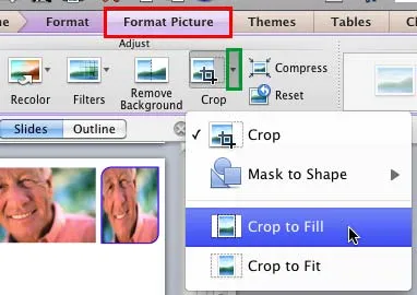
Crop to fill

It is never too late to learn something. After my post about fixing aspect ratios of image fills in PowerPoint, Geetesh Bajaj pointed out that there is a much smarter way to do this. Here are his posts for Mac and for Windows.

·Data visualization

Showing off your clients

Three different ways to show off your client list, depending on what you want to emphasize:

  1. Page of logos to show that they include the biggest names in the industry (here is how to design one)
  2. Map with dots to show that they are scattered around the globe
  3. Bar chart with sales number ranking to show how much you sold them (if you can share this information)

Mixing them up might not give the best picture: logos of completely unknown companies, a world map with lots of dots in New York City.

·Advertising

Anticipation

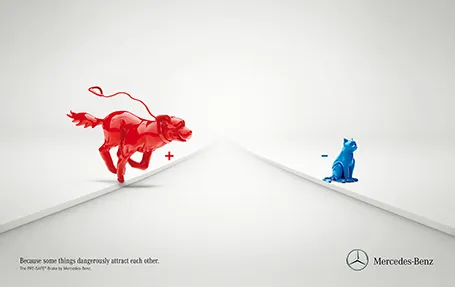
Most of the time, it is more powerful to show events that are about to happen rather than the event itself. It is very well done in the ad below for an automatic braking system that anticipates the movement of objects on the road. It brings great tension to the visual, almost making the still image move.

Commenters on Ads of the World were less enthusiastic though. Maybe the plusses and minuses should have been made a bit bigger. And well, if there is something wrong with the chart, it is in its 3D composition. The dog is too close and actually not running towards the cat. But I am probably the only one who bothers about that…

·PowerPoint

Excel to recover from a PPT crash

PowerPoint 2011 for Mac does not work well with Apple’s Time Machine backup system. You cannot change the backup timing, so my machine always tries to backup during Israeli office hours (night time US), and guess what, one of the few files that needs a backup is the presentation file I have open right now in PowerPoint. While I am sure there is some sort of file conflict mechanism in place, it is not very effective and I had PowerPoint crashing on me numerous times.

What to do about it? This is a relatively friendly crash, your program is not stuck, it just refuses to save your work (with a frequent autosave setting, that should be about 10 minutes of work). Now here is a nice trick to rescue that chart: select all objects on the page, hit copy, and paste them in an empty Excel sheet. Force quit PowerPoint, re-open, copy the objects in Excel and paste them back in. You just saved yourself from having to redo that 15 layer animation.

Political communications

Yesterday was election day in Israel, and I was shocked how hard it is for a voter to find out what a party actually stands for. In the end, decisions are not based on information provided by the parties themselves, but election guides provided by the news media.

The cause of this is probably rooted in the way political parties work. Policy documents are hammered out after long internal debates, where people fight over nuances and single sentences. Translating that watered down policy document in a clear message to voters is very hard. As a result, fresh new parties do a better job at communicating what they stand for with a small group of people enjoying the benefits of a white sheet of paper.

Put everything away, take a pause, and sketch out what you really want to say.

·Images

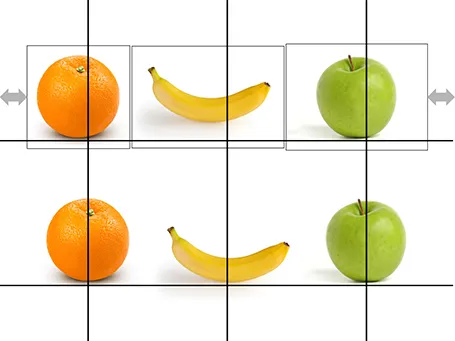
Centring objects

Images with objects isolated on an empty background are not always cropped perfectly. Centring the image will not center the object. Draw a some quick guide lines and you can align things properly.

·Investor presentation

Investment banking presentations

A question that came in yesterday:

Jan, I have a question about presentations to investment bankers/analysts. One of my clients getting ready to go on a road show says their investment banking consultants have told them to present what I would call (ala Garth Reynolds) a “slideument” that will also serve as a leave-behind. The consultants claim this is the way it’s always done and if they don’t do it this way, their audience will disregard them. Your thoughts?

Yes, in financial services people are used to very text-heavy slideuments for fund raising and IPO roadshows. And in most cases, people will print out the full 200 page deck for each participant in the meeting room.

Now, in finance presentations you need a few pages that are dense (financial statements for example). But there is no reason why the general lessons for presentation design do not apply in finance. In the end, investors are people, and it is harder to convince people to do something (invest) with a boring presentation.

And I have seen it work myself. After the initial resistance, people were actually very impressed with a different style fund raising presentation (and proved it by wiring money).

So what to do? My advice would be to take both approaches. A fund raising roadshow is a big deal and usually people have enough time/resources allocated to it to prepare both a visual, and a dense deck. Present the visual presentation, and selectively jump to appendix charts if you have to. Let the audience read the appendix in their own time.


Continue reading →