

A few days ago, a friend posted a “complaint” on her facebook timeline that her husband always failed to spot fashion imperfections, in this case grey tints that did not match.
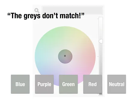
Grey colours sit in the center of the color wheel with equal balance of Red, Green, and Blue. But tipping the balance of the color mix a little bit instantly makes your grey look different. Use it as a design option to create a matching set of colours, watch out if it is not what you intended to do.
The same is true in black and white images, not every BW image is really pure grey, but it is easy to correct it, just have PowerPoint or Keynote turn it into a proper black and white image.