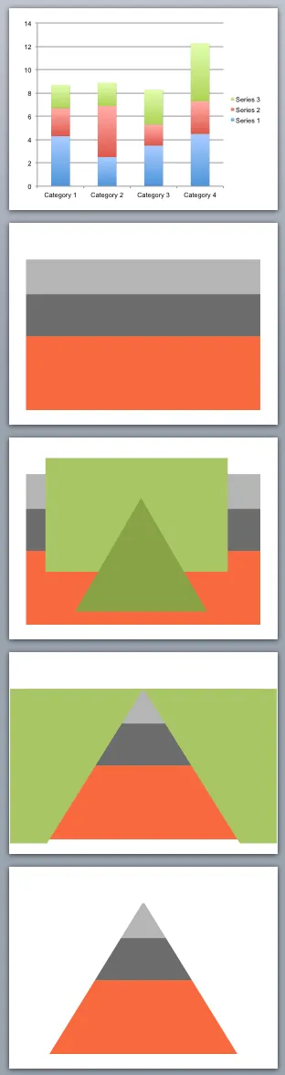
You can use shape cut outs as masks to create unconventional data charts. Here is how I created the pyramid-shaped stacked column chart:
- Insert a standard stacked column chart
- Cut away clutter until you are left with one huge column
- Insert a rectangle and a triangle
- Align the two shapes, select the rectangle first, the triangle second, right click, grouping, and hit subtract (PowerPoint 2011 for Mac)
- Color the remaining mask in the background color and position it over the graph