SlideMagic Blog

Frequent updates about all things presentations since 2008. Subscribe to never miss a post.

RSS

Investors read the blogs as well

When pitching your startup it is a waste of time to dwell on educating investors about things that you can pick up by reading the major tech blogs: smart phone penetration, sharing economy, etc. etc. A smart investor is likely to read the same posts as you do.

Put in a place marker slide to make the generic point in 10 seconds, then move on and explain why your particular application of the sharing economy (or another major trend) is so innovative and clever?

If the idea is good, you might convince investors of this point as well very quickly. Then, we move into the territory if you, your partners, and your plan to make it all happen. And that is the toughest part of the pitch. Not from a design perspective (it is easy to draw a few Gantt charts), but the difficult bit is getting your plain straight and convincing investors that you can pull it of.

Art: Old Woman Reading, Rembrandt, 1655 - Sign up for SlideMagic - Subscribe to this blog - Follow on Twitter

·Delivery

What did you remember?

It is a good exercise to go back in your memory and try to recollect presentations you saw, and what you still remember of them.

Chances are that you forgot:

  • The names of the 7 forces affecting that guy’s industry
  • That complex logical argument structure
  • The mission statement
  • That inspirational quote
  • The benefits: flexible, scalable, cost efficient, and customisable
  • Etc.

There is a good chance that you still remember:

  • That personal story
  • That detailed but unexpected fact
  • That French accent
  • The Skype message notification icon
  • That image of a container ship that summarised the big idea
  • The button that was missing on the shirt
  • That clever analogy that ran through the entire presentation
  • That unexpected turning/break point in the story
  • The benefit that you get that whole thing up and running 7 minutes 30 seconds
  • Etc.

Now look back at the presentation you are working on.

Art: Gilbert Stuart’s unfinished 1796 painting of George Washington, also known as The Athenaeum. Sign up for SlideMagic, subscribe to this blog, follow on Twitter.

·Layout

Fancy management theory

Your Group CEO has asked you to present her your strategy for the next 3 years. While you have a pretty good idea what you want to do, you are not sure how to present it on slides. You call in the Internet to the rescue and Google delivers an endless stream of Harvard, McKinsey, and other management gurus’ perspectives of what a strategy should contain.

The problem is when you put it on a slide, your strategy sounds like a page out of a management theory book. All is in there: visions, missions, governance, change management, stakeholder involvement. In the middle of all the buzzwords it is hard to find your own story.

The other way to present it? Do not use the frameworks to tell the big idea behind your strategy. Tell it in your own way. Once you have done that, use the fancy frameworks as a check list to compare your full strategic plan against. Have you thought about everything?

Frameworks are great for work planning, not for making convincing presentations.

Art: Nicolas de Largillierre, (Details of artist on Google Art Project), Portrait of a Boy in Fancy Dress, 1710. Sign up for SlideMagic, subscribe to this blog, follow on Twitter.

Do you have MacBook screen stains as well?

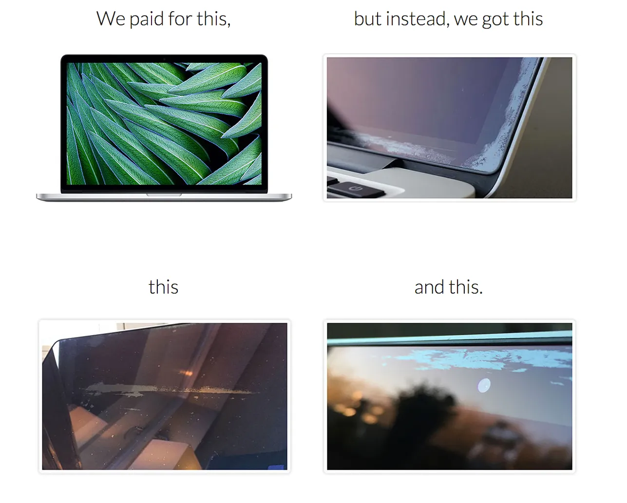
The anti-reflective coating of my late 2013 MacBook pro has started to peel of. Posting on Apple support forums has not given an answer. I am glad to see a web site staingate.org, that collects images and serial numbers of affected users. I you have the same problem, please add yourself to the list.

Art: Vassily Kandinsky, Composition 6, 1913. Sign up for SlideMagic. Subscribe to this blog. Follow on Twitter.

·Data visualization

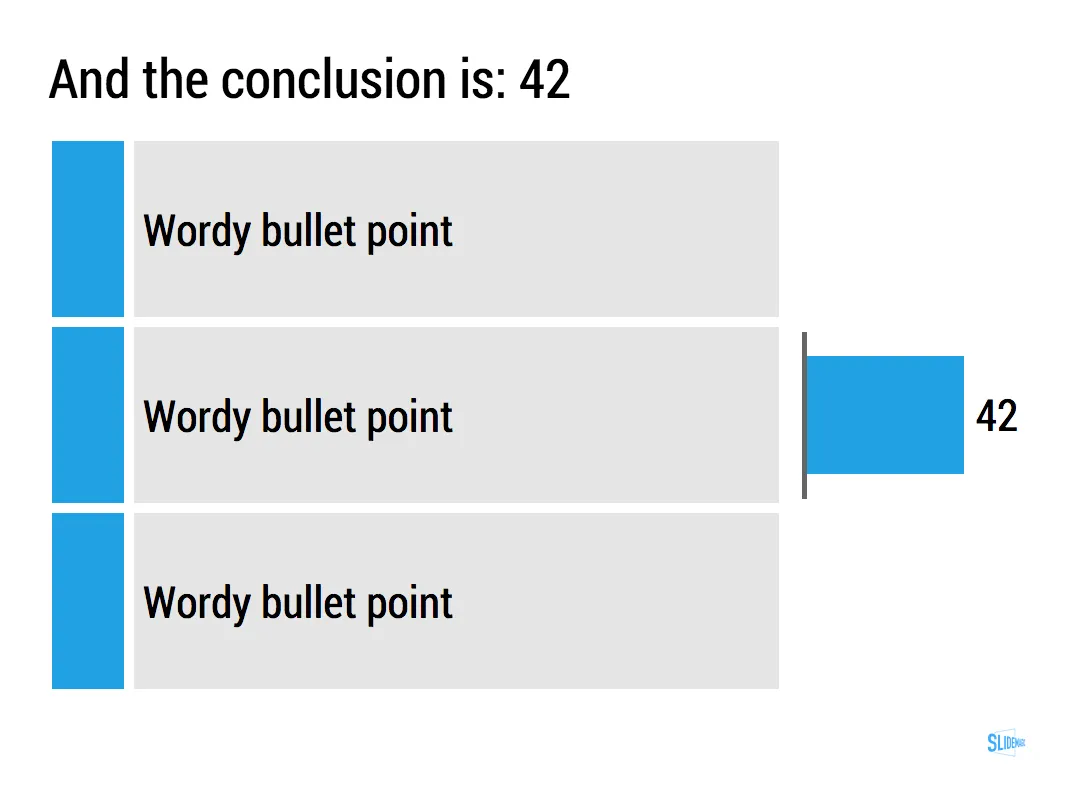
The lone column

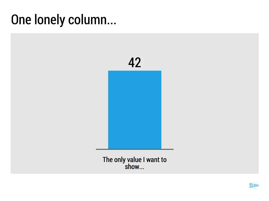
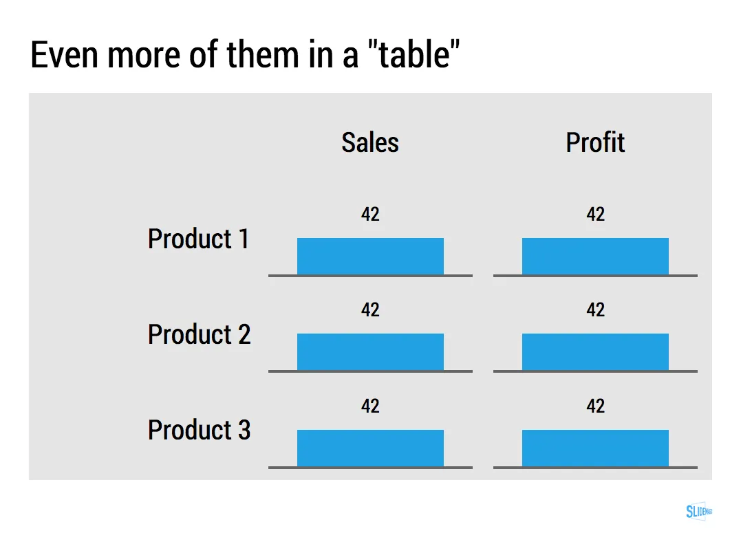
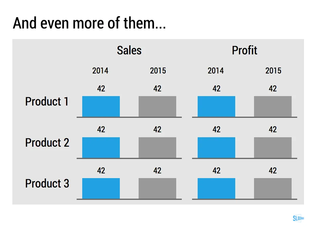
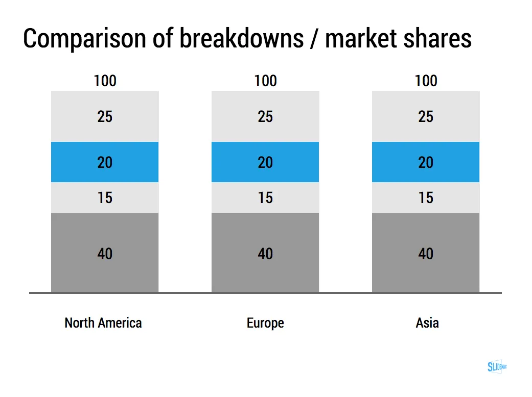
Most of the time, numbers in graphs look better than numbers in a table. There are exceptions though: when there is just one number, and when there is very little variation among the numbers. During my time at McKinsey, I have seen many examples of “lone columns”, column charts with just one number in them, or tables full of tiny column charts with hardly any variations among them.

These charts are not only difficult to read, but they are also very hard to create in PowerPoint or Keynote SlideMagic’s grid structure does it in a snap though, but hopefully users won’t abuse the app for these type of consulting charts. Sign up for SlideMagic here.

Art: Painting of Trafalgar Square (c. 1865) by Henry Pether. Sign up for SlideMagic, subscribe to this blog, follow on Twitter
·Data visualization

The only data charts you need

I have been designing presentation slides for over 20 years now (scary) and over time stopped using more and more types of data charts.

  • Pie charts: I don’t like the way they look, it has to place data labels, it is hard to compare two of them side by side
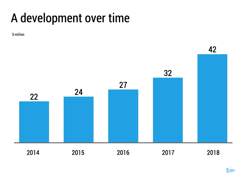
  • Line charts have ver little presence (duh, a thin line) and I use column charts where possible to visualise time series. Yes, for correlations and hard core scientific data I might have to resort to them
  • Clustered column charts, I find them confusing, it works better to just put 2 column charts next to each other
  • Hybrid charts with 2 axes, very confusing. Again, I split them up into 2.

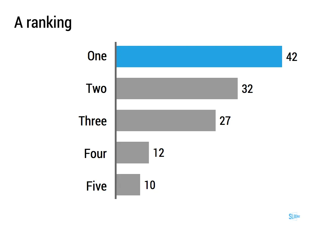
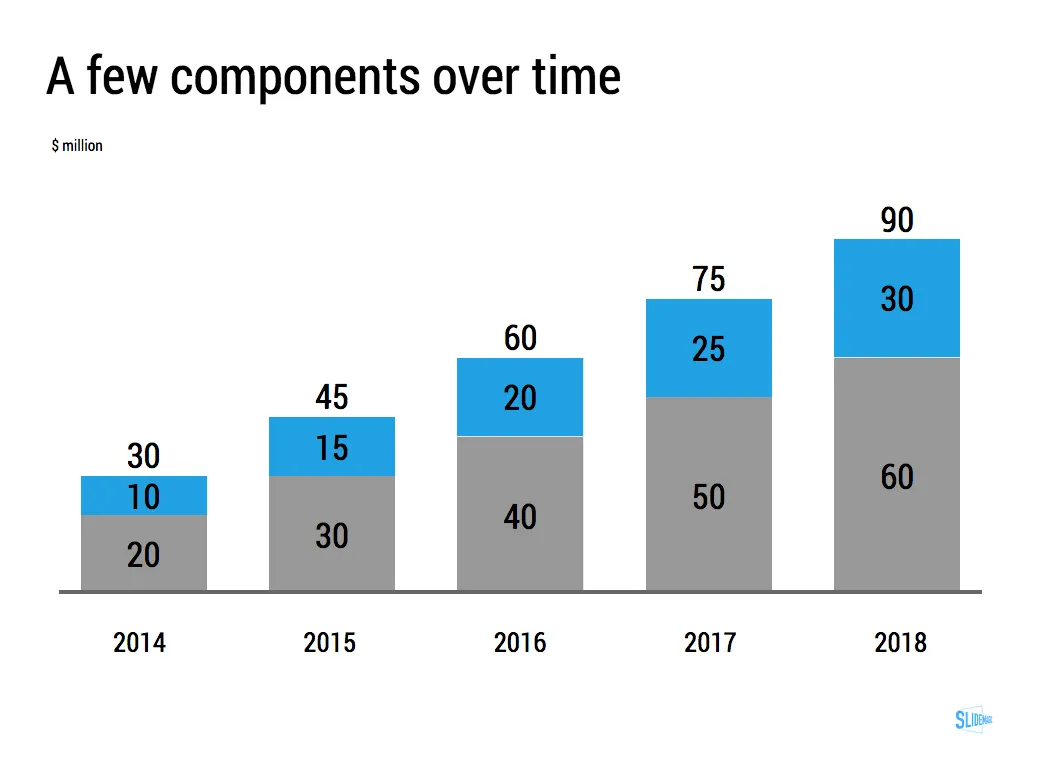
So, as a presentation designer you can get away with a very limited arsenal of data charts. Here is a quick run down of the ones I use: columns, stacked columns, and bar charts. (You can can guess which ones ship with SlideMagic)

The key to designing good data charts is careful, manual design (the opposite of copy pasting from a spreadsheet). What is the one single message that you want to pop out. What are the 10 to 20 data points that support this. Where to drop the accent colour, to what number of decimals should you round up the numbers. What breakdown categories should you group consolidate. Do I need a graph, or is it clearer to put the numbers in a single table? Data charts take time to prepare, but once you figured out what you want to show, can be produced in 5 minutes.

Continue reading →
·Software

New PowerPoint 2016 for Mac can beat Keynote

The preview of the new Microsoft Office 2016 is out (finally) and I have installed it on my production machine letting it do all my presentation design work for clients. (You can download the Office 2016 preview here)

  • It looks beautiful. PowerPoint 2016 for Mac looks exactly the same as PowerPoint 2013 for Windows. A calm flat user interface. Working in a beautiful software environment always encourages you to create beautiful presentations.
  • The whole interface feels faster, snappier, and smoother, somehow. This is especially true for Excel. The current version of Excel for Mac has a highly annoying latency when entering data in cells.
  • Subtle changes to the default colours and fonts. Gone are the boring olive greens of the old PowerPoint colour scheme. Calibri light looks great on Retina displays. Gone are the default gradients and drop shadows. Gone are the tick marks in data charts.
  • The commenting infrastructure is nice for collaboration with other people
  • Full integration with OneDrive cloud storage (if Microsoft has guts they should add Dropbox as well, and maybe even Google Drive).
  • Now PowerPoint gives suggested snap lines to place objects, automatically distributing and aligning things on your screen.
  • The grid behaves more normal with a centimeter ruler. If you accidentally move a grid line (yes, this still happens) it is easy to move it back to the right position.
  • Now text and shape backgrounds have the exact same colour rendering, an annoying bug in PowerPoint 2011, where despite selecting the same RGB value, colours on text and shapes would render differently.
Continue reading →

Fitting a data chart into the grid

Strategy consulting emerged in the 1930s by blending techniques from mathematics, engineering, and economics and apply them to improve company performance. The profession also pioneered new ways of business communications.

  1. Tables, frameworks, and drawings were used to visualise strategic trade offs. A departure from the long-winded corporate memo.
  2. Line, column, and bar charts were simplified and focused on a specific message. A departure with data-loaded scientific graphs

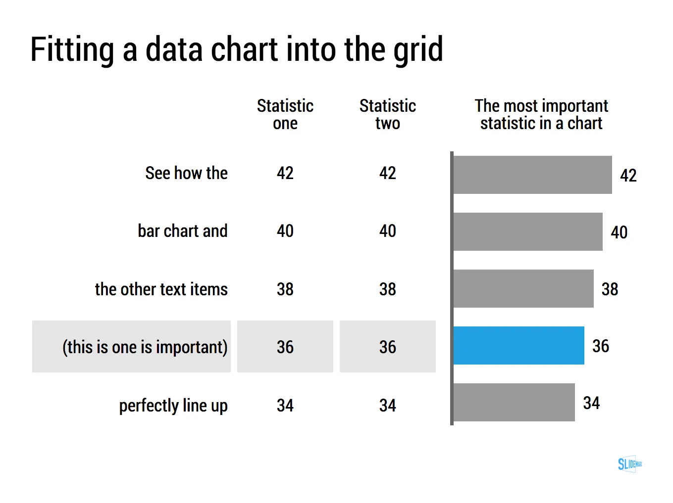
In my management consulting charts, tables and data charts are blended. Often the most important statistic in a table is visualised using some sort of bar chart. See the example below.

Many consultants push this technique too far. I have seen many charts were many, many columns were represented by bar charts. These bar charts had become so small that it is more clear to just stick in the value. If there is very little variation among your data, then using a bar chart does not make the chart much clearer: you get a bunch of bars of roughly the same size (I do not believe in breaking axes). And the worst consulting mistake is the famous bar chart with just one data item.

Getting data charts to line up with text in PowerPoint and Keynote is very tricky. SlideMagic is built around a very strict grid and this data chart grid alignment was one of the hardest things to get right in the design. I think we cracked it and the SlideMagic templates contain a number of slide compositions where data charts and tables are blended.

Continue reading →
·Story

"Let's start with the slide headlines"

This is often how a manager starts a presentation design exercise. For her, it feels very comfortable: the 20 slides are in production, just fill them out, everything is under control. In the next meeting we can check against the agreed headlines and point out empty spots that still need to be completed.

Here is why I usually skip this stage of a project:

  • The slide headlines you can come up with at the start of a project are usually, hollow and descriptive: the market, the competitive advantage, the financials, the team. They do not contain any content
  • Even if you were to push them one level further (3 meetings later), you focus the attention of your manager on editing headlines and shuffling slides. There is the hard to resist urge to word smith the language for endless flow iterations. Still without the actual meat of the presentation.
  • “Empty” slide headlines are great to carve up a piece of work. Team member A gets this data, team member B focuses on that. But, creating the logical fact pack that solves the problem is different from creating the emotional presentation that will convince people to act upon the audience.

So, I actually dive straight in. Create the key slide that hammers home the key point of the presentation. I add backups that support this point (for example a new way to look at the competitive positioning in detail). I add place holders for less important stuff: the work plan going forward, the financials. These can be filled out later.

Continue reading →

How to pick a nice accent colour

You can’t argue about taste when selecting your colours for your look and feel. There is a practical consideration though. Try picking a colour that gives enough contrast with both white and black characters. It creates a lot of possible colour combinations without a lot of colours. Example: SlideMagic blue.

Art: Van Gogh, self portrait, 1889. Sign up for SlideMagic, subscribe to this blog, follow me on Twitter.