

I have been designing presentation slides for over 20 years now (scary) and over time stopped using more and more types of data charts.
- Pie charts: I don’t like the way they look, it has to place data labels, it is hard to compare two of them side by side
- Line charts have ver little presence (duh, a thin line) and I use column charts where possible to visualise time series. Yes, for correlations and hard core scientific data I might have to resort to them
- Clustered column charts, I find them confusing, it works better to just put 2 column charts next to each other
- Hybrid charts with 2 axes, very confusing. Again, I split them up into 2.
So, as a presentation designer you can get away with a very limited arsenal of data charts. Here is a quick run down of the ones I use: columns, stacked columns, and bar charts. (You can can guess which ones ship with SlideMagic)
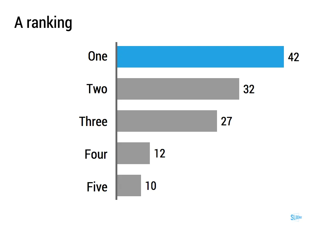
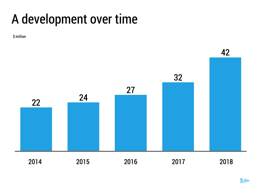
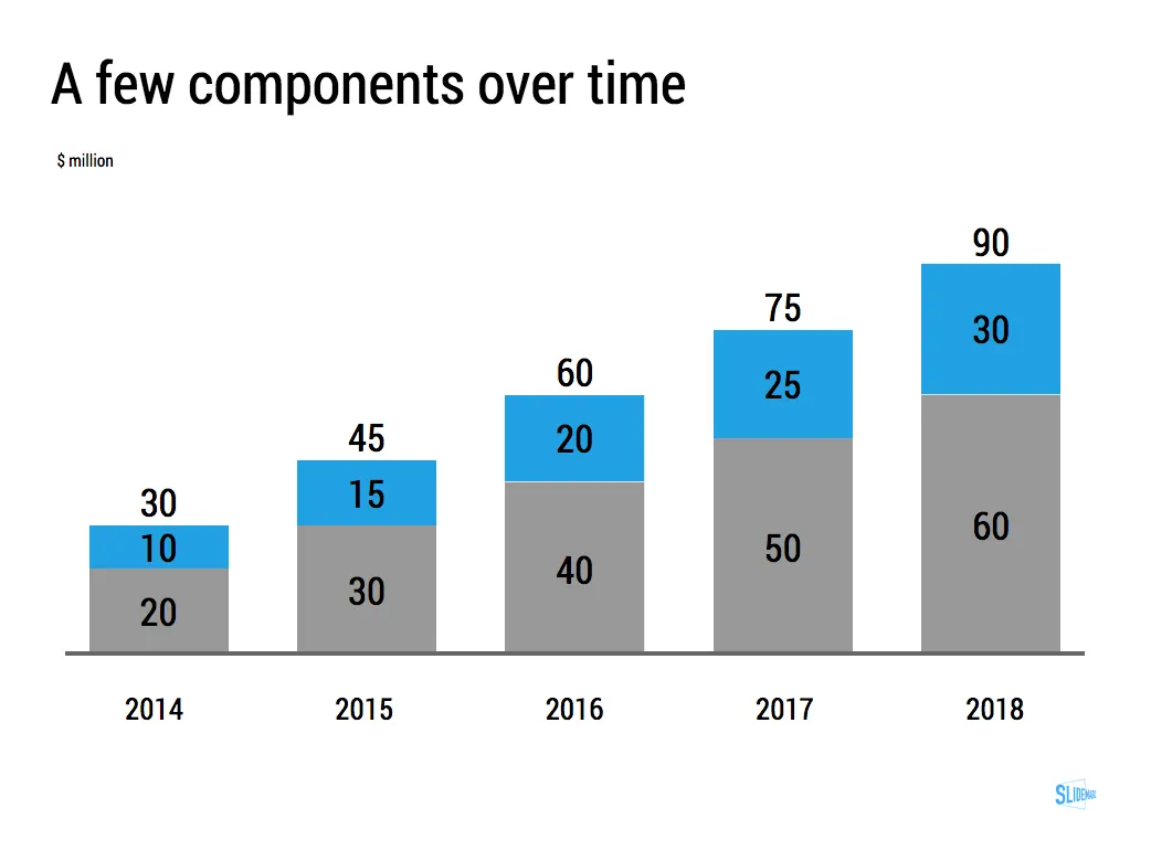
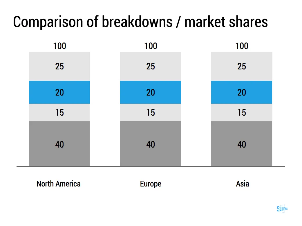
The key to designing good data charts is careful, manual design (the opposite of copy pasting from a spreadsheet). What is the one single message that you want to pop out. What are the 10 to 20 data points that support this. Where to drop the accent colour, to what number of decimals should you round up the numbers. What breakdown categories should you group consolidate. Do I need a graph, or is it clearer to put the numbers in a single table? Data charts take time to prepare, but once you figured out what you want to show, can be produced in 5 minutes.
Art: Willem Claeszoon Heda, Breakfast Table with Blackberry Pie (1631), sign up for SlideMagic, subscribe to this blog, follow on Twitter
