SlideMagic Blog

Frequent updates about all things presentations since 2008. Subscribe to never miss a post.

RSS

Are you comfortabie with work in progress ambiguity?

Over the years I have discovered that different people can tolerate different levels of work in progress. Some clients freak out if I send an incomplete draft, others welcome the opportunity to discuss my work early on in the project.

My own preferences:

  • Incomplete headlines and text: For me text is a mental place holder for a concept in a slide. I actually need to force myself to get into the detail and get the wording of a line exactly right. I think visual, not verbal
  • Provisional story flow: again I do not mind that much, story flows can be fixed quickly.
  • Ugly, early slide designs: this is a huge deal for me. The wrong photos, a misaligned composition, it bothers me very much.

When working with new clients, I need to find out quickly how they respond to incomplete work. Most clients have the opposite preferences:

  • Very worried about the exact formulation of text
  • Very worried about the exact flow of the story
  • Not that concerned about slide design early in the project

This client set of preferences puts you in writing mode (sequencing bullet points and slide titles), my preferences puts you in visual design mode. As a result, most of the times, I finish a presentation almost 70% before showing it to a client. In this way we can discuss visual design. Otherwise we might be stuck in story line editing forever.

Image: J. S. Bach’s The Art of Fugue breaks off abruptly during Contrapunctus XIV. Sign up for SlideMagic. Subscribe to this blog. Follow me on Twitter.

You do not really need animations in presentations

As professional presentation designer, I hardly use animations, and my presentation software SlideMagic does not have animation functionality.

  • Animations do not show well on mobile devices and/or in PDF files
  • Most animations are used for slide transitions or spectacular intros and exits of slide objects. These just distract the audience and reduce the level “seriousness” of your pitch. Flying text boxes work in MBA class, but giggling venture capitalists are less likely to invest in you.
  • Layered animations are a pain to edit

If I need to build up the content on a slide slowly, I duplicate a slide multiple times and add a bit more on each page. To the audience, it looks like an animation, it shows on mobile devices/PDF, and it is easy to edit/change.

Art: Georges Seurat, The Circus, 1891. Sign up for SlideMagic. Subscribe to this blog. Follow me on Twitter.

Presentation or procrastrination?

A bit more elaboration on yesterday’s post.

A lot of time is spent on presentation design in corporations. There are many mid-level managers and analysts that have PowerPoint open on their screen all day. For the wrong reasons. Here is a strong statement: I think managers are using PowerPoint as a tool to keep subordinates busy. Boom, I said it.

Big corporates work in the leveraged hierarchy model. Commands trickle down the line. Every manager has a lot of issues to worry about and subordinates to manage. It is like a giant juggling exercise. The key idea is that a manager could do each individual task faster/better herself, but can’t complete all of them. It is more efficient to delegate work to others, check in now and then, spot mistakes or correct the direction. Although the total amount of time spent on a task is higher, and there is a lot of work wasted (someone going down the wrong track before being corrected), overall - at a company level - things get done faster.

A manager’s day gets divided up in meeting slots (see Paul Graham’ post). In every unit of time, the manager has an opportunity to provide input into one of her issues, talk with one of her subordinates. If there is not a lot of time, meetings get shorter, and input gets more cryptical. PowerPoint is the conduit. “Make it a bit more polished, add a section on the competition, combine these 2 slides into one, show the breakdown by month” All instructions that cost of a lot (PowerPoint time) but add very little to the story or the decision the company needs to take.

Continue reading →

What takes the time?

Presentation design can take a long time. But most of that time is not spent on the physical activity of putting slides together. The time consuming bit is to come up with the design itself.

Now we have hard data. A SlideMagic beta tester deleted the wrong presentation and had to re-create it from a PDF export. Time spent to create the presentation: 6 hours. Time spent to recreate it from the PDF example: 30 minutes. (Of course, SlideMagic’s grid structure made it easy…).

Think about how you can spend those 6 hours most productively.  I would take 30 minutes to start thinking about your presentation way before the deadline. Then drop it. Spend time sketching ideas on paper, and then putting the whole thing on slides. And maybe you could have shortened that 6 hours a bit?

I think business presentations should have more standardised slides (a list, a transition, a contrast, an overlap, a growth path). You might say that that will will cause all presentations to look the same. But remember, that standardisation is already happening today: most PowerPoint users only know how to make bullet point slides, even if they wanted to be more creative.

That is what SlideMagic is trying to do: offer easy customisable slide building blocks that are more creative than bullet points but less complicated than hard-to-modify PowerPoint templates.

Art: Henri Rousseau – The Football Players (1908). Subscribe to this blog. Follow me on Twitter.

"On each slide we have a line with the key message..."

…but it is not the headline.

Over time, many slide decks becomes so cluttered and messy that I have seen people adding a sentence or a bubble on each slide with a sentence that summarises the message of the slide. (I have even seen them in the footnotes on every page). “What we really want to say is this”.

Why do this last, instead of first? If you start with the sentence, and you build your slide just to support that message, the slide will be a lot more effective.

Why not write this as the slide title? Many PowerPoint templates are so poorly designed that people do not use the headline. The headline is set in such a big font that you can only write 3 words. Two thirds of the headline space is taken up by the corporate logo. The elaborate graphic background of the title makes it hard to read what is written there.

In short: clean up the template, start with the headline, and write it where it is supposed to be.

Art: Hans Krell, Battle of Orsha, 1525. Subscribe to this blog. Follow me on Twitter.

·SlideMagic

SlideMagic is in public beta, anyone can sign up

Two years after having the first idea about creating a PowerPoint alternative from scratch, I now have taken the invite wall down on presentation software SlideMagic. Anyone can now sign up for the beta version.

Here is how to get hooked:

  1. Go to the “templates” tab and clone one of the template presentations to start
  2. Customise your own accent colour and logo
  3. Go all the way to the end (beyond playing around) and create one real presentation for your next meeting. It can be a short presentation. It can be low-risk presentation.

Step 3 is the important one. You will see how incredibly easy it is to create a presentation, especially when you think you should go back to PowerPoint for your next presentation.

Let me know your thoughts and share SlideMagic with like minded people who you think might enjoy it as well.

Art: Claude Monet, La rue Montorgueil à Paris. Fête du 30 juin 1878. Subscribe to this blog. Follow me on Twitter. Sign up for SlideMagic

·SlideMagic

Why SlideMagic is different

I created a quick presentation (hey, in SlideMagic) that highlights some of the features I have put inside that you will not get in other presentation design apps. Some of them you will never find there (even if people try to copy them) because of the fundamentally different way SlideMagic works. Less designer freedom and more uniformity allows you to do great things!

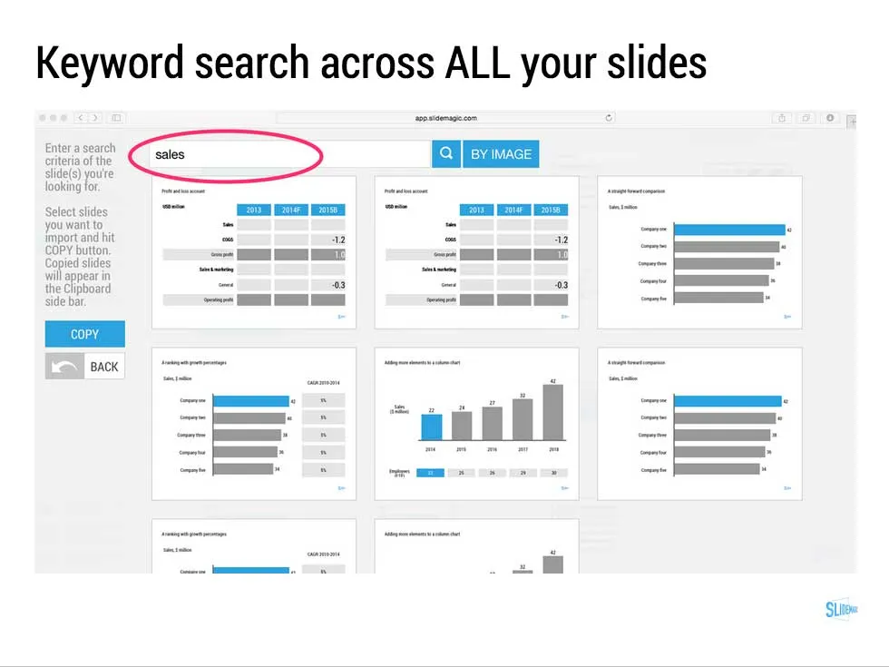
  • Keyword search across all your slides, no more opening and closing files
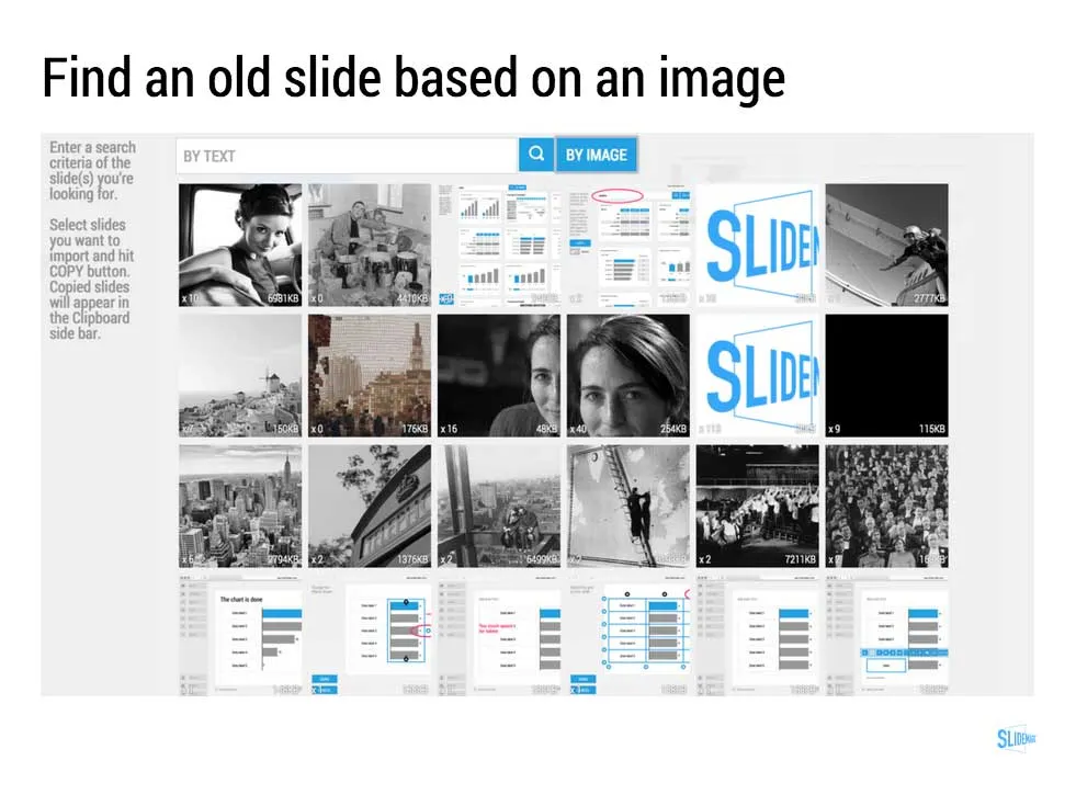
  • Image-based search: “get me all the slides that contain this image”
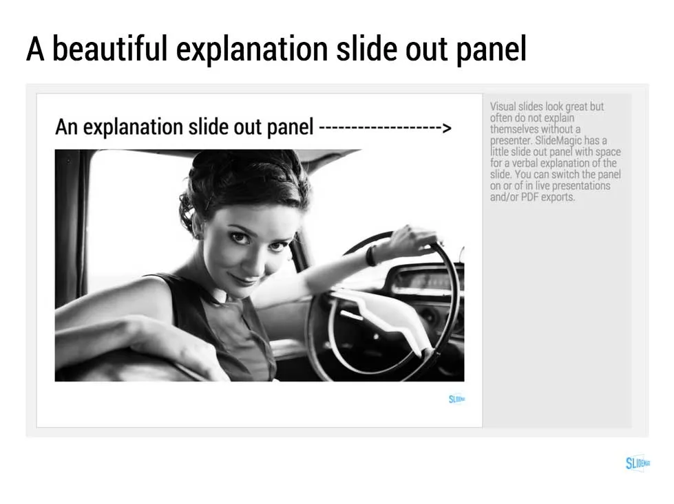
  • Explanation slide-out drawer to turn an abstract visual presentation that needs verbal explanation into a document that you can email.
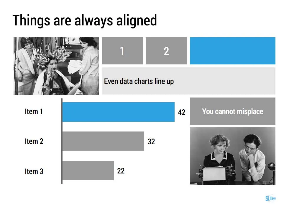
  • A strictly enforced grid that makes sure everything is always lined up and distributed properly. And the most tricky part: that includes the columns and bars of data charts as well.
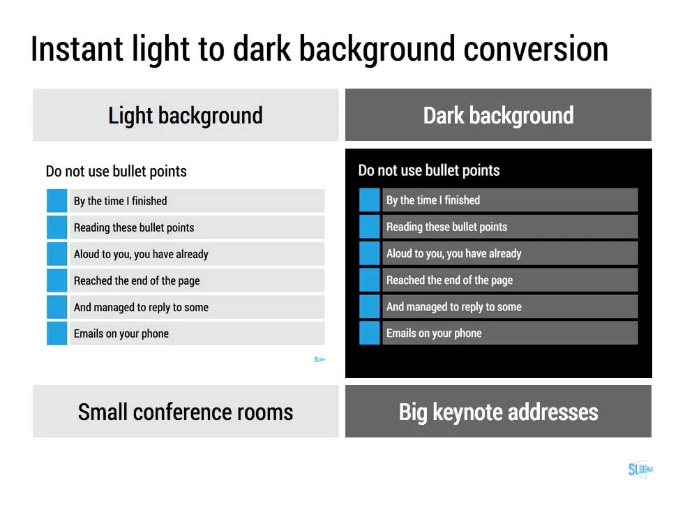
  • Instant conversion from a light to a dark background and back (switch between a conference room and a keynote hall setting)
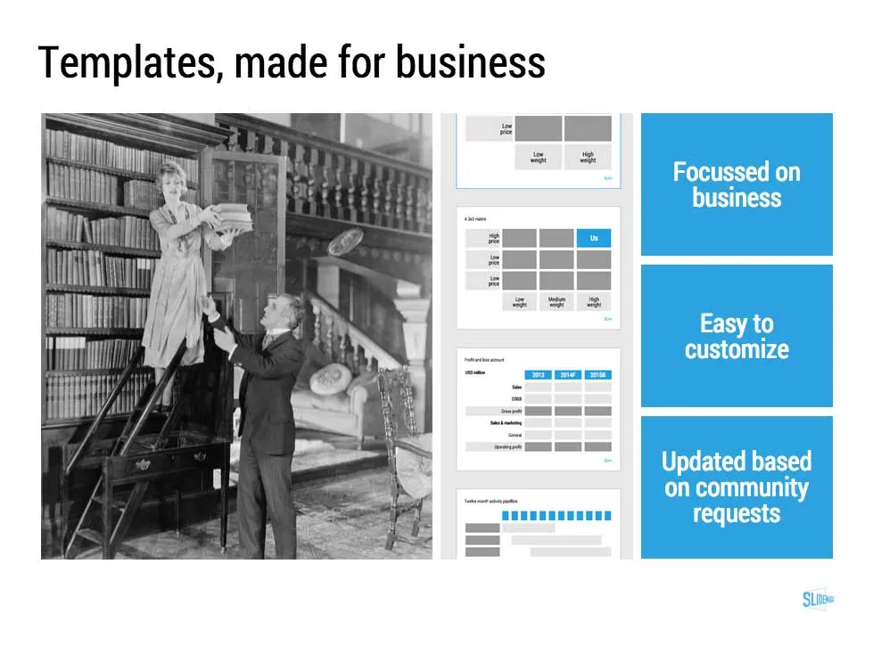
  • And, a template bank that is constantly updated by a McKinsey/Idea Transplant designer!

Give SlideMagic a try yourself, you can request an invite here.

Art: Albert Gleizes, 1912, Les Baigneuses, oil on canvas, 105 x 171 cm, Musée d’Art Moderne de la Ville de Paris. Published in Du “Cubisme” Subscribe to this blog, follow me on Twitter

·Layout

2x2 matrix clarity in presentations

The 2x2 matrix is a favourite layout for differentiating yourself from others. 'We, the good guys, are in the top right corner".

But people sometime force the framework somewhat. If you are having trouble filling the bottom left box, consider using a Venn diagram (a “best of both worlds concept”).

If it is going to be a 2x2 matrix and your axis choice is a bit tricky, write things out in full. Rather than “ease of deployment, low, high” consider ignoring the axis name and write the 2 categories: “Big system integration project”, “Up and running in 5 minutes”. You can also write explicitly in the 4 boxes what they are about (BCG did that with their brand matrix: “dogs, cows, stars, question marks”)

Framework in pitch presentation are different from those in a micro economics Phd thesis.

UPDATE January 2018: we have now added 2x2 presentation templates to the SlideMagic template store.

Art: Peterka Vlada, Sunset at Liberty Square, Oil on canvas, 40x28 inches ( 100x70 cm ), 2012 Subscribe to this blog, follow me on Twitter

·Investor presentation

"We can skip the problem"

Often, this is what a confident sales rep says when discussing the brief for a sales presentation. For industry insiders, it is true that you do not have to elaborate much about issues they already know. But I think plunging straight into features, benefits, and solutions is the wrong approach.

It is much easier to sell a problem than to sell a solution. Almost all my sales and investor presentations elaborate on the problem.

  • For sales presentations, it is a good opportunity to discuss individual issues the client has. The best sales presentations talk about the client, and not about the seller. Even if it is old news for the audience, it is good to start your story on common ground. And most importantly, I often present the solution using a slide layout that I already introduced during the problem part of the presentation. “Here is that same slide we discussed before but now with that big messy part ripped out”.
  • For investor presentations, you actually need to educate the audience about the issue that your innovation is solving. So here the problem section is actually very important.

So, next time push back when they tell you to skip the problem.

Art: DalíAtomicus (1948) by Halsman in an un-retouched version Subscribe to this blog, follow me on Twitter

·Layout

The final clean up

Some things to check once you think you have finished your presentation:

  • Are the fonts consistent throughout the presentation? Are have default Arials/Calibris managed to sneak in?
  • Are font sizes in comparable boxes the same?
  • Are the headlines all in the same place on every slide?
  • Are objects in each slide aligned, and properly distributed?
  • Are the proper colours used on every slide, including data charts, or do you still see standard PowerPoint colours anywhere?
  • Are all images in the proper aspect ratio, without distortion?
  • Did you include an attribution to creative common images?
  • In case you will be displaying the presentation on another computer, have you checked Windows/Mac rendering issues? Sometimes fonts are rendered in slightly different sizes, causing words to drop to the second line.
  • Is data properly rounded up?

Now you see why SlideMagic has 1 font, 1 accent colour, and a strict grid that makes it impossible to misalign objects or put titles in the wrong places.

Art: Berthe Morisot, Hanging the Laundry out to Dry, 1875 Subscribe to this blog, follow me on Twitter