

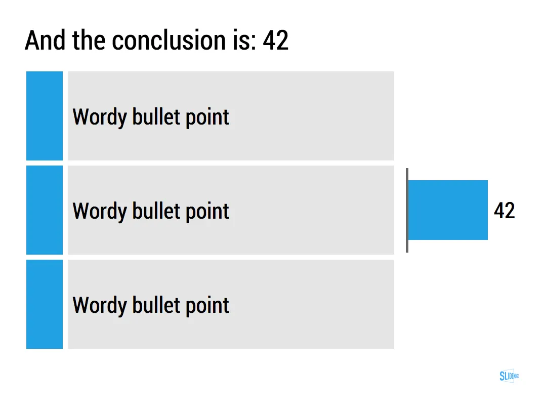
Most of the time, numbers in graphs look better than numbers in a table. There are exceptions though: when there is just one number, and when there is very little variation among the numbers. During my time at McKinsey, I have seen many examples of “lone columns”, column charts with just one number in them, or tables full of tiny column charts with hardly any variations among them.
These charts are not only difficult to read, but they are also very hard to create in PowerPoint or Keynote SlideMagic’s grid structure does it in a snap though, but hopefully users won’t abuse the app for these type of consulting charts. Sign up for SlideMagic here.



Art: Painting of Trafalgar Square (c. 1865) by Henry Pether. Sign up for SlideMagic, subscribe to this blog, follow on Twitter