SlideMagic Blog

Frequent updates about all things presentations since 2008. Subscribe to never miss a post.

RSS

Role descriptions do not fit in 2 words anymore

Descriptions of jobs, professions, roles, used to be simple: graphics designer, lawyer, head of sales. In a dinner party conversation, you could usually explain in 2 words how you spend your days in the office.

Not anymore.

Our roles and jobs are fragmenting. Labels are inflated or overused (everyone is a consultant, a founder, etc.). Even companies might have difficulty describing who they are. Are we private equity or venture capital? Are we in the business of consulting or marketing services?

I had the problem myself after leaving McKinsey. It was hard to describe what I actually did. Strategy consulting? Not really. Design? Not really? Business development? Not really. Manage a fund raising roadshow? Not really.

In the end, I stopped trying to fit myself into a specific box. Rather than trying to define what I do by comparing it to known labels (explaining the things I do not do), I actually pitched what I do by well, explaining what I do. My opening is usually “I am a presentation designer, but a slightly unusual one”. Then comes a more elaborate explanation.

I think that model works well in almost all pitches, give a people a very rough idea of the box they should put you in, which makes them open to understand what you are all about in more detail.

Art: The Open Door, Peter Ilsted, 1920.

Two types of spectacular

Which one?

  1. A spectacular, interactive, 3D, infographic, animation, video, drum rolls, effects, polished visualisation of a pretty well known fact (“smart phone penetration is huge”)
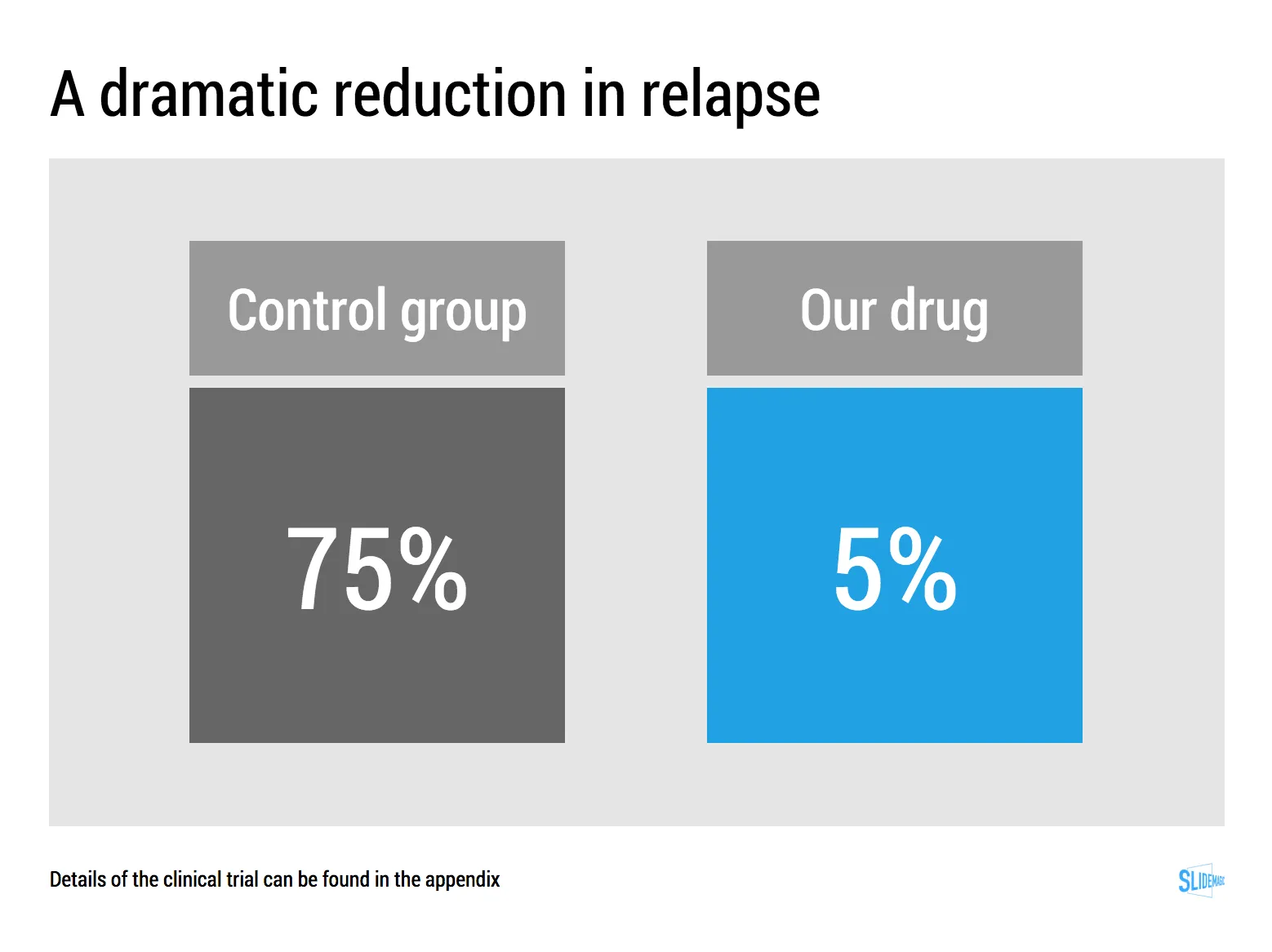
  2. A sober representation of an amazing fact (“relapse rates dropped from 75% to 5% with our drug”)

If you manage to isolate what is truly spectacular about your story, visualising that is pretty straightforward. Your only challenge with number 2 is to get the basic chart hygiene right (hey, SlideMagic can take care of that)

Art: Knud Bergslien, Skiing Birchlegs Crossing the Mountain with the Royal Child.

·SlideMagic

Be less busy with presentations

This memo that was sent to the team behind Slack before its preview release resonated with me.

We are unlikely to be able to sell “a group chat system” very well: there are just not enough people shopping for group chat system (and, as pointed out elsewhere, our current fax machine works fine).

I love the “be less busy” tag line of Slack. I love the stress relief that search provides in Slack (you can always find things if you have to).

The more I think about it, SlideMagic might actually not an alternative to PowerPoint, it is a broader concept of change in how people in enterprises should communicate, and how they spend their time preparing for this communication. My tool enables this, but it is not the main thing of what it is all about.

SlideMagic enables you:

  • To be less busy with meetings: you can have short, to the point meetings where ideas can be communicated clearly, and decisions can be taken quickly. Documents are simple and clear, and more or less standardised. It becomes a very efficient corporate language.
  • To be less busy with preparing for meetings, Most of the time will go into forming your idea. Once you have your idea, it only should take an hour or so to jot it down in beautiful slides. And a powerful keyword search function across all your slides ensures that you will never have to do double work, rework slides.
  • To lift the spirits of a company by eliminating poor design. Employees work better in a beautiful office. Seeing depressing dense bullet point presentations on every screen, on every printer, on every fax machine, on every projector, in every email inbox, does not add to employee morale.
Continue reading →
·Images

New image search habits

There are a number of problems with stock images:

  • Most of them are staged, cheesy, unrealistic images
  • Stock image search algorithms no push up results for photos that include some design elements (some words for example), stuff that is better being taken care of by the presentation designer
  • Many people are over doing the images, trying to use a photograph to visualise a concept that does not really need visualising. The result: an endless string of “stunning” images that distracts the audience rather than support your story
  • Stock images are so over-used that a presentation who uses them now almost look as bad as one that consist of list of bullets. It is an instant recognition: you see the first page of a bullet point presentation, you see the first page of a stock image presentation and you think “uh oh, the next 30 minutes it is going to be one like these”

Here are the steps I go through when trying to find an appropriate visual concept for a slide:

  1. Do I need an image at all? Or can a simple box composition with some text do the job?
  2. If I need images, is there some consistent set of photographs I can use throughout the presentation? Art? People using mobile phones? Retro? Paris?
  3. Do a quick Google Image search with search tools set to “labeled for re-use” to see whether there are any good free/real images out there (always check the actual image for re-use rights, Google might have it wrong)
  4. Try some other free image sources (see my list of free image sources here).
  5. Dive into stock image sites
Continue reading →

Selling professional services

Not every product or service is the same, not every sales presentation is the same. Professional services are different from products that roll of the conveyor belt. They have a high level of (human) customisation. Here are some things to keep in mind when designing a presentation for professional services:

  • The look and feel should be serious; think law firm, think management consulting firm
  • Since it is all about customisation, the pitch is all about understanding the client’s problem, being able to ask intelligent questions about it, hinting at what a solution might look like.
  • Clients buy the skills of people. Having the people who will be working on the project in the room will help. The presentation becomes almost an excuse to figure out the people on the team

So, in short, the presentation is more a background for the presentation meeting, not the driver of the meeting itself.

Art: Frans Hals, portrait of an unknown man, 1665. Sign up for SlideMagic. Subscribe to this blog. Follow on Twitter.

Market sizing in startup pitches

Where to put the market size in your startup pitch? It depends.

  1. Option one is early on in the pitch, when you are convincing investors of the need for your invention. In many cases however, investors will not doubt the size of the market, they doubt whether you can get a share of it. When you claim you have a cure for cancer, the issue is not whether there will be demand, the issue is: does it work. The exception is for cases where everyone thinks a market is small/non-existent: you might have to pull out stats about the number of patients that suffer from a rare disease x the amount of money that people spend on a therapy.
  2. Option two is to put the market sizing towards the back of the presentation together with the business model and revenue scenario forecast of your company. Market size is used to sanity check your financial numbers, rather than convincing investors of the need of your product. For most businesses a bottom up market forecast, works better than a $1b top down number copied from a random research report.

Art: Jean Siméon Chardin, La Brioche, 1763 - sign up for SlideMagic - subscribe to this blog - follow on Twitter

·SlideMagic

Little productivity hacks in SlideMagic

Recently, I have focussed most of the development work for SlideMagic on improving the workflow. It is the small differences that can make a big difference. Here are two features that you might not have discovered yet:

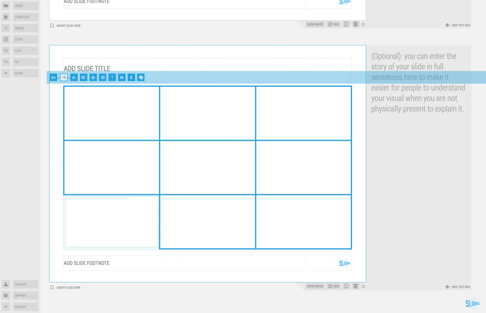
You can select multiple boxes and edit their design (colours, font size, etc.) at the same time. Great for creating tables quickly or clean up inconsistent font sizes.

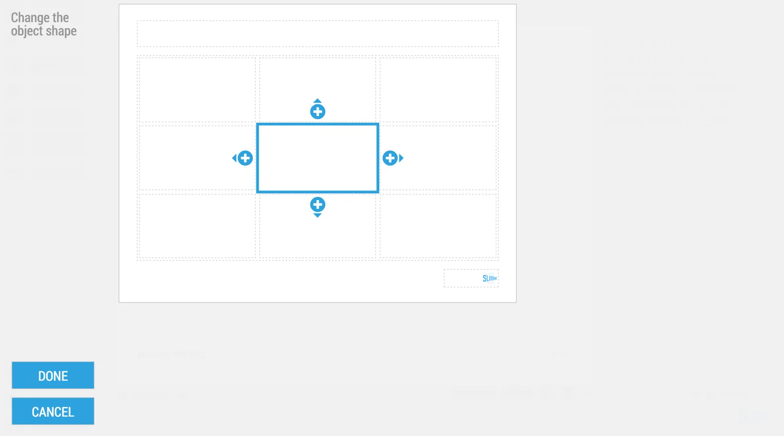
In the shape change menu you can tackle multiple shapes in one go. Click another shape and you can adjust its perimeter as well without leaving and re-entering the menu.

You can give SlideMagic a try yourself, the beta version is free to use. Sign up here.

Art: Rabbits by Johann Georg Seitz, subscribe to this blog, follow on Twitter

·Investor presentation

Ban social media speak

Self-proclaimed social media experts have taken all credibility out of buzzwords such as engagement, social, conversation, sharing, etc. etc. Clean your investor pitch from social media speak or you run the risk of sounding like a social media expert.

Instead, to describe what users actually do, use human language. To explain how your business gets traction use really hard, quantitative, measures that add up to the bottom line. “Buzz” does not necessarily bring dollars.

Art: Shepherdess With a Flock of Sheep, Anton Mauve, sign up for SlideMagic, subscribe to this blog, follow on Twitter.

·Investor presentation

Kawasaki: the only 10 slides you need in a pitch

Guy Kawasaki (the person behind the 10/20/30 rule) listed these 10 slides as the only ones you need in a startup pitch to investors. I agree and disagree with him.

I agree that these are more or less the 10 points you need to hit. But in order to hit these points, you might need more (visual) slides. Especially number 2: the problem/opportunity. A one slide explanation might not make the point emotionally. Or number 4: the magic, might take more than one slide.

The biggest problem is not which slides you need, the challenge is how to design them. Design is easy for the straightforward slides: title, business model, go-to-market, management team, projections. The other ones are a bit more tricky.

Art: Rothko number 10, sign up for SlideMagic, subscribe to this blog, follow on Twitter

Investors read the blogs as well

When pitching your startup it is a waste of time to dwell on educating investors about things that you can pick up by reading the major tech blogs: smart phone penetration, sharing economy, etc. etc. A smart investor is likely to read the same posts as you do.

Put in a place marker slide to make the generic point in 10 seconds, then move on and explain why your particular application of the sharing economy (or another major trend) is so innovative and clever?

If the idea is good, you might convince investors of this point as well very quickly. Then, we move into the territory if you, your partners, and your plan to make it all happen. And that is the toughest part of the pitch. Not from a design perspective (it is easy to draw a few Gantt charts), but the difficult bit is getting your plain straight and convincing investors that you can pull it of.

Art: Old Woman Reading, Rembrandt, 1655 - Sign up for SlideMagic - Subscribe to this blog - Follow on Twitter